|
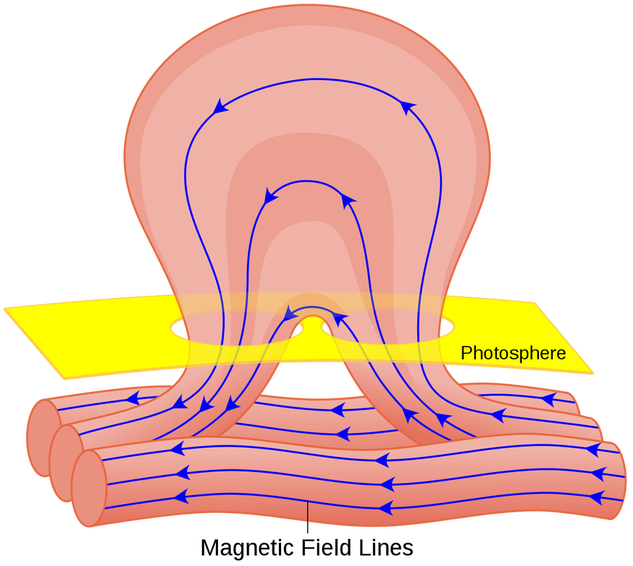
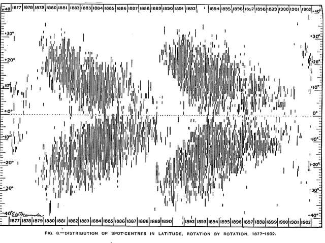
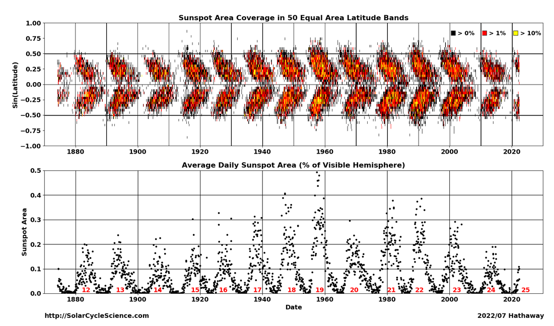
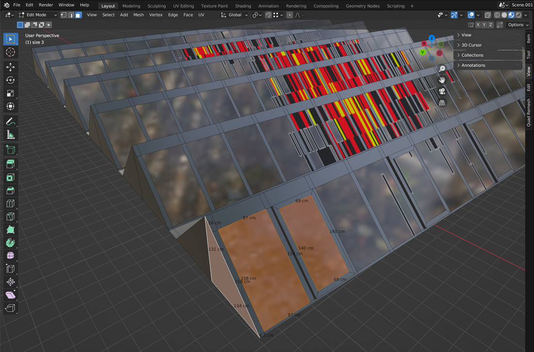
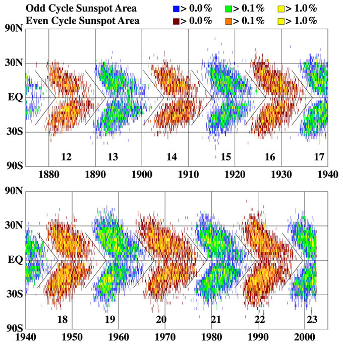
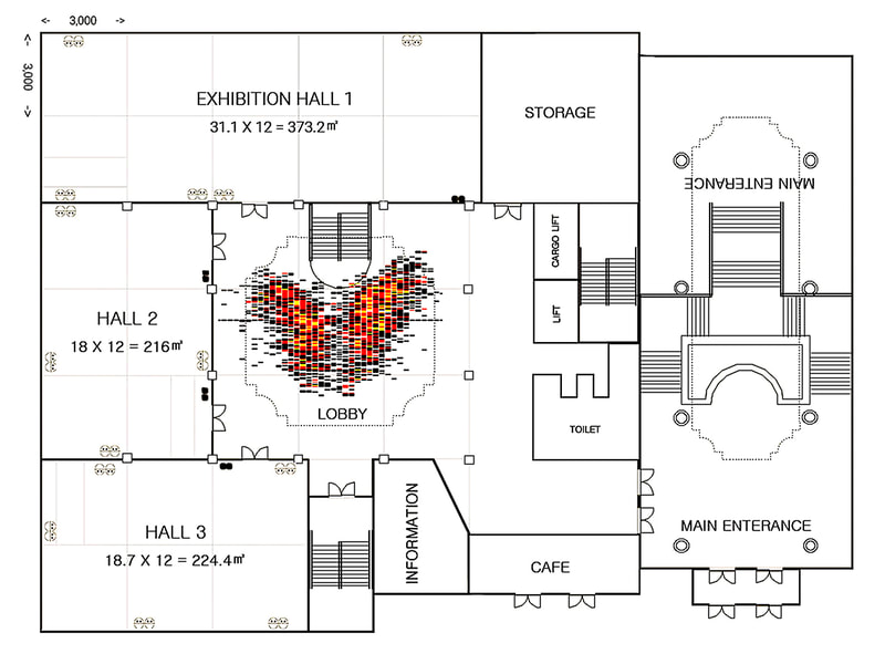
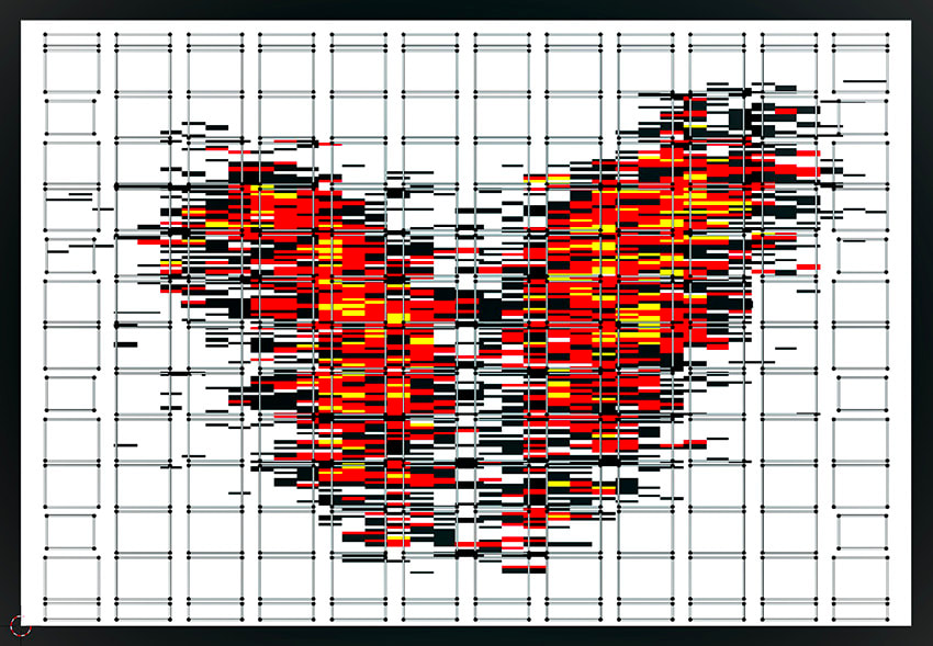
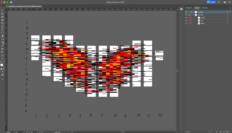
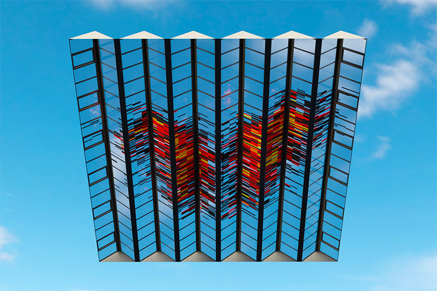
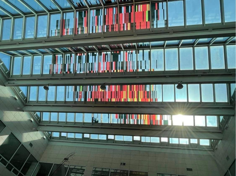
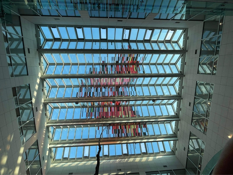
❉ Blog post 24 on diagrams in art and science looks at one of my favourite diagrams from Astrophysics, the Maunder or Butterfly diagram. Names after the brilliant husband and wife astronomers Edward and Annie Maunder, these technical plots of Sunspot position and size continue to reveal valuable insights in to the activity of the Sun, and allow us to explore and predict the cyclical effects that solar activity has on life on Earth. Figure 1: Video footage of granules surrounding a sunspot Credit: Swedish 1-m Solar Telescope (SST) 2004 For millennia, enigmatic dark spots on the surface of the Sun have captivated observers, with the first recorded sightings dating back to ancient China, circa 800 BC. However it wasn't until the early 17th century that the invention of the telescope allowed for a more systematic and scientific study of these phenomena, allowing early scientists such as Galileo Galilei to embarked on the meticulous documentation of these spots, pioneering a tradition of consistent observation that underpins modern solar research. Sunspots are dark regions that appear on the sun's photosphere, which is the outermost layer visible to us. They appear darker because they are cooler than their surroundings, with temperatures ranging from 3,800 to 4,300 Kelvin. This is a significant difference compared to the Sun's average surface temperature of around 5,800 Kelvin. The formation of sunspots has been linked to the Sun's magnetic field, which arrises from the movement of electrically charged plasma inside the Sun known as the solar dynamo. These vast, powerful magnetic fields can become twisted and tangled due to the way in which the Sun spins faster at its equator than at its poles. This difference in rotational speed is also responsible for the distinctive shape of butterfly diagrams, as we'll later see. Figure 3: Diagram of the magnetic line structure of a solar flare and its origin caused by deformation of the magnetic field lines in the sun. Image courtesy of wikimedia commons Sunspots typically occur in pairs called bipolar sunspot groups, with each spot having an opposite magnetic polarity. The magnetic field lines form loops, extending from one spot to the other. The intense strength of these magnetic fields can hinder convection, the process by which hot plasma rises to the Sun's surface, cools, and then sinks back down. This hindrance in plasma flow results in a relative decrease in temperature. The stronger the magnetic field, the greater the temperature reduction, and consequently, the darker the sunspot appears. Figure 4: A time-lapse image of all the sunspots that appeared on the sun in June 2023. (Made using data from NASA's Solar Dynamics Observatory.) (Image credit: Şenol Şanlı) The number and location of sunspots on the Sun's photosphere follow a solar cycle that lasts approximately 11 years. During the solar maximum, the period of highest activity, sunspots are abundant and mainly found in mid-latitudes. As the cycle progresses towards the solar minimum, a calmer phase, sunspots become scarcer and are located closer to the Sun's equator. Solar cycle 1, which lasted from February 1755 to June 1766, was the first solar cycle to be extensively recorded. Johann Rudolph Wolf, who discovered this cycle, determined its duration to be 11.3 years. Wolf was inspired by Heinrich Schwabe's 1843 discovery of the solar cycle and collected all available sunspot observations, dating back to Galileo's first telescopic observations. Through his research, Wolf refined Schwabe's estimate of the average cycle length from about 10 years to 11.11 years. However, due to a lack of reliable observations before 1755, Wolf could not confidently identify earlier cycles. As a result, the 1755–1766 cycle is conventionally designated as cycle 1. Wolf's groundbreaking findings, which he published in 1852, laid the groundwork for our current understanding of solar cycles. Figure 5: Butterfly diagram published by Edward and Annie Maunder (1904) illustrating the movement of active solar latitudes toward the equator as a solar cycle progresses. British astronomer Edward Maunder (1851–1928) developed a strong fascination with astronomy, particularly solar astronomy, from a young age. His interest was ignited by his observation of a large group of sunspots visible to the naked eye in February 1866. In 1881, Maunder became the head of the solar program at the Greenwich Royal Observatory in London, where he collaborated with his second wife and fellow astronomer Annie Maunder (1868-1947). Edward's new role allowed him to focus on his own research and investigate potential links between sunspots, solar activity, geomagnetic activity, and the Earth's environment. However, he faced persistent skepticism from the scientific community, including prominent figures like Lord Kelvin (1). Figure 5 displays the first Maunder diagram, published by Edward and Annie in 1904 and gifted by Annie to the renowned astronomer Walter Orr Roberts, the first director of the High Altitude Observatory in Boulder, Colorado. The diagram illustrates the distribution of sunspots recorded between 1876 and 1902 (north above, south below). These elegant plots resemble butterfly wings and quickly gained the nickname "Butterfly Diagrams." The original Maunder butterflies are also included in Prof. David Hathaway's comprehensive and updated sunspot chart, created during his 30-year tenure at NASA using 140 years of data (Figure 6). Prof. Hathaway is a leading expert on sunspots and former head of Solar Physics at NASA's Marshall Space Flight Center, and more details of his research can be found at Solar Cycle Science. I reached out to Prof. Hathaway, who kindly endorsed my proposal to adapt his work into a sunspot project at the 2022 Changwon Sculpture Biennale in South Korea. The Butterfly I chose for the installation occurred during Solar Cycle 20, between November 1964 and July 1980, the period in which I was born in July 1976. Figure 6: Sunspot area butterfly diagram showing the distribution of sunspot area as a function of latitude since 1874. (from SolarCycleScience.com, D. Hathaway) The Changwon Biennale is South Korea's largest recurring sculpture show, and during the fall of 2022 it showcased 69 artists under the title, 'Channel: Particle Wave Duality'. Curated by Director Cho Kwan Yong, Chief Curator Lee Tahe Hoon and Curator Hyojin Nam, the show considered the broad sense of how light and matter interact at the intersection of art and science. In preparation for the Biennale, the curatorial team sent out plans and photographs of each of the exhibition galleries, including the main atrium of the Seongsan Art Hall with it's enormous glass ceiling. I'd recently worked on a window installation for a project to design a city on Mars based on the structure of the Ribosome molecule, and asked the Biennale team to measure the 216 panes of glass in the ceiling in order to design the sunspot butterfly installation. 3D artist and illustrator Tony Cheng then used those measurements to create a computer model of the ceiling so we could experiment with different sized butterflies and predict how the installation would look when viewed from different angles and floors within the building below. Figure 7: 3D Blender model of the glass ceiling at Seongsan Art Hall, Gwangju |
|||||||||||||||||||||||||||||||||||||||||||||||||||||||||||||||||||||||||||||||||||||||||||||||||||||||||||||||||||||||||||||||||||||
|
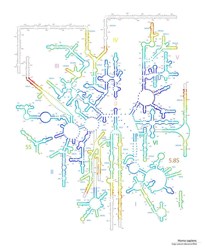
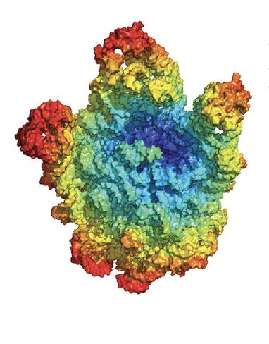
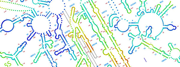
I contacted Anton Petrov at the NASA funded Centre for the Origins of Life Research (COOL), at Georgia Tech, to ask for permission to adapt diagrams from the Loren Williams research group for use in this project. I was given a link to a specially designed page of their website containing copyright free images of ribosome structures from various forms of life and in various file formats (Link below).
|
From: History of the ribosome and the origin of translation, 2015, Petrov et. al.
COOL receives funding from NASA’s department of exobiology, in the belief that knowing more about the origins of life on earth at the chemical level will potentially help astrobiologists understand what chemical signatures to look for on Mars in their search for extraterrestrial life.
The fact that the structure of ribosomes is so similar across all of life on earth supports the idea that life arose from a single cell or 'Universal Common Ancestor', a theory first proposed by Charles Darwin over 150 years ago. Meanwhile the 'Ribosome World Hypothesis' proposes that the first ancient, primordial ribosomes were self-replicating intermediates between a prebiotic world and the first cellular life forms.
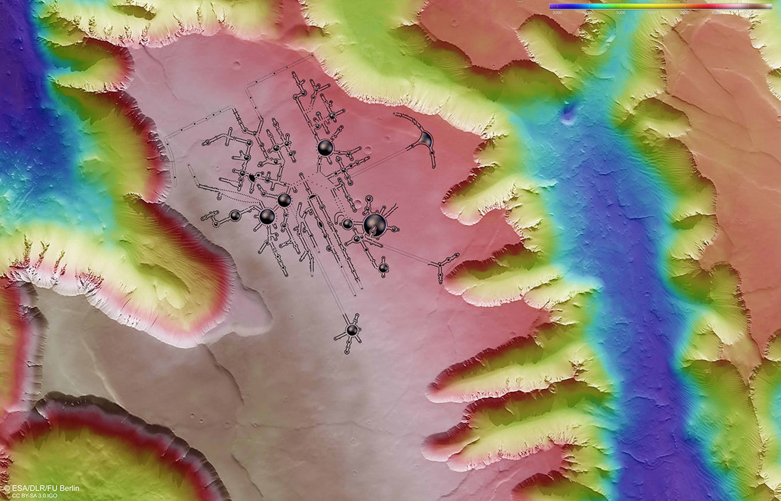
By choosing the diagram of the ribosome as a blueprint for our first extraterrestrial colony, I wanted to connect the molecular genesis of life with its potential futures, and design a poetic emblem for the remarkable moment when organic life attempts to spread out into the solar system for the first time.
In looking for a suitable location for the fictional martian city I first considered Asimov crater, named after the prolific writer and biochemistry professor Isaac Asimov. The smooth terrain of Arcadia Planitia also seemed an appropriate location. The term 'Arcadia' symbolizes an idyllic, pastoral harmony in Greek mythology. Known as the mythical home of Pan, the god of shepherds, hunters, meadows, and forests of the mountain wilds, Arcadia has been a source of inspiration for artists and writers back to the ancient times.
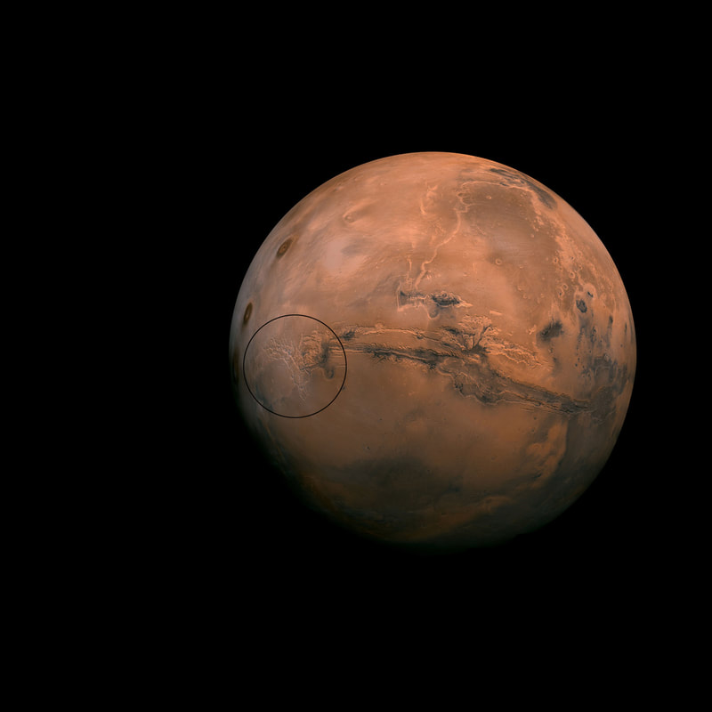
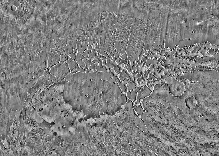
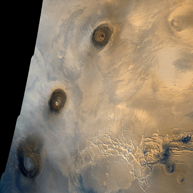
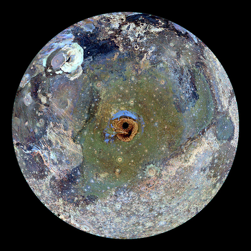
However I finally chose Noctis Labyrinthus, a region often poetically referred to as the 'Labyrinth of the Night'. This dense network of intersecting valleys and canyons forms a geological maze carved into the Martian crust at the western end of Valles Marineris, the largest canyon in our solar system. In the mornings its shadowy recesses are deep and cold enough to briefly fill with mist at sun rise, adding its mysterious allure.
The next step was to make a physical model of a small section of Noctus Labyrinthus, and this involved downloading 'high fidelity stereo-photogrammetric data' from NASA’s ‘High Resolution Imaging Science Experiment’ or HiRISE, the most powerful camera ever sent to another planet (figure 6) (5).
Image adapted by Michael Whittle (Courtesy of ESA / DLR / FU Berlin, as part of the HiRISE project).
Computer programmer and 3D modeler Alan Gordie, who works under the name Organic Computer, has adapted NASA HiRISE data to create 3D representations of geographic features on Mars. I've included a link below to learn more about his modelling process and his other fascinating projects.
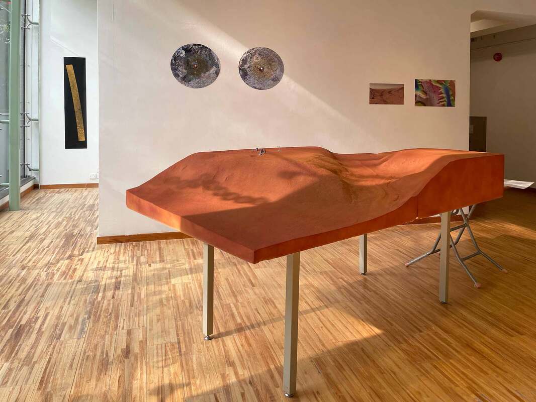
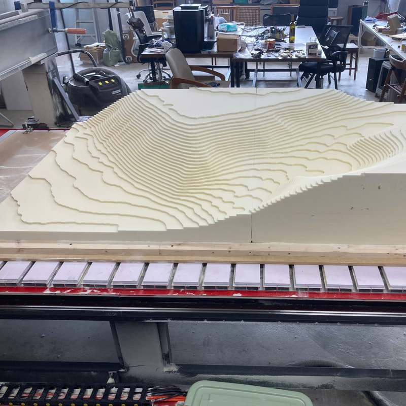
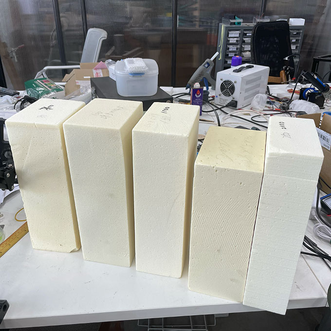
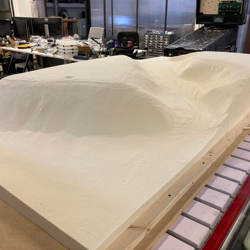
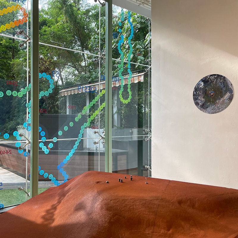
Alan kindly gave permission to use one of his HiRISE models of a section of the labyrinth, and the data was then adapted for compatibility with CNC milling by Homan Ho at my favourite Hong Kong fabricators 'FabLab Tokwawan'. This finally allowed us to create a large-scale model of a portion of Noctus Labyrinthus in high-density architectural foam, with enough detail to capture all the subtle qualities of the martian landscape.
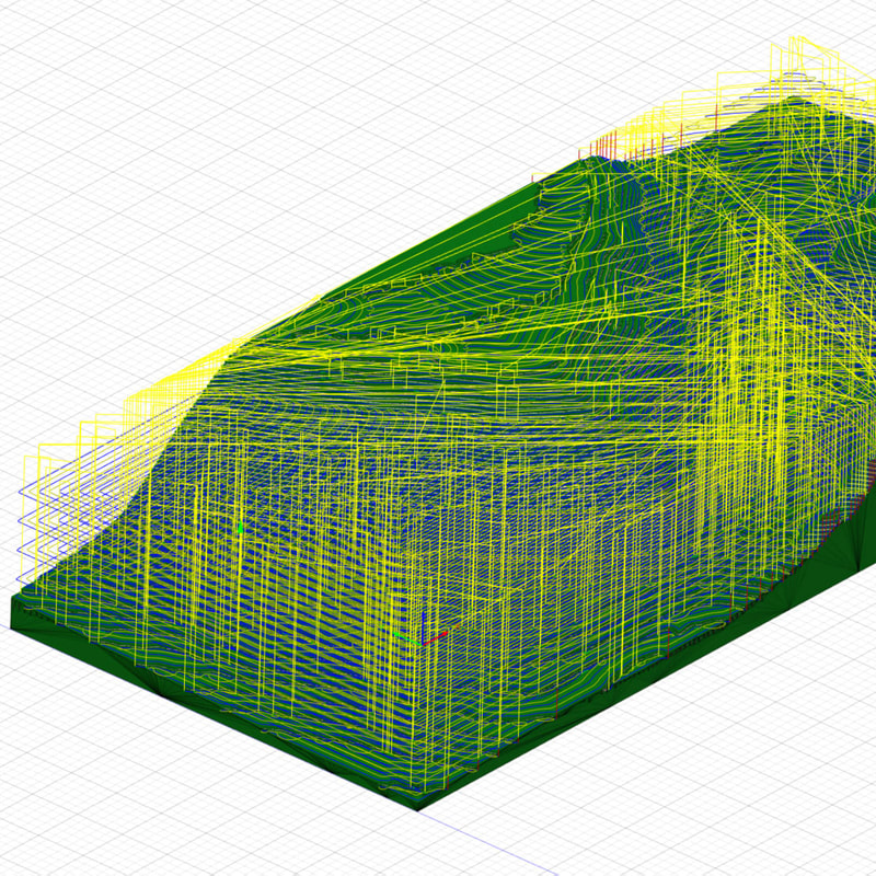
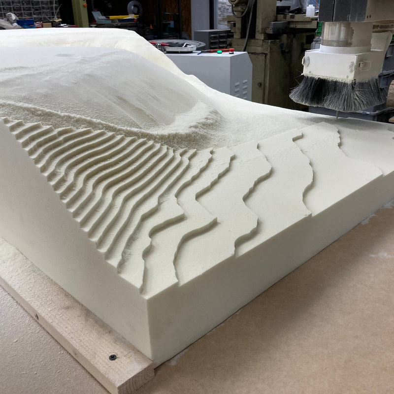
Homan ran a cutting simulation to check for potential bugs in the data, then started the process at a low resolution to remove the bulk of the foam and create a roughly stepped series of terraces. Switched to a finer modelling blade allowed us to mill the surface with millimetre precision. The tiny craters, rippling landslides, and intricate cliffs gradually became visible, and a small section of actual Martian landscape, 140 million miles away, slowly emerged in downtown Kowloon in Hong Kong.
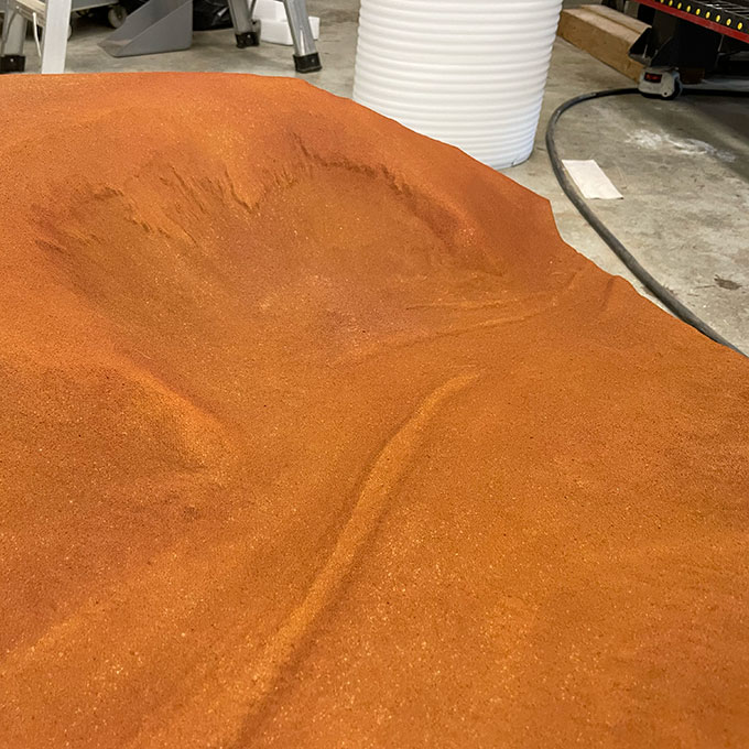
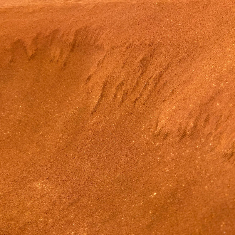
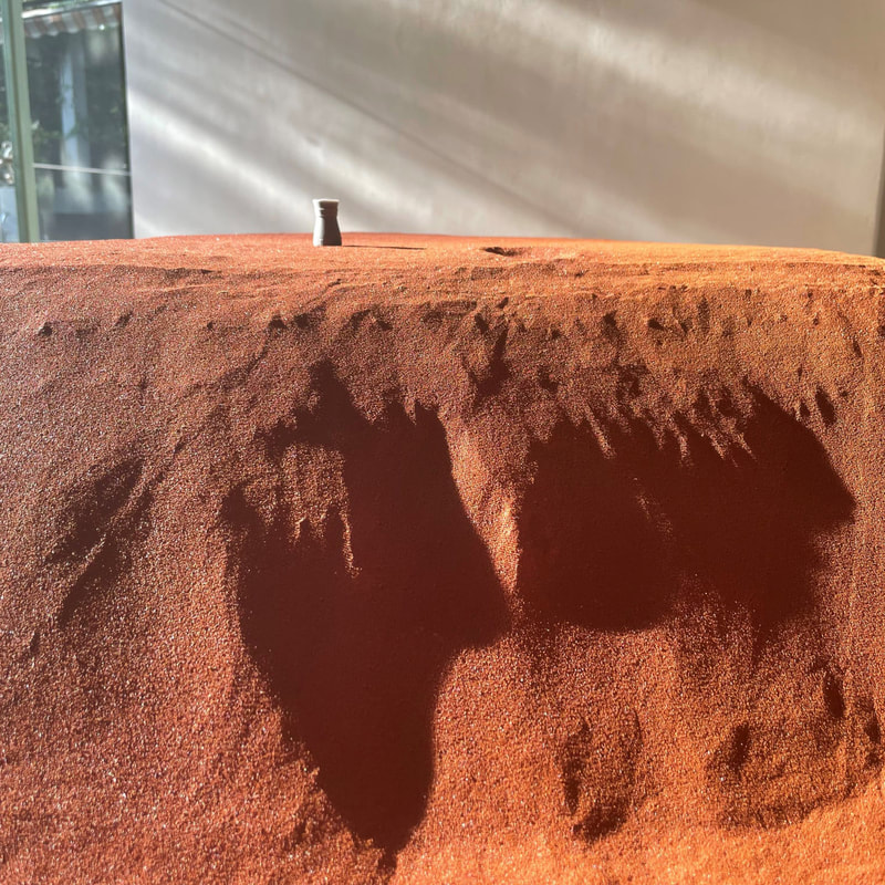
Homan also sourced iron oxide pigments, or powdered haematite, so we could colour the surface of the model using materials similar to those found in the rusty martian dust. The model was then shipped to and installed in the gallery along with all of the reference materials, drawings, and notes that had gone in to generating the project.
Figure 9: CNC milled replica model of the Martian landscape for the CITYA exhibition, 2021
Exhibited along with NASA HiRISE image data swathes and Martian maps
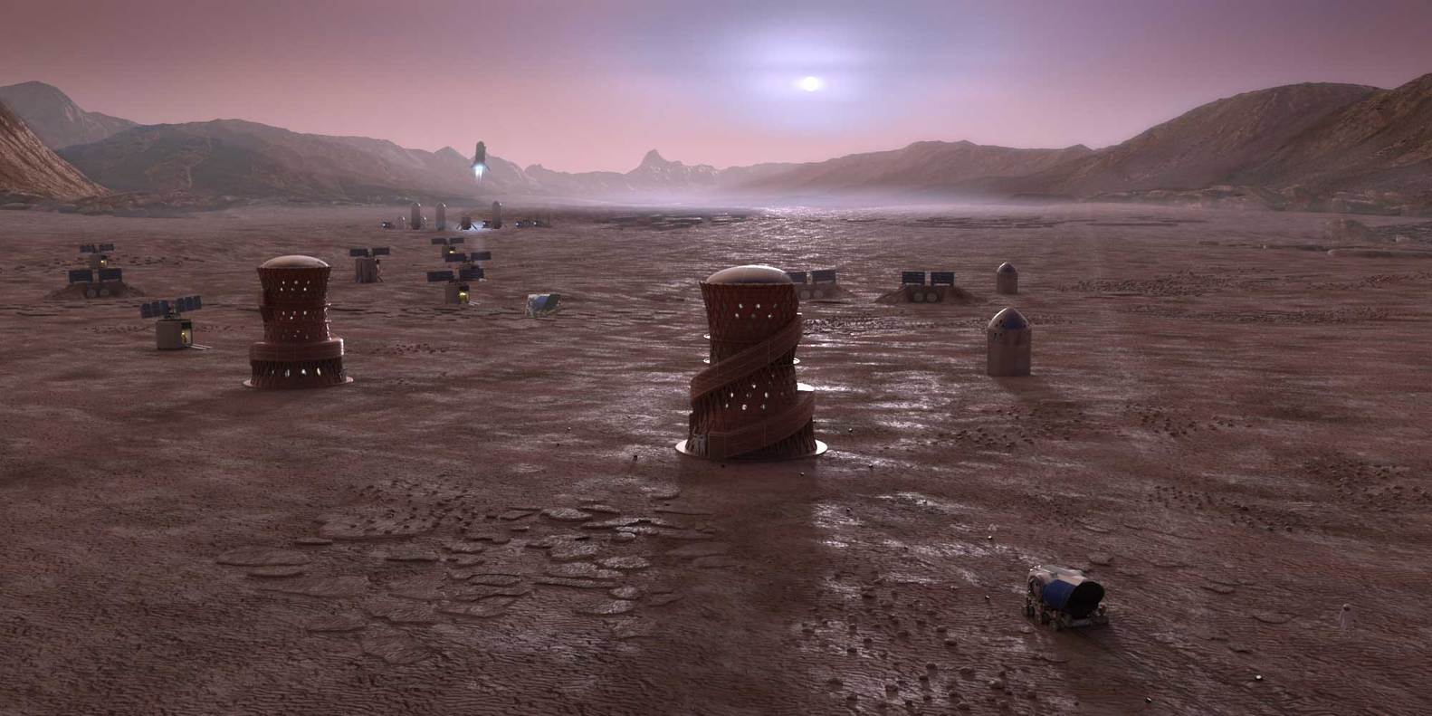
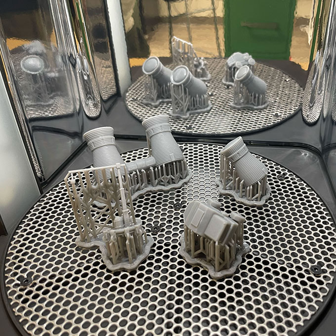
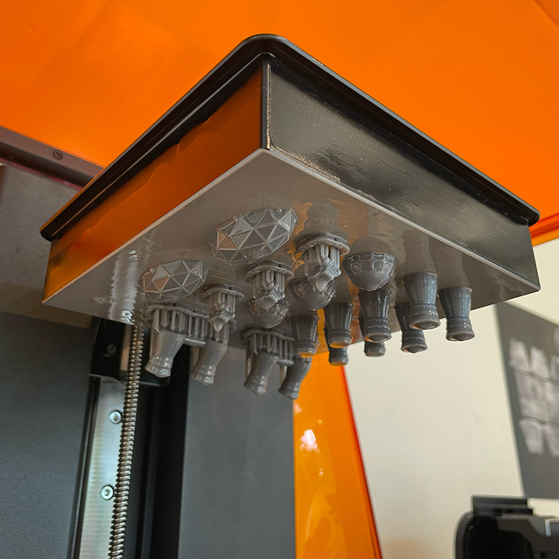
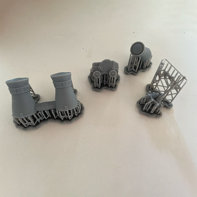
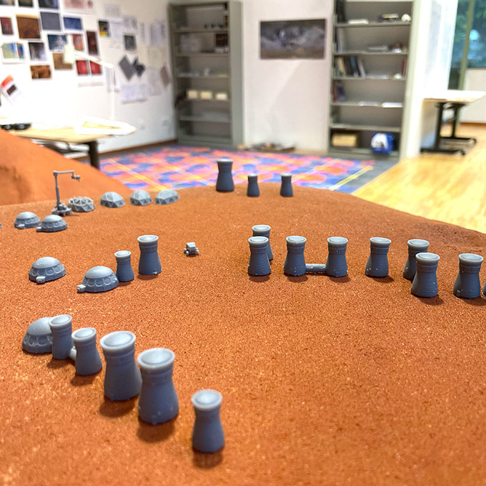
The gallery became a studio for the duration of the exhibition, and the model buildings were printed using high resolution 3D UV-resin printers and gradually added to the model. Their forms were based on designs created by SEArch+ / Space Exploration Architecture, winners of 6 NASA Centennial Challenge Competitions. This team of engineers and architects specialkise in developing human supporting architecture for living and exploring space.
The goal of NASA's 2019 habitat challenge was to create 3D-printed sustainable housing for deep space exploration, including the agency’s planned journey to Mars (6). Find our more about SEArch+'s ambitious projects here: http://www.spacexarch.com/
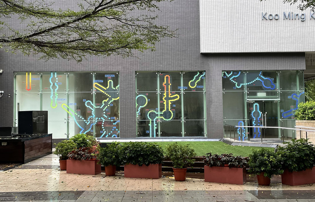
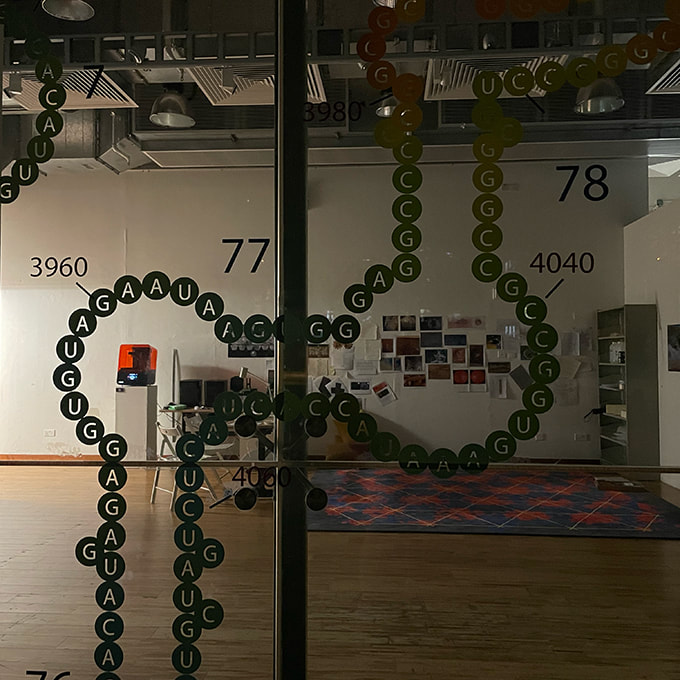
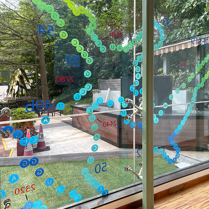
Once the interior installation was complete, sections of the ribosome diagram were enlarged and attached as semi-transparent, coloured vinyl to the gallery windows, creating a contrast in scale with the city plans and modeled landscape inside.
Below are images from project development and links to learn more:
LINKS:
- Explore updates to Becks design and geographical accurate designs at Mark Node's website here.
- The Ribosome Gallery created by the Loren Williams research group can be accessed here.
- More of Organic Computers models of Mars and the process of their creation can be found here on the Sketchfab blog "Science highlight".
- You can also learn more about Homan Ho's work at Fab Lab TokwaWan in Hong Kong here.
1) Petrov, A S., Bernier, C. R., Gulen, B., Waterbury, C. C., Hershkovitz, E., Hsiao, C., Harvey, S. C., Hud, N. V., Fox, G. E., Wartell, R. M., and Williams, L. D. (2014) Secondary Structures of rRNAs from All Three Domains of Life, PLoS One 9, e88222. 2.
2) Petrov, A S., Bernier, C. R., Hershkovitz, E., Xue, Y., Waterbury, C. C., Grover, M. A., C., H. S., Hud, N. V., Wartell, R. M., and Williams, L. D. (2013) Secondary Structure and Domain Architecture of the 23S rRNA, Nucleic Acids Res. 417522-7535.
3) Petrov, Anton S. et al. (2015) History of the ribosome and the origin of translation. PNAS, 112:50. Pages: 15396 - 15401. Online: www.pnas.org/cgi/doi/10.1073/pnas.1509761112
https://www.pnas.org/content/111/28/10251
4) Ramakrishnan V. 2002Ribosome structure and the mechanism of translation.
Cell 108:557-2; PMID:11909526; http://dx.doi.org/10.1016/S0092-8674(02)00619-0
2009 Nobel Prize in Medicine, Online: https://www.nobelprize.org/prizes/chemistry/2009/illustrated-information/
5) NASA HiRISE DTMS: https://www.uahirise.org/dtm/
6) NASA Centennial Challenge. Online: https://www.nasa.gov/directorates/spacetech/centennial_challenges/overview.html
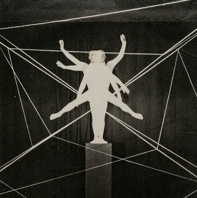
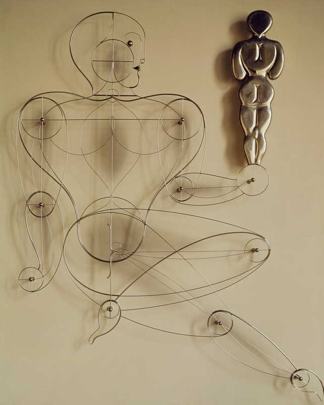
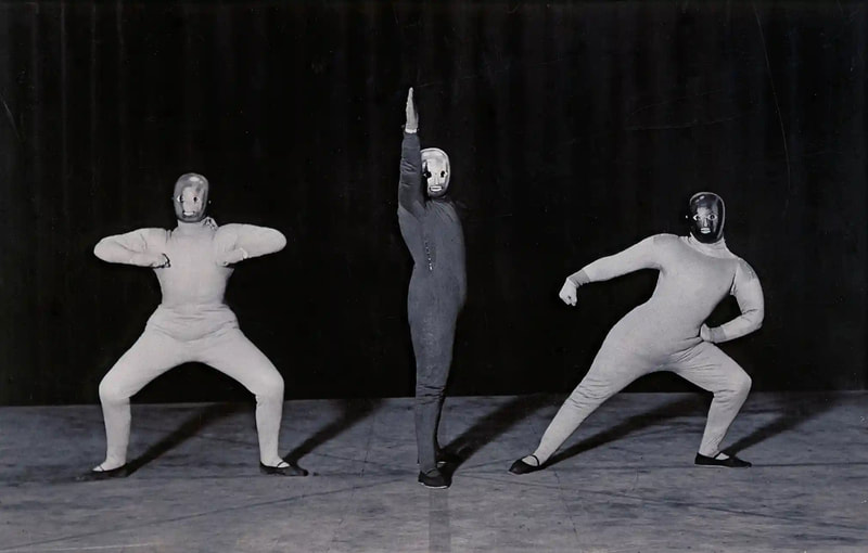
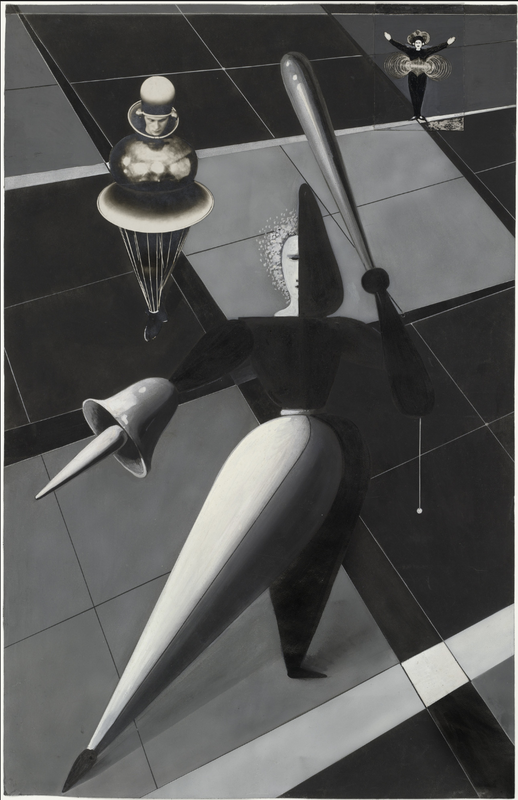
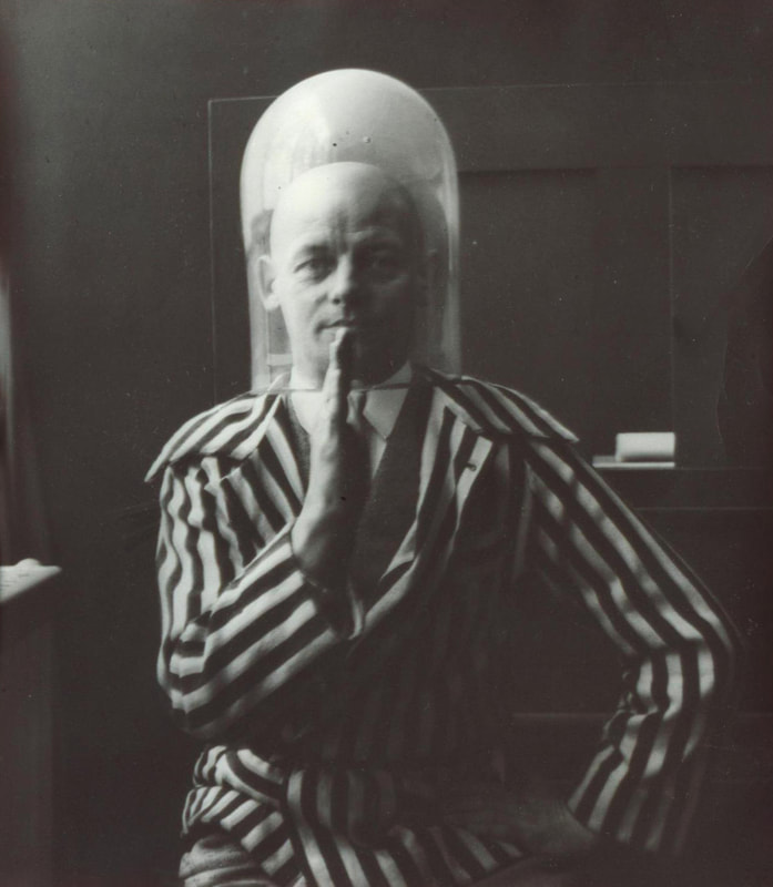
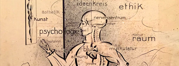
Bauhaus Archiv, Oskar Schlemmer 'Der Mensch' original photograph by Lux Feininger. Photo: Marcia F. Feuerstein.
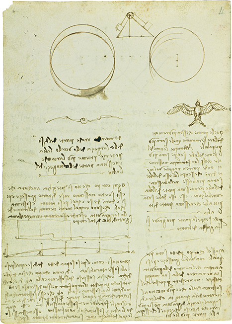
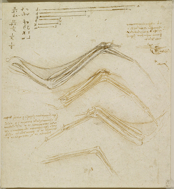
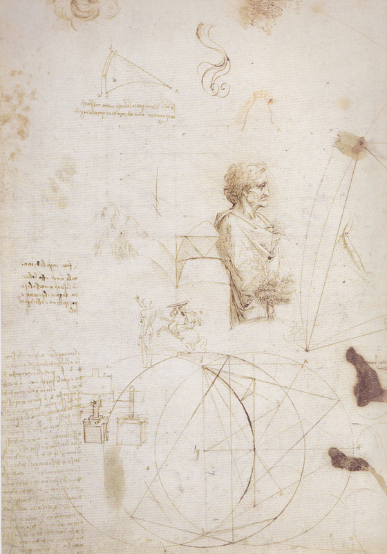
Leonardo da Vinci, a polymath of the highest order, harnessed the power of diagrams to visualise complex natural systems, generate detailed technical solutions to engineering projects, and construct the complex systems of perspective that underly many of his masterful paintings.
JMW Turner, England's most celebrated romantic period artist embarked on his career as an apprentice to an architect, honing his skills as a draftsman. He taught for over 30 years as Professor of Perspective at the Royal Academy, often adding this accolade when signing his paintings as PP.
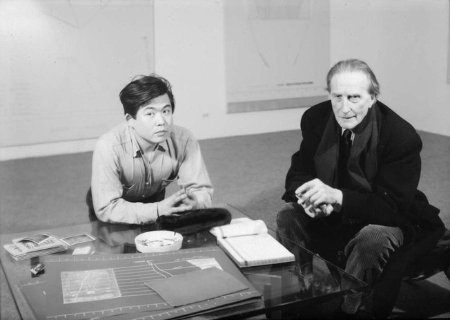
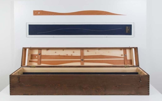
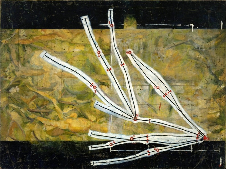
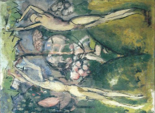
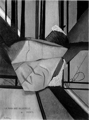
Marcel Duchamp's artistic evolution was profoundly influenced by his intensive study of French textbooks brimming with austere diagrams during his time in art school, helping to catalyse his shift away from what he called 'retinal art' designed only to please the eye. In a fascinating twist, this influence extended to his proteges Arakawa & Gins, with Arakawa's fascination running so deep that he contemplated changing his name to the word 'Diagram' itself.
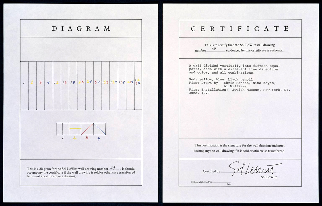
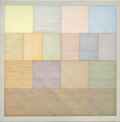
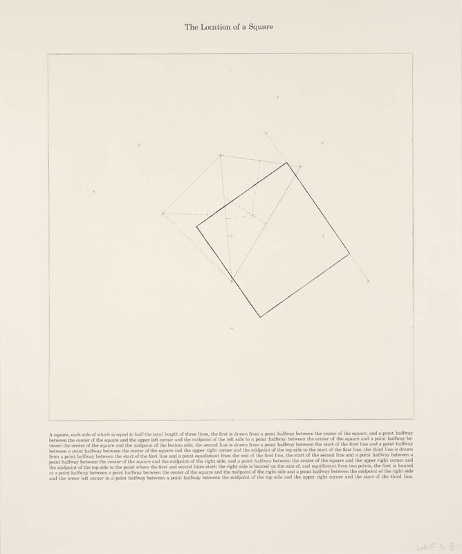
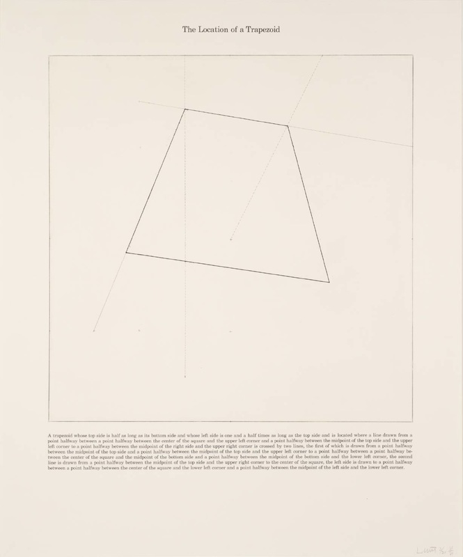
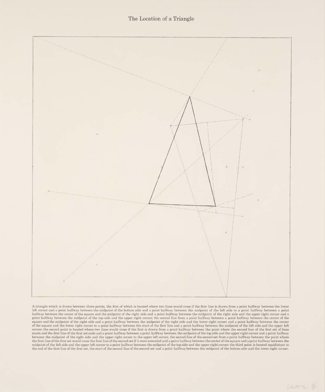
The master of diagrammatic conceptual art, Sol LeWitt, embarked on his artistic journey as a graphic designer in the esteemed office of world-renowned architect I.M. Pei. Like Duchamp, his obsession with the work of 19th-century diagrammatic photographer Eadweard Muybridge added yet another layer of complexity to his creative repertoire.
Contemporary Swiss artist Yves Netzhammer's background in architecture, including training in architectural drafting, left a lasting imprint on his art, which is characterized by an engaging yet disconcerting mixture of diagrammatic images with contemporary neuroses.
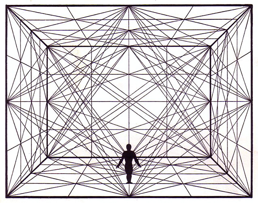
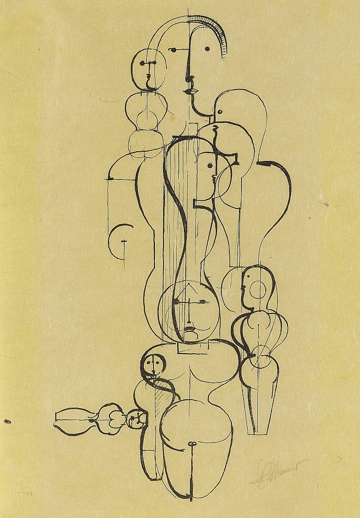
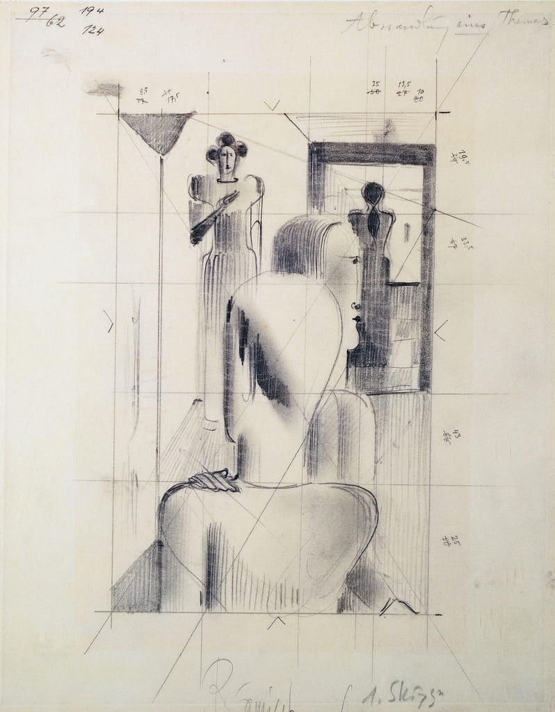
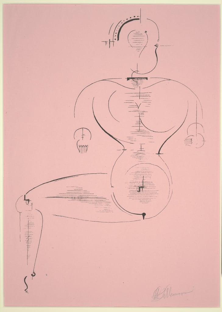
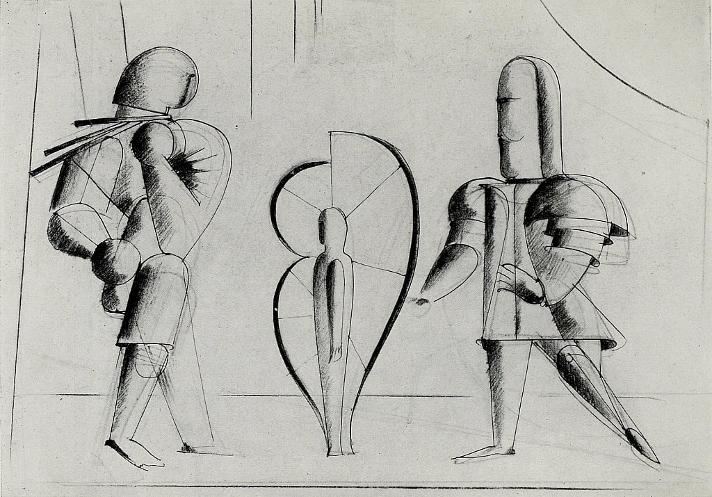
In the case of the legendary Bauhaus teacher Oskar Schlemmer, an early training in cartography significantly fueled his interest in combining formal, geometric clarity with subjective experience and dynamic expression. In Schlemmer's own words he felt as if he must , "...opt for Cezanne or Van Gogh, classicism or romanticism, Ingres or Delacroix, Leibel or Böcklin, Bach or Beethoven. I would like to present the most romantic idea in the most austere form." (1) The austere form he chose was the diagram.
(The view in the Bauhaus opposite), 1925
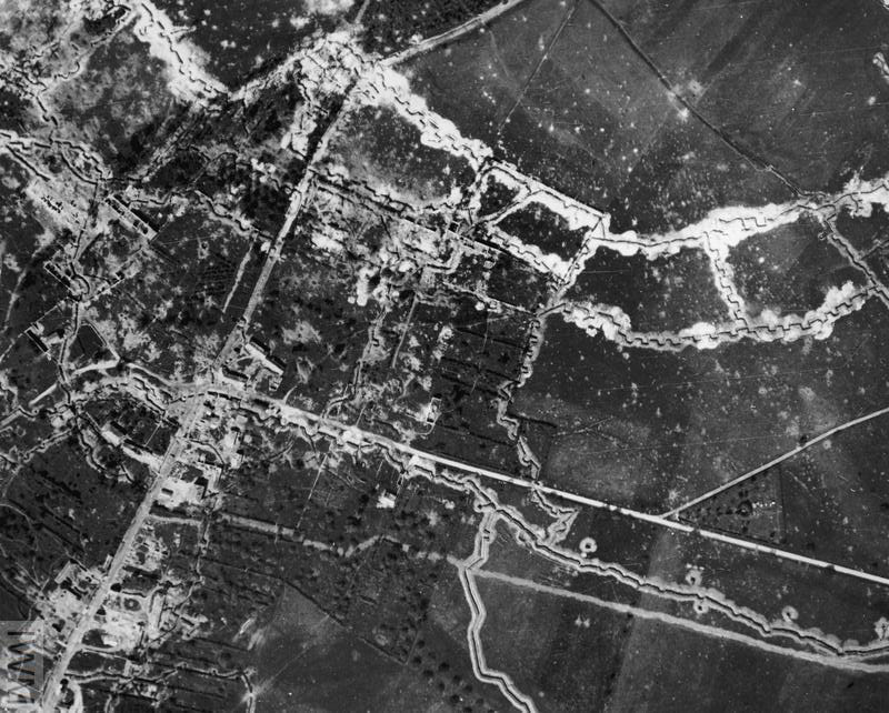
World War 1 was primarily a war of maps, and these were produced in their tens of thousands by these teams of military specialists whose job it was to survey the terrain and keep maps up to date based on direct observation, sound ranging, and other specialised techniques. The recent invention of Airplanes allowed for daily aerial reconnaissance of enemy troop positions in their labyrinthine trenches.
Working at 12,000ft above enemy positions, photographers would lean from their so called 'flying coffins' to photograph troop locations, often flying treacherously low to capture critical details. As a time saving measure, film canisters and observational notes were dropped directly over map makers' workshops, allowing for the quickest possible cartographic updates.
Courtesy of Imperial War Museum © IWM HU 91108
As Schlemmer later commented, "I have always admired the fantastic aspect of a drawn map. Purity in respect of art is thus nicely preserved for me." (2)
In 1918, after returning to civilian life, he resumed his artistic studies under the guidance of Hölzel, but began to venture beyond traditional painting into the realm of 3-dimenions, crafting a series of sculptures that garnered attention when exhibited at the renowned 'Der Sturm' Gallery in Berlin. Simultaneously, Schlemmer found himself working alongside the esteemed artists Paul Klee and Willi Baumeister at the Stuttgart Academy of Fine Art.
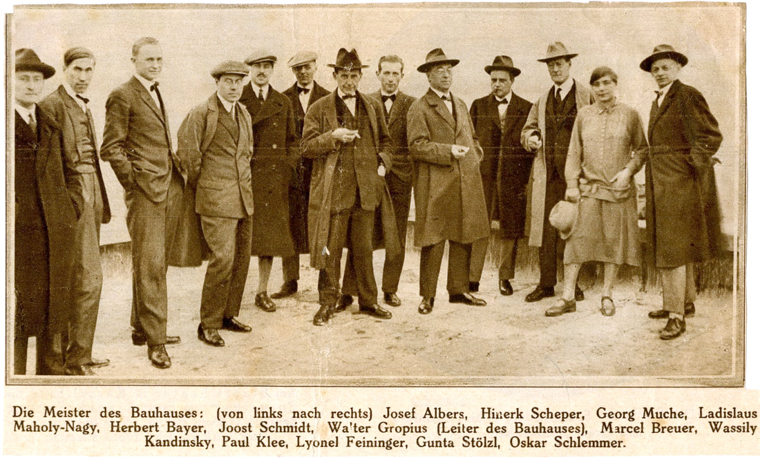
However, the most transformative chapter in Schlemmer's career came when he received an invitation to teach at the Weimar Bauhaus from Walter Gropius, who had founded the school in 1919 in the wake of World War I.
Google Arts and Culture, © Stiftung Bauhaus Dessau
When the Bauhaus moved to Dessau in 1925, Schlemmer developed a series of architectural courses that incorporated his knowledge of theatre, choreography and the human form, underpinned by his interest and experience in diagrammatic image making. This innovative fusion of disciplines set a precedent for the interdisciplinary approach that would come to define his educational philosophy.
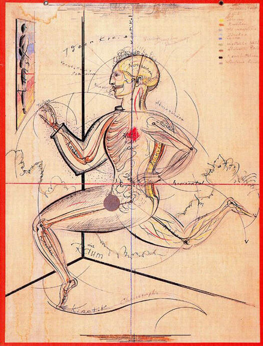
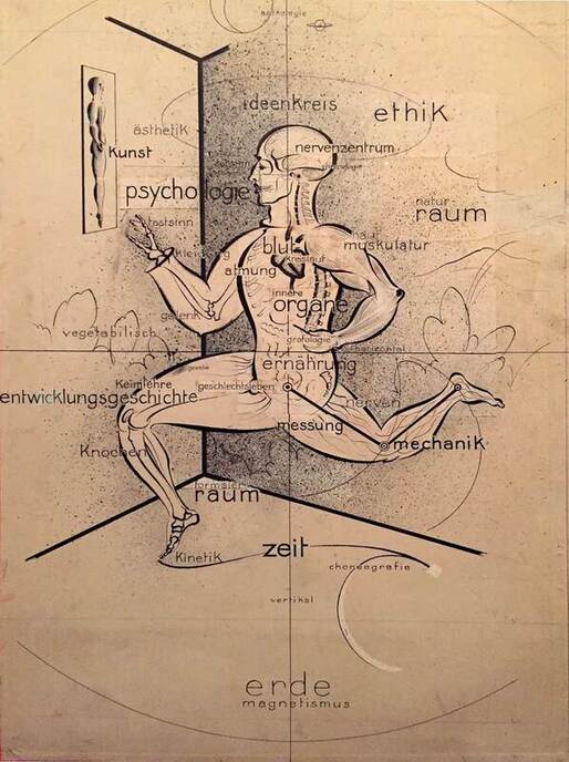
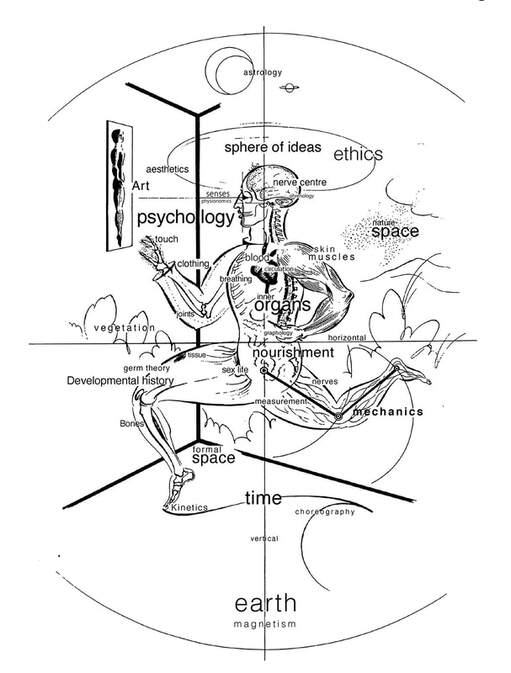
However, Schlemmer's most groundbreaking venture came in 1928, when he introduced an obligatory course for third-year students, titled 'Der Mensch,' or 'The Human Being.' This visionary program cast humans as dynamic agents composed of intricate anatomical and hereditary systems, active participants within vast networks that encompassed not only their physical environments, but higher spheres of metaphysical concepts and ideals. This transdisciplinary approach foreshadowed the development of fields like cybernetics and systems science, which would emerge only later in the 1940s.
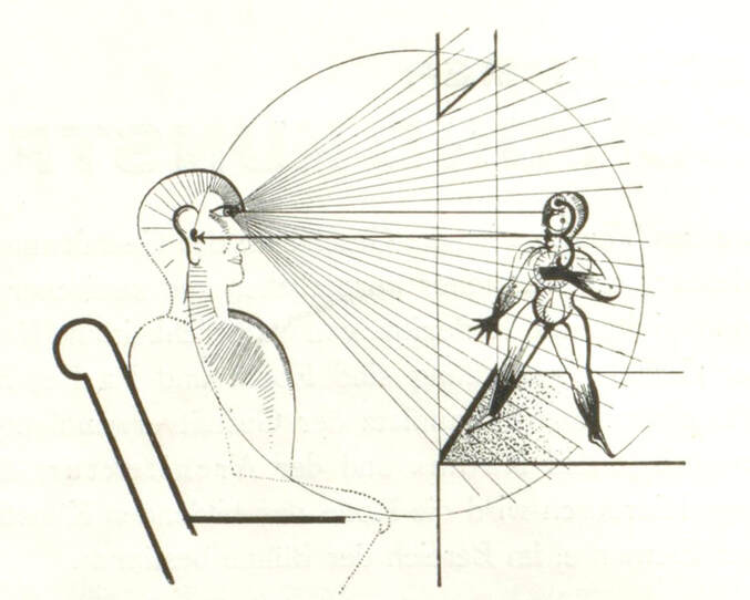
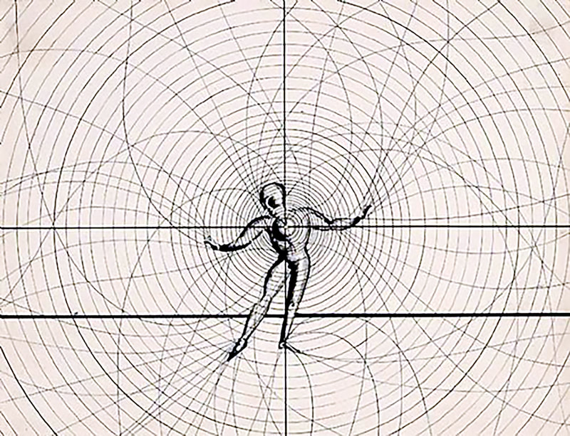
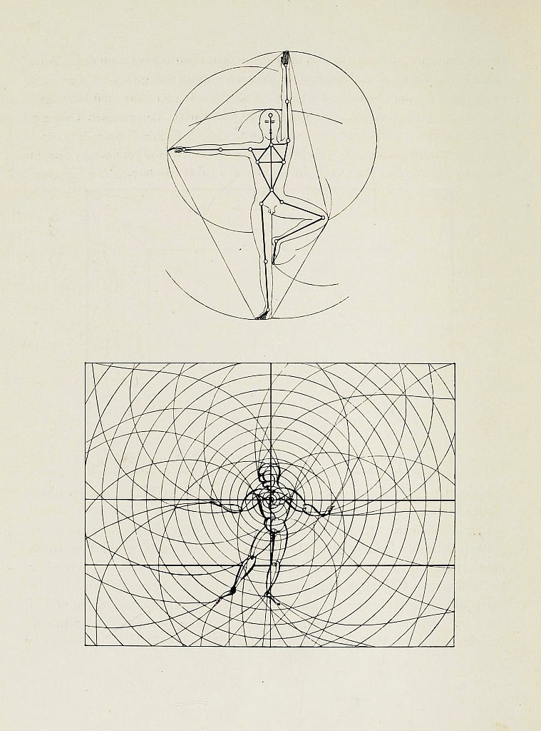
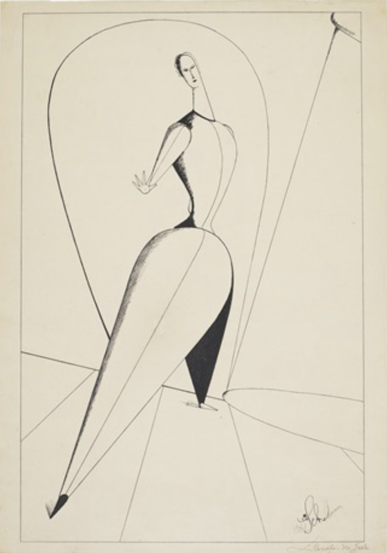
To convey the essence of his new course, Schlemmer composed and refined a diagram titled 'Man in the Sphere of Ideas' featuring a semi-transparent figure frozen in motion (figure 2).
English translation by Michael Whittle.
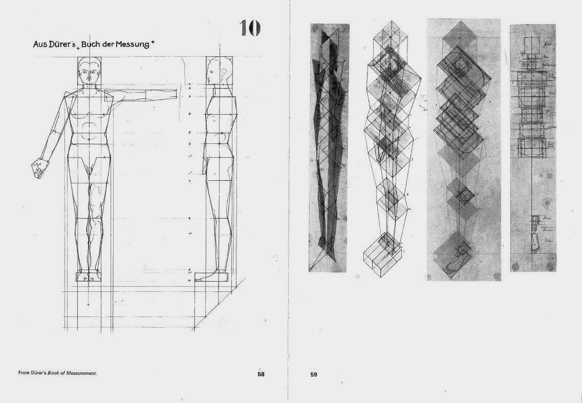
According to Marcia Feuerstein, Schlemmer was astounded by his students’ lack of even a basic knowledge of the human body, and began by having them make figure drawing of one another. (3) For the series of lectures that became the basis for his new course, Schlemmer referenced Adalbert Goeringer's book 'Der Goldene Schnitt', or Golden Circle, which emphasised the fundamental importance on the golden section in the study of proportion.
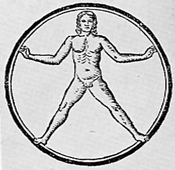
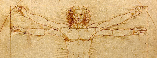
Schlemmer also referred to other historic canons of human proportion including the ancient Canon of Polyclitus, the Egyptian canon, Albrecht Dürer’s various studies, and Leonardo da Vinci’s reinterpretation of Vitruvius’ proportional body (Figure 1) (See also a previous blog post on the Vitruvian Man).
In his theatre productions Schlemmer continued to further refine and codify the body as an iconic representation, which stood him in contrast to the psychological and emotionally expressive approaches common to German dance of the 1920s.
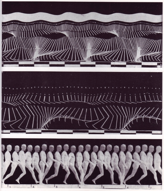
Indeed, Schlemmer was already aware of the pioneering work of the physiologist J.E. Marey, who laid the groundwork for a quantitative study of human motion that led to the scientific classification of key parameters in this rapidly developing field.
This transition from describing the so called 'sensual body' using words and drawings, to generating more accurate scientific data had a significant impact on the performing arts, particularly in the realm of dance and choreographers such as Schlemmer. (4)
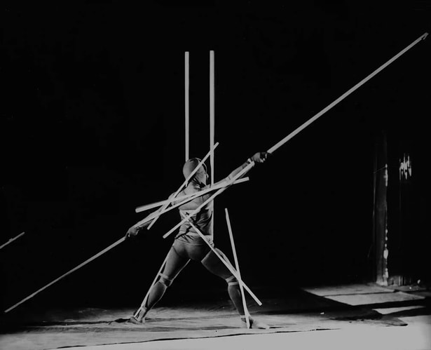
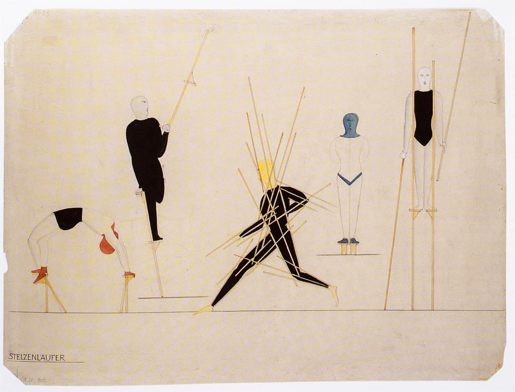
For his performance known as 'Stäbetanz' or 'Slat Dance', Schlemmer used white wooden sticks to extend the limbs of a dancer. This highlighted the geometric relationship between the human body and space, and Schlemmer mirrored the methods of Marey by obscuring the body itself by using a black costume against a black background.
Choreographer and scholar Debra McCall reconstructed the Bauhaus Dances using Schlemmer’s original notes and toured them internationally in the 1980s. In an interview McCall spoke of how her teacher “...Martha Graham said that where the dancer stands ready is hallowed ground. She understood the sacred aspect of theatre, and Schlemmer felt very much the same. He believed that walking, standing, and sitting are very serious, and that [just] to see a figure on a stage is serious as well. The Stick Dance, for example, is the extension of the golden mean into space because our anatomical form is based on those proportions; it is sacred geometry in motion. When you see it and the other pieces performed, it’s like being in church. You will not hear a sound in the theatre.” (5)
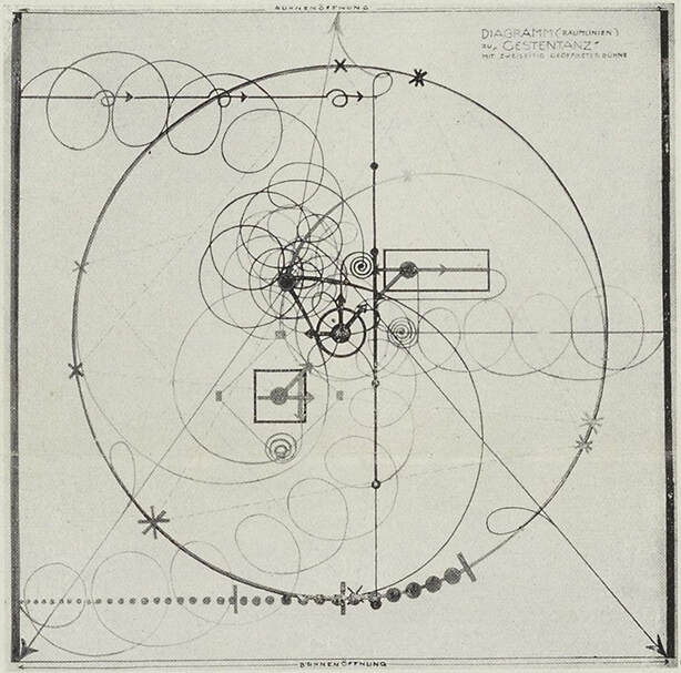
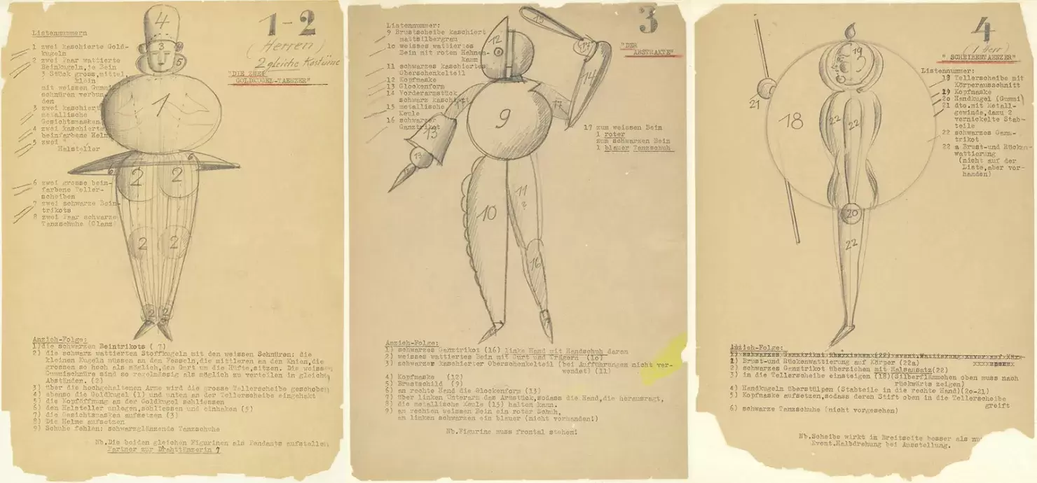
Schlemmer's also experimented with choreographic diagrams for his 1926-27 performance "Gesture Dance". These images graphically mapped out the entire sequence of actions, although he recognized that even with directions for tempo and sound, notation still couldn't provide a complete depiction of the performance and supplemented them with written descriptions. (6)
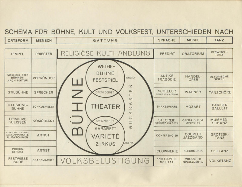
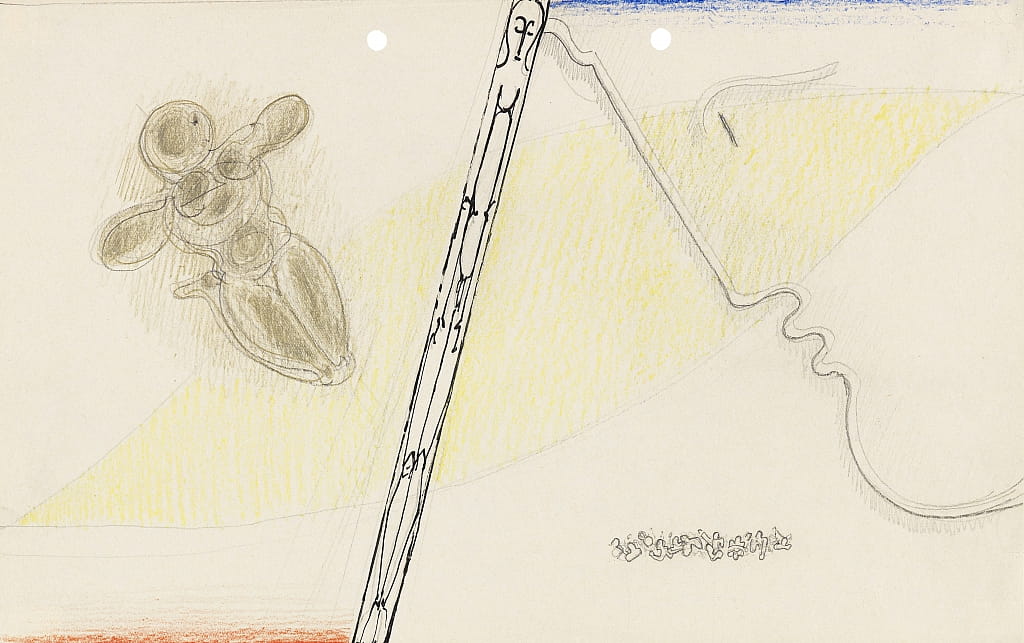
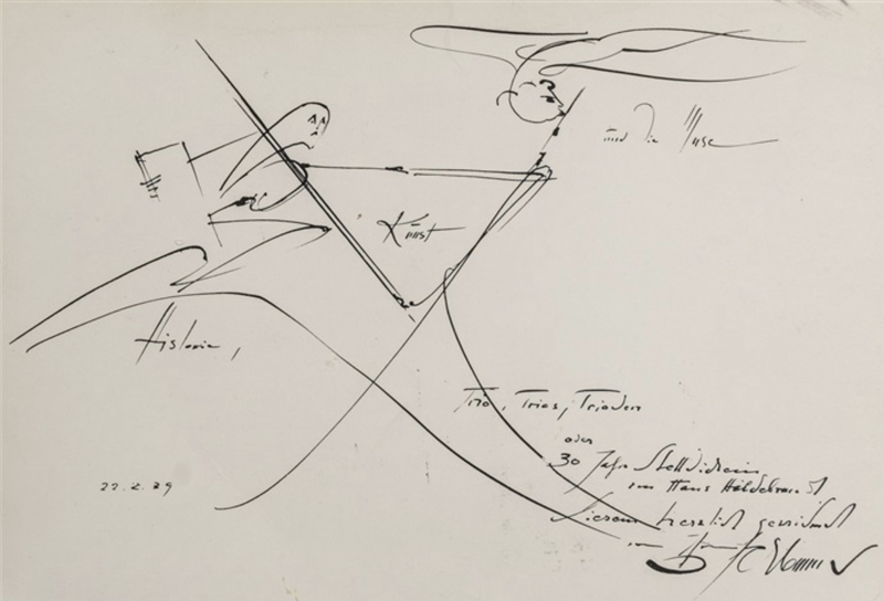
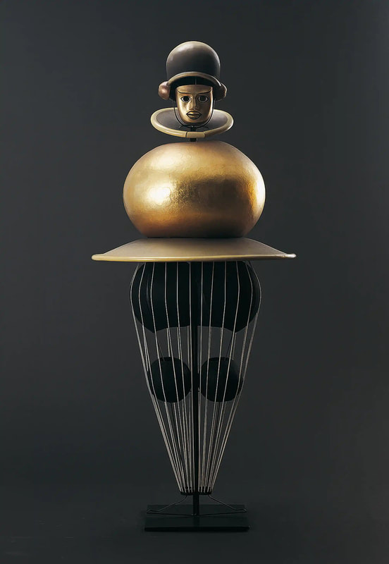
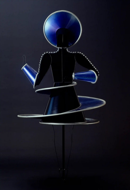
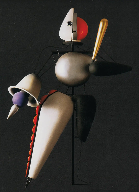
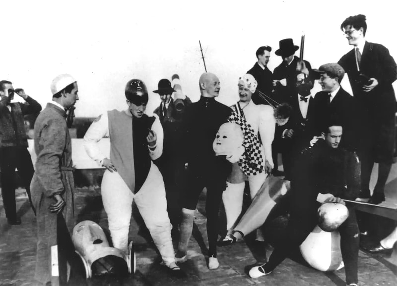
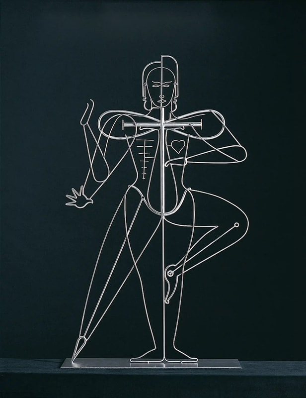
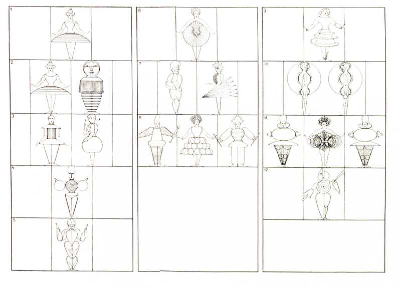
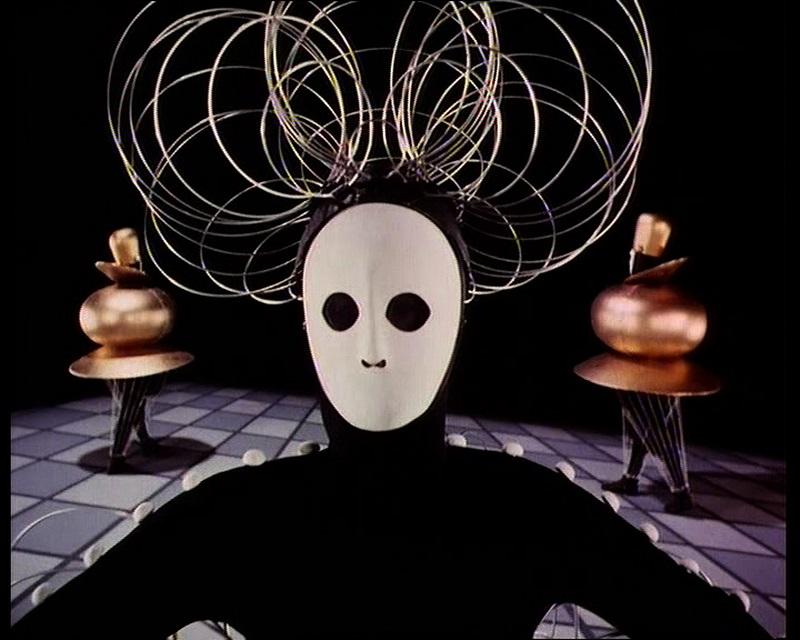
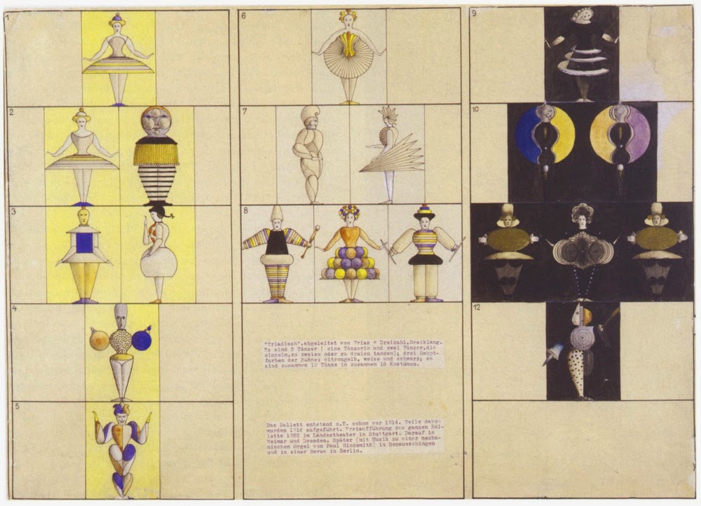
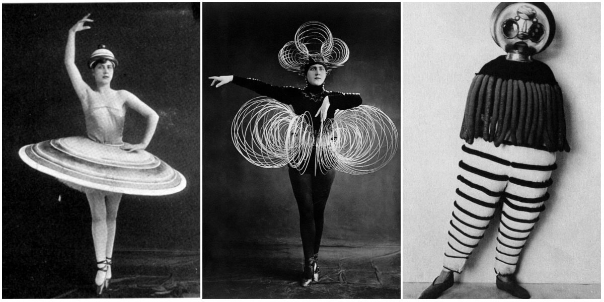
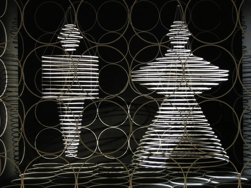
Below are images and a recording of the Triadic Ballet, as well as a series of other diagrammatic forms created by Schlemmer in his visual and conceptual quest to codify and simplify the complexity of life and living.
He used music as an analogy to describe his preference, stating that ''...what I love most are plain, austere things. Not flowery, scented, silky, Wagnerian things but Bach and Handel.'' (7)
1) Schlemmer, Oskar, pg 28. The letters and Diaries of Oskar Schlemmer (1958), ed. Tut Schlemmer, trans. K. Winston, (Evanston, IL. Northwestern University Press, 1990)
2) Conzen, Ina, Oskar Schlemmer: Visions of a New World, Staatsgalerie Stuttgart (Hirmer Verlag, 2016)
3) Marcia F. Feuerstein (2019) Oskar Schlemmer's Vordruck: an absent woman within a Bauhaus canon of the body, Theatre and Performance Design, 5:1-2, 125-140, DOI: 10.1080/23322551.2019.1605767
4) https://www.researchgate.net/publication/221571982_Man_in_espacemov_Motion_Analysis_in_3D_Space
5) https://www.gsd.harvard.edu/2019/05/in-space-movement-and-the-technological-body-bauhaus-performance-finds-new-context-in-contemporary-technology/
6) https://www.artforum.com/print/197707/oskar-schlemmer-s-performance-art-35972
7) https://www.nytimes.com/1986/05/25/arts/art-view-schlemmer-s-noncommittal-muse-came-to-life-on-stage.html?smid=url-share
© Royal Collection Trust / Her Majesty Queen Elizabeth II (CC BY-NC-SA 4.0)
Geometry was fundamental to Leonardo’s process of understanding both the visible forms of nature and the hidden mechanisms and forces underlying natural phenomena. His vision of the interplay of these rules of geometry was transformative and dynamic rather than static, as if he observed nature as a process of geometry in action.
He was however not merely content to record how something worked, but also strove to find out why it worked the way it did, and it was this insatiable curiosity that transformed a technician into a scientist. (1)
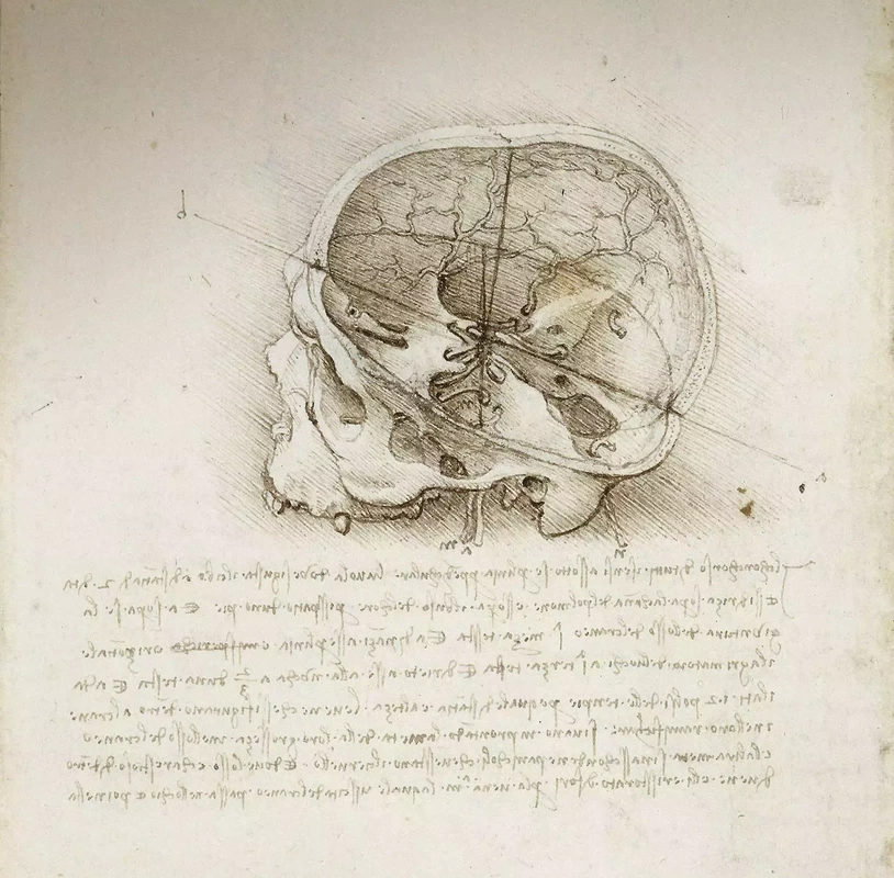
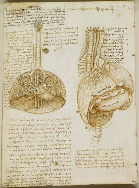
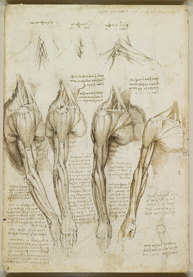
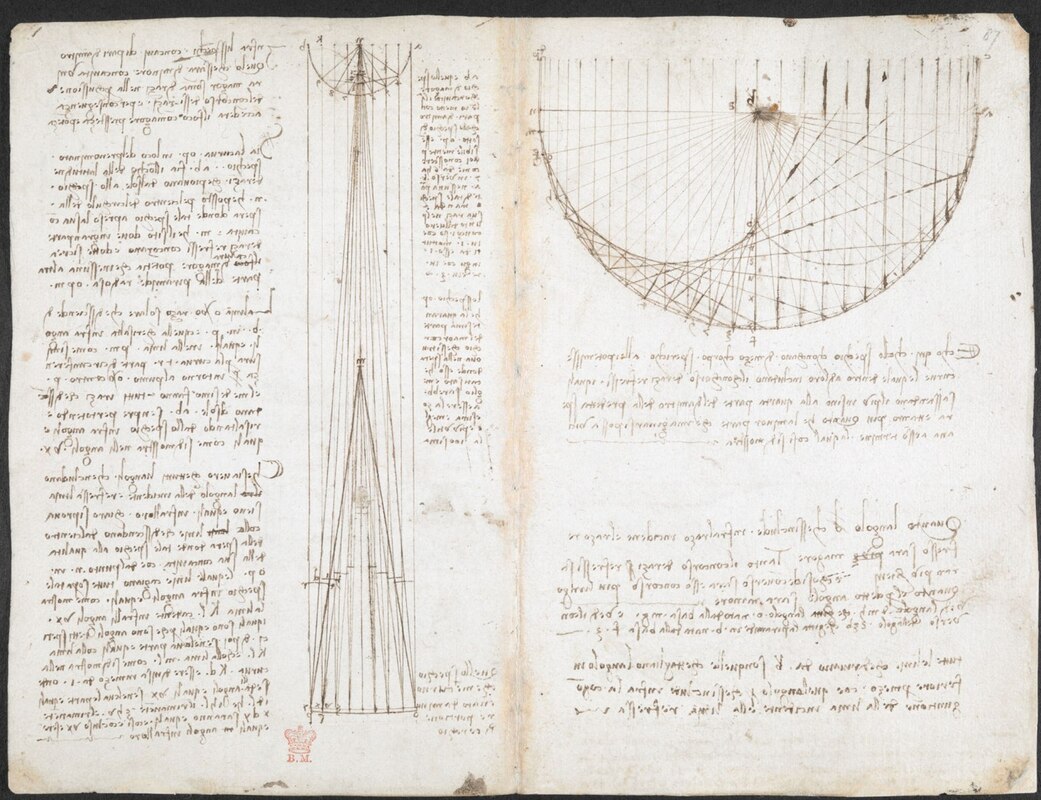
In the words of the great da Vinci scholar Martin Kemp, for Leonardo, the "...muscles of the human body worked immaculately according to the laws that governed levers. The flow of the blood in the vessels and of the air in the bronchial tubes in the lungs was governed by the geometrical rules that applied to all branching systems. A flying bird was designed in perfect conformity with the geometry of airflow.” (2) (See figures 2-5)
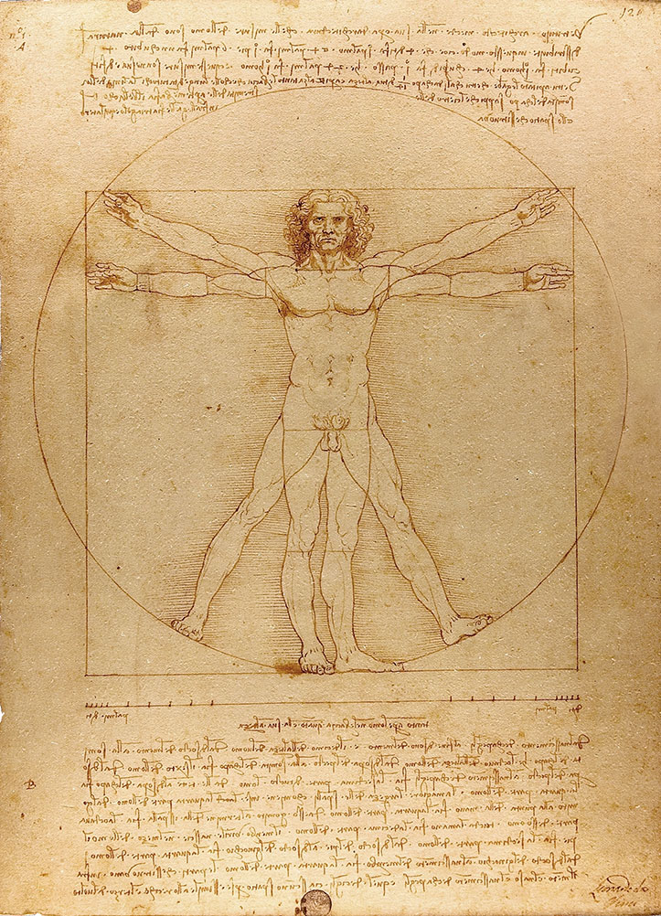
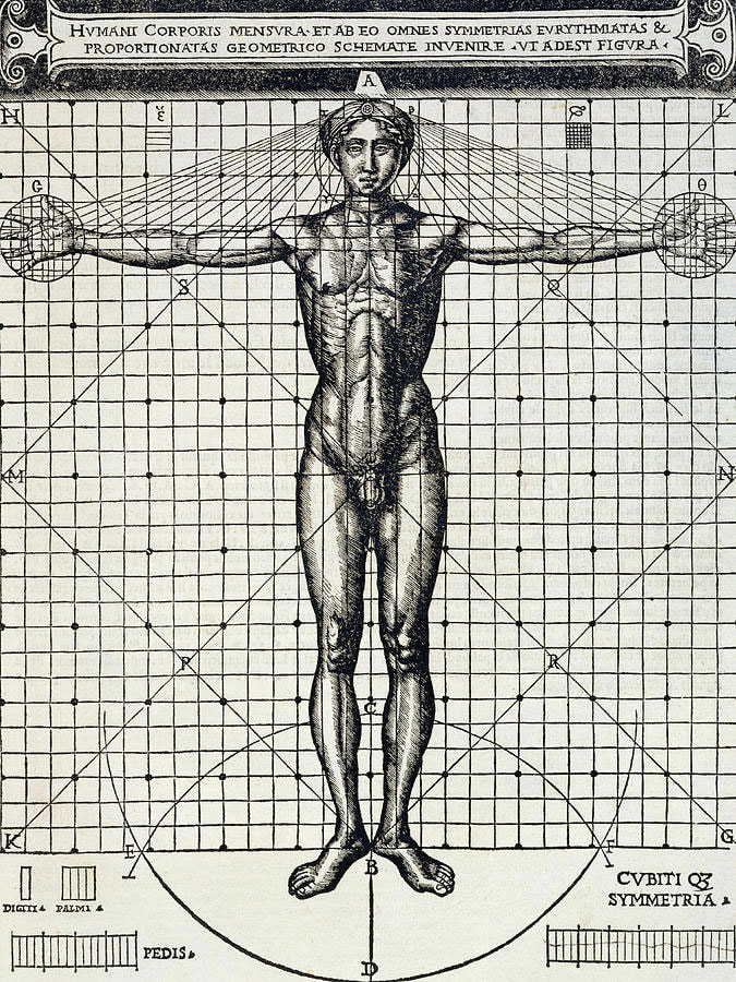
In his book De Architectura, Vitruvius founds his theory of architecture on the proportions of the human body, which he considered nature’s greatest work. The challenge was to show how the human figure can be positioned within a circle and a square with the navel at the centre. Ancient thinkers had long invested the circle and the square with symbolic powers, with the circle representing the cosmic and the divine, and the square the earthly and the secular.
Leonardo's elegant solution was to position his figure so that the navel aligned with the centre of the circle, but then to position the square off-centre in alignment with the base of the circle. (figure 6)
Pen and ink with wash over metalpoint on paper, 34.6 cm × 25.5 cm
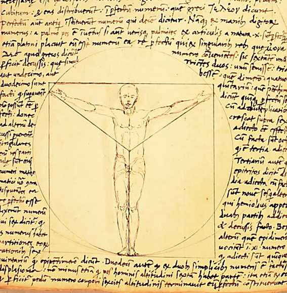
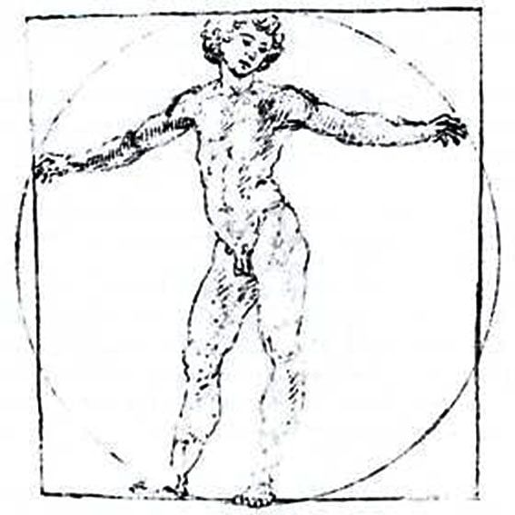
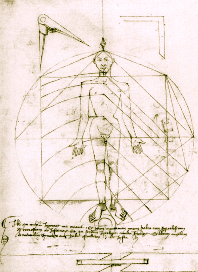
One drawing in particular, made by Leonardo's close friend Giacomo Andrea Da Ferrara, actually predates that of Leonardo's, and its rediscovery in a lost manuscript in Ferrara, Italy in 1986, lead some art historians to question whether or not Leonardo's drawing was actually of copy of his friend's solution. (3) (See figure 9)
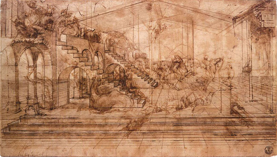
Ink on paper, 16.3 x 29 cm, Florence, Galleria degli Uffizi
British art historian Kenneth Clark described the drawing as "a carefully measured courtyard invaded by a retinue of ghosts". Clark considered it one of Leonardo's most revealing drawings, and the earliest evidence of his scientific attainments in perspective, which to his mind provided "a scaffold for the artist's imagination." (4)
Likewise, Martin Kemp considers the sketch an exemplar of the paradoxical combination of contained measure and unconstrained improvisation characteristic of many of Leonardo’s drawings. (5)
Leonardo referred to geometry as “the science of continuous quantity’” whereas he referred to numbers and mathematics as dealing with “discontinuous quantities” with little correspondence to the nature of actual physical forms. (6)
In his essay for the book accompanying the 2006 exhibition 'Leonardo da Vinci: Experience, Experiment and Design' at the Victoria and Albert museum in London, Kemp discusses Leonardo’s use of disegno as a means to think visually. Disegno was a common term used by Renaissance draughtsmen and is normally translated in English as either drawing (in a fine art context) or design (in the context of applied arts).
Leonardo’s use of disegno allowed him to integrate the subjective imaginative faculty or fantasia with the intellect, which in turn achieved expression in the Renaissance concept of science (scientia). Misura was the term used to describe the measuring of proportions, the construction of perspective systems and rules of light and shade, and was regarded by Leonardo as the fundamentally scientific aspect of expression in painting. (7) In works such as the Perspective study for the adoration of the Magi (figure 6), we can see this process at work in the way he combines the fluid, creative, subjective process of disegno with the logic, rigor and measurement of misura.
Kemp uses the following quote from Leonardo to support his claim that disegno was considered as the supreme tool that served the eye as a means of investigation and exposition. When Leonardo praises how the eye commands the hand, Kemp suggests that he was essentially making claims about the power of disegno:
"Now do you not see that the eye embraces the beauty of the world? The eye is commander of astronomy; it makes cosmography; it guides and rectifies all the human arts; it conducts man to various regions of the world; it is the prince of mathematics; it’s sciences are most certain; it has measured the height and size of the stars; it has disclosed the elements and their distributions; it’s made predictions of future events by means of the course of the stars; it has generated architecture, perspective and divine painting. Oh excellent above all other things created by God… And it triumphs over nature, in that the constituent parts of nature are finite, but the works that the eye commands of the hands are infinite." (8)
(See below for a link to a digitised version)
Drawing and thinking through diagrams was for da Vinci a natural, almost instinctual means to develop his ideas, communicate them with others and construct a science of painting. However, as with other artists of the Renaissance, Leonardo inherited the tradition for diagramming from Medieval diagrammers before him, as I covered in previously blog posts:
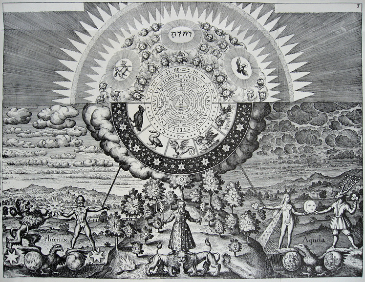
Diagrams from the Dark Ages, and Cosmic Diagrams from Alchemical Laboratory.
Leonardo's online Codex:
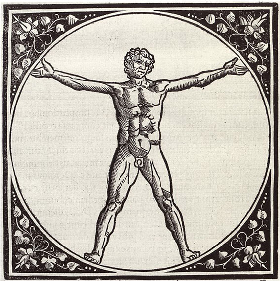
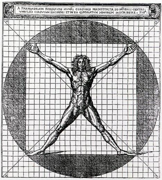
The Alternative Vitruvian Men:
Biblioteca Ariostea, Ferrara (Cart. Sec. XVI, Fol. Figurato, Classe II, N. 176, Fol 78V)
1) Kenneth Clark, (1973). Leonardo Da Vinci, Penguin Books, UK, pg 39
2) Martin Kemp, (2007). Leonardo da Vinci: Experience, Experiment and Design. London: V&A Publications. pg 14
3) Claudio Sgarbi, (2012). At the Origin of Leonardo’s Ideal Man. DISEGNARECON, 5(9),
pg 177–186. https://doi.org/10.6092/issn.1828-5961/3166
4) Kenneth Clark, (1973). Leonardo Da Vinci, Penguin Books, UK, pg 39
5) Da Vinci, Leonardo, quoted in: Kemp, M. (2007) Leonardo da Vinci: Experience, Experiment and Design. London: V&A Publications. pg 96
6) Ibid. pg 23
7) Ibid. pg 18
8) Ibid. pg 96
9)Cosmography was considered a science between the fifteenth and seventeenth centuries,
attempting to map the general features of the cosmos or universe, describing both heaven
and earth (but without encroaching upon geography or astronomy).
I had flown in from Osaka on an empty evening flight and transferred by shuttle bus to my hotel. Once signed in I was guided along corridors lined with security cameras to a room with bay windows overlooking the city. I unpacked and tried to mentally prepare myself for the next 21 days confined to a 24 square metre space (258 ft² ). The subjects I chose to focus on for the installation were movement and location, which seemed timely during a period of worldwide travel restrictions, lengthy quarantines and social distancing.
In a previous project I'd explored the molecular and evolutionary origins of organic movement, and this involved studying Actin and Myosin, two types of specialised motor-proteins found in all types of muscle cells. International research groups had mapped out the structural relationships amongst these two ancient super-families of molecules, and I used their findings to build my own 3D computer models of these molecular family trees, which were then used to create a drawing.
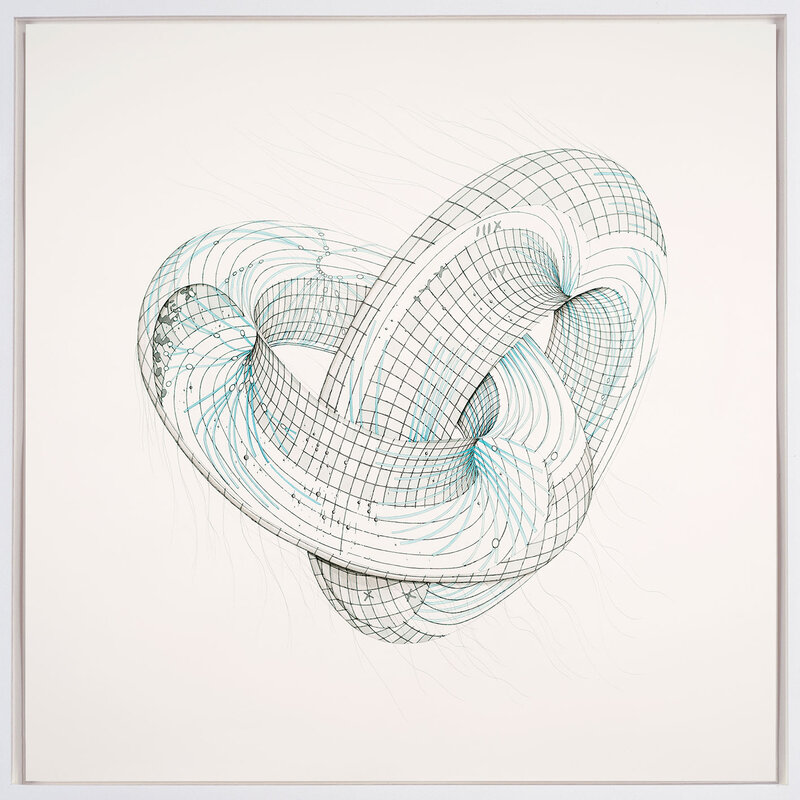
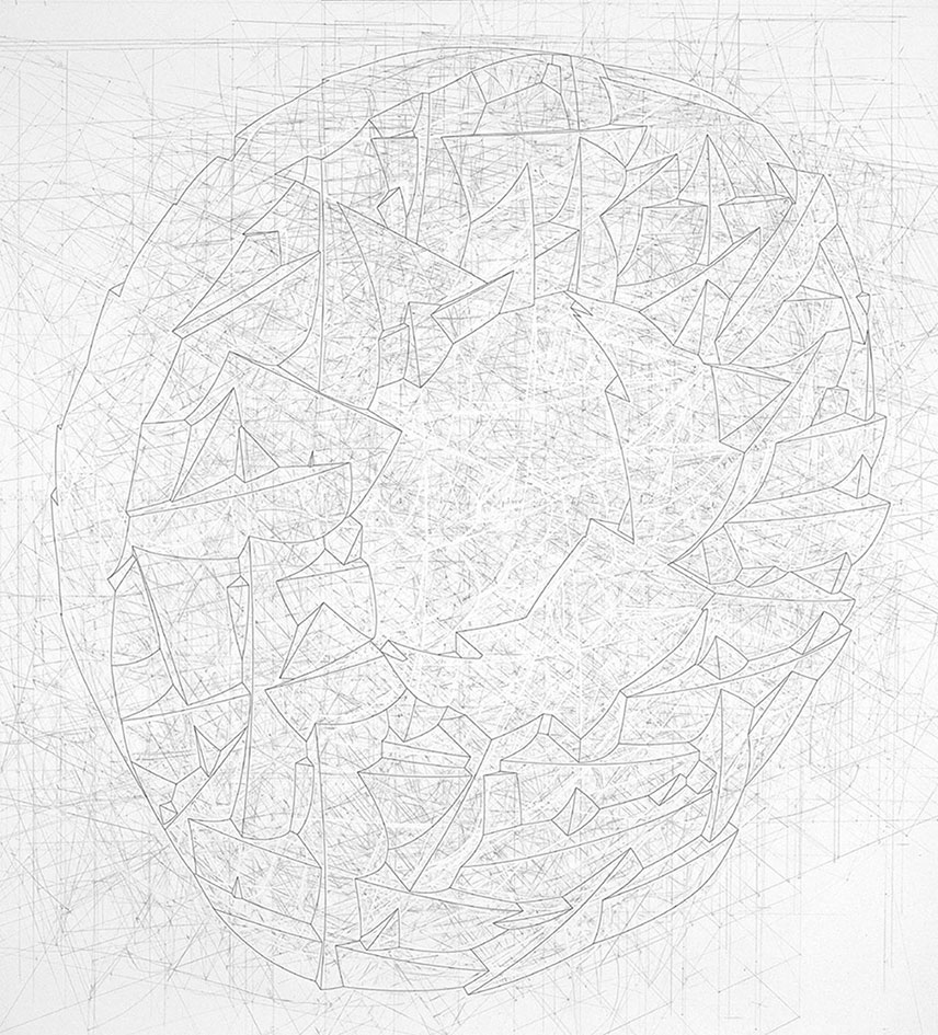
'Model for the origins of movement' depicts the branching, diagrammatic lineages of actin and myosin as fragile interlinked tori floating in an empty white space (figure 2).
2017, 124 x 124 cm, Ink and watercolour on paper
The process of creating this work is described in greater detail in the article "Portraits of thought: Transfiguring the diagrams of science", written for Intellect Book's "Drawing: research, theory, practice" (1). A link to the Journal is here. Links to the original research papers on Actin and Myosin can be found in the references below (2,3)
Like 'Model for the Origins of Movement', the installation 'Perpetual Motion' incorporates concepts and theories from scientific studies of movement, but also location, and it sets in contrast the different ways these notions are being explored in contemporary science.
The first research project to catch my attention was a visual digest of cutting edge genetic studies that plot historical global patterns in human genetic variation. The resulting world-maps provide a snap-shot of our current understanding of genetic similarities and differences between male and female population groups, and also reveal the routes taken by our prehistoric ancestors on their journey out of Africa.
Another discovery I was immediately drawn had proven to be such a major breakthrough in the neuroscience of movement that it was awarded a joint Nobel prize in 2014. The discovery of 'Grid cells' and their distinctive geometric firing patterns by Britt and Edvard Moser built upon the work of their mentor John O'Keefe, the discoverer of 'Place Cells'. Together, these studies gave us our first glimpse at the intricate cellular mechanisms at work in the brain that underlie how we navigate space, and revealed profound connections between location and the formation of memories.
As an installation ‘Perpetual motion’ is a hodological study (the study of pathways) of our past global movements across deep time, and our more intimate passages and navigations through daily life. The project contrasts the vast networks of our ancestor’s migration patterns out of Africa, against our day-to-day meanderings through rooms, buildings and cities.
Out of Africa
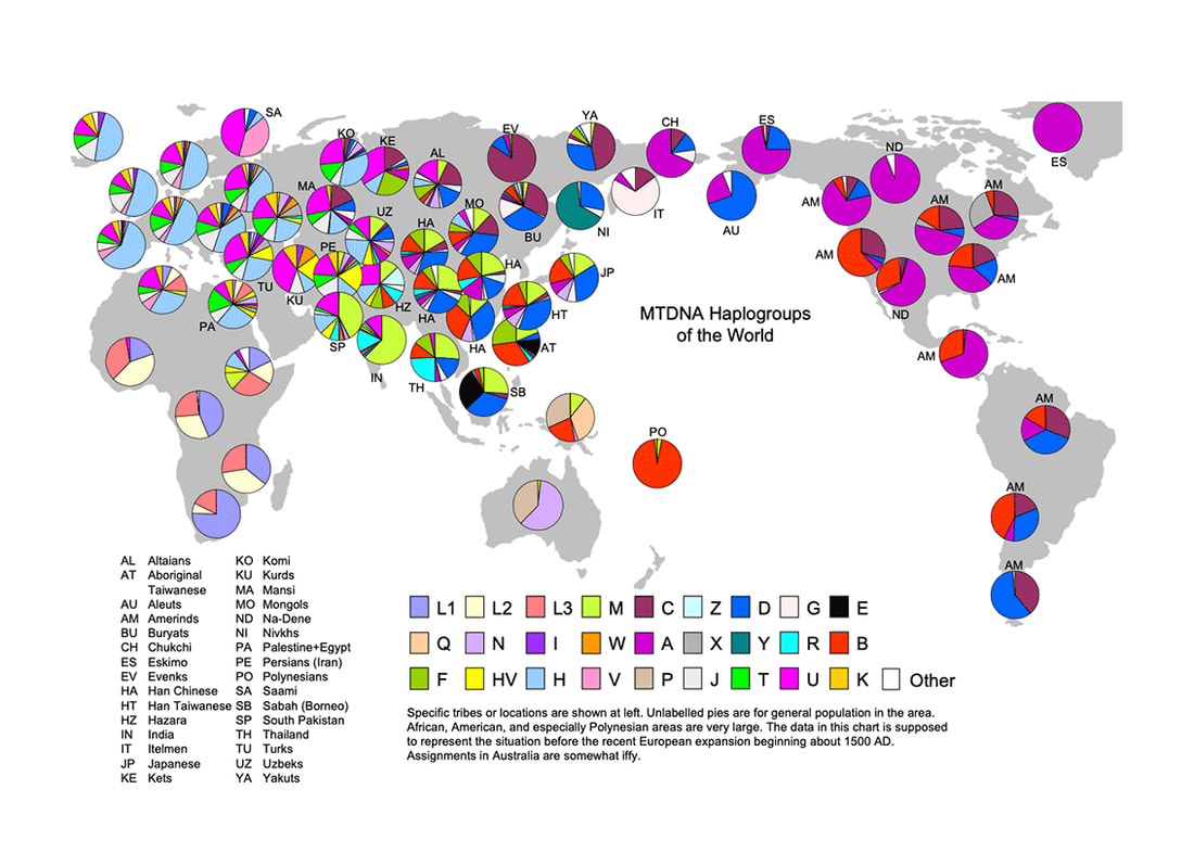
DNA haplogroup maps help trace patriarchal and matriarchal human lineages back across time, in order to understand how populations have spread across the globe. Haplogroup maps rely upon measuring distinctive mutations within genetic elements of the genome that vary little over time.
In males such material is found within the non-recombining portions of DNA in the Y-chromosome. For females similar material is found within Mitochondria, energy providing microscopic structures within human cells that contain their own plasmid-like DNA structures.
Mitochondrial DNA (MtDNA) comprises only a small segment of the total human genome but has proven highly effective in studying early human populations. MtDNA has the advantage of unusually rapid mutation rates, descends almost entirely through the female lineage (via the female ovum / egg), and shows few, if any, of the effects from environmental selective forces.
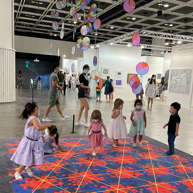
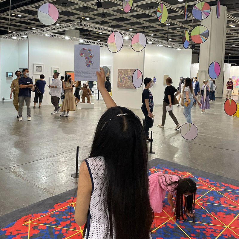
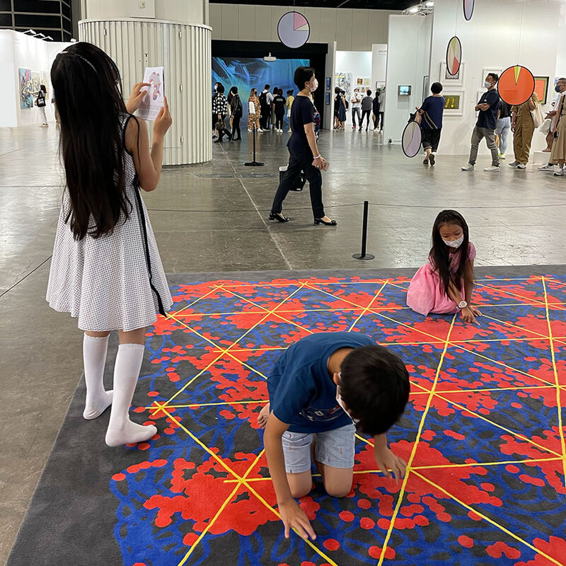
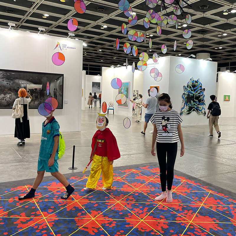
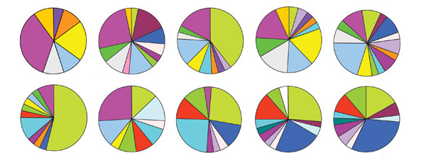
The coloured pie charts in figure 3 represent world-wide genetic variation within female populations. The period of time chosen for the map is circa 1500 AD, just before what's referred to as the 'European expansion', marked by rise of colonial empires and vast commercial networks.
Professor J.D. McDonald, who compiled the chart from a number of location specific studies, noted in his paper that the sampling sizes and thus the accuracy of the chart varies greatly from region to region. In fact, the majority of genetic data is derived from Europe and North America, despite Africa being the most genetically diverse continent on the entire planet (5). I reached out to Prof. McDonald to explain the nature of my project and ask permission to adapt the diagrams from his research into an artwork, which he kindly granted.
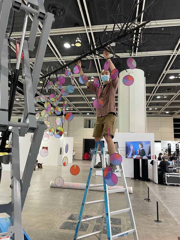
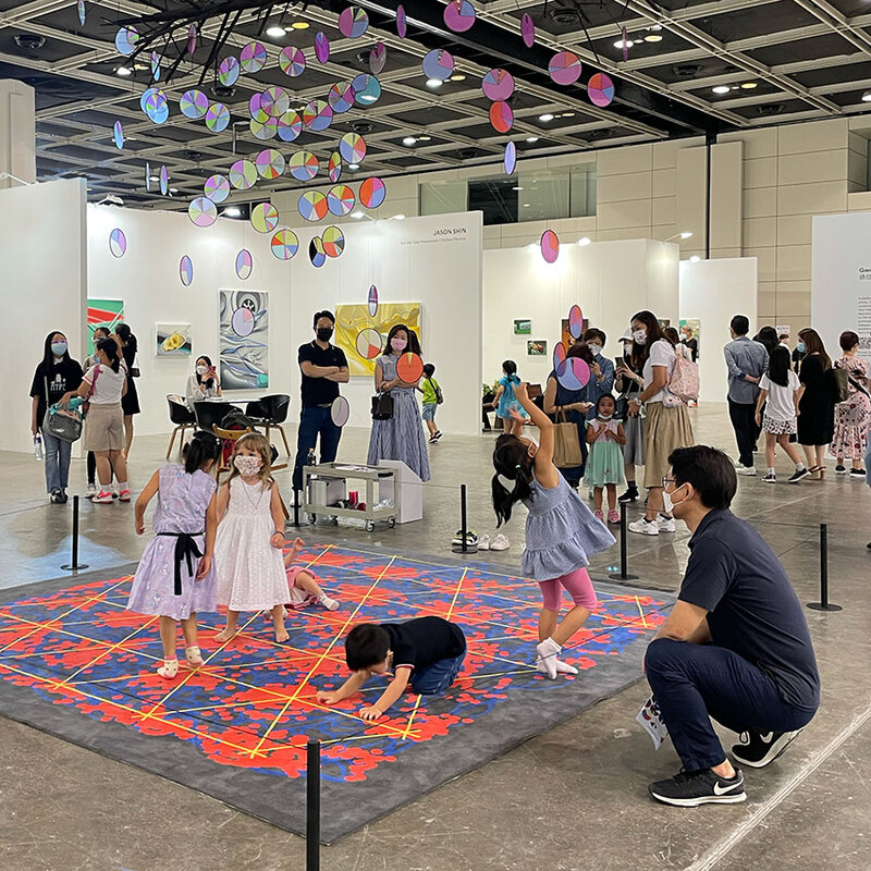
For ‘Perpetual Motion’, the 28 colour variations that represent the common MtDNA haplogroups used to compile Prof. McDonald’s map, were meant to be translated in to coloured glass, with each pie chart segment cut using a robotic CNC water-jet machine. The glass segments were then to be reassembled using traditional stained-glass techniques and suspended as a map-like mobile within the exhibition space.
However, with estimated visitor numbers of 20,000 people over the 4 days exhibition, the decision was made to UV-print the disks on acrylic due to health and safety requirements. Each circular diagram was then wrapped in the lead ‘came’ for this version of the sculpture.
Beneath the mobile was positioned another diagrammatic artwork mapping movement and location at very different scales of time and space.
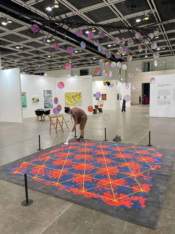
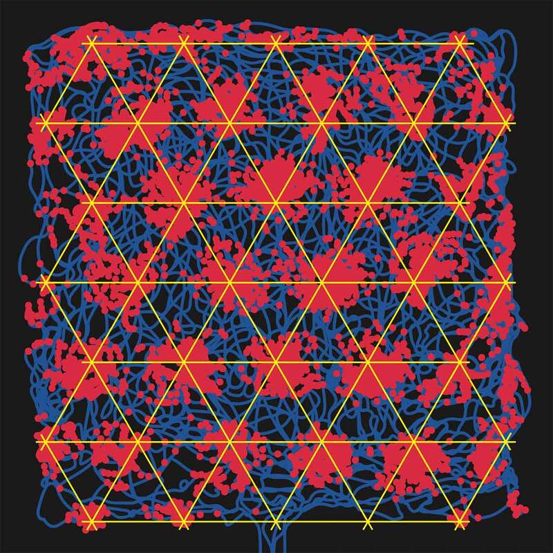
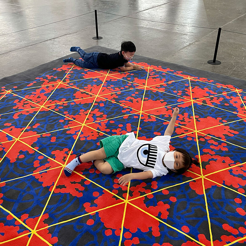
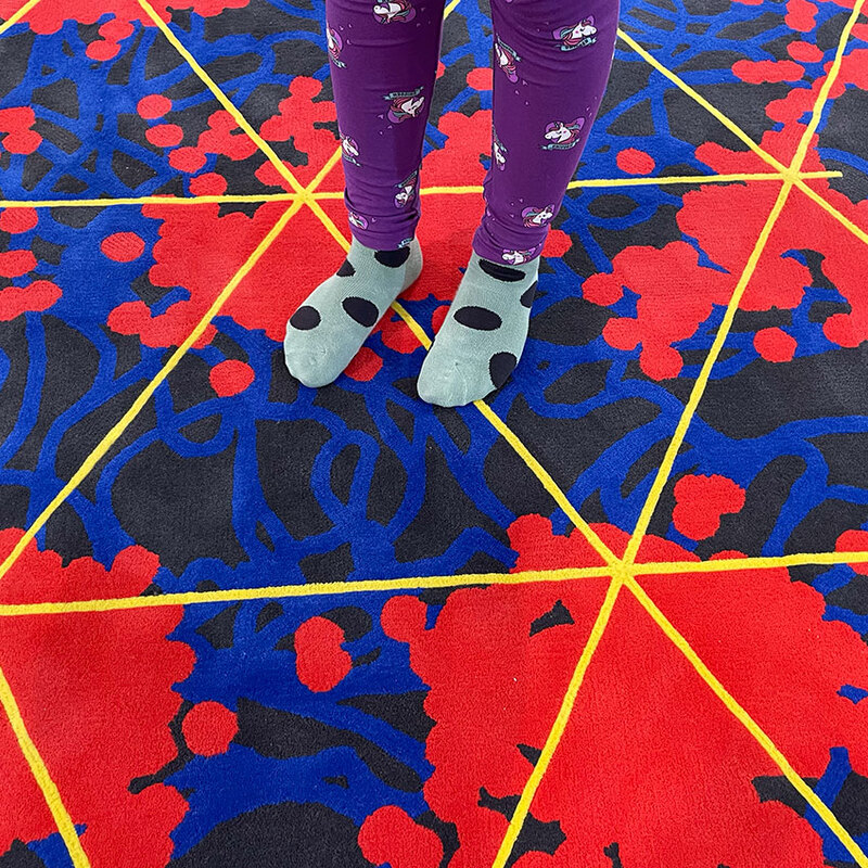
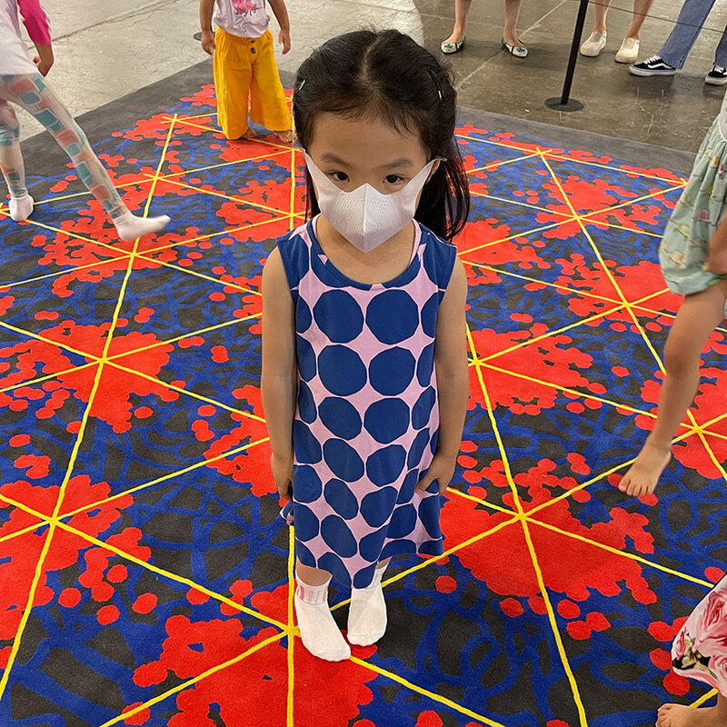
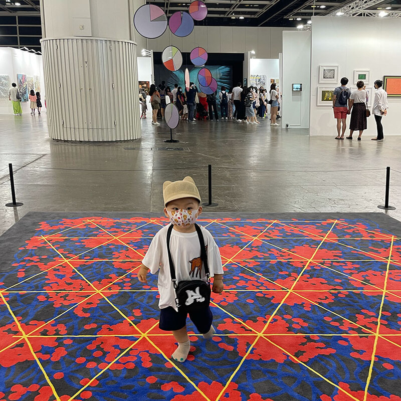
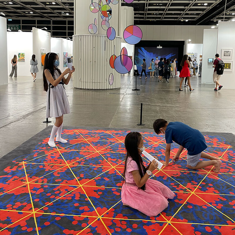
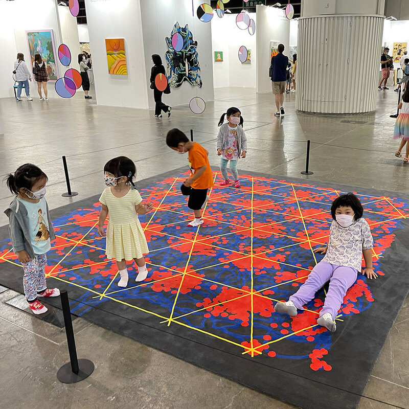
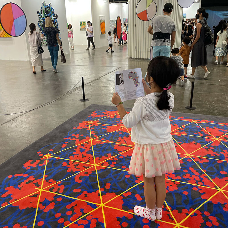
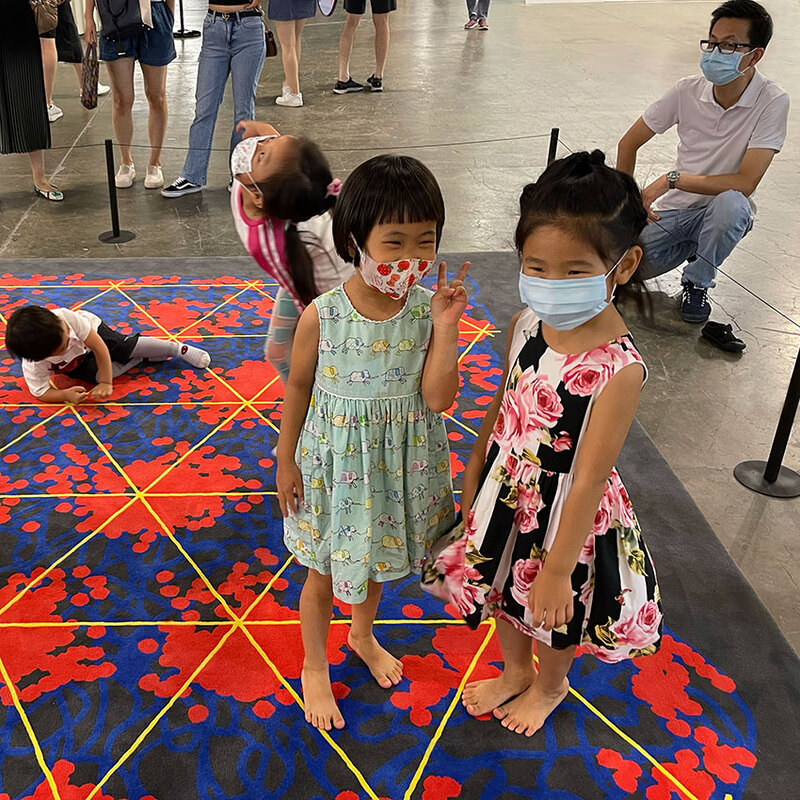
The carpet sculpture is designed to be walked upon, and the pattern is derived from 'Grid cells' in the mammalian brain. The discovery of Grid cells and their distinctive geometric firing patterns by May Britt and Edvard Moser built upon the work of their mentor John O'Keefe, the discoverer of 'Place Cells'. Together, these findings revealed profound connections between the way we navigate space and construct memories of our surroundings.
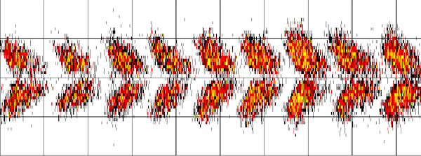
Grid cells are a specialized type of neuron that constitute a self-positioning system within the brain allowing us to create cognitive spatial maps of the spaces we explore and inhabit. These cells are found within the mammalian entorhinal cortex, a region deep within the brain next to the hippocampus. They derive their name from their triangular grid-like firing patterns, and the phenomenon was first recorded in the brains of mice exploring an experimental test box over a period of time (6) (figure 5).
of the rat every time the cell spikes. Slowly the dots accumulate and the hexagonal grid-pattern emerges.
At the start of the project I contacted Professors May Britt and Edvard Moser who granted permission for me to adapt images from the research for this installation. Dr. Elmkvist-Nilsen, head of communication at the Kavli Institute for Systems Neuroscience, also kindly sent me copies of the Moser’s research papers, images and presentations. Dr. Elmkvist-Nilsen is a specialist in images of 'knowledge-visuals' generated in scientific research, and has a dual background in visual arts and human/zoo biology.
Interestingly, Nobel Media now owns the rights to the Moser’s original illustrations of grid cells in rodents and humans, and their research group must now produce their own versions before sharing for public use. As a result, I decided to recreate my own diagram of the Moser’s iconic grid-cell firing patterns, which was then used to produce a handmade woolen 3.5 square metre carpet beneath the mobile haplogroup sculpture.
Figure 6 shows my recreation of grid-cell firing patters. The blue line represents the path taken by the mouse in search of chocolate drops inside the test chamber, and each red point marks the firing of the single grid cell being measured during the experiment (figure 5,6). The yellow lines highlight the remarkably geometric triangular firing patterns observed within this region of the brain.
As visitors navigated and explored the space, the symbolic markings on the carpet mirrored microscopic neuronal processes occurring within their brains, whilst above them circulated a mobile constellation of pie charts containing genetic data from their historic female ancestors.
I would like to thank Professor J.D. McDonald, Professors May Britt and Edvard Moser and Dr Elmkvist-Nilsen for their enthusiastic support of this project, and for their generous permission to use their research and images to create this installation.
1) Whittle, M. (2020), “Portraits of Thought: Transfiguring the diagrams of science”, Drawing Research Theory Practice, volume 5, number 2. pages 311-317
2) Goodson, H. V. and Hawse, W. F. (2002), ‘Molecular evolution of the actin family’, Journal of Cell 21. Science, 115:13, pp. 2619–22. Online here
3) Hodge, T. and Cope, J. (2000), ‘A myosin family tree’, Journal of Cell Science, 113:19, pages 3353–54.
Online here
4) Why did modern human populations disperse from ca. 60,000 years ago? A new model 10325 9381 - 9386Online: https://doi.org/10.1073/pnas.0510792103
5) Choudhury, A., Aron, S., Botigué, L.R. et al. High-depth African genomes inform human migration and health. Nature 586, 741–748 (2020). https://doi.org/10.1038/s41586-020-2859-7
6) Moser, E., Roudi, Y., Witter, M. et al. (2014). Grid cells and cortical representation. National Review of Neuroscience, 15, pages: 466 - 481 Online: https://doi.org/10.1038/nrn3766
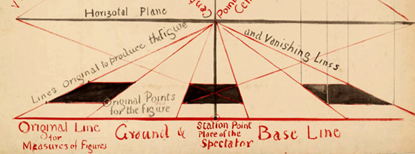
❉ Blog number 18 on diagrams in art and culture revisits an interview I made in 2013 with the artist Richard Talbot. Richard is a leading authority on perspective, and Head of Fine Art and Professor of Contemporary Drawing at Newcastle University in the UK.
I first discovered Richard's work in the book 'Writing on Drawing', a compilation of essays edited by Steve Garner, and published by Chicago University Press in 2013. (More information about the publication is available in a previous blog post: Diagrammatology: A reader.) Richard's contribution 'Drawing Connections', comprises chapter 3 of the book, and introduces his studio practice and academic research in to the theory, history and practice of perspective.
As a second year PhD student in Kyoto I travelled to the UK at the end of the summer in 2013 as part of a research trip to interview artists and theoreticians working with diagrams. One of the highlights of the trip was the opportunity to talk with Richard in his beautiful studio and office in the distinctive, red-brick, double arches of Newcastle University's Gate Tower.
|
"Essentially, perspective is a form of abstraction. It simplifies the relationship between eye, brain and object. It is an ideal view, imagined as being seen by a one-eyed, motionless person who is clearly detached from what he sees. It makes a God of the spectator, who becomes the person on whom the whole world converges, the Unmoved Onlooker."
Robert Hughes (2)
|
RT: I did, but realized early on that I had chosen the wrong subject. I noticed also that
you had studied Biomedicine.
MW: Yes, so I was immersed in diagrams, especially as I specialised in Biochemistry, which as a subject deals with diagrams on many levels.
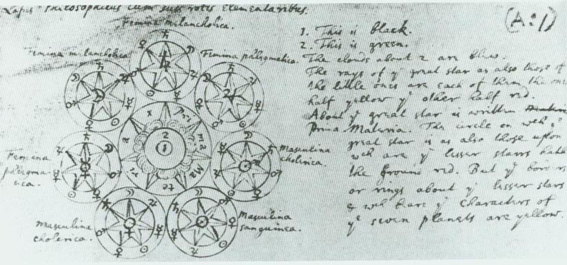
RT: Yes, when I was at school, all the chemistry diagrams and the glassware we used, I still find very exciting, it still gives me a buzz when I look at those diagrams. Also I suppose that Alchemical drawings which are in a sense diagrammatic, but which also refer to broader cultural aspects and spiritual things. But I think it is that combination of diagrammatic mixed with something else where things become very interesting.
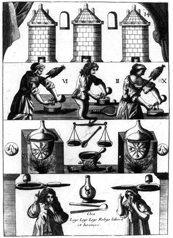
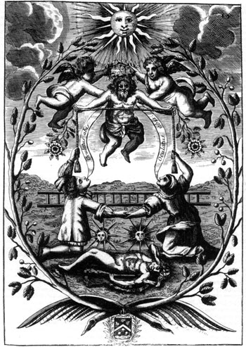
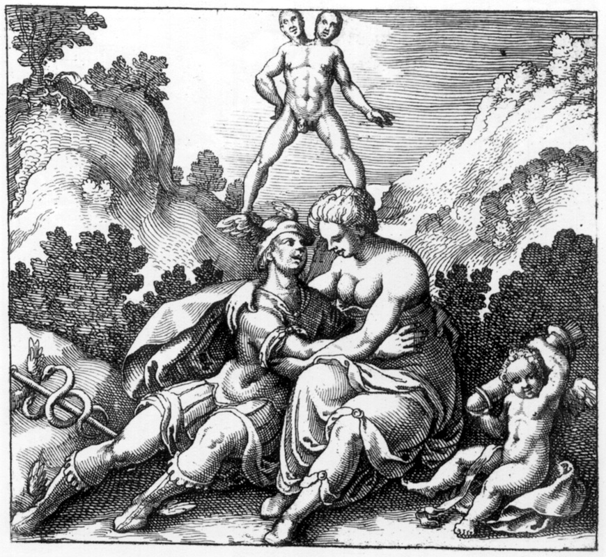
MW: Especially for the initiated few who can decode and read the Alchemical imagery and illustrations such as those in Michael Maier’s books. And you were also interested in optics and optical diagrams ?
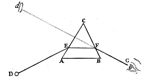
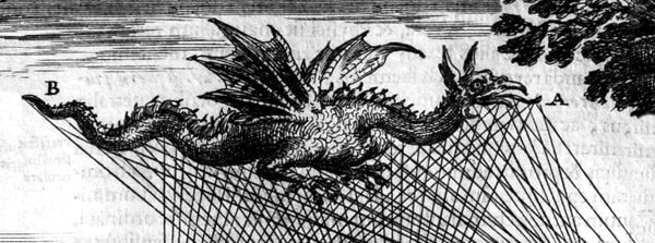
Figure 2: Ray diagram from 'OPTICKS:
A treatise of the Reflections, Refractions, Inflections and Colours of light', Sir Isaac Newton
(forth edition, 1730, Available online here)
MW: That’s something I wanted to ask you about because you had mentioned that you were interested in landscapes, and the idea that maybe the drawings you make are detached, conceptual landscapes. I remember reading 'To the Lighthouse' by Virginia Woolf, and there’s a very short chapter in the middle of the book, which describes time passing in an empty room. But it does so from outside the book, from the detached perspective of an omnipotent narrator, an all seeing eye. I wondered if that was something you were interested in as an artist?
RT: Yes, I think so. I suppose maybe it’s this kind of hyper-consciousness, just this thing, observing, and you just become very aware of time and space, and of yourself as a little entity within this. It’s almost as if time disappears.
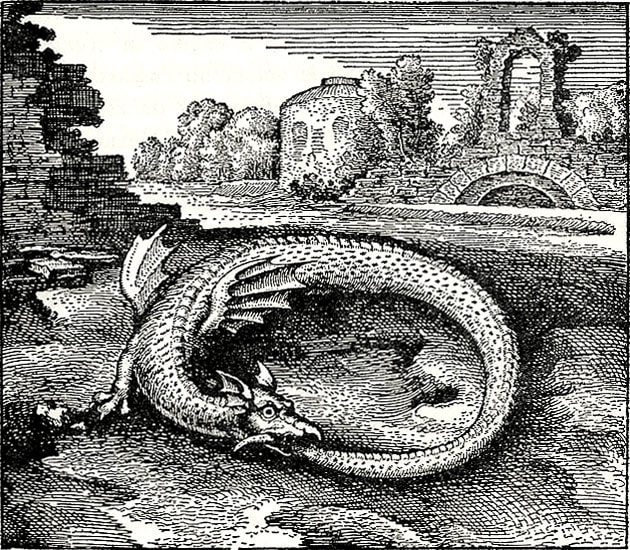
The other thing I remember reading a lot as a student was Nietzsche, and the image of time as a snake eating its tail. He called it ‘eternal recurrence’, where you’re trying to imagine that every moment could be relived exactly the same, so it kind of neutralizes time, because as animals we’re stuck with this as a problem and try to find strategies to overcome that sense of things in the future and things in the past.
MW: I read that time was something that you would like to take out of your drawings, or perhaps avoid referencing in some way. Also, that you presented the objects in your drawings as Platonic forms, without any signs of wear and tear or reference to scale.
RT: Yes, that’s right, I started off by making objects, but always found it really frustrating in terms of size, or what you make it with. But I suppose that a lot of the twentieth century was about that problem, about objects, and their separateness to us all.
MW: Such as the use of Plinths to present work ?
RT: Yes, for example Plinths.
MW: So did you ever regard your sculptural works as models, as a way to perhaps overcome these issues ?
RT: I suppose I did think of them as 3 dimensional diagrams, but then I suppose that made me unhappy about the materials they were made from. I always imagined whether perhaps it could be made out of perfect marble perhaps.
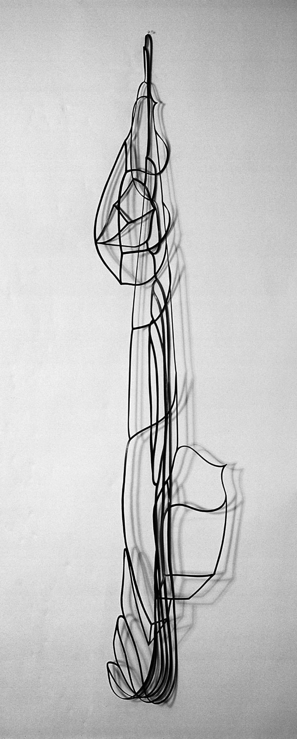
MW: I started to consider making works from elemental materials, such as aluminium or carbon, just to try to deal with the problem of simplifying or neutralizing that issue of materiality. One of the 3 dimensional works that you made called ‘boat’ was made out of rubber wasn’t it ? Hanging as a collapsed frame on the wall, the skeletal form of a boat.
RT: Yes, it’s funny that that particular series of works didn’t end up going anywhere; I’m just trying to remember what the actual sequence was.
I think sometime in the early eighties, I was put forward for a commission; it was one of those completely random invitations to do something. It was for the Savoy Hotel. It was one of those awkward things of, well, do you design sculpture, or do you use something you’ve already got? So I started playing around with drawings and making cutouts from drawings of things. I ended up with some large sheets of rubber and started cutting it out to see whether it was something I could use.
I didn’t intend to end up with something which would hang on the wall, but I did that in the studio by putting it to one side, and it’s quite extraordinary how that works. So it was quite accidental, but was just the recognition of having taken it in to that different area that I didn’t have any control of, so it was quite accidental. It was all cut by hand, so it was a very crisp line cut with a scalpel.
MW: About your working process, you wrote very beautifully about that initial process of orientation, the initial white sheet that you approach, and the infinite possibilities you’re faced with - setting up some kind of initial starting conditions. You used the analogy of the Gothic Cathedral with its ground plans, and then the more organic process of construction that follows that.
There was also another article in the same book (Writing on Drawing: Essays on Drawing Practice and Research) by Terry Rosenberg about ideational drawing, a process of drawing which I though really suited your work very well.
RT: Yes, I mean I must say that I haven’t read fully all of the articles in that book, but have skimmed through them.
MW: There were a couple of essays that really stood out for me personally, yours and Terry Rosenberg’s. I enjoyed the way you talked about your use of perspective, not as a tool to create realistic drawings, but as a tool to allow you to use your intuition.
RT: Well I think that also goes back to that idea of self-consciousness, sort of knowing that you’re this entity that looks at something from the outside.
I used to play around with spatial perspectives, and then I thought that actually one way of neutralizing these issues was just to use it, just to actually use the system. So that to get over that whole issue of viewpoint, for example when you make a piece of sculpture, how do you look at it ? If there’s no best side as it were. So I thought, well if I just take it on full, this issue of perspective, and to absolutely use it as it was set up to use, then it falls by the way side, as an issue.
MW: Turning the problem in to part of the solution?
RT: I think it’s like sometimes in Mathematics, when a problem can’t be solved directly, they will call on a tool from other part of mathematics, and using that tool they can then move from one place to another. But in the end result, that tool disappears, it doesn’t ultimately play a part in the answer, but it has been a useful tool to get you from one place to another.
MW: That reminds me of the role enzymes play in Biochemistry. They’re completely essential to facilitating the process, but don’t take part in a reaction in a way that they are altered themselves in the outcome.
RT: Yes, that’s right, yes. So it is a kind of a vehicle, but then it’s using that perspective that makes me then question how it was originally used in the Renaissance, because when you’re actually working with it on the paper, there are so many interesting things actually going on that art historian looking in from the outside wouldn’t grasp. And it is to do with that idea of play, between the diagrammatic and the spatial element. Perspective isn’t all about creating a space, it is about the surface and how these things operate 2 dimensionally as well.
MW: I was very interested in the way you talked about the depth of space in your drawings, and not using deep space, but keeping things relatively shallow and immediate.
RT: Yes, I think that this also relates to my sense of what these Renaissance artists were doing. The picture that is portrayed of perspective is all about getting everything in terms of the horizon. But I don’t actually think that’s it at all. You are really working in a really shallow space. All those Renaissance paintings are also working in a really shallow space, and I think when you’re actually constructing that on the paper, there’s a real, almost physical connection to the space.
MW: I don’t normally use colour in my work, it’s actually something I avoid, and have for a long time. Then I came across a book by David Batchelor called Chromophobia. He was writing about colour and how it has been perceived as the additional, the exotic, the lipstick. Or at least that’s how it was regarded by artists and writers who saw it as extraneous. And so I’m interested to ask you how you deal with colour in your work.
RT: Well I have to admit as to having always avoided it, as I’ve never understood it. It’s a complete mystery. If I was making a drawing, I can’t see any reason to use colour. But then equally I probably can’t see any reason not to use it. But then I would probably be thinking well, why do I ? But then I know with somebody like Michael Craig Martin, I suppose he’s somebody in the seventies who was producing very austere, paired down work, such as his linear drawings, which were initially all black and white.
But then he probably just stopped worrying and started to use incredibly strong colours in his work. And now the colour is really significant to his work. But its interesting that Michael Craig Martin was taught by Joseph Albers.
MW: That’s interesting, I didn’t know that.
RT: Yes, at Yale. So he would have had a real grounding in colour, and it’s almost as if he, you know – 30 years later or whatever it was – just decided to start using these colours. It is odd how we set rules for ourselves and at the time we kind of need them, but occasionally we just think ‘drop them’, and stop worrying about them.
MW: There were a number of times when looking at your works and reading what you wrote about them that reminded me of mathematics, and the idea of skeletonized forms. The idea of an equation, where the aim is to remove as much information as possible and leave only the knowledge - the process of essentializing something. Also the way that you talk about using intuition, and how intuition can be very immediate, or how it can require you to put the work away for many years. A slow boiler that you come back to much later.
Is mathematics something you’re interested in? Or is it restricted to geometry, or patterns of thought?
RT: Yes, I’m interested, not in the sense of reading books on mathematics, but when I’m near mathematicians and they talk about what they are doing, I do feel an affinity with what they are doing, and I suppose that with my drawings, they become very complex, but I do have that hankering after something really, really simple. I do have this idea that one day I’ll just be able to draw a line, and that that will be the finish! And in a way I suppose you do occasionally see it in some art works – and think that that is just an extraordinary piece of drawing, but then that in a way embodies everything they’ve ever done – 40 years later they’ve managed to make this extraordinary thing !
MW: Richard Dawkins wrote a while ago about the idea of a conceptual space containing all possible genetic variations, a kind of hyper-space of all possible genetic forms, and I was always fascinated by that idea. I think that also Douglas Hofsteader in Goedel Escher Bach, described the idea that Bach, in composing, had the ability to look over all the millions, well almost infinite combinations of musical notes, and was able to see patterns, islands or constellations of musical forms. And I wondered if that idea was perhaps something you were interested in. A vaguely discernible, fuzzy possibility of the form you’re searching for, and how this idea relates to diagrammatic forms.
RT: Yes, I think that is definitely true, and I suppose that one of the things I am aware of is that in some ways, the drawings all start from the same point. That blank paper, that orientation.
MW: The tabula-rasa ?
RT: Absolutely, and you know that it could go in a completely infinite number of directions, and yet there is a sense that there is some solution there - that you setting things up. It becomes very obvious sometimes.
I wouldn’t compare myself to Bach, but I can see that way of thinking - that there is an infinite number of possibilities, but you alight on a particular form that is true for you in one sense or another. It’s hard to really articulate that process.
RT: I think when I first started using perspective I was still in that mindset of drawing objects as things in space, but then quite quickly I became aware of how potent the workings-out - you know, the plans, the elevations and so on - how potent they were and how they were working with the kind of forms which were being described. It was also in trying to pin things down, I became aware of the balance between leaving things open ended and tying something down and saying ‘this is that form’. It was that form, but not in such a positive or fixed way.
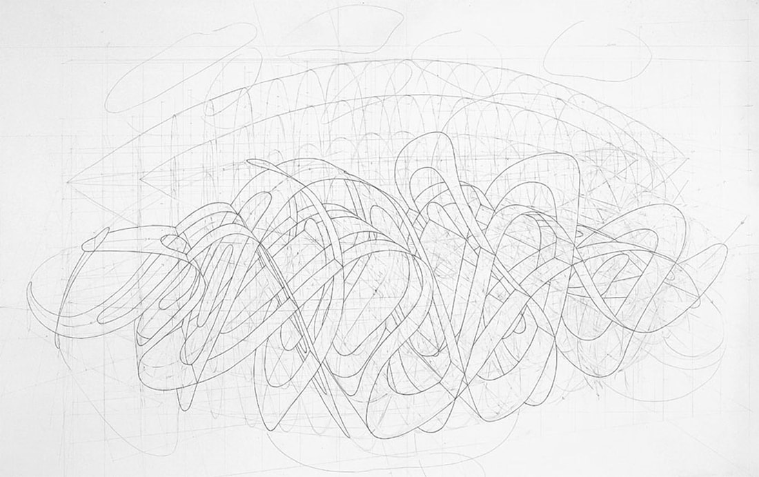
I stopped using ink on the drawings. I was using ink to go around the forms I was building, but that stopped. And so I started getting a much more subtle interplay between the workings out, and those workings out would be the plans, and elevations, and a myriad of other kind of connections which were being built, a kind of scaffolding.
MW: And you saw inking in as a kind of finishing process ?
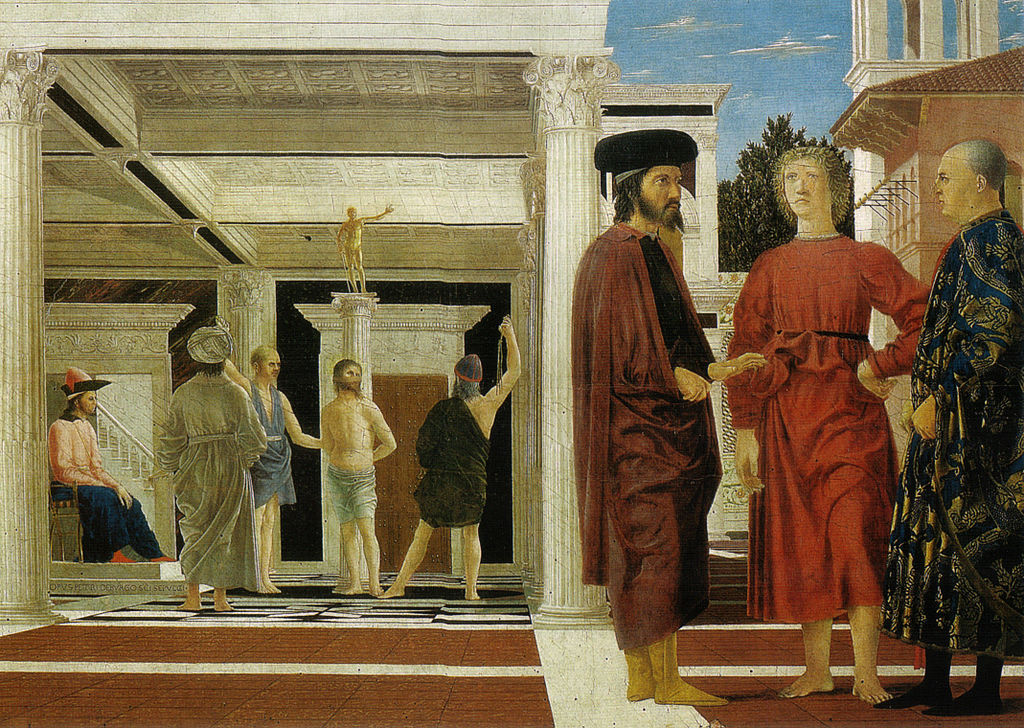
RT: I did. You know you suddenly think that it has in a way killed off the drawings. Not inking became a way to leave the drawing as an open-ended thing. Perhaps when a work is too ‘closed down’ it can end up being very uninteresting. For example Raphael. I’ve never enjoyed looking at Raphael’s paintings because they seem so overly fixed, whereas, Piero de la Francesca’s paintings seem almost as if they are propositions.
Oil and tempera on panel, 58.4 x 81.5 cm
The Flagellation of Christ (outline and outline proportions)
Courtesy of Richard Talbot.
MW: Very early on in coming up with the questions that I wanted to ask in my PhD, I pretty much hit the same problem you did in realizing that I had always studied sculpture, but always made drawings. And I thought of the drawings as sculptural drawings and, luckily for me, my teachers at the time thought the same. So I had to decide whether to investigate the relationship between 2D and 3D diagrams - and thus include sculpture, or the way in which artists use diagrammatic image making to a romantic end, a subjective end; the way in which Marcel Duchamp played subject against object and also struggled with the issues of dimensionality. Where do you stand in terms of subject and object ?
RT: Yes, well I don’t think I would come down either way, because I don’t think that coming down on either side actually gets you anywhere. I suppose that in my student days, this dilemma about the objective and subjective was helped by there being, at Goldsmiths - which was something which was great about Goldsmiths at that time - was that there was a huge range of practice within the staff.
So you did have conversations with people who were systems thinkers, right through to people who were watercolour, or landscape painters. People weren’t trying to ram the stuff down your throat; you were just having these interesting conversations, and then weighing it up about your own situation.
Thinking about what you were doing, what you thought you were trying to do, what you were actually doing ! You know, all those worries you have about, you know, ‘is it art ?’ I found myself really being able to make work when I stopped worrying about what side of the fence I was on, and finding a way of working where I felt as if I wasn’t having to choose one way or the other. But both sides of me could be involved in that hankering after perfection. It’s a case of playing these things off against each other.
I distinctly remember that when I did my MA at Chelsea, the external assessor we had was Paul Neagu, I think he’s dead now, but he was very well known. He was one of the artists who Richard Demarco brought to this country, alongside such artists as Joseph Beuys.
Anyway I remember that the work I’d made at Chelsea had become really quite austere, and extremely minimal, and he said… ‘don’t forget the other side of yourself’, and I realized exactly what it was he meant. That we can easily kind of forget. But then I think that also we need those extremes sometimes, to realize something. We need to go beyond in order to know where the edge was. It’s only when you fall over the edge that your realize there was one !
MW: So there is actually nothing within your body of work that you see as a mathematical proof, some foundation to build upon ?
RT: No, I would certainly never say that there is anything that I’m demonstrating that is mathematical, no. I could say that when I was at Goldsmiths, I was taught by people who were involved in systems, and there were several people I knew, for example Malcolm Hughes working at the Slade, who had students working with experimental systems, building computers to generate paintings and so on; and I always felt that there was a problem in that they knew the kind of thing they were aiming for, and that it just seemed as if, well, you could make that painting without that system.
It was almost as if they were using that system as almost a ‘get out’. The paintings would always end up looking like lots of other abstract constructive paintings that weren’t made with a system, that were just made purely intuitively. And so I have a distrust of the idea of a system, and I think that that system is always, ultimately being driven by you.
MW: What are you working on at the moment ?
RT: Well apart form being heavily tied up in administration, I’ve finished some drawings and I’ve also been playing with film and video, which I can show you if you want.
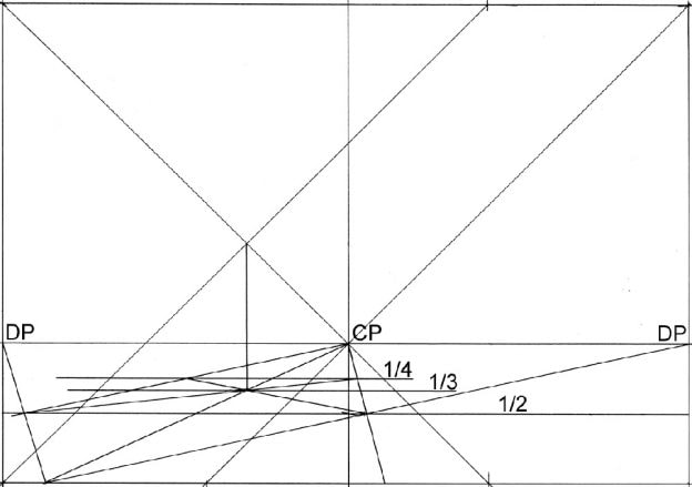
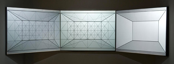
It’s very long drawing, based on a system in a sense, and was a definite play on the standard idea of a single viewer’s perspective. They start with a really basic perspective grid, a ‘unit’, drawn in such a way that I can simply add these units together and extend the space in any direction. Strangely, it adds the possibility of time, in that your eye can travel along the drawing and the space continues always to make sense.
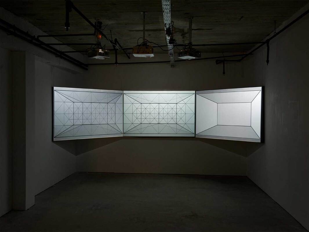
The video is another simple grid that is constantly shifting from the 2 dimensional surface in to the 3 dimensional image. Originally I had intended it to be projected on to a screen, but then I had the chance to project it in one of the large spaces downstairs, and the results were quite extraordinary - because it did actually become part of the space, which wasn’t fully intentional, but those were the results.
The question of the artist’s intention is also an interesting problem I think within the history of perspective; the well-known analyses of key renaissance paintings demonstrate that the spaces in the paintings are sometimes not quite what they seem to be. There is often some uncertainty, yet it is usually thought that perspective is fixed - that it's an unambiguous and rational thing.
MW: Watching the video feels like a trying to solve a puzzle in perspective, there are moments when the lines are like a 2 dimensional pattern of shifting compositions, and then suddenly something in the visual cortex takes over and there’s the impression of instant depth from those very same lines. It reminds me of watching animations of higher dimensional cubes rotating. You think you have understood what is happening and there’s a sudden unexpected shift, you have to grapple with different kinds of depths.
RT: Well - I don’t know - It’s to do with my intention, I’m not settling down to produce something which has a specific result. I know they do result in that, but I’m not setting out to do that.
I am showing this work – I’ve never tried it before. I hope it works… It’s actually going to be projected on to three screens, the same image, butted up against itself, but slightly out of synch. So the whole thing will be ‘shifting’, so that a more complex thing will be going on. I have no idea what it will look like – it might just look awful, but then I’m trying it – for this show.
Grid from Richard Talbot on Vimeo.
Richard's academic studies in to the origins of linear perspective can be downloaded by clicking on the following link:
| speculations_on_the_origins_of_linear_pe.pdf | |
| File Size: | 3315 kb |
| File Type: | |
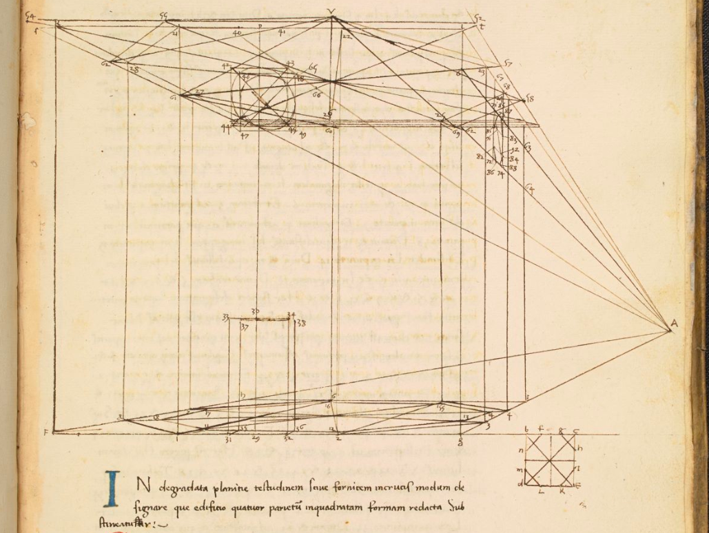
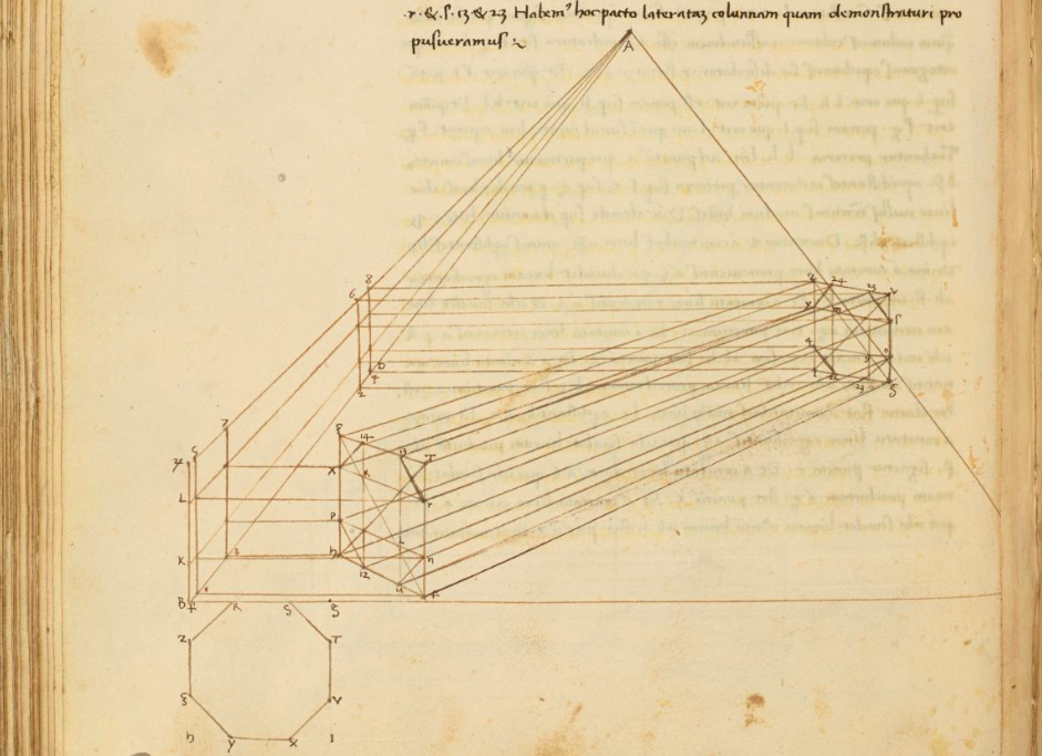
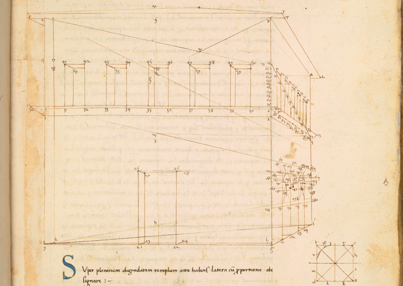
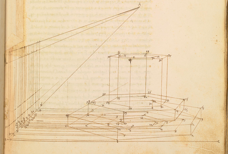
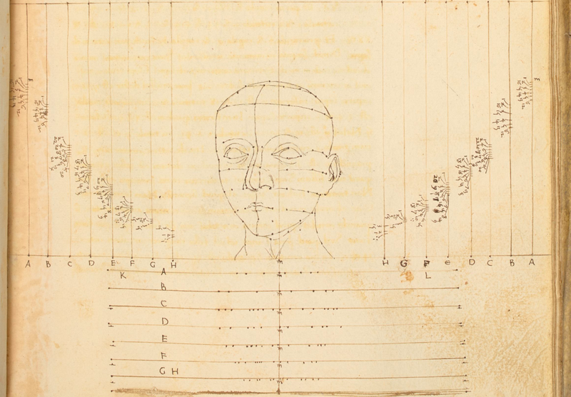
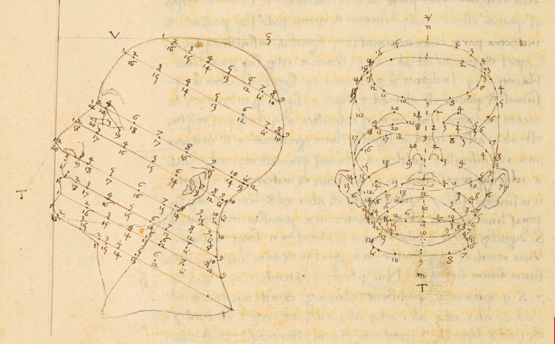
Finally, below are a series of Piero della Francesca's own diagrammatic studies from his book 'De prospectiva pingendi: a treatise on perspective' c 1470 - 1492. The treatise, divided into three books, provides detailed, mathematical instructions, illustrated with numerous diagrams, for creating realistic perspective in illustrations. It was widely known among artists (such as Albrecht Dürer), but also in an academic milieu, where the copies of the Latin translation are thought to have circulated.
The book is available to view online at the British Library here.
1) Talbot,R. (2008) Drawings Connections, In: Writing on Drawing: Essays on drawing practice and research (2008) Intellect Books, UK: Bristol, p.55.
2) Hughes, R. 1980, The Shock of the New, London: Penguin Random House Company, p.17.
❉ Blog number 17 on diagrams in art and culture covers some of the ideas, images and research projects I discovered during a spring-time residency on the island of Jeju in South Korea. The two new drawings I developed following my stay there were on show in a group exhibition at the Chusa Memorial Museum from Oct 15th - Nov 17th, 2019.
( United States Geological Survey Landsat data, Robert Simmon, Google Earth, 2000 )
|
낭떠러지에온갖풀말랐는데
난초는오히려생기가돋아난다 군자는험악한곳에살면서도 보통사람과다르지않은가 |
On the dark cliff hundreds of weeds are withering,
And yet the orchid bounds with vigor. The noble person dwells in steep, isolated places. He is indeed different from normal people. - Chen Hsien Chang (Ming dynasty) |
Mikyung and Do il's main studios are in Yongin city just south of Seoul, but they travel regularly with their daughter Yule to Mikyung's hometown on Jeju to maintain the family tangerine orchard. The residency program is run from Mikyung's family home there, alongside a barn converted by Do il in to studio space.
Once all the artists had arrived at the orchard we were welcomed by a Kayagum concert held beneath the heavy bows of one of Jeju's ancient Hackberry trees. Afterwards, we set about exploring the island and learning more about it's most famous historical resident Chusa Kim Jeong-hui, exiled scholar and man with two hundred names.
|
Opened in 2010, the Chusa Memorial Museum is situated next to the original site of Chusa's home on Jeju, which has now been rebuilt in traditional materials.
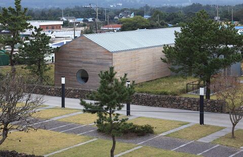
The Museum is mostly subterranean, with three exhibition halls, a lecture theatre and conservation room. Above ground, the minimalist memorial hall with its single circular window references one of Chusa's most iconic paintings titled 'Sehando', or 'Winter scene' (figs. 2, 3). |
figure 2: Chusa Memorial Hall
( designed by Seung Hyo Sang ) |
1844, National Treasure #180 ( public domain )
|
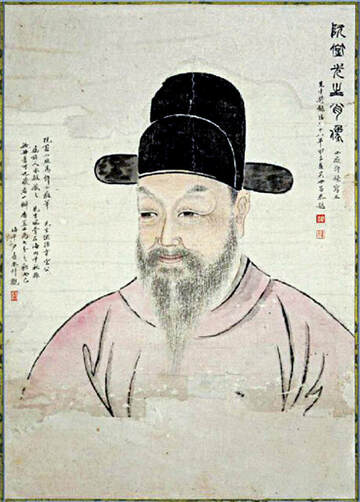
figure 4: Portrait of Chusa Kim Jeong-hui
(public domain) |
Chusa was 55 when he was banished to Jeju on September the 4th, 1840. The ruler of Korea at the time, King Heon-jong, was young and relatively powerless, and a number of influential aristocratic families took this as their chance to advance their positions within the royal court by any means necessary.
Charges were made against Chusa following his promotion to vice minister of justice and deputy envoy to Qing China, and despite being entirely unfounded, the accusations were serious enough for Chusa to initially be sentenced to death. A friend in government however managed to convince officials to instead send him in exile to remotest 'Daejeong-hyeon', the archaic name for southwest Jeju, where he would spend the next 8 years of his life in productive, scholarly solitude. |
Geology and the molten roots of an island
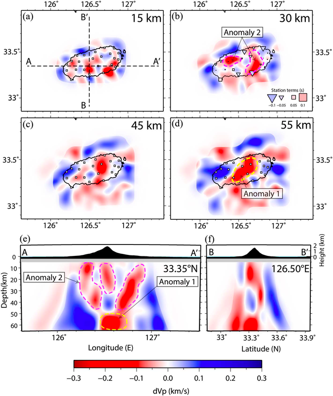
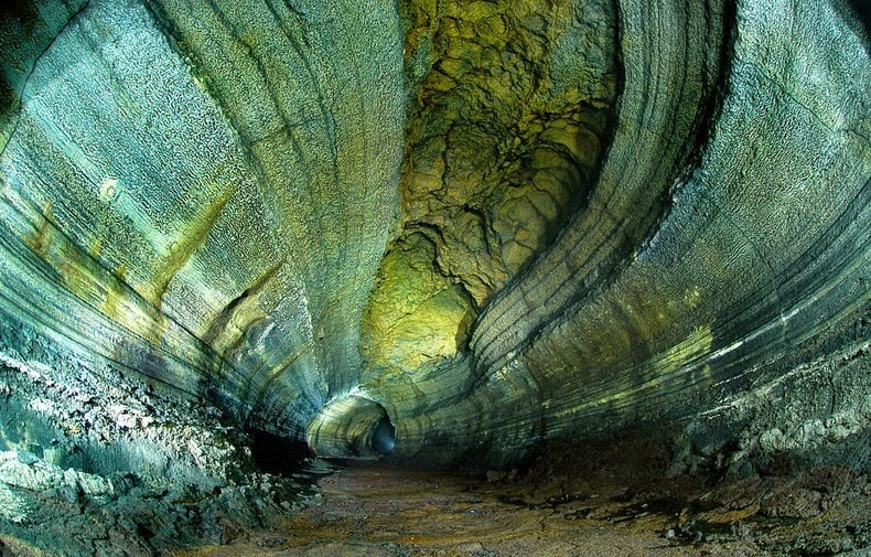
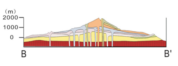
As you arrive by air the most distinctive feature of the island is Mount Halla or Hallasan, an enormous shield volcano and the highest peak in South Korea. The remainder of the island is relatively flat, which highlights the 300 plus other volcanic cones that protrude abruptly amongst the fields. These surface features connect underground as a colossal volcanic network of structures, a so-called ‘magma plumbing system’ that extends up to 60 km deep (figs. 5,6).
( Yoon Sun et.al., Korea Rural Community and Agriculture Corporation, 2006, scale 1:150,000. )
|
figure 6: Diagrams of Lithospheric Structures Beneath Jeju Island
Image courtesy of Jung-Hun Song (CC BY-NC-ND 4.0) |
Between 2013 and 2015, a team of Geologists from Seoul and Busan used 20 seismographic stations across the island to record waves passing through the earth from the 484 different earthquakes that had occurred in neighboring regions during that period.
Earthquake waves are known to travel at different speeds through different types of rock. By carefully comparing the arrival times of the waves at each station against which routes they had taken through the earth, (a process known as 'Teleseismic Traveltime Tomography'), the scientists were able to model the enormous bodies of magma beneath Jeju, giving us our first look at the vast molten roots of the island and a clearer understanding of how these systems develop (fig. 6). |
Biology and the genetic roots the orchid
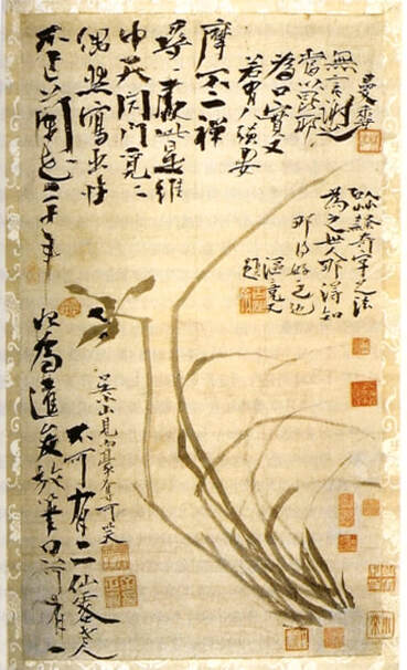
Chusa's brush of choice was made of rat’s whiskers, a material which he found combined strength with sensitivity, and also allowed him to abruptly change the direction of his stroke whilst painting. With each new painting he would often coin a new 'Ho' or pen-name when signing the piece, to suggest a particular persona in association with the image.
|
figure 8: Orchid painting, Chusa
(unknown date, public domain) |
Over his life time Chusa created over 200 different pen-names for his calligraphy, poems and paintings, and according to his own accounts, in his 70 years he wore down 10 ink stones and 1,000 brushes whilst developing the distinctive Chusa style or 'Chusache'.
His most famous orchid masterpiece is said to have been made after not having painted a single orchid for 20 years, created in an absent minded moment as a gift for his young servant (figure 8). It's unlikely that his servant appreciated what he'd been given, but a local artisan certainly knew it's worth and continued to beg and pester Chusa for the scroll until it suddenly one day disappeared. Later, Chusa wryly added this tale to the painting itself in his unique 'Chusache' script (fig. 8). |
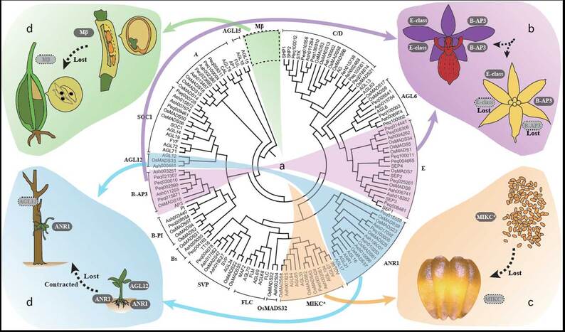
Around 10% of all flowering plants species are now known to be orchids, with somewhere between 20,000 and 30,000 species and over 70,000 hybrids and cultivars. Scientists are currently in the process of mapping out the extensive evolutionary lineage of orchids and in 2017, a study published in Nature Magazine announced that an international consortium of researchers had sequenced the genome of Apostasia shenzhenica, a primitive 'Grass Orchid' whose appearance is only barely recognisable as an orchid.
By comparing it's genome with known sequences in other species, they were able to estimate the time at which it diverged or 'split off' from other orchids. Their study also gives us a better idea of when the 'Most Recent Common Ancestor' (MRCA) of all orchids existed, now believed to be around 200 million years ago at the dawn of the age of the dinosaurs (figure 9).
figure 9: Phylogenetic tree diagram of MADS-box genes involved in orchid morphological evolution.
Image courtesy of Jie-Yu Wang and Rolf Lohaus (CC BY 4.0)
In developing the two new drawings for the residency on Jeju, I was interested in the notion of absence within an image - what an artist chooses to show and chooses not to, but also in terms of what can be said to lie hidden behind the surface appearance of the things which surround us.
Written within the fabric of nature is evidence of innumerable events that occurred in deep geological and evolutionary time in order for the volcanoes and orchids to exist, and it's only by means of years of collaborative investigation and ingenious new techniques, that we have come to be able to detect and decipher them.
As geologists diagram the molten roots beneath the rock on which Chusa wandered, and geneticists piece together the genetic roots which underlie each of Chusa's orchids, we have come to realise that these structures stretch backwards through space and time in ways that Chusa could never have imagined.
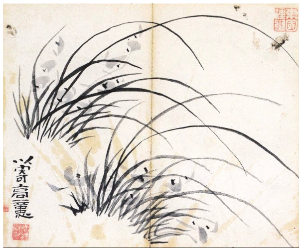
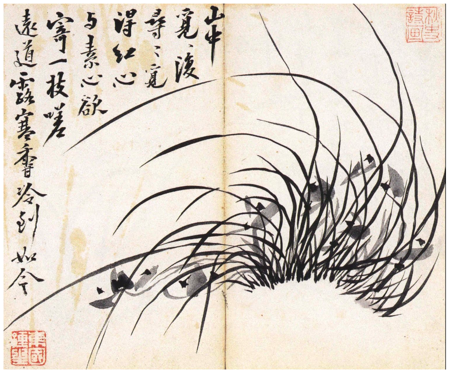
Below are high resolution images of each finished drawing, which can be viewed in detail using the control icons to the right of each image. Beneath these are a collection of Chusa's own orchid paintings, which now comprise a digitized collection available online here as part of Google's Arts and Culture Project.
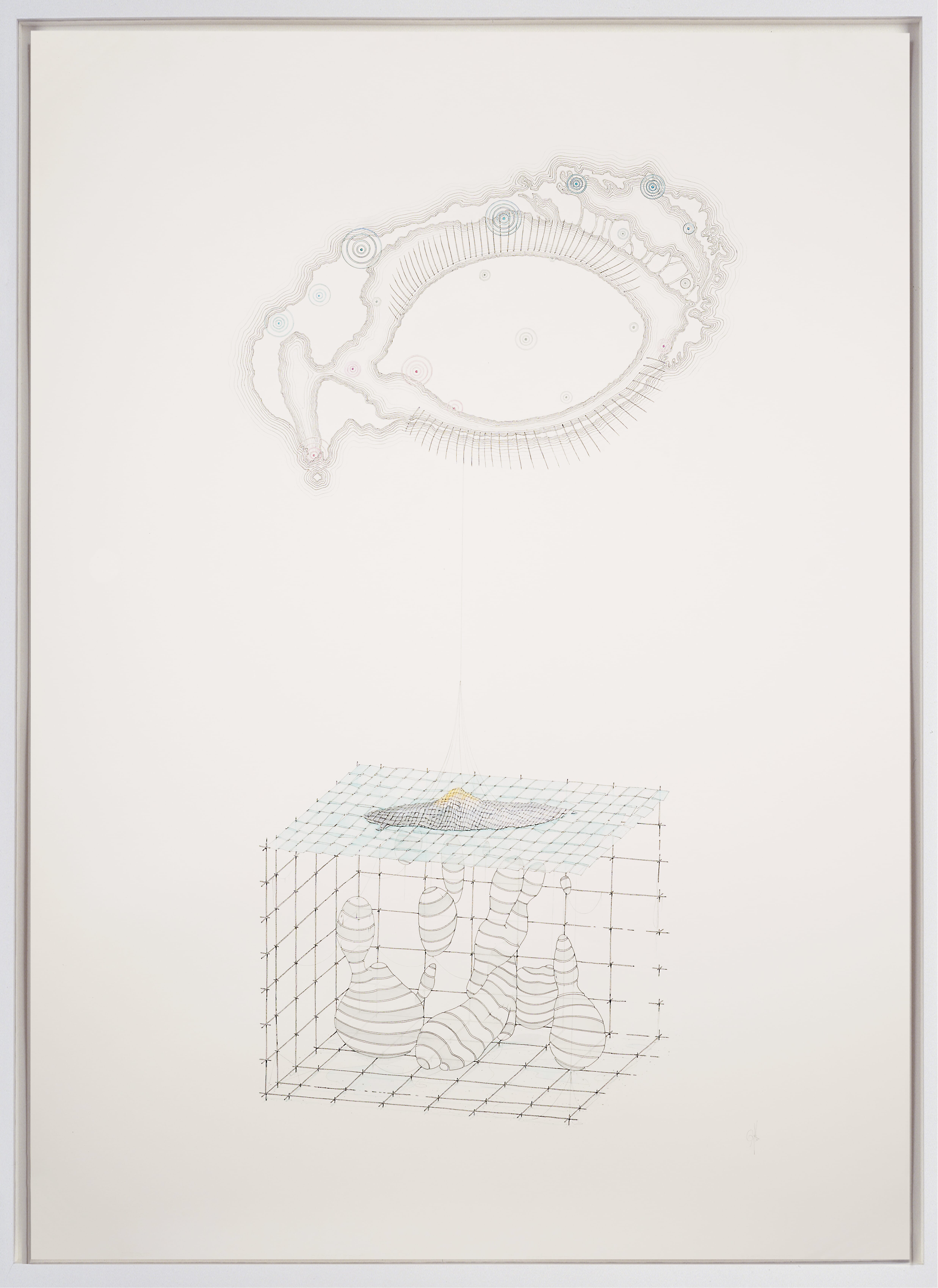
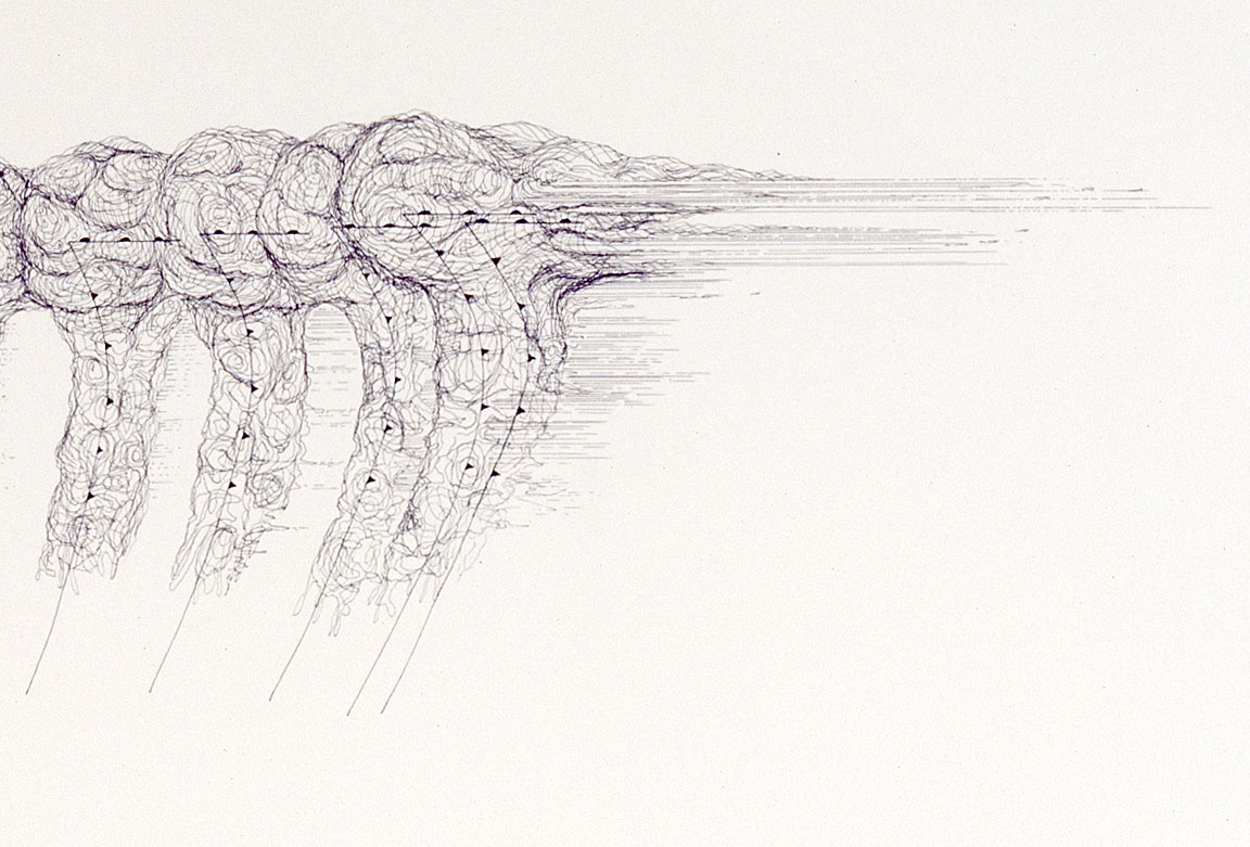
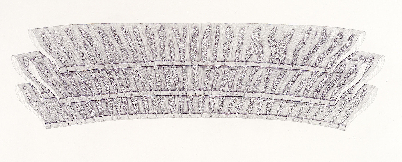
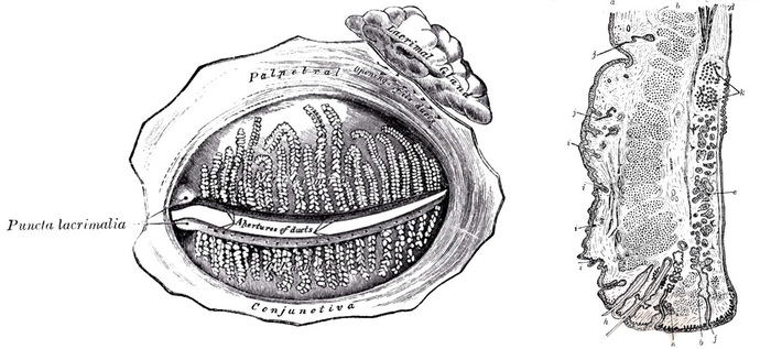
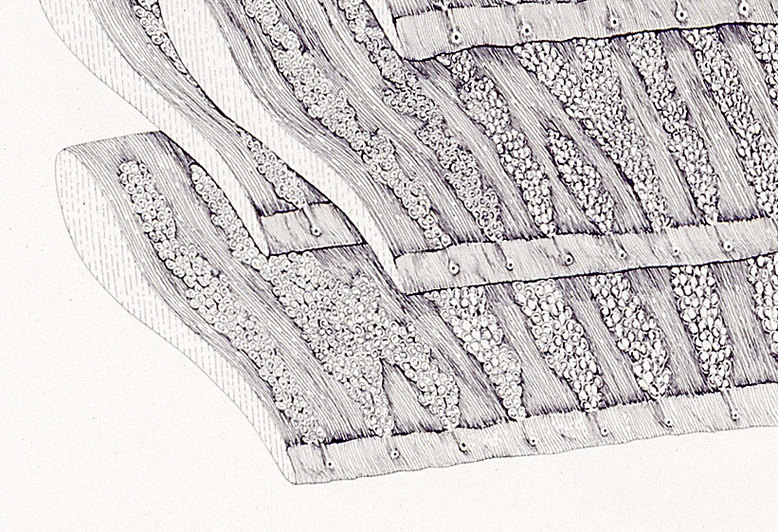
Tear glands, tear ducts, tear drops
(Lacrimal gland and ducts with Lithospheric anomalies)
Michael Whittle, 2019, Ink pencil and watercolour on paper, 111.2 x 78.9 cm
Jung-Hun Song et.al., 2018, Imaging of Lithospheric Structure Beneath Jeju Volcanic Island by Teleseismic Traveltime Tomography, Journal of Geophysical Research: Solid Earth, 10.1029.
Online: https://doi.org/10.1029/2018JB015979
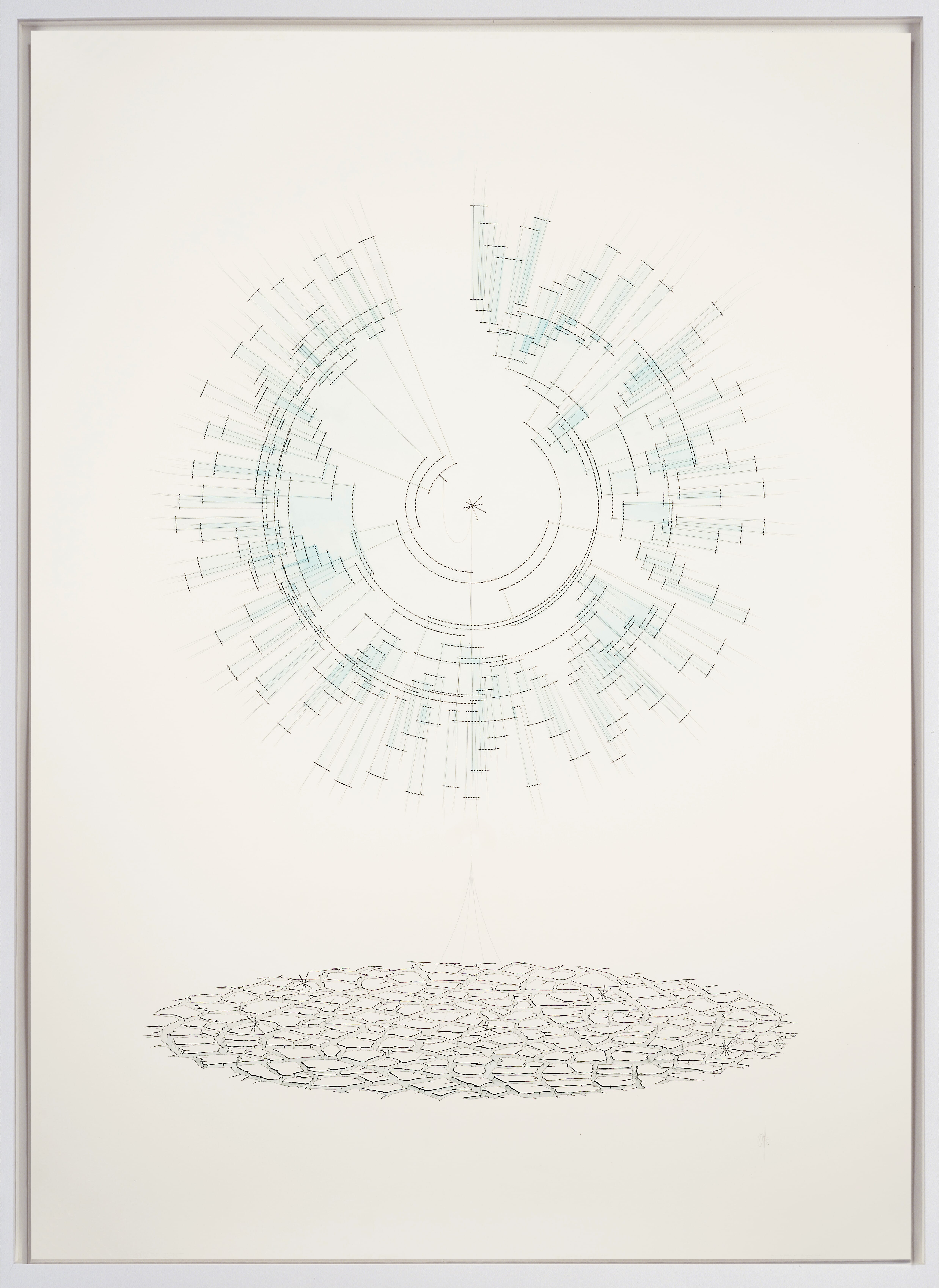
The roots of the Orchid
(Divergent phylogenetic tree with common ancestor and desiccation)
Michel Whittle, 2019, Ink pencil and watercolour on paper, 111.2 x 78.9 cm
Guo-Qiang Zhang et.al., 2017, The Apostasia genome and the evolution of orchids. Nature 549: 379-383
Online: https://rdcu.be/bUj7h
Chusa's Orchids:
2013, Ink on paper, 82 x 82 cm
Blog post 16 is dedicated to the human visual system, our mind's highest bandwidth connection with external reality. As an artist with a background in biology, vision is a recurrent theme in my drawings and sculptures, which often consider the strengths, weaknesses, origins and limits of the 'wet-ware' that underlies visuality, and facilitates the way we create and experience visual art. Our scientific understanding of the intricacies of vision is constantly evolving over time, and this is something I try to take in to account in the vision-related works I make as an artist.
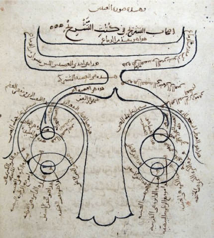
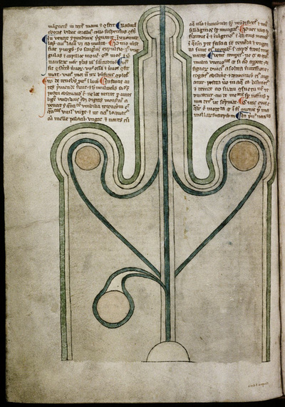
| Figure 2: Ibn al-Haytham: Diagram of the human visual system. From a 1083 copy of his Kitāb al-Manāzir, Süleymaniye Library, Istanbul. | It's now over a thousand years since the Golden Age of Arabic Science, during which time Ibn al-Haytham published his magisterial 7 volume treatise on optics the ' Kitab al-Manazir ' (1015), from which the diagram in figure 2 is taken (1). Translated into Latin in the 13th century as ' De Aspectibus ', and again in 1572 after the advent of the printing press, the ideas it contained would influence generations of European thinkers throughout the middle ages and on in to the Renaissance. Al-Haytham's methodical attention to detail and insistence on evidence based reasoning meant that he's often referred to as not only the father of modern optics, but one of the World's first true proponents and practitioners of the scientific method. |
Figure 2 is particularly interesting because of artistic restrictions on Muslims against depicting living or sentient beings, known as Aniconism. However Al-Haytham's use of the abstractive powers of the diagram meant that he was able to draw an elegantly stylised nose, the eyes and their lenses, and the optic nerves to the visual cortex at the back of the brain (shown here at the top of figure 1). Remarkably, he even included the chiasma or 'crossing point' of the optic nerves within the brain.
Al-Haytham's work on optics proposed a systematic solution to the problem of vision that combined experimental investigations in to the behavior of light with inventive geometrical proofs and constant forays into the psychology of visual perception. His insight that light is composed of particles for example, would later be described by Newton and finally proven by Einstein in his work on the 'photoelectric effect' in 1905, for which he later won the 1921 Nobel prize for physics.
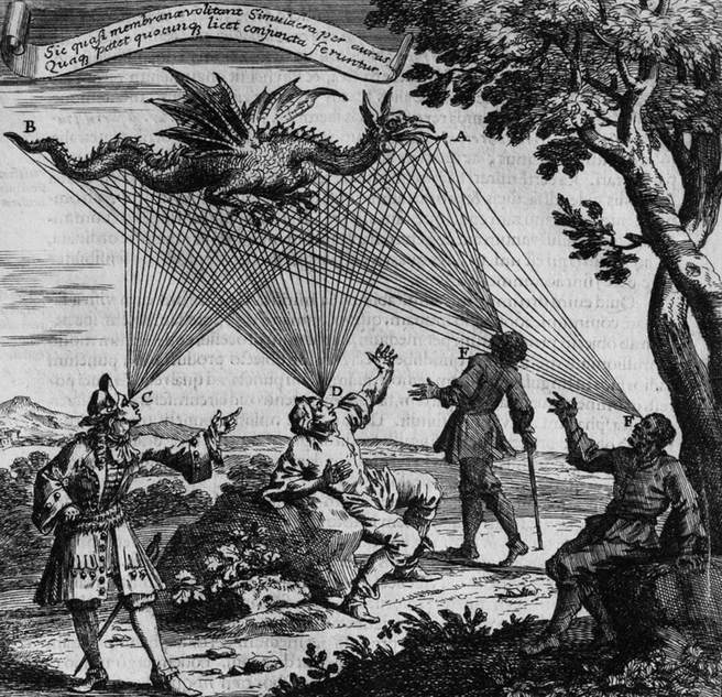
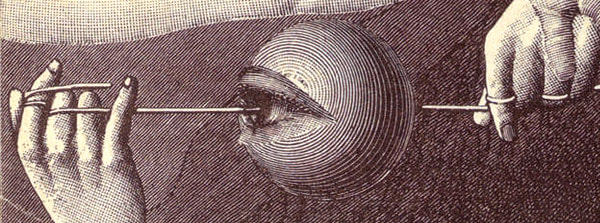
The treatise offered a coherent alternative to the Euclidean and Ptolemaic theories of visual emission, in which visual rays were believed to be emitted from the eye, curiously emphasized by the peculiar hands gestures in figure 3 below. This esoteric idea was first proposed by the 5th century Greek philosopher Empedocles, who claimed that vision was enabled by the goddess Aphrodite, who lit a divine fire within the human eye.
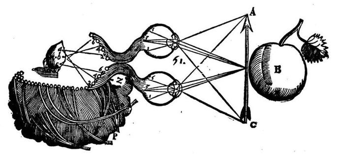
Johannes Kepler (b.1571) directly followed al-Haytham's formalism to its inevitable and logical conclusion in his mechanistic theory of the retinal image that was to replace its impressionistic predecessor. However even he struggled to accept what al-Haytham called the "monstrous" distortion of sensation that would be provoked by inversion of the image, and it remained for René Descartes (b.1596) to compile his own theory of vision, beautifully illustrated with diagrams and far closer to our current understanding (figure 4).
Figure 4 above depicts Descartes theory of how physical impulses are transmitted in the form of rays from the arrow into the eye give rise to physical impulses through the optic nerves and then into the brain to the pineal gland, which he incorrectly believed served as the nexus between the immaterial mind (which he referred to as res-cogitans) and the physical body (res-entensa).
2013, Wood, perspex, Japanese archery target, strobe-lights, 42 x 89 x 19 cm
| Figure 6: Descartes' blind man probing the environment with sticks. No confusion arises concerning the location of objects despite the fact that the sticks are crossed. | He goes on to point out that so long as there are systematic rules that link eye or body motions to changes in the retinal image, the brain will be able to construct a correct representation of space. Cleverly, descartes uses the analogy of a blind man who is exploring his environment with the aid of a stick AD, held in his right hand and a stick, CB, held in his left hand (figure 6). Even though the blind man may cross the sticks in front of him, just as the image is inverted on the retina, no confusion concerning the location of objects will result from this (3). |
Until only recently the idea of fully understanding the inner workings of the eye was considered a problem of such intractable complexity that it was often held as evidence of a supernatural engineer. Even Darwin himself appeared troubled at first, remarking in an often misquoted aside in Origin of the Species that the whole idea that something so flawless “could have been formed by natural selection, seems, I freely confess, absurd in the highest degree.”
However as with all complex biological features, the human visual system arose unimaginably slowly over hundreds of millions of years of clumsy trial and error, and on closer inspection we find numerous examples of evolutionary concession and compromise. As a result, the human eye and visual system is just good as it needs to be and no better, and systemic errors have to be accommodated for using sophisticated cognitive processing techniques (the blind spot is a good example of this).
For an excellent article covering this topic click here: The Poor Design of the Human Eye.
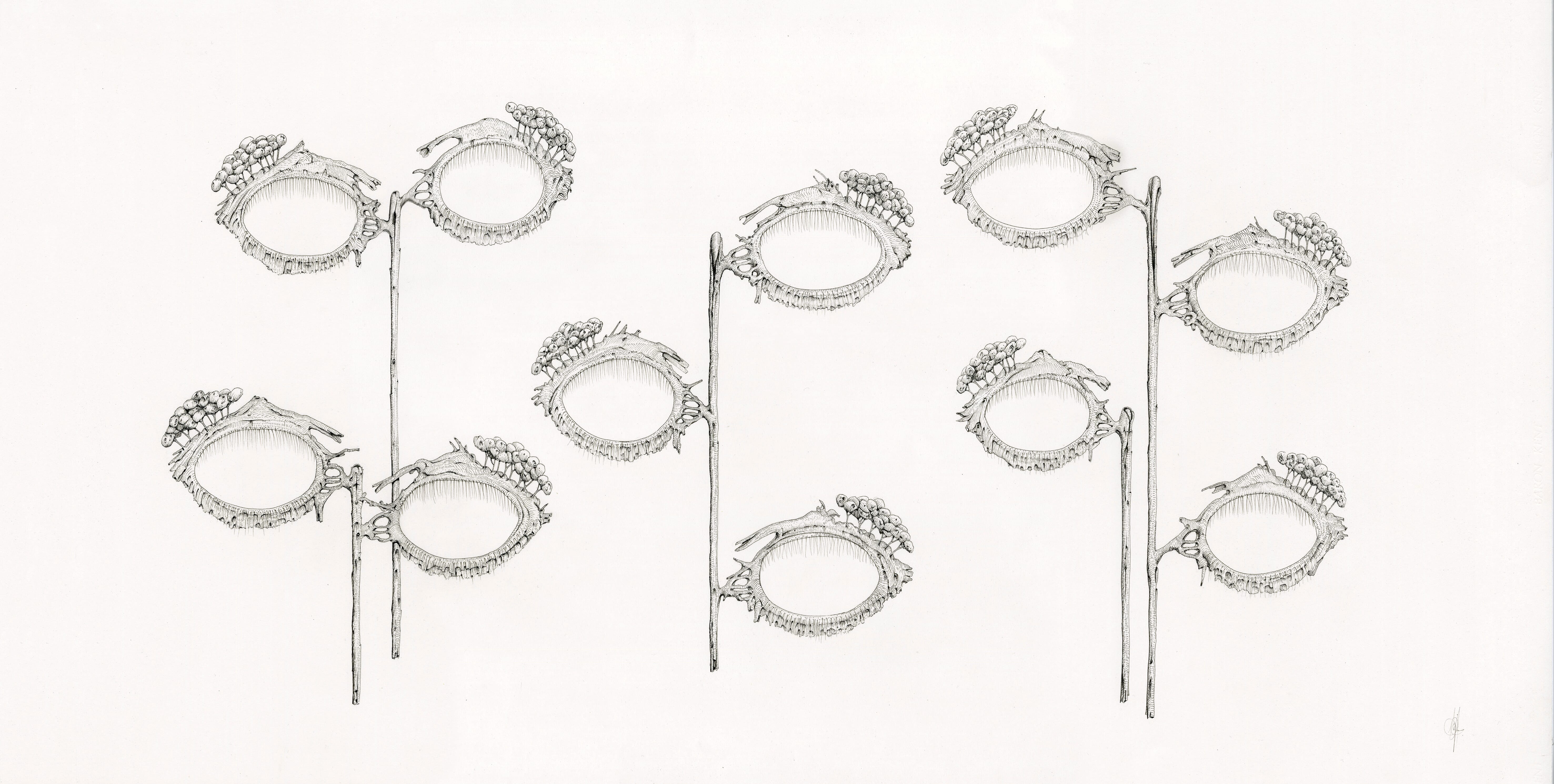
2013, ink on paper, 45 x 84 cm
The last decade of brain research has revealed more about the human brain than all the years of prior research combined. The number of neurons devoted entirely to visual processing is now estimated to be in their hundreds of millions, taking up about 30% of the whole cortex, as compared with 8% for touch and only 3% for hearing. Each of the two optic nerves that carry signals from the retina to the brain consists of a million fibers, whereas each auditory nerve carries a mere 30,000.
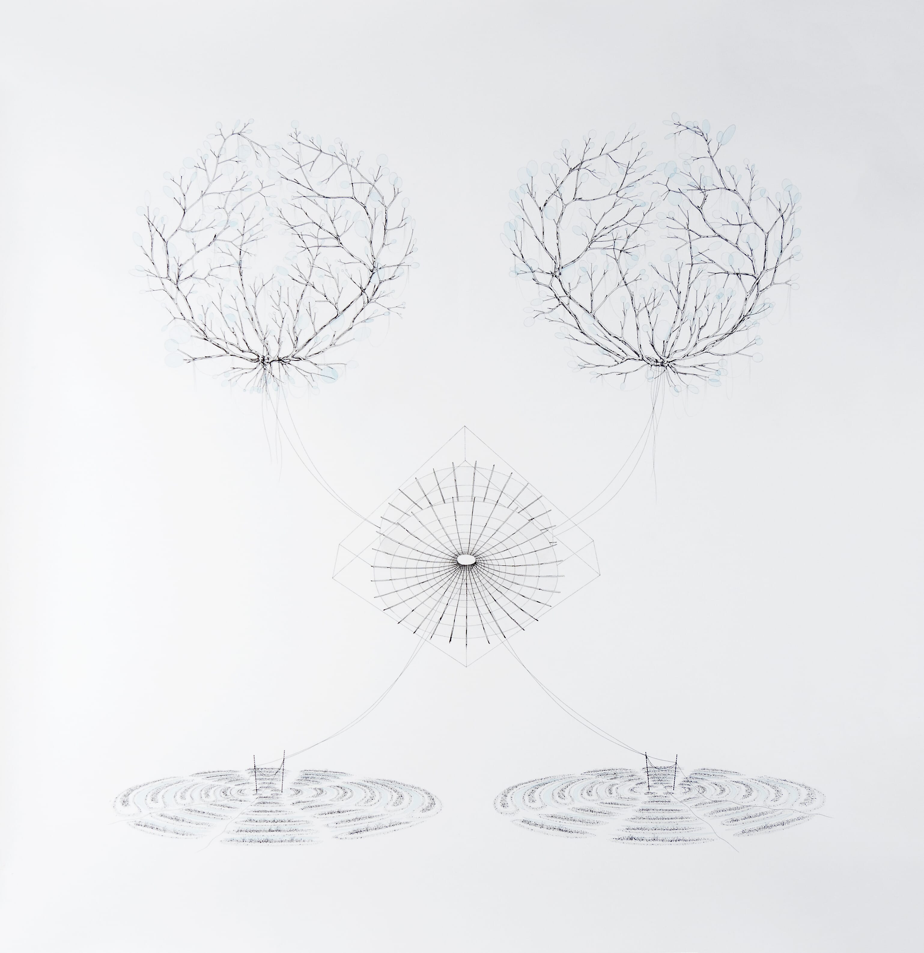
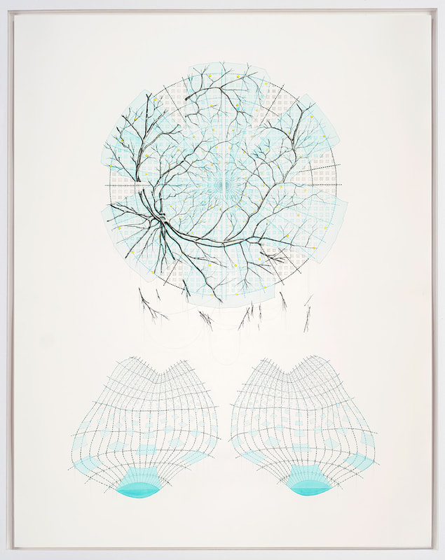
(Neural network detected retinal vasculatures with catenoid and
two point source interference patterns), 2017, 97 x 92 cm, Ink, pencil, and watercolour on paper
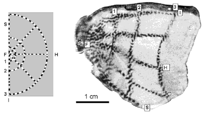
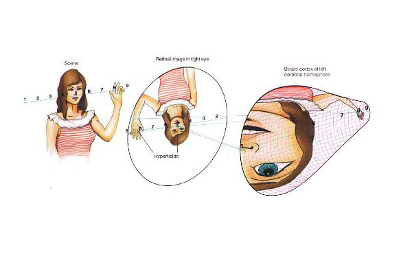
When the visual cortex of the Macaque was removed and simply pressed on to a radio-sensitive plate, enough to the radioactive marker had became most concentrated in the most active cells to leave a trace on the plate. The external, striped target on the left was shown to map directly on to the internal, organic material of the brain on the right. Point F represents data captured by a small area of incredibly highly sensitive retina known as the Fovea, where detail is at its highest.
It's probably worth repeating - what you're looking in figure 10 is an actual metabolic imprint of the external environment being mapped on to the structure of the brain at the cellular level, half to the left and half to the right. More details of how this image was created are included in the footnotes below as note 4 (4).
Original paper: Tootell RB, Switkes E, Silverman MS, Hamilton SL (1988) Functional anatomy of macaque striate cortex. II. Retinotopic organization. J Neurosci 8:1531–1568. Abstract/FREE Full Text: Google Scholar
(Retinotopic visual stimuli map of primate striate visual cortex with retinal vessel shadows),
2017, 140 x 108 cm, Ink and watercolour on paper,
Figures 12a and b present hypothetical examples of how complex, real world images are believed to be processed and mapped out within the structures of the brain as 'Retinotopic Representations' in the 2 lobes of the visual cortex at the back of the brain.
divided, inverted and distorted with in the visual cortex, from Frisby & Stone (2010), p. 6.
Visual data from the tiny foveal region is given maximum priority over that collected from the rest of the retina, with approximately half of the nerve fibers in the optic nerves carrying information from the fovea alone, while the remaining half carrying information from the rest of the retina.
It's an interesting realisation that this tiny high resolution part of your vision is about the same size as your thumb nail held at arms length in front of your eye. Rather than the eye acting as a camera that takes in a complete image, the act of looking is in fact a process of diagramming the world using that tiny region of high resolution information provided by the fovea.
One of the pioneering researchers of how the human visual system relies on such diagrammatic eye movements was the Russian psychologist Alfred Yarbus (1914-1986). Yarbus conducted several influential experiments using suction caps attached to the eyes to track eye movements while participants viewed various images and scenes. His most famous study, published in the book "Eye Movements and Vision" (1967), demonstrated that the way people move their eyes while looking at a picture depends on the task they are given or the information they are seeking.
Figure 13 shows the results of one such experiment, and the rapid series of twitching eye movements, known as saccades, that scan the world around us as we process our surroundings. Nicholas Wade from the University of Dundee (UK) & Galina Rozhkova from the Institute for Information Transmission Problems at the Russian Academy of Sciences (Moscow) have compiled an excellent website detailing the work of Yarbus, and how his discoveries laid the foundations for the study of human vision and cognition: https://yarbus.eu/faces/.
Record of the eye movements during free examination of the photograph with both eyes for 3 minutes
Al-Haytham was rightly concerned about the monstrous distortions involved in human vision and visual processing. During their decoding, images are not only inverted but divided and distorted with in the visual cortex, and yet our visual experience of the external world remains immersive and wholly convincing.
Finally, to end the post is a clip from an interview with the Nobel prize winning physicist Richard Feynman, who spent many of years of his distinguished career investigating the fundamental nature of light at the level of photon-photon interactions. During the clip he discusses the phenomenon of vision and the tiny segment of the electromagnetic spectrum that it evolved to detect.
1) al-Haythem wrote the series on optics whilst working at Cairo's al-Azhar Mosque sometime between 1028 and 1038
2) "Apart from that, it is necessary to beware of assuming that in order to sense, the mind needs to perceive certain images transmitted by the objects to the brain, as our philosophers commonly suppose; or at least, the nature of these images must be conceived quite otherwise than as they do: For, inasmuch as [the philosophers] do not consider anything about these images except that they must resemble the objects they represent, it is impossible for them to show us how they can be formed by these objects, received by the external sense organs, and transmitted by the nerves to the brain. And they have had no other reason for positing them except that, observing that a picture can easily stimulate our minds to conceive the object painted there, it seemed to them that in the same way, the mind should be stimulated by little pictures which form in our head to conceive of those objects that touch our senses; instead we should consider that there are many other things besides pictures which can stimulate our thought, such as, for example, signs and words, which do not in any way resemble the things which they signify." Descartes, Optics, Fourth discourse (p. 89 in trans. by P.J. Olscamp)
3) "So that you must not be surprised that the objects can be seen in their true positions, even though the picture they imprint upon the eye is inverted: for this is just like our blind man's being able to sense the object B, which is to his right, by means of his left hand, and the object D, which is to his left, by means of his right hand at one and the same time. And just as this blind man does not judge that a body is double, although he touches it with his two hands, so likewise when both our eyes are disposed in the manner which is required in order to carry our attention toward one and the same location, they need only cause us to see a single object there, even though a picture of it is formed in each of our eyes." Descartes, Optics, Sixth Discourse, trans. P.J. Olscamp, p. 105.
4) Figure 10 shows the results of an experiment in which an anaesthetized Macaque monkey viewed a flickering bulls-eye pattern, and was then injected with radioactively labeled glucose (a special type of glucose with a radioactive Fluorine molecule attached). The glucose was taken up in higher amounts by the most active neurons. Area V1 of the visual cortex was then surgically removed and flattened before being used to expose radioactively sensitive film. The result is a picture of regions of activity evoked by the bulls-eye pattern, creating what is known as a 'Retinotopic Map'.
CONTROLS
HERE ↓
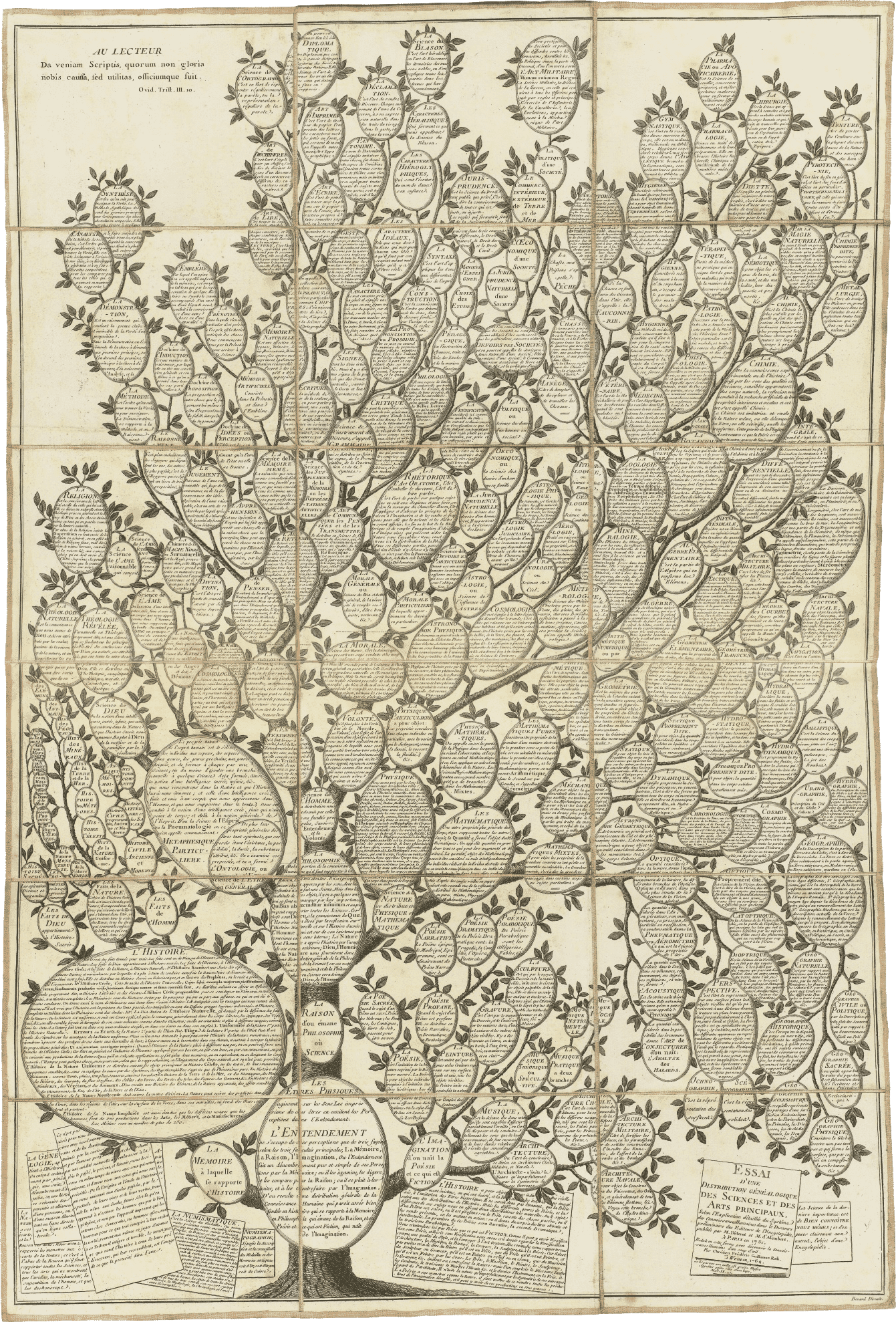
Tree of knowledge, Chrétien Frederic Guillaume Roth, Fold-out frontispiece of the first volume of the indices to the 'Encyclopedie, ou Dictionnaire Raisonne des Sciences, des Arts et des Metiers', (Encyclopedia or Dictionary of the Sciences, Arts and Professions), edited by Denis Diderot (1713-1784) and Jean d'Alembert (1717-1783).
The diagram sets out a genealogical relationship between various arts and sciences, with the left, middle, and right branches influenced by the threefold classification in the philosopher Francis Bacon's 1605 book "Advancement of Learning".
❉ The Culture of Diagram
|
Click to Purchase:
John Bender, Michael Marrinan,
Stanford Uni. Press, 2010, 296 pg, ISBN: 9780804745055 |
Notable Quotes:
" It has been some thirty years since W.J.T. Mitchell, defending the importance of spatial form in literature, called for a new “diagrammatology,” by which he meant a “systematic study of the way that relationships among elements are represented and interpreted by graphic construction.” It has been more than twenty since the cognitive scientists J. Larkin and H.A. Simon sought to demonstrate “why a diagram is (sometimes) worth ten thousand words.” It has been five years since the British philosopher John Mullarky, drawing on the work of Gilles Deleuze, Alain Badiou, François Laruelle and Michel Henry, proposed a “metaphilosophical diagrammatology” to defend his theory of radical immanence. And it has only been four since the Danish philosopher Frederik Stjernfelt plumbed the legacy of C.S. Peirce and Edmund Husserl for a realist semiotics, which he also called “diagrammatology.” pg 15 |
Bender and Marrinan's book outlines the ways in which diagrams have come to play such a central and formative role in European visual thinking and knowledge production. John Bender is Professor in Interdisciplinary Studies at Stanford University and Michael Marrinan is Professor of Art History, also at Stanford. If you were to draw a Venn diagram of their combined professional interests and specialisations, then this collaborative book has emerged from a complex intersection near the centre of their overlapping sets.
The Culture of Diagram is wide in historical scope and forward thinking in an important and influential way, so much so, that the title is commonly used to refer to the recent resurgence of interest in diagrams, diagram making and diagrammatic thought in the humanities.
From Roland Barthes 'The plates of the encyclopedia' to the cubist paintings of Braque and Picasso, and from the poetry to Mallarme to the work of the Quantum physicist Neils Bohr - The Culture of Diagram constructs a pan-historical web of texts, pictures, formulas and figures, whilst foregrounding the diagram as tools for blurring boundaries and highlighting the production of knowledge as process.
More quotes:
'For Braque and Picasso, the shift to diagram entailed thinking past the surfaces that separate things in the world, piercing their outer skins, and searching for ways to trigger memories of comprehension that might be tactile, auditory, or olfactory rather than visual' p.205
'Users of diagrams, unlike viewers, are functional components inseparable from the system in which they are imbricated... Users of diagrams practice correlation to make working objects. Modernist self-reflection is not the goal.' p.72
Illustrations / Acknowledgements
1. Scenario
2. Diagram
3. Descriptions
4. Visualisations
5. Numbers
6. Crossings
Notes / Bibliography / Index
❉ Deleuze and the Diagram
Aesthetic Threads in Visual Organization
|
Click to Purchase:
Jakub Zdeblik, Bloomsbury, 2012,
256 pg, ISBN:9781472526199 |
Notable Quotes:
'An assemblage, like archipelagos and spinal columns or quadrupeds and cephalopods, relies on the diagrammatic process of abstraction, here described as folding and unfolding, for the connection, based on function, of heterogenous parts. Most strikingly, the image of a mammal contorting into the shape of a cephalopod drives the point home. We can imagine the bones cracking, the limbs twisting and the body contracting. The squid is the animal that emblematizes the diagrammatic process. But it is a squid that carries a mammal inside of it on a virtual level. ' p.176 |
The interactive diagram of the tree of knowledge at the start of this blog embodies the metaphysics of the English Philosopher-Scientist Francis Bacon. It's structure is arboreal or 'treelike' in how it conceives and depicts the structure of knowledge as a hierarchy of order and linearity. The continental philosophy of Gilles Deleuze can also be described as diagrammatic, but in the sense that it resembles the structure of a rhizome, a web-like underground plant stem whose growth appears to be aimless and disordered.
The focus of Zdebik's book is on Deleuze's visual aesthetic theory and the visual devices in Deleuze's writing. Deleuze conceptualized his theory as a form of painting, and as such, promoted the need to shift from figuration into abstraction. Like Deleuze, Zdebik's prose is rich with complex analogies and metaphors - hence the image of 'a squid that carries a contorted mammal inside of it on a virtual level' quoted above.
This is a demanding text whose chapters require several careful readings and access to primary source texts (ie. Deleuze's original writing), as well as an acquaintance with the school of continental philosophy (often referred to as the deconstructionists or poststructuralists).
From an artist's perspective this is a rich, complex text full of important insights that suggest a new relationship between philosophy, art and diagrams, and for this reason is well worth the effort. Deleuze was proposing a way to think about philosophy through art using the diagrammatic art work of Paul Klee and Francis Bacon (the artist) as exemplars. Zdebik highlights the abstract depths to which Deleuze took the concept of diagram in his attempt to sketch out a rhizomatic relationship between philosophy and art.
Preface \ Introduction: What is a Diagram?
1. Constraint and System as Vegetation: Diagram and Visual Organization
2. Black Line White Surface
3. Gilles Deleuze's Diagram (Complicated by a Comparison to Immanuel Kant's Schema)
4. The Extraordinary Contraction
5. Skin, Aesthetics, Incarnation: Deleuze's Diagram of Francis Bacon-An Epilogue
Notes \ Bibliography \ Index
❉ The Domain of Images
|
Click to Purchase:
James Elkins, Cornell Uni. press, 2001, 304 pg, ISBN: 0801487242
|
Notable Quotes:
'In the domain of visual artefacts, fine art is a tiny minority... Taken as a whole, images are far more various. This book is about that richer field; art appears in it as a special case, a kind of image among many others.' IX (preface) 'Of all the subjects of this "survey of exemplary images', schemata are most in need of further historical analysis and work. Not only are they they the fastest growing kind of image, but they are arguably the most varied.' p.234 |
James Elkins is a trailblazing scholar of visual imagery with an output as varied as it is prodigious. Chapter 13 of his book The domain of images is devoted to diagrams, which Elkins opts to refer to as 'Schemata' in reference to the philosopher Immanuel Kant's use of the term to describe the visual and imaginative aspects of diagrammatic structures.
A close reading of the text is a disjointed and fragmented experience due to the way Elkins has chosen to structure the layout of the book. His exacting use of footnotes and intricate system of references requires time, effort and note making on behalf of the reader. It feels as if Elkins is playing with the limitations of the physical book as an analogue version of a hypertext, a format which would have allowed him to include an even more diverse proliferation of images and ideas.
Elkins writing is always dense, lucid and engaging, and his use of technical terms is precise and never feels unnecessary. The glossary at the end of the book is a very welcome addition for a subject already oversaturated with specialist jargon and multiple definitions, and it's a shame more authors don't do this.
|
CONTENTS:
Preface / Acknowledgements / List of plates PART I: 1. Art history and Images That Are Not Art 2. Art History and the History of Crystallography 3. Interpreting Nonart Images 4. What is a Picture ? 5. Pictures as Ruined Notations 6. Problems of Classification |
PART II:
7. Allographs 8. Semasiographs 9. Pseudowriting 10. Subgraphemics 11. Hypographemics 12. Emblemata 13. Schemata 14. Conclusion: Ghost and Natural Imagfes Glossary / Frequently Cited Sources / Picture credits / Index |
❉ Diagrammatology:
Phenomenology, Ontology, and Semiotics
|
Click to Purchase:
Frederik Stjernfelt, Springer, 2007,
508 pg, ISBN: 9789400705319) |
Notable Quotes:
'Maybe my conclusion is evident: all pictures, also in the ordinary art history sense of the word, are also diagrams - primarily maps in the general meaning of the term suggested... (they) constitute a special subset of the diagram category... we, by contemplating them, make use of... the spontaneous diagrammatical abilities characterizing natural perception.' p.279 |
The Danish philosopher Frederik Stjernfelt's Diagrammatology is an ambitious, heavyweight, academic tome that positions the diagram as central to epistemology - the philosophical study of knowledge and knowledge production. Because of the ubiquitous nature of diagrams, the various roles that they play in knowledge production has been investigated from a variety of standpoints in a variety of fields. Stjernfelt's book proposes a unifying framework that underlies the complexities of the topic - the development of a semiotics based on iconical realism.
In the first part of the book Stjernfelt reexamines the mature work of the American philosopher-scientist (and founder of semiotics) Charles Sanders Peirce, in particular Peirce's doctrine of 'diagrammatical reasoning', which mainly includes diagrammatic construction, observation and manipulation. Stjernfelt proposes an interpretation of Peircean semiotics and Husserlian phenomenology that builds on similarities between the two, then in the second part of the book presents three possible domains of application: biosemiotics (DNA as code), picture theory (an art historical picture plane analysis) and literary theory.
Diagrammatology has received praise for its sheer ambition and for the fluency and meticulous clarity in which it is written, but the price paid for having introduced so many complex topics is that many of the ideas can't be explored to enough depth. Any one of the subjects chosen by Sternfelt could have given rise to a similarly sized book in its own right, such as the diagrammatic analysis of the art historical works in Chapter 13. However Diagrammatology opens up many exciting new avenues for further research, and is likely to be remembered as the book whose title has become synonymous with an entire field of diagram research.
|
CONTENTS:
Preface / Introduction PART I: 1. Let's stick together: Peirce's Conception of Continuity 2. The Physiology of Arguement - Perices extreme realism: The Continuity in Peirce's Theory of Signs 3. How to Learn More: An Apology for a Strong Concept of Iconicity. 4. Moving Pictures of Thought: Diagrams as Centrepiece of a Peircean Epistemology 5. Everything is Transformed: Transformation in Semiotics 6. Categories, Diagrams, Schemata: The Cognitive Grasping of Ideal Objects in Husserl and Peirce 7. Mereology: Parts and Whole in Phenomenology and Semiotics 8. Diagrammatical Reasoning and the Synthetic A Priori |
PART II:
9. Biosemiotics as Material and Formal Ontology 10. A Natural Symphony ? Von Uexkull's Bedeutungslehre and it's Actuality 11. Man the Abstract Animal: Diagrams, Abstraction, and the Semiotic Missing Link. 12. The signifying Body: A Semiotic concept of Embodiment 13. Christ Levitating and the Vanishing Square: Diagrams in Picture Analysis 14. Into the Picture: Husserl's Picture Theories - and Two Types of Pictures 15. Small Outline of a Theory fo the Sketch 16. Who is Michael Wo-Ling Ptah-Hotep Jerolomon ? Literary Interpretation as Thought Experiment 17. Five Types of Schematic Iconicity in the Literary Text: -An Extension of the Ingardenian Viewpoint. 18. The Man Who Knew Too Much: Espionage in Reality and Fiction: Regional Ontology and Iconicity Perspective / Appendix / Notes / Bibliography / Indexes |
❉ Drawing a Hypothesis
Figures of Thought
|
Click to Purchase:
Nikolaus Gansterer, Springer Verlag gmbh, 2011, 351 pg, ISBN: 3709108020
|
Notable Quotes:
'There are currently at least two opposing ways of understanding the term ‘diagram’. Some see diagrams above all as an aid to systematisation – “problem solvers, because they ‘automatically support a large number of perceptual inferences, which are extremely easy for humans’”, while others see them as “pro - liferators of a process of unfolding” or “maps of movement”. ' Susanna Leeb, pg. 31 |
Over a period of about five years the Austrian artist Nikolaus Gansterer corresponded with a number of other artists, theoreticians and scientists and then worked to compile, edit and illustrate 'Drawing a Hypothesis - figures of thought'. The texts range from insightful essays on the nature of diagrams and diagram making to creative writing and fictional narratives, sometimes in reaction to several of the 160 schematic drawings provided by Gansterer. It's a beautiful designed and thoughtfully put together book and, incredibly, it's available in its entirety as a pdf on Gansterer's own homepage here: FIGURES OF THOUGHT pdf.
It's definitely worth finding a printed copy however, to fully appreciate the effort that artist Simona Koch has put in to the design of the book, which was quite rightly included as one of the ten most beautiful books of Austria 2011, and awarded bronze medal at the annual book design competition 'Best Books from all over the World in 2012'.
An insightful review of the book can be found here written by Gert Hasenhütl:
Drawing a Hypothesis?
|
CONTENTS:
Index of Figures. Drawing a Hypothesis (Preface), Nikolaus Gansterer. A Line with Variable Direction, which Traces No Contour, and Delimits No Form, Susanne Leeb. I Must Be Seeing Things, Clemens Krümmel. Subjective Objectivities, Jörg Piringer. Grapheus Was Here, Anthony Auerbach. Asynchronous Connections, Kirsten Matheus. Distancing the If and Then, Emma Cocker. Drawing Interest / Recording Vitality, Karin Harrasser. Nonself Compatibility in Plants, Monika Bakke. Hypotheses non Fingo or When Symbols Fail, Andreas Schinner, Wiry Fantasy, Ferdinand Schmatz. Reading Figures, Helmut Leder. Collection of Figures of Thoughts, Gerhard Dirmoser. Radical Cartographies, Philippe Rekacewicz. 3 Elements, Axel Stockburger. Dances of Space, Marc Boeckler. Collection of Emotions and Orientation, Christian Reder. |
On the Importance of Scientific Research in Relation to Humanities, Walter Seidl. Interpersonal Governance Structures, Katja Mayer. The Afterthought of Drawing: 6 Hypotheses, Jane Tormey. The Hand, The Creatures, The Singing Garden & The Night Sky, Moira Roth. The Unthought Known, Felix de Mendelssohn. Processing the Routes of Thoughts, Kerstin Bartels. An Attempted Survey, Section.a. The Line of Thought, Hanneke Grootenboer. Strong Evidence for Telon-priming Cell Layers in the Mammalian Olfactory Bulb, M. L. Nardo, A. Adam, P. Brandlmayr, B. F. Fisher. Expected Anomalies Caused by Increased Radiation, Christina Stadlbauer. On Pluto 86 Winter Lasts 92 Years, Ralo Mayer. Appendix: Personalia / Subindex / Index of Names / Colophon / Notices |
❉ Writing on Drawing
Essays on Drawing Practice and Research.
|
Click to Purchase:
Steve Garner (Ed), Intellect (UK) / Chicago University Press (USA), 2008, 224 pg, ISBN: 1841502006
|
Notable Quotes:
'Even though I had stopped consciously making objects to show and drawing had become my main activity, I still thought of myself as a sculptor... I initially used the same methods that an architect would use to construct a building in perspective, but left all the construction work there on the paper... Even though I am using geometry in the drawings, the process is still, in fact, very intuitive. I do not start with an idea of what the end drawing will look like... I make some marks and lines that are purely diagrammatic and some which describe forms.' Richard Talbot, p.55 |
Writing on Drawing is a collection of diverse essays that consider the multifaceted nature of drawing to highlight its importance as a cognitive process. In his introduction to the book Steve Garner, editor of these invited essays, describes the domain of drawing practice and research as characterised by diversity. Garner suggests that if drawing is to emerge as a distinct domain in its own right then practitioners from fields as diverse as computer science, history, psychology, education and fine art need a way to chart and better understand how drawing connects their disparate fields, all the better to facilitate interdisciplinary communication.
|
In her essay 'Nailing the liminal', acclaimed drawing scholar Deanna Petherbridge considers the various problems faced by drawing researchers in their search for clearer definitions, and Petherbridge is well very equipped to talk about these issues as an artist and curator whose has specialised in drawing for over 45 years, not to mention as authoress of 'The Primacy of Drawing, Histories and Theories of Practice', published by Yale Uni. press in 2010.
|
Click to Purchase:
|
More can be found about the work and research of Richard Talbot here: Richard Talbot.org
|
CONTENTS:
Acknowledgements / Preface Foreword - Re: Positioning Drawing, Anita Taylor Introduction, Steve Garner 1. Towards a Critical Discourse in Drawing Research Steve Garner 2. Nailing the Liminal: The Difficulties of Defining Drawing Deanna Petherbridge 3. Drawing Connections, Richard Talbot 4. Looking at Drawing: Theoretical Distinctions and their Usefulness, Ernst van Alphen 5. Pride, Prejudice and the Pencil, James Faure Walker |
6. Reappraising Young Children's Mark-making and Drawing, Angela Anning 7. New Beginnings and Monstrous Births: Notes Towards an Appreciation of Ideational Drawing, Terry Rosenberg 8. Embedded Drawing, Angela Eames 9. Recording: And Questions of Accuracy, Stephen Farthing 10. Drawing: Towards an Intelligence of Seeing, Howard Riley 11. Digital Drawing, Graphic Storytelling and Visual Journalism, Anna Ursyn Notes on Contributors / Index |
❉ 100 Diagrams that Changed the World:
from the earliest cave paintings to the innovation of the ipod
|
Click to Purchase:
Scott Christianson, Penguin, 2012, 224 pg, ISBN: 9780452289774
|
Notable Quotes:
'It all begins with a diagram. Everything from family trees to seating arrangements at a wedding to bank heists start with a roughly sketched plan. In architecture it is the grand design or floor plan; in mathematics, it is the graphic representation of an algebraic or geometric relationship; in physics, diagrams may serve as the tool to aid the scientist in making enormously complex calculations. Diagrams are all around us and we use them constantly.' p.11 |
Aimed at a general audience, this selection of 100 historic diagrams is broad in scope and remarkably open in terms of its definition of diagram. This leads to a very interesting collection, and examples include: diagrammatic illustrations of Dante's inferno, elegant patent diagrams for the first automobile, a diagram of Thomas Edison's light bulb, Nazi propaganda maps, sewing patterns and IKEA flat-pack furniture instructions. Descriptions and explanations are kept to a minimum but provide good starting points.
The books title however is a little misleading, as many of the diagrams are merely interesting diagrammatic records of technological progress, rather than instruments of change and progress as diagrams in their own right. Florence Nightingale's ingenious rose charts for example, or the early exploded diagrams of artist engineer Mario Taccola were both arguably more influential as innovative diagrams than say the schematics for Edison's lightbulb or Apple's ipod.
Christianson's book does however capture the excitement of creative innovation that's associated with diagrams, and their potential to allow for the cross fertilisation of ideas between specialisms, surely something which is more relevant now than at any other time in history.
'The great diagrams depicted in the book form the basis for many fields — art, astronomy, cartography, chemistry, mathematics, engineering, history, communications, particle physics, and space travel among others. More often than not, however, their creators — mostly known, but many lost to time — were polymaths who are creating new technologies or breakthroughs by drawing from a potent combination of disciplines. By applying trigonometric methods to the heavens, or by harnessing the movement of the sun and the planets to keep time, they were forging powerful new tools; their diagrams were imbued with synergy.'
❉ The Philosophical Status of Diagrams
|
Click to Purchase:
Mark Greaves, CSLI publications, 2002, 221 pg, ISBN: 1575862948
|
Notable Quotes:
'This book explores the reasons why structured graphics have been largely ignored in contemporary formal theories of axiomatic systems. In particular, it elucidates the systematic forces in the intellectual history of mathematics which have driven the adoption of sentential representational styles over diagrammatic ones. In this book, the effects of historical forces on the evolution of diagrammatically-based systems of inference in logic and geometry are traced from antiquity to the early twentieth-century work of David Hilbert.' |
This somewhat specialist academic publication falls into two distinct parts, as shown in the contents list below. Part I provides a concise overview of the historical rise and fall of the diagram in Geometry following the advent of ideal lines and points and the invention of non-Euclidean geometries. Part II describes how this distrust of deduction techniques based on spatial intuition in geometry (ie. geometric diagrams) was in fact mirrored by a parallel distrust of diagrams in logical calculi.
This is a clear and meticulously written introduction accessible to non-specialists in Geometry and Mathematical Logic. Whilst Greave's conclusions at the end of his book hesitate to make predictions about the future role of the diagram in either Geometry or Logic, they do leave one wondering whether we may yet see a reemergence of diagramming in these fields in a similar way the diagrammatic renaissance in Quantum Physics (- See this earlier blog post on Diagrams in Physics: Meta-engines of creativity - Diagrams in physics).
The CSLI (Centre for the Study of Language and Information) is based at Stanford University and Mark Greaves is the Director of the Joint Logistics Technology Office at DARPA.
|
CONTENTS:
Acknowledgements 1 Introduction Part I: Geometry 2 Diagrams for Geometry 3 Euclidean Geometry 4 Desacates and the Rise of Analytic Geometry 5 Geometric Diagrams in the Nineteenth Century 5.1 Diagrams in the Geometry of Poncelet 5.2 Non-Euclidean Geometries and the Rejection of Kantianism 5.3 Pasch, Hilbert, and the RIse of Pure Geometry 6 Summary |
Part II: Logic
7 Diagrams for Logic 8 The Logical Framework for the Syllogism 9 Diagrams for Syllogistic Logic 9.1 Introduction 9.2 The Linguistic Formulation of the Syllogism 9.3 Early Diagrams for Syllogistic Logic 9.4 Euler Diagrams and the Rise of Extensional Logic 10 Diagrams for Symbolic Logic 10.1 Introduction 10.2 Boole's Symbolic Logic 10.3 Boolean Logic and Venn Diagrams 10.4 Peirce's Extensional Graphs 10.5 Logic at the End of the Nineteenth Century 11 Summary 12 Conclusion References / Index |
❉ The Diagrams of Architecture: AD Reader
|
Click to Purchase:
Mark Garcia (Ed.), Wiley, 2010, 320 pg, ISBN: 0470519452
|
Notable Quotes:
' The role that the diagram is now playing in our attempts to theorize material reality in the late 20th century is not so different from the way the concept of the "schema" was used by Kant to theorize Newtonian reality in the late 18th century... Another great thinker of the same era who ought not be left out of consideration is Goethe, who, it can be argued, rejected the (aprodictic) Kantian-Newtonian model in favor for a genetic interpretation of form... Indeed Goethe is the father of the modern concept of diagram insofar as he insisted on formation as the locus of explanation, not simple appearance. ' Sanford Kwinter, pg. 123 |
The diagram plays a number of crucial roles in Architecture, most obviously as a fixed set of instructional plans that dictate how buildings are to be built, ie. blueprints. However diagrams also facilitate the more dynamic, fluid and creative process of building design generation, and even the modelling processes involved in predicting and analysing how individuals or crowds move through and interact within rooms, building and city streets.
Because diagrams play such fundamentally important roles in architecture, a dense theoretical framework has arisen around their function, especially during the 1980's, and editor Mark Garcia has commissioned, collected and introduced 26 essays from leading international academics, architects, theorists and professional experts. These ideas are illustrated with a full-colour critical collection of over 250 of the most significant and original diagrams from around the world, many of which are previously unpublished.
As the quote from the ever insightful Sanford Kwinter illustrates above, discussion of the diagram in these essays ranges far beyond the confines of architecture to include its conception in philosophy, design and art.
Introduction: Histories and Theories of the Diagrams of Architecture (Mark Garcia).
Part I: Histories and Theories of the Diagrams of Architecture.
Diagrams of Diagrams: Architectural Abstraction and Modern Representation (Anthony Vidler).
Scientific Management and the Birth of the Functional Diagram (Hyungmin Pai).
Urban Diagrams and Urban Modelling (David Grahame Shane).
Dummy Text, or the Diagrammatic Basis of Contemporary Architecture (Robert E. Somol).
Diagram: an Original Scene of Writing (Peter Eisenman).
Poetics of the Ideogram (Leon van Schaik).
Diagrams in Multisensory and Phenomenological Architecture (Joy Monice Malnar and Frank Vodvarka).
The Hammer and the Song (Sanford Kwinter).
Part II: Multidisciplinary Dimensions of the Diagrams of Architecture.
Diagramming the Interior (Mark Taylor).
Diagrams in Landscape Architecture (Jacky Bowring and Simon Swaffield).
Inhabiting the Forest of Symbols: From Diagramming the City to the City as Diagram (Brian McGrath).
Diagrams and their Future in Urban Design (Peter A. Hall).
Diagrams in Structural Engineering: Applied Diagram – Engineering Precision (Hanif Kara).
Spatial Notation and the Magical Operations of Collage in the Post-Digital Age (Neil Spiller).
Part III: Architects of the Diagrams of Architecture.
The Diagrams of Bernard Tschumi (Bernard Tschumi, Bernard Tschumi Architects, interviewed by Mark Garcia).
The Diagram and the Becoming Unmotivated of the Sign (Peter Eisenman, Eisenman Architects).
Expressive Abstractions: The Diagrams of Will Alsop (Will Alsop interviewed by Mark Garcia).
Diagrams (Ben van Benkel and Caroline Bos, UNStudio).
Diagramming the Contemporary: OMA’s Little Helper in the Quest for the New (Wouter Deen and Udo Garrtizmann, OMA).
Between Ideas and Matters: Icons, Indexes, Diagrams, Drawings and Graphs (Alejandro Zaera-Polo, Foreign Office Architects).
Metacity/Datatown (Winy Maas, MVRDV).
Atlas of Novel Tectonics (Jesse Reiser and Nanako Umemoto, Reiser + Umemoto).
Parametric Diagrams (Patrik Schumacher, Zaha Hadid Architects).
NOX Diagrams (Lars Spuybroek, NOX).
Part IV: Epilogues.
Architectural Evolution: The Pulsations of Time (Charles Jencks).
Epilogue (A Beginning of Other Diagrams of Architecture and the Futures of the Diagrams of Architecture) (Mark Garcia).
Select Bibliography / Index
Classic texts
❉ Paul Klee, Notebooks Volume 1
The thinking eye
| paul_klee_notebooks_vol_1_the_thinking_eye.pdf | |
| File Size: | 24501 kb |
| File Type: | |
❉ Paul Klee, Notebooks Volume 2
The nature of nature
| paul_klee_notebooks_vol_2_the_nature_of_nature.pdf | |
| File Size: | 45011 kb |
| File Type: | |
❉ D'arcy Wentworth Thompson
On growth and form
| ongrowthform00thom.pdf | |
| File Size: | 77106 kb |
| File Type: | |
On Growth and form, D'arcy Wentworth Thompson 1945 edition
(first published in 1917)
❉ Patrick Geddes,
Cities in Evolution
and to the Study of Civics
first published in 1915
| citiesinevolutio00gedduoft.pdf | |
| File Size: | 47189 kb |
| File Type: | |
Mathematician, astronomer and physicist C.F. Gauss famously asserted that: "Mathematics is the Queen of the Sciences, and Arithmetic the Queen of Mathematics. She often condescends to render service to Astronomy and other natural sciences, but under all circumstances the first place is her due." (1)
The sheer complexity of the calculations involved in string theory for example, lead physics titan Edward Witten to describe them as a bit of 21st century physics that somehow dropped into the 20th century. Witten's own work in string theory was revolutionary and led Witten to mathematical results so profound that he become the first physicist to be awarded the Fields medal for mathematics in 1990.
With this in mind, this blog entry considers some of the most profound, mysterious and powerful diagram in physics, diagrams which seem to transcend their mathematical origins and function at meta-levels in terms of their efficiency and the value of their insights.
The first and most iconic example of such diagrams is the Feynman diagram, named after the American physicist Richard Feynman (1918-88). Feynman was the eccentric 'genius's genius' with a legendary reputation for creative problem solving and the ability to teach the complexities of quantum physics to students and non-physicists.
| Figure 2: One of the earliest published Feynman diagrams (Sightings, Sept. 2003) depicting electron-electron scattering by means of a virtual photon (labelled here as virtual quantum and depicted as a wavy line). The diagram presents a quantum-mechanical view of how particles with like charge repel one another. | Feynman first created his diagrams as mnemonic doodles to keep track of the long and complex calculations of QED, or Quantum Electrodynamics, the study of electromagnetism at the quantum-mechanical level. However he quickly realised they could be developed into a method of organising calculations with such efficiency that they avoid having to write out sheets of dense mathematical notation. Feynman diagrams are powerful tools because they provide a transparent picture for particle interactions in spacetime. They usually represent sub-atomic events in two dimensions: space on the horizontal axis and time on the vertical axis (figure 2). Straight lines represent fermions, such as electrons, and wavy lines represent bosons, such as photons (except for the Higgs boson which uses a dashed line, and gluons which use loops). |
which he decorated with hand painted Feynman diagrams.
At the quantum level particles interact in every way available to them, and so an exact description of the scattering process involves summing up a large number of diagrams, each with their own mathematical formula for the likelihood they will occur.
Pioneer of data visualization and expert on information graphics Edward Tufte, had 120 Feynman diagrams constructed in stainless steel (see figure 4). His wall mounted constructs represent all 120 different ways that a 6-photon scattering event can be depicted.
Wall mounted installation of stainless steel with shadows, 530 x 230 x 10 cm (Installation view at Fermilab)
Feynman introduced his ingenious schematic in 1948, but by the 1980's their limitations were starting to become apparent, and Feynman himself went on to prove that the diagrams were only approximations that involved an enormous amount of redundancy that arose from their reliance on involving virtual particles (see figure 2).
Feynman diagrams were designed to describe all the possible results of subatomic particle collisions, but even a seemingly simple event like two gluons colliding to produce four less energetic gluons, involves some 220 diagrams. Such collisions occur billions of times a second during experiments carried out using modern day particle accelerators.
In the mid-2000s patterns began to emerge from events recorded in particle accelerators that repeatedly hinted at an unknown, underlying, coherent mathematical structure. A new set of formulas were proposed by the physicists Ruth Britto, Freddy Cachazo, Bo Feng and Edward Witten, known as the BCFW recursion relations after their discoverers. The formulas dispense with familiar variables of Feynman diagrams such as position and time, and involves an entirely new diagrammatic system first developed in the 1970's by Roger Penrose, named twistor diagrams.
| Figure 5: Twistor diagrams depicting an interaction between six gluons that can be used to derive a simple formula for the 6-gluon scattering amplitude. | According to Andrew Hodges: "Twistor diagrams for scattering amplitudes have been explored since the early 1970s, when Roger Penrose first wrote them down. But the ideas underlying them suddenly received quite new attention at the end of 2003, when Ed Witten's twistor string model brought together twistor geometry, string theory and scattering amplitudes for pure gauge fields." (2) |
After over a decade of research with his collaborators, Arkani-Hamed showed how twistor diagrams could be pieced together to create a timeless, multidimensional object known as an 'Amplituhedron' (figure 6).
of Feynman diagrams.
The Amplituhedron has been described as an intricate, multi-faceted, higher dimensional jewel at the heart of quantum mechanics, a meta-level Feynman diagram completely new to mathematics.
| figure 7: Arkani-Hamed's hand drawn diagram of the amplituhedron representing an 8-gluon particle interaction. | This theoretical object enables simplified calculation of particle interactions with such astounding efficiency that according to Jacob Bourjaily, "you can easily do, on paper, computations that were infeasible even with a computer before." (4) The amplituhedron is a geometrical representation of real particle data. The scattering amplitude can be derived from its volume and details of a particular scattering process determine its dimensionality and facets. Figure 7 shows the amplituhedron representing an 8-gluon particle interaction, an event that would require almost 500 pages of algebra using Feynman diagrams. |
From Feynman diagrams to twistor diagrams and the discovery of the enigmatic amplituhedron, diagrams remain a powerful, albeit mysterious tool in theoretical physics. They permit information to be stored and shared with high fidelity, but they also mobilise and shape new knowledge by allowing intuition and rational thought to play a role in the creative process.
For his 'Momentum' series (2010-2013), Spanish photographer Alejandro Guijarro traveled to several international academic institutions that specialize in quantum mechanics: CERN, Stanford, Berkeley and Oxford. In a form of documentation, Guijarro measured and photographed blackboards that he found in lecture theatres, meeting rooms and offices, then printed the images at a 1:1 scale.
The series highlights the transitive nature of diagrams at work during the creation and transmission of knowledge. It presents the process as a physically involved gestural performance, as various trains of thought are followed and erased to leave a blurred palimpsest.
'Momentum' is reminiscent of Marcel Duchamp’s project 'Unhappy Readymade', discussed in this previous Blog: The Diagrams of Geometry part II- A soggy book of diagrams as a wedding present from Marcel Duchamp.
Both projects present us with a token of something lost - information and knowledge made manifest through the substrates ink, paper, chalk and board only to be subject to entropy.
In the case of 'Unhappy Readymade' it's the wind and rain which add entropy, in the case of Guijarro’s 'Momentum' it's the hand of the professor, janitor or the student armed with a blackboard eraser that return the arena of ideas to a tabula rasa.
1) C.F. Gauss quoted in Gauss zum Gedächtniss (1856) by Wolfgang Sartorius von Waltershausen
2) Andrew Hodges, Online at: http://www.twistordiagrams.org.uk/papers/
3) Arkani-Hamed, quoted in 'A Jewel at the Heart of Quantum Mechanics' by Natalie Wolchova, online
at: https://www.quantamagazine.org/physicists-discover-geometry-underlying-particle-physics-20130917/
4) Jacob Bourjaily, quoted in 'A Jewel at the Heart of Quantum Mechanics' by Natalie Wolchova, online
at: https://www.quantamagazine.org/physicists-discover-geometry-underlying-particle-physics-20130917/
for Paul Eluard's book of poetry 'Repetitions', published 1922
without the help of a good drawing,
is not only half a mathematician,
but also a man without eyes. "
Lodovico Cigoli to Galileo Galilei, 1611
A number of simple, cautionary examples of the problematic relationship between Maths and diagrams exist as diagrammatic puzzles, and a famous example is the 'Missing Square Puzzle' shown in figure 1.
| Figure 1: When component parts of triangle A are rearranged, an empty square appears from nowhere | When the coloured components of Triangle A are rearranged to form Triangle B, the process of their reorganisation creates an empty square from nowhere, despite the fact that both triangles appear to have identical surface areas. The key to understanding this kind of puzzle is the idea that Mathematical objects exist in a fictional world created by mathematicians. No matter how precisely drawn, Geometry diagrams only ever give rough approximations of the ideal objects they represent, and these objects can only ever exist in a world where points has zero dimensions and where a lines and planes have zero thickness. |
Marcel Duchamp was fascinated by the idea of a parallel world of Mathematical perfection that exists alongside the chaos and imperfection of reality and daily experience. This was the subject of the blog post: 'A soggy book of diagrams as a wedding present from Marcel Duchamp', which considered one of Duchamp's less well known projects using a found book of Euclid's Geometry.
| Figure 3: Mitsunobu Matsuyama's 'Paradox' | Another excellent example of this type of diagrammatic puzzle is the Mitsunobu Matsuyama Paradox, which consists of a square divided into 4 quadrilaterals. When each quadrilateral is rotated 90 degrees clockwise, the new arrangement suddenly gives rise to a small central square, as depicted in red in figure 3. This puzzle also relies on the natural limits of accuracy to human vision. Both the height and width of the two squares (before and after rotation of their quadrilaterals) are fractionally different, but this is barely distinguishable to the naked eye, because the difference is spread around the entire perimeter of each square. |
For Lodovico Cigoli, a good 17th century diagram provided a visual means of gaining a deeper insight into the mathematics of nature. However, over the course of the following two centuries, the role of the diagram shifted to the extent that it became considered more of a veil that obscured the essence of mathematics, and algebra was proposed as the only way to lift the veil.
"...it is not the figures which furnish the proof with geometers, though the style of the exposition may make you think so. The force of the demonstration is independent of the figure drawn, which is drawn only to facilitate the knowledge of our meaning, and to fix the attention; it is the universal propositions, i.e., the definitions, axioms, and theorems already demonstrated, which make the reasoning, and which would sustain it though the figure were not there." (2)
by Gottfried Leibniz (Figure 1 left) and Christiaan Huygens (figure 2 right) to Jacob Bernoulli
for publication in the Acta Eruditorum, 1691
However, the diagram remains an extremely powerful tool and a visual guide in providing an insight into the austere and pristine world mathematical geometry and topology. Leibniz's own notebooks contain an astounding array of diagrammatic sketches that accompany his mathematics, as in figure 4, and the designs and calculations for his 'Universal Calculator', some 200 years before the work of Charles Babbage.
For an interesting introduction to the notebooks of Leibniz, see Stephen Wolfram's blog: Dropping In on Gottfried Leibniz.
Man Ray described the models that he found languishing in dusty cabinets as 'so unusual, as revolutionary as anything that is being done today in painting or in sculpture', though he admitted that he understood nothing of their mathematical nature. When the Second World War came to Paris in 1940, Man Ray relocated to Hollywood, where he started work on a series of 'suggestively erotic paintings' based on his 1930's photographs. Under the title of the 'Shakespearean Equations', he later referred to the paintings as one of the pinnacles of his creative vision.
Below are images of selected paintings from the 'Shakespearean Equations' series, Juxtaposed alongside the original mathematical models they were based upon.
Note: An extensive online collection of mathematical models is available here: the Schilling Catalogue of Mathematical models
shown alongside the models they were based on, from the Institut Henri Poincaré, Paris.
As Witt points out in his own blog on this series here: Functional Surfaces I, it's said that the architect Le Corbusier kept a copy in his studio whilst designing the Phillips Pavilion. Max Ernst appropriated from the book for a series of collages and poems in the catalogue accompanying his 1949 exhibition 'Paramyths'.
| Figure 6: La Fable de la Souris de Milo (The Fable of the Mouse of Milo), Max Ernst, Collage, c.1948 | The graphs used by Ernst in figures 6 and 7 represent Bessel functions, prescribed solutions to differential equations found to govern a variety of wave motions, particularly those that are confined to the surface of spheres and cylinders. The head of the venus de Milo in figure 6 also contains diagrams of electromagnetic and planetary gravitational fields. Figure 7: Ausstellungssignet, Max Ernst, 1948 Pen and Ink on Paper, 5.6x10.5 cm. |
by Eugene Jahnke and Fritz Emde, courtesy of Andrew Witt.
| Dodecahedron planum vacuum, Lithograph by Leonardo da Vinci, for Luca Pacioli's 'Divina Proportione', 1509. | The dynamism and immediacy of computer rendered models has abruptly changed the way we experience the geometrical diagrams of Mathematics. The video below was made by the Mechanical Engineer and amateur Mathematician Jos Leys using POV-Ray. The film opens with a rotating 600 cell (a 4 dimensional analogue of an Icosahedron), before dissecting and reconstructing a 120-cell (a 4-dimensional analogue of a dodecahedron) in twelve rings of 10 dodecahedra. Two sets of six rings form 2 solid interlocked tori. More video and information available here: JOSLEYS.COM |
a dissection of the 120-cell in 12 rings of 10 dodecahedrons
1) Some 29 letters from Cigoli to Galileo remain, however only 2 letters from the scientist to the painter are left, as the artist's heirs chose to destroy all incriminating evidence of their association, after the papal condemnation of Galileo. (In 1610 Cigoli received from Pope Paul V the assignment to paint the dome of Santa Maggiore Maggiore with the Immaculate Conception, the Apostles and Saints.)
2) Leibniz1704, New Essays: 403
© 2017 Estate of Madeline Gins. Reproduced with permission of the Estate of Madeline Gins
Whilst art students in Kyoto, my friends and I were invited by our teacher Usami Keiji to stay with him and his wife Sawako, at their cliff-top studios in Fukui, overlooking the sea of Japan. After a winding drive north through the mountains, we were met with an extravagant lunch of champagne, king crab, and one of Usami's arm-waving, hilarious, impromptu speeches on Foucault. Afterwards, a still-smiling Usami slid a book across the table between the bottles and empty red crab shells, saying only "This is a work of a genius".
The book was 'The Mechanism of Meaning', a series of essays and photographs documenting the creation of eighty, large panel paintings made by the Japanese artist Shusaku Arakawa and his wife, the American poet, Madeline Gins, following a decade of collaboration between 1963 to 1973.
Usami insisted I borrowed the book, but over the years whenever I tried to return it he would complain that it was too heavy for him to carry, and would ask me, smiling, to look after it well until the next time we met. Sadly, Usami passed away in 2012 and I still have his copy of the book, full of his own notes and comments in the margins about the work of two master diagram makers - Arakawa and Gins.
As the legend goes, Arakawa arrived in New York with nothing but a few dollar bills and the telephone number of Marcel Duchamp. More importantly however, he carried with him a letter of recommendation from his mentor, the poet Shuzo Takeguchi, one of Japan's leading art critics and a champion of Surrealism in Japan. As a parting gift Takeguchi had given the young artist a book of his poetry, amongst the pages of which he had hidden a considerable sum of money for the young artist to later discover.
Arakawa arrived to heavy snow at JFK airport in December 1961 and, using the little English he knew, made the fated phone call to Duchamp that would gain him not only immediate access to the very heart of New York's artistic community, but would see him become a protégé of Duchamp himself.
© 2017 Estate of Madeline Gins. Reproduced with permission of the Estate of Madeline Gins
Duchamp arranged for Arakawa to stay in the loft apartment of Yoko Ono as she was away in Japan, and it was there that he met John Cage who had arranged to use the loft as a practice space for his group of musicians. It was also through Duchamp that Arakawa was introduced to Andy Warhol, whose attendance at Arakawa's early exhibitions brought a great deal of attention to the young, as yet unknown artist.
The year after Arakawa arrival in New York he met Madeline Gins, and a year later they started work together on 'The Mechanism of Meaning', an ambitious collaboration that would take another ten years to complete.*
(* Note: The series actually exists in two different versions, one at the Sezon Museum of Modern Art in Japan and the other in the holdings of the recently established 'Reversible destiny foundation' in New York, based in Arakawa and Gins former studio.)
| Figure 1: Madeline Gins and Arakawa in New York, 1972 Copyright credit: © 2017 Estate of Madeline Gins. Reproduced with permission of the Estate of Madeline Gins and Reversible Destiny Foundation. | Figure 3: Arakawa, Diagram with Duchamp’s Glass as a Minor Detail (Installation View of 'Arakawa: Diagrams', Dwan Gallery, Los Angeles 1964) Copyright credit: © 2017 Estate of Madeline Gins. Reproduced with permission of the Estate of Madeline Gins and Reversible Destiny Foundation. |
As described in an earlier blog post: " Coffee, diagrams, chocolate, masturbation ", diagrams were at the very heart of Marcel Duchamp's artistic practice and philosophy, having been educated at a time in France when sweeping reforms replaced traditional landscape and portrait studies with a fastidious training in diagrammatic draftsmanship.
Duchamp's fascination with the reductive, refined aesthetics of diagrammatic images was clearly something he passed on to Arakawa, who developed his own obsession with diagrams and diagram making. His first solo exhibition in New York at the Dwan Gallery in 1966 was titled simply 'Arakawa: Diagrams', and the Gallerist Virginia Dwan later recalled how she had to dissuade the artist from wanting to sign his paintings 'Diagram', a move she felt was too abstract even for the New York art world.
Early works such as 'Diagram with Duchamp’s Glass as a Minor Detail' (Figure 3) are evidence that Arakawa was all to aware of the profound influence his mentor was having upon his practice, and his desire to both pay homage and at the same time break orbit and seek out his own distinctive style. However Duchamp's diagrammatic art 'in service of the mind' would remain a major influence on both Arakawa and Gins as they developed their own master work - 'The Mechanism of Meaning'.
Of the 80 panels that make up the series, one acts as an index by dividing the body of works into 16 different groups of paintings like chapters in a text book:
1) Neutralization of Subjectivity
2) Localization and Transference
3) Presentation of Ambiguous zones
4) The Energy of Meaning (Biochemical, Physical, and Psychophysical aspects)
5) Degrees of meaning
6) Expansion and Reduction - Meaning of Scale
7) Splitting of Meaning
8) Reassembling
9) Reversibility
10) Texture of Meaning
11) Mapping of Meaning
12) Feeling of Meaning
13) Logic of Meaning
14) Construction of the Memory of Meaning
15) Review and Self-Criticism
'The Mechanism of Meaning' consists a number of self-contradictory puzzles, instructions and statements presented in a variety of diagrammatic formats. Gins' wide-ranging studies are evident in the works, which reference Oriental philosophy, Japanese and Chinese poetry, English and Physics. Gins also took art classes at the Brooklyn Museum, and it was here that she first met her fellow student Arakawa (who later claimed that he enrolled only in order to extend his American visa).
When engaging with 'The Mechanism of Meaning', the panels act in a way like mirrors to the thought processes being used to analyse them, a kind of self referential, recursive process reminiscent of Douglas Hofstadter idea of 'a strange loops'.
Many of the texts in the paintings resemble 'Koans' from Zen Buddhism, short puzzles designed to be meditated upon by monks during their training. Viewers of 'The Mechanism of Meaning' are instructed to 'Turn left as you turn right', or to picture a 'Mnemonic device for forgetting' and then 'Imagine a thought which bypasses everything'.
Zen Koans are intended to jolt the thinker in to a state of enlightenment through paradox, and the project won Arakawa and Gins a host of intellectual admirers including Italo Calvino, who wrote how "An Arakawa painting seems precisely cut out to contain the mind, or to be contained in it… After studying one of Arakawa’s paintings it is I who begin to feel that my mind is ‘like’ the picture" (1).
The French Philosopher Jean-Francois Lyotard described how the work of Arakawa and Gins “makes us think through the eyes.” (2) Such an poignant image is reminiscent of the American Philosopher C.S. Peirce's description of diagrams as 'moving pictures of thought'.
Ink on paper, from “The Mechanism of Meaning” c. 1963 – 88, Ink on paper (size unknown)
Copyright credit: © 2017 Estate of Madeline Gins. Reproduced with permission of the Estate of Madeline Gins and Reversible Destiny Foundation.
Figure 4 is a sketch for the panel 'Ambiguous zones of a Lemon', and consists of an entangled network that diagrams the various ways we can consider a lemon. What at first appears to be a humorous take on a lemon's multiple, nuanced qualities, in fact turns out to reveal a great deal about the complex relationship between our objective and subjectively descriptions of reality.
To paraphrase the British philosopher Bertrand Russell: an observer, when he feels himself to himself to be observing a stone (or, in Arakawa's case, a lemon), is really, if physics is to be believed, observing the effects of the stone upon himself (3).
The distinction between subjective and objective qualities is of fundamental importance to the philosophy of science, where qualities are divided in to primary (those that exist independent of an observer, such as quantity and mass), and secondary (those given by the human senses to an object, such as colour, taste and smell). The categories of Arakawa and Gins play with these distinctions, allowing them to resonate in a way that I term 'Romantic - Objective'.
Categories of ambiguous zones:
| lemon dream of a lemon area of a lemon hidden lemon subject: lemon illusion of a lemon memory of a lemon image of a lemon before or pre- lemon painting of a lemon | another translation of a lemon still lemon (if possible) misapprehension of a lemon drawing of a lemon model of a lemon this is a lemon actual lemon impression of a lemon moving / transitional lemon almost lemon | animal's lemon cut-out of a lemon after lemon past lemon sliced lemon reflection of a lemon photo of a lemon reflection of a lemon photo of a lemon last lemon ?? |
'The Mechanism of Meaning' series is akin to Duchamp's idea of a 'playful physics', in which objectivity and systems of scientific measure and analysis are taken to their limits, in order to reveal their tenuous philosophical underpinnings.
The aim of such an approach isn't simply to undermine the scientific process, for, in the words of Arakawa himself, "If you want to become an artist, you have to become a scientist first." (4) Rather the aim is to creatively test the limits of thought and logic in a way similar to the Philosophy of Ludwig Wittgenstein, the work of whom Arakawa and Gins had read and would discuss at length in their studio. (The style of Wittgenstein's 'Tractatus Logico-Philosophicus' becomes immediately apparent when viewing 'The mechanism of Meaning'.)
Gins and Arakawa created a rich new vocabulary to map out the poetic-conceptual terrain their work explored, and their terminology is suggestive of entirely new fields of study. Rather than refer to himself an artist, Arakawa pronounced himself a 'coordinologist', and Gins described herself as a 'biotopologist', and both continued to engage in frequent discussions with philosophers and scientists.
'The Mechanism of Meaning gained world-wide success in the 1970's, and was shown in it's entirety at the Venice Biennale in 1970, and again in Germany in 1972, where it was praised by the renowned German theoretical physicist Werner Heisenberg, winner of the 1932 Nobel prize in physics, who invited Arakawa and Gins as artists in residence at the prestigious Max-Planck-Institute.
Heisenberg has the so called 'uncertainty principle' named after him, and it's easy to imagine the appeal that 'The Mechanism of Meaning' had to a mind used to struggling with the indeterminate nature of reality at it's most fundamental level.
I would like to thank the Estate of Madeline Gins and the Reversible Destiny Foundation for permission to use these images, and more information can be found at the Reversible Destiny Foundation homepage, or by following their facebook page here.
The foundation recently announced that they will be working together with Gagosian gallery to fully document and represent 'The Mechanism of Meaning' series, in order to bring this important and still highly relevant work Arakawa and Gins to a contemporary audience.
| The Mechanism of Meaning, 1.1 Neutralization of Subjectivity, 1963-73/96, Acrylic and silk screened paper on canvas, 244 x 173 cm © 1997 Estate of Madeline Gins. Reproduced with permission of the Estate of Madeline Gins The Mechanism of Meaning, 4.1 The Energy of Meaning, 1963-73/96, Acrylic and coloured pencil on canvas, 244 x 173 cm © 1997 Estate of Madeline Gins. Reproduced with permission of the Estate of Madeline Gins The Mechanism of Meaning, 5.4 Degrees of Meaning, 1963-73/96, Acrylic, cork, magnetic clip, nails, painted assemblage (Mylar, paper, string, wire, and wood), paper, rubber strip, wire, wood and measuring stick on canvas, 244 x 173 cm © 1997 Estate of Madeline Gins. Reproduced with permission of the Estate of Madeline Gins The Mechanism of Meaning, 5.6 Degrees of Meaning, 1963-73/96, Acrylic, level, metal chain, newspaper, packaged outdoor thermometer, paintbrush, sponge, and wristwatch on canvas, 244 x 173 cm © 1997 Estate of Madeline Gins. Reproduced with permission of the Estate of Madeline Gins The Mechanism of Meaning, 6.2 Expansion and Reduction - Meaning of Scale, 1963-73/96, Acrylic, neon tubes with plastic electrical unit and oil on canvas, 244 x 173 cm © 1997 Estate of Madeline Gins. Reproduced with permission of the Estate of Madeline Gins The Mechanism of Meaning, 7.2 Splitting of Meaning, 1963-73/96, Acrylic, neon tubes with plastic electrical unit and oil on canvas, 244 x 173 cm © 1997 Estate of Madeline Gins. Reproduced with permission of the Estate of Madeline Gins The Mechanism of Meaning, 8.1 Reassembling, 1963-73/96, Acrylic on canvas, 244 x 173 cm © 1997 Estate of Madeline Gins. Reproduced with permission of the Estate of Madeline Gins The Mechanism of Meaning, 8.2 Reassembling, 1963-73/96, Acrylic, cardboard, lightbulb, lightbulb socket, and painted duct tape on canvas, 244 x 173 cm © 1997 Estate of Madeline Gins. Reproduced with permission of the Estate of Madeline Gins The Mechanism of Meaning, 10.3 Textures of Meaning 963-73/96, Acrylic, ball of transparent tape, newspaper, painted photograph, paper record, pencil, plastic cup, razor blade, ring and X-rays on canvas, 244 x 173 cm © 1997 Estate of Madeline Gins. Reproduced with permission of the Estate of Madeline Gins The Mechanism of Meaning, 12.4 The Feeling of Meaning, 1963-73/96, Acrylic , baseballs, hoop, metal spring and net on canvas, 244 x 173 cm © 1997 Estate of Madeline Gins. Reproduced with permission of the Estate of Madeline Gins The Mechanism of Meaning, 14.2 Construction of the Memory of Meaning, 1963-73/96, Acrylic and pencil on canvas, 244 x 173 cm © 1997 Estate of Madeline Gins. Reproduced with permission of the Estate of Madeline Gins |
2) Lyotard, J.F, In: Reversible Destiny, Arakawa / Gins, Guggenheim Museum Publication, 1997.
3) Bertrand Russell, An inquiry into meaning and truth: The William James lectures for 1940 delivered at Harvard University, London Routledge, 1992, p.72.
4) Arakawa speaking in the film Children Who Won’t Die (2010) Directed by Nobu Yamaoka.
5) Peirce, C.S, quoted in: Brent, J. Charles Sanders Peirce: A life, 1998, Indiana Uni. Press, p.129
The limitations of the human senses and of human thought are interests that connect not only the works in that particular exhibition, but the majority art that I've produced over the last 10 years. Other common themes include our attempts to classify and comprehend the world around us, taking into account our biological limitations, and, most importantly, the dissonance that arises from our division of existence in to the subjective inner world of experience and an objective outer world of physical reality.
As an undergraduate student of Biochemistry, I was summoned by the head of the department to his office after our end of year examinations, where he cautioned me against my use of adjectives such as 'subtle', 'intricate' and 'profound' in an essay on molecular biology. Science, I was told, was like a game of cricket, which relies upon everyone playing by the same rules. Subjectivity, it turns out, was to be avoided at all costs in the context of a Biochemistry examination.
Five years later at the Royal College of Art, the vice chancellor, himself a former Biochemist, described my entry for the 2003, RCA Christmas card competition as too 'cold', 'clinical' and 'objective', but decided to award it second prize anyway out of curiosity.
It took a while to realise the deeper connection between these two seemingly unrelated events, but they were my earliest first hand experiences of the great divide between scientific objectivity and artistic subjectivity, and it wasn't until I created 'Clouds, glands, tributaries' in 2007, that I felt I had struck a balance between these two philosophical ideals, and possibly found a way to combine them.
Over time I came to realise that the approach to creating drawing is almost identical to that writing of Japanese Haiku poetry. Unlike classical Chinese poetry, the Haiku poet must remain entirely objective whilst composing the three short lines of the poem. In a classic 'show, don't tell' fashion, if a poet makes the mistake of revealing their subjective feelings too directly then the poem fails as a haiku.
To my mind the true power of a haiku lies in the 'subjective void' left by the poet for readers to fill themselves. As a result, the effect of a successful haiku is fleeting but powerfully subjective, and much more than the sum of its objective observations. The best haiku, even in translation, are capable of subjectively connecting reader and writer across vast distances in time, space, culture and language, despite the suppression of subjective expression in favour of objective depiction.
14 cyclones rotating towards the viewer, drawn as weather diagrams
| The cloud images are based on weather diagrams and employ the symbols for ‘cold front’ (colder air moving in the direction the triangles are pointing) and ‘warm front’ (warmer air moving in the direction the semicircles are pointing). Whereas weather diagrams depict such formations as maps viewed from above (i.e. by satellite imagery), in the drawing the clouds are positioned upright so that the cyclones rotate inwards toward the viewer. | Image 3: Mature mid-latiude wave cyclone Source: Lutgens and Tarbuck, 2009 |
Collision of cold front and warm front as part of the formation of a cyclone
four inner eyelids complete with Meibomian (tarsal) glands
and also the Lacrimal gland which creates tears. (frontal view and cross section)
Inner upper eyelids complete with meibomian (tarsal) glands and ducts
diagram depicting the theory of river tributary formation and flood plain
The drawings are based on the geological theory for the formation of river tributaries which suggests that over a period of geological time, small irregularities in the valley wall are eroded by running water to create fissures that gradually extend back into the surface of rock face into vast and complex river networks.
diagram depicting the theory of river tributary formation
The Meibomian / Tarsal glands secrete an oil that traps the 'tear film' against the surface of the eye. This creates a miniscule layer of salt water 0.003 mm thick, through which we view the world. The geological layer beneath this depicts an erosion pattern arising as a result of water draining from the land into a river system.
Two other aspects of water are present only by suggestion, the raindrops from the storm clouds and tears from the eyes, and both of these play off the idea of erosion over time on the landscape beneath. The spherical ball of an eye is also suggested by the spherical, negative space created by each of the three layers, in particular the four, overlapping, upper eyelids.
To use Umberto Eco's terms, 'Clouds, glands, tributaries' is an open work in with no definitive reading. Like Marcel Duchamp's 'Large Glass' ('The Bride Stripped Bare by Her Bachelors, Even'), the title provides important clues but specific details remain hidden unless the viewer has some knowledge in meteorology, biology or geology.
Duchamp proposed thought of a painting's title as "another colour on the artist’s palette", and his use of obscure references in 'The Large Glass' was accompanied by volumes of notes published both during his lifetime and afterwards as an encyclopaedic reference system to 'The Large Glass'. The disconnected and vague nature of the notes however only acts to add yet another layer of abstract meaning to be deciphered, as part of a cryptic game that has occupied a whole generation of Duchamp scholars.
'Clouds, glands, tributaries' relies upon specialised knowledge to recognise the specific nature of the diagrams being used as the title gives no suggestion as to what type of cloud, gland or tributary the viewer is looking at, so that the references risk being lost in ambiguity.
In order to avoid this problem the titles of later works employ more specific scientific terminology, to act as a set of keys to access the concepts being referred to. Instead of having to refer to volumes of notes to read each drawing however, an inquisitive viewer can check the terms used in a title using their smartphone, and in this way each person can develop their own reading of a work and draw their own conclusions, thanks to the ever increasing intelligence of search engines, and the vast, interconnected hypertext of the internet.
To see just how subtle, intricate and profound biochemical pathways really are, it's worth following the link below to two of my favourite diagrams of all times. Compiled by Gerhard Michal of the Boehringer Mannheim company, they were originally published as huge wall posters, but are now available for free in an online, interactive form.
The two charts 'Biochemical Pathways' and 'Cellular and Molecular Processes', are both daunting in their scale and beauty, but it's worth remembering that if every known molecule within the human cell were to be included on a chart at this scale, it would need to be far larger than a football pitch in size (and probably 3-D).
Click on the images below to access the online versions of the charts:
Feel free to leave comments or to contact me directly if you'd like any more information on life as an artist in Japan, what a PhD in Fine Art involves, applying for the Japanese Government Monbusho Scholarship program (MEXT), or to talk about diagrams and diagrammatic art in general.
The working process of Swiss artist Yves Netzhammer begins with what he calls his 'stockpile of conjectures'. This is a growing body of diagrammatic sketches that compose his process of visual thinking, and act as source material for further development into finished drawings, animations, sculptures and installations.
Netzhammer's use of computer illustration and 3D modeling programs is a means of distancing the hand of the artist from his artworks, and imbues his work with a concise and highly distinctive aesthetic of economised line, form, colour and movement. In this way, the diagrams, models and video works of Netzhammer embody the characteristics of what Duchamp called "paintings of precision", imagery purified of irregularities and presented in an airless, ideal realm.
Rope, metal, wood, glass and colour, variable dimensions
| In the sculptural version the black vinyl outline of the dog leaves the wall and becomes a black rope. This then passes through two supports to create a barrier so that the physical form of the work also acts to keep the viewer at a distance. Netzhammer's work explores the philosophical and psychological aspects of the complex interrelationship between humans, animals, objects and tools in the natural environment. Emotionally engaging elements within the work encourage mixed feelings of repulsion and empathy in a way that immediately engages viewers subjectively. This is further accentuated by the objective, clinical, almost antiseptic aesthetic that the diagram affords. | Figure 4: Digital drawing for Seilzeichnung, 2011 |
You can read more about Mander's work in a previous blog here: Portrait of the artist as a building.
Netzhammer first studied architecture and received training in architectural draughting. This is an important point, because of the strong theoretical and practical presence of the diagram within the field since the 1980's. Netzhammer later enrolled at Zurich’s Hochschule für Gestaltung und Kunst, where he attended the figurative arts course.
The human form in Netzhammer's work is depicted in a way that highlights its own artificiality. His figures resemble the featureless models used in art school life drawing class, crash test dummies and shop display mannequins. These are presented in spaces constructed in the idealised, neutral style of the computer-aided design programs of architectural modeling. A stark, single light source also helps direct the viewer's attention to the objective, artificiality of this system of visualisation.
Below is a series of video extracts that help give a clearer example of how Netzhammer uses the diagrammatic format to create a distinctive, objective visual language which he then applies to emotive, subjective themes in a way that I describe as Romantic Objective.
The clips were compiled by the artist himself from an exhibition at Bremen Art Museum in 2006: 'Die Anordungsweise zweier Gegenteil, bei der Erzeugung ihres beruhrungsmaximums' (The arrangement of two opposites while their maximum point of contact is under generation).
Their Maximum Contact Is Under Generation
2005, Kunsthalle Bremen, Germany
I contacted Netzhammer in 2013 as part of my PhD research into the importance of the diagram in contemporary art. I wanted to ask about the role the diagram plays in his own drawings, installations and video works, and why he opted to work with diagrammatic imagery. He explained that:
" It started, in my case, in looking for another way to show a new form of subjectivity. I positioned the computer between me and my thoughts/wishes. I guess, I prefer the diagrammatic “style”, because I’m really trying to find “something” (connected to philosophical questions). Not in the common scientific sense of discovery, but something which appears close to our questions about identity. I hope that an artistic approach to forms of empathy can generate such results, especially, when it comes in a paradoxical format like drawings, which stands in the tradition of explanation. "
A full transcript of Netzhammer's answers and other interviews with diagrammatic artists can be found on the research page of this website.
Below are a series of video clips of Netzhammer's various projects.
More information can be found at the artist's own website: http://netzhammer.com/
and also the online journal: http://www.journalfuerkunstsexundmathematik.ch/
The diagrams of geometry - part 2: A soggy book of diagrams as a wedding present from Marcel Duchamp
10/20/2016
Feel free to leave comments or to contact me directly if you'd like any more information on life as an artist in Japan, what a PhD in Fine Art involves, applying for the Japanese government Monbusho scholarship program (MEXT), or to talk about diagrams and diagrammatic art in general.
in front of Network of Stoppages (1914),
Oil and pencil on canvas, 148.9 x 198.12 cm
We have already seen in a previous post how Duchamp's training as a young artist was founded upon the diagram, having studied during a period in France when students were made to practice mechanical drawing as opposed to the traditional historical modes of figurative and landscape.
Trained in ‘the language of industry’, (2) Duchamp remained fascinated with the detached, objective qualities of technical diagrammatic drawings, proclaiming his desire to create “paintings of precision” with a “beauty of indifference.” (3)
He also spoke in interview of how he wished to "go back to a completely dry drawing, a dry conception of art. I was beginning to appreciate the value of exactness, of precision and the importance of chance… And the mechanical drawing was for me the best form of that dry conception of art… a mechanical drawing has no taste in it. (4)
|
Figure 2: Marcel Duchamp, Chocolate Grinder (No. 1), 1913, Oil on canvas, 61.9 x 64.5 cm
© Artists Rights Society (ARS), New York / ADAGP, Paris / Estate of Marcel Duchamp |
Figure 3: Marcel Duchamp, Chocolate Grinder (No. 2), 1914, Oil, graphite, and thread on canvas,
65.4 x 54.3 cm © Artists Rights Society (ARS), New York / ADAGP, Paris / Estate of Marcel Duchamp |
The steps Duchamp took to refine his work towards being beautifully indifferent images of precision are visible in the two paintings above, made within a year of each other. Chocolate grinder number 1 (1913) is painted in traditional perspective and the illusion of three dimensionality also relies upon its strong shadows and graded colouration. On the other hand in Chocolate grinder number 2, the object is depicted in what could be described as a conceptual landscape: a neutral and shadow free environment of flat colour and a strict one point perspective.
Despite his fascination with the diagram Duchamp continued to seek out new ways to subvert this mechanical, ‘anti-expressive’ system of geometrical depiction on a number of levels, such as his attempts to incorporate chance and chaos in to his artistic process.
In "Three standard stoppages", the artist claims to have dropped metre long pieces of string from a height of one metre and traced the outline they made upon landing. These shapes were then cut out of strips of wood and presented in a box as a set of alternative, two dimensional standard metre lengths.
1913–4, replica 1964, Wood, glass and paint on canas, 400 x 1300 x 900 mm
It is important to take into account what was happening within the world of science at the time these works were being made, and Duchamp's active interest in the popular science books of the time.
In "Science and Hypothesis" (1902) for example, the mathematician, theoretical physicist, engineer, and philosopher of science Henri Poincaré posed the question of whether or not it would be 'unreasonable to inquire whether the metric system is true or false?'. At almost the same time, two other noteworthy figures Hermann Minkowskiand Albert Einstein were already setting about redefining our most basic understanding of the very geometric fabric of reality for the first time in well over 2000 years. (6)
Also of special interest to Duchamp at that time was the work of the French humorist Alfred Jarry (1873-1907), creator of Pataphysics, or the 'science of imaginary solutions'. Jarry developed this imaginary subject to "examine the laws governing exceptions, and … explain the universe parallel to this one", and it is easy to see how Duchamp was drawn to such a novel, humorous and profoundly revealing idea with its suggestions of alternative realities with their own physical laws. (7)
The wooden templates of Duchamp's "diminished metres" were later used to design the pattern of lines in his painting "Network of Stoppages" (Reseaux des stoppages), shown below.
1914, oil and pencil on canvas, 198 x 149 cm
|
Figure 6: Marcel Duchamp, Young Man and Girl in Spring, oil on canvas, 1911
|
A similar "Romantic - Objective" contrast was made when the artist later transferred his diagrammatic network to his master work "The Bride Stripped Bare by her Bachelors, Even (The Large Glass)" 1915–23, another major work of Duchamp's that is fundamentally diagrammatic in nature. |
The large glass subverts the dry, mechanical visual language of objectivity by applying it to subjects that it wasn't designed to address, namely the psycho-sociology of human courtship and sexuality, or what would previously have been called romanticism.
[Due to the complexity and art-historical importance of The Large Glass and its accompanying notes, it will be covered in a future post dedicated to that work alone.]
Foreshadowing the production processes of Sol LeWitt, Unhappy Readymade consisted of a simple set of instructions sent by post as a wedding gift to his sister Suzanne Duchamp and the artist Jean Crotti, so that, in the words of LeWitt, “the Idea becomes a machine that makes the art.” (8)
In an interview with Pierre Cabanne, Duchamp described his instructions for Crotti to buy a
"…geometry book which he had to hang by strings on the balcony of his apartment in the rue Condamine; the wind had to go through the book, choose its own problems, turn and tear out the pages. Suzanne did a small painting of it, ‘Marcel’s Unhappy Readymade.’ That’s all that’s left, since the wind tore it up. It amused me to bring the idea of happy and unhappy into readymades, and then the rain, the wind, the pages flying, it was an amusing idea… " (9)
|
Fig. 7: Unknown artist, Photograph
of Unhappy Readymade, 1920 |
Fig. 8: Suzanne Duchamp, Unhappy Readymade, oil on canvas, 1920
|
Fig. 9: Marcel Duchamp, Unhappy Readymade, Box in a valise version, re-touched photograph, 1935 - 41
|
The Duchamp scholar Linda Dalrymple Henderson points out that this was in fact one of the artist's last specific comments on geometry, and that the book used was a copy of Euclid’s elements so that, ironically, the plane geometry of Euclid was in contrast to damage caused by the wind and rain producing distortions in the diagrams as “non-Euclidean deformations of the Euclidean geometries in the text.” (10)
In a letter to his sister, Duchamp wrote: “I liked the photo very much of the Ready Made sitting there on the balcony. When it all falls apart you can replace it.” (11)
Duchamp also suggests that this is a lesson to be repeated, a reminder of the fundamental difference between an essentialised, idealised, conceptual landscape of perfect forms, and the chaotic nature of decay and change, which composes our everyday experience of the real world. Some years later Duchamp told one interviewer that “he had liked disparaging ‘the seriousness of a book full of principles,’ and suggested to another that, in its exposure to the weather, ‘the treatise seriously got the facts of life’”. (12)
Downloadable copies are available in various formats courtesy of an Internet Archive at the University of Toronto Libraries here: Downloadable formats
Or as a pdf here: Downloadable pdf.
Click on the pages of the book below to turn them:
Oliver Byrne (1810–1890) was a civil engineer and prolific author of works on subjects including mathematics, geometry, and engineering. His most well known book was this version of ‘Euclid’s Elements’, published by Pickering in 1847, which used coloured graphic explanations of each geometric principle.
The book has become the subject of renewed interest in recent years for its innovative graphic conception and its style which prefigures the modernist experiments of the Bauhaus and De Stijl movements. Information design writer Edward Tufte refers to the book in his work on graphic design and McLean in his Victorian book design of 1963. In 2010 Taschen republished the work in a wonderful facsimile edition. ( Wikipedia link )
1) Nayral, J. (1912) preface to Galeries J. Dalmau, Barcelona. Exposció de Arta cubista. (April – May 1912) Reprinted in Guillaume Apollinaire: Les Painters Cubistes. Breunig, L.C., Chevaliare J. Cl. Paris: Hermann (1965) p. 181
2) Nesbit, M. (1991) The Language of Industry. In: The Definitely Unfinished Marcel Duchamp. De Duve, T. (Ed.) Massachusetts: Cambridge: The MIT Press, 1991. pg.356.
3) Duchamp, M. Salt Seller: The writings of Marcel Duchamp (Marchand du sel). Eds. Sanouillet, M. Peterson, E. New York: Oxford University Press, 1973. p. 30.
4) Duchamp, M. As quoted in Sweeney, A conversation with Marcel Duchamp, NBC Television interview, January 1956. Sweeney, J.J. (1946) Eleven Europeans in America: Marcel Duchamp. Museum of Modern Art Bulletin 13, p. 19-21. In: Dalrymple Henderson, L. (1998) Duchamp in context: Science and technology in the large glass and related works. New Jersey: Princeton University Press.
5) Duchamp, quoted in: Katherine Kuh, The Artist's Voice: Talks with Seventeen Artists, New York 1962, p.81.
6) Henri Poincaré quoted in: Herbert Molderings, 'Objects of Modern Scepticism', in Thierry de Duve (ed.), The Definitively Unfinished Marcel Duchamp, Cambridge, Massachusetts 1991, pp.243-65, reproduced p.247 Arturo Schwarz, The Complete Works of Marcel Duchamp, revised and expanded edition, New York 1997, pp.594-6, reproduced pp.594, 595, 596
7) Alfred Jarry quoted in: Dawn Ades, Neil Cox and David Hopkins, Marcel Duchamp, London 1999, pp.78-9, reproduced p.78
8) LeWitt, S. (1967) Paragraphs on Conceptual Art. Art Forum. June, 1967
9) Cabanne, P. (1971) Dialogues with Marcel Duchamp. Originally published: London: Thames and Hudson. p. 61.
10) Dalrymple Henderson, L. (2013) The Fourth Dimension and non-Euclidean geometry in Modern Art. 2nd Revised Edition. Massachusetts Institute of Technology. p. 283.
11) Duchamp, M. (1920) Letter to Suzanne Duchamp. In: Affectueusement, Marcel: Ten Letters from Marcel Duchamp to Suzanne Duchamp and Jean Crotti. (1982) Francis Naumann, M. Archives of American Art Journal, Vol. 22, No. 4. pp. 2-19.
12) Tompkins, C. (1998) Duchamp: A Biography. New York: Henry Holt and Co. Inc. p.212-214
Feel free to leave comments or to contact me directly if you'd like any more information on life as an artist in Japan, what a PhD in Fine Art involves, applying for the Japanese Government Monbusho Scholarship program (MEXT), or to talk about diagrams and diagrammatic art in general.
When the diagrammatic instructions are purchased, an accompanying certificate validates the authenticity of the artwork and grants the owner permission to reconstruct the work in a location of their choice.
By attributing absolute priority to concept LeWitt gave a Platonic dimension to these artworks, in that he insisted that they exist in essence as ideas in a purely abstract, immaterial way. In the words of LeWitt himself, “the Idea becomes a machine that makes the art.” (1)
Radically, LeWitt proposed that in order for an artist to deepen their artistic practice, they should aim to remove their individual subjective decisions and taste from the creative act itself. Again, in the words of LeWitt:
"If the artist wishes to explore his idea thoroughly, then arbitrary or chance decisions would be kept to a minimum, while caprice, taste and other whimsies would be eliminated from the making of the art… To work with a plan that is preset is one way of avoiding subjectivity… This eliminates the arbitrary, the capricious, and the subjective as much as possible." (2)
First Installation: LeWitt residence, New York (Art © 2011 The LeWitt Estate /Artists Rights Society, New York)
Lewitt's stance epitomises what I would now call that of the "Romantic Objective", in that his artistic practice successfully combines the idealistic goals of objectivity with poetic irrationality. (A much more detailed explanation can be found in Chapter 4.1 and 4.2 of my PhD thesis "Romantic Objectivism: Diagrammatic thought in Contemporary Art", which is available for download from the research page of this website.)
Looking at the first five propositions from LeWitt’s Sentences on Conceptual Art helps clarify his position, and how he conceives the role that intuition and logic play as devices with in his work:
1. Conceptual artists are mystics rather than rationalists. They leap to conclusions that logic cannot reach.
2. Rational judgements repeat rational judgements.
3. Irrational judgements lead to new experiences.
4. Formal art is essentially rational.
5. Irrational thoughts should be followed absolutely and logically. (3)
The diagrammatic format is central to LeWitt's practice and he used diagrams both to store his artistic concepts and then later translate and transcribe them into reality.
Imperfections that arise naturally during the process of recreating the works by hand, add a range of tones and textures to the images and, over time, Lewitt found ways to incorporate even this into the nature of the work, as shown in the time lapse video below.
The video was made during the installation of his wall drawing #797 at the Blanton museum of Art, in which minor imperfections become amplified due to repetition, adding to the unique character of the final work.
Black, red, yellow, and blue marker on wall Installation view, Feb. 2014
Blanton Museum of Art LeWitt Collection, Chester, Connecticut
© 2014 Estate of Sol LeWitt/Artist Rights Society (ARS)
" ...entropy of communication is reduced to the ideal state… in which the visual element is the exact result of a conceptual process [and] permits the extreme purification of the idea or concept, to the point at which it is presented for what it is, a rational and objective entity that does not admit those subjective or empathetic conditions that are part of the usual aesthetic operation. " (4)
Celant’s comments are idealistic in terms of the extent to which it is possible to strip an artwork entirely of its subjective nature, and are more suited to the early 'monosemic' works of the French conceptual artist Bener Venet, as we will see in a future post.
LeWitt's idealistic goal of objective image making lead him inevitably to the specialised visual language of mathematical geometry in his Location series, in which Platonic-type geometric forms are presented accompanied by labyrinthine poetic-instructional texts.
In order for the diagrams of geometry to function, a number of assumptions must first be made so that they can be said to represent the underlying mathematics. For example, a point of ink on paper is taken to represent a conceptual mathematical point of zero dimensions, and an ink line is understood as representing a perfect one-dimensional line of zero width.
Such paradoxical ambiguities are simply overlooked during the reading of such images, and the American Philosopher and Semiologist Charles Sanders Peirce referred to such inconvenient physical qualities as "accidental characters that have no significance”. (5)
The location of six geometric figures (circle, square, triangle, rectangle, parallelogram and trapezoid).
1974, Set of six etchings, Edition of 25 10 AP.
Sol LeWitt uses the high-fidelity, low-entropy notation of geometry, but contrasts it with a convoluted textual description of, or instructions for, each of his six geometric diagrams. He also chose to write the texts using everyday language rather than the efficient and specialised symbols of mathematics, and the result is a single sentence, hundreds of words long and almost impossible to mentally reconstruct.
(circle, square, triangle, rectangle, parallelogram and trapezoid).
1974, Set of six etchings, Edition of 25 10 AP.
The texts accompanying each geometric image become almost religious mantras, where meaning is lost within the sounds of the words themselves. This fascinating juxtaposition of text and pure notation results in a poetic resonance that is "Romantic-Objective" as well as diagrammatic in nature:
A circle whose radius is equal to half the distance between two points, the first point is found where two lines would cross if the first line were drawn from a point halfway between a point halfway between the center of the square and the upper right corner and the midpoint of the topside to a point halfway between a point halfway between the center of the square and the midpoint of the right side and a point halfway between the midpoint of the right side and the lower right corner, the second line of the first set is drawn from a point halfway between a point halfway between the center of the square and a point halfway between the midpoint and the left side and the upper left corner and the midpoint of the left side to a point halfway between a point halfway between the center of the square and the upper right corner and a point halfway between the midpoint of the right side and the upper right corner; the second point is found where two lines would cross if the first line is drawn from a point halfway between a point halfway between the center of the square and the midpoint of the bottom side and a point halfway between the center of the square and the lower left corner to a point halfway between the end of the first line of the first set and the end of the second line of the first set, the second line of the second set is drawn from a point halfway between the point where the first two lines have crossed and a point halfway between the start of the first line of the first set and a point halfway between the midpoint of the left side and the upper left corner to a point halfway between the end of the first line of the second set and the midpoint of the bottom side; all whose center is located equidistant to three points, the first of which is located at the center of the square, the second point is located at a point halfway between a point halfway between the center of the square and the upper left corner, the third point is located halfway between the start of the first line of the first set and the end of the first line of the second set.
Importantly, LeWitt himself once remarked that he considered his Location series his “poetry”. (7)
(also known as the ‘Theme Sheet’) (detail)
c. 1448, pen and ink, Windsor Castle, The Royal Collection.
" The triangle abc is similar to a third of the large triangle dbf because it is made up of two equal parts, that is abe and bec, and the large triangle is made up of 6 parts, and each of these parts is equal to each of the said 2, and the 6 parts are these: dec and ced and so on, in similar parts. And if the triangle abc had its sides similar to its axis, cb, the triangle dbf would receive in itself 4 of these triangles, whereas at present it receives 3; thus to see the difference from one of the triangles which are ¼ of the large one and one of those which are ⅓, have the large triangle divided in to twelfths, and say that it is 12 twelfths. Then say that the triangle which is a ⅓ of it is 4 of these twelfths and the triangle that is a ¼ of this large one contains three of these twelfths, so that the difference between 4 and 3 is one twelfth, whence we can say that the smaller is ¾ of the larger. "
The following selection of geometry diagrams are taken from the beautifully designed German book "der Geometrie descriptive" c.1865, by Leopold Mossbrugger. Fig.a in image 3, presents the various line types employed during the construction of these ideal types of mathematical forms, and the diagrammatic systems used to bring them into being as two dimensional lithographs upon the page.
This particular copy was purchased from an antiquarian bookstore in Prague, the capital the Czech Republic, in 2002
.
by Leopold Mossbrugger, c.1865
References:
1) LeWitt, S. (1967) Paragraphs on Conceptual Art. Art Forum. June, 1967
2) Ibid
3) LeWitt, S. (1969) Sentences on Conceptual Art. In: Art and Language, No. 11. (May 1969) p. 11
4) Celant, G. (2009) (First published:1988) The Sol LeWitt Orchestra. In: Sol LeWitt: 100 views. Eds. Markonish, D. and Cross, S. MASS MoCa in association with Harvard University Press, p. 27.
5) de Waal, C. (2013 ) Peirce: A guide for the perplexed, London: Bloomsbury Academic. p.88.
6) Baume, N. (2001) Sol LeWitt: Open cubes. Exhibition Catalogue. Hartford: Atheneum Museum of Art.
7) Lewitt, S. quoted in: LeWitt and Miller Keller, A. Excerpts from a Correspondence, 1981 – 1983. In: Suzanne Singer, ed., Sol LeWitt wall drawings, 1968 – 1984. Amsterdam: Stedelijk Museum, Eindhoven: Van Abbemuseum, Hartford: Wadford Atheneum, 1984. p. 18-25.
Feel free to leave comments or to contact me directly if you'd like any more information on life as an artist in Japan, what a PhD in Fine Art involves, applying for the Japanese Government Monbusho Scholarship program (MEXT), or to talk about diagrams and diagrammatic art in general.
covered in Joyce's own revisions, from David Hayman's A First Draft Version of Finnegans Wake.
The illustration above gives a glimpse into the intricate web of ideas created by James Joyce during the writing of his experimental and difficult novel Finnegans Wake, first published in 1939. In one of the most dense and convoluted plots in literary history, readers are left with the impression that events are happening simultaneously thanks to Joyce's use of multiple, interconnected and disjointed narratives.
The Irish experimental poet Billy Mills described it as "the book the web was invented for", proposing that by taking in to account music, the act of reading-aloud and contemporary digital technologies we are able to open up rich new interpretations of the text that have much more in common with encyclopedias and web hypertexts than the conventional format of the novel. (1) Mills article can be found here.
| " The book was, we can now see, crying out for the invention of the web, which would enable the holding of multiple domains of knowledge in the mind at one time that a proper reading requires... and maybe, just maybe, future generations will look back on early discussions of Finnegans Wake’s unreadability and wonder what the hell was the matter with us. " (2) |
The Hungarian born artist László Moholy-Nagy, created a diagram of the themes of Finnegans Wake with Joyce (JJ) positioned as the pivotal point of a wheel like structure. The four concentric circles represent Giambattisata Vico's theory of history, and the columns on the left show various 'levels' such as: familial, historical, mythological, cabalistic, biblical, symbolistic, etc. Column headers contain the characters HCE (H.C. Earwicker), ALP (Anna Livia Plurabella) and their children.
The spokes of the wheel that pass through the various layers of narrative suggest further interconnections within the text, based upon the signs of the zodiac, the four evangelists and Phoenix park in Dublin etc.
It's easy now to imagine an interactive, three dimensional version of Moholy-Nagy's diagram, connecting its users via encyclopedic hyper links to important images, texts and music referenced by Joyce.
through Dublin on June 16, 1904, in Joyce's masterwork Ulysees.
Nabokov even went so far as to diagram the route that Stephen Dedalus and Leopold Bloom took through Dublin on June 16, 1904, as part of his lectures notes for Ulysees, and suggested to those who teach Ulysses that: “Instead of perpetuating the pretentious nonsense of Homeric, chromatic, and visceral chapter headings, instructors should prepare maps of Dublin with Bloom’s and Stephen’s intertwining itineraries clearly traced.”
The American novelist Kurt Vonnegut proposed that there are in fact only a very limited number of underlying plots to all of the stories which we tell ourselves, and all can be depicted using simple diagrams. Vonnegut submitted his idea as his 1969 Masters Thesis at the University of Chicago, but it was rejected at the time as being overly simplistic.
However Vonnegut persisted with the idea, eventually representing his thesis as a series of lectures, and extract is show in the video below:
In the case of the story of Cinderella, Vonnegut recognised a deep structural similarity between it and the plot of the new testament. In both cases, the protagonists receive incremental gifts from a spirit or deity, experience a sudden fall from grace, only to rise again to experience off the chart levels of bliss and good fortune.
Vonnegut suggested several other distinct patterns that he named 'Man in a hole' (fall-rise), 'Boy meets girl' (fall-rise-fall), 'Kafka' (an infinite fall described by Vonnegut as 'a pessimistic story'), and 'Hamlet', whose situation is the same as Cinderella’s, except that the sexes are reversed.
However Vonnegut proposes that Shakespeare's master-piece leaves us uncertain as to what is good and what is bad news, and opts to leave the graph empty.
In order to take a closer look at the structure of literature and thus of text itself, Alonzo Reed and Brainerd Kellogg developed a novel diagrammatic system in the 1860's and 70's, now known as Reed-Kellogg diagrams. As pedagogical tools these diagrams capture a number of important features of sentence structure in a clear visual layout that highlights the core of the sentence and how other elements relate to that core.
The Reed-Kellogg method, however, provides a compact and aesthetically pleasing diagrammatic means of breaking down sentence components for educational analysis, and the following are a series of opening sentences from famous novels, compiled by the infographics company 'Pop Chart Lab', titled “A Diagrammatical Dissertation on Opening Lines of Notable Novels.”
More information is available at popchartlab.com
1)Billy mills, Finnegans Wake – the book the web was invented for, Online: The Guardian, April 28th, 2015. (Available here)
2)Ibid.
3) Vladimir Nabokov in interview: http://www.theparisreview.org/interviews/4310/the-art-of-fiction-no-40-vladimir-nabokov
4) Ibid.
Feel free to leave comments or to contact me directly if you'd like any more information on life as an artist in Japan, what a PhD in Fine Art involves, applying for the Japanese Government Monbusho Scholarship program (MEXT), or to talk about diagrams and diagrammatic art in general.
| Figure 1: Unknown artist, The internal and external senses from St Augustine, De spiritu et anima (Trinity College Cambridge MS O.7.16 fol 47) | Figure 2: Unknown artist, Diagram of the brain, circa 1300. University Library at Cambridge University (Avicenna's five ventricles: Common sense, Imagination, Judgment, Image creation and Memory.) |
Diagrams played an important role in medieval image making, and it's during this period that fundamental changes took place in how they were used and created. As a result medieval diagrams offer unique insights in to intellectual perception during the Middle Ages.
Medieval diagrams combine utility with beauty and practicality with metaphysics. They also adopt aesthetic tendencies towards either visual refinement and clarity or elaborate adornment in an ornate, Gothic, decorative style (see above).
The rise of Scholasticism lead to a proliferation of didactic tables and diagrams within monasteries, in order to classify and interpret abstract concepts as stylised, diagrammatic mnemonics. The heuristic power of the diagrammatic format meant that it was used create an array of artistic, philosophical, theological and scientific tools to explore novel ideas and make new connections.
On the other hand, the early, esoteric, alchemical diagrams of the period became increasingly hermetic in their interpretation, as their makers employed arcane symbols in chaotic systems of references, and imbued their mystical art with an aura of concealed meaning and noble, archaic secrecy. (See Blog entry: "Cosmic diagrams from the sacred heart of the alchemical laboratory." May 12th, 2016)
The ability of diagrams to express several layers of meaning simultaneously rendered them particularly well suited to medieval attempts to anthropomorphically connect time, matter, the cosmos, man and God. Charts of complex, conceptual interrelations were compiled in an attempt to reveal underlying patterns, harmonies and deep connections hidden within nature.
Some of the most profoundly creative diagrams from this period come from the hand of a Medieval Italian Monk named Opicinus de Canistris. These incredible works were made on animal skin or 'velum' and the neck of the animal can be clearly made out towards the top of the image below, as Opicinus made good use of this expensive but long lasting material.
Biblioteca Apostolica Vaticana, Vatican City, Pal. Lat. 1993
Karl Whittington proposes that "... Opicinus sought a new value of truth, attempting to find a way to reconcile new science with theological tradition while simultaneously seeing the potential of empirical observation to frame old questions in new ways... his drawings anticipate the concept of man as the measure of all things." (1)
These rich diagrammatic art works cleverly mediate between the classic medieval binaries of: human/divine, matter/spirit, visible/invisible, appearance/truth and microcosm/macrocosm. However what sets the cleric’s work apart from other medieval artists of the time is the way in which he combines empirical objectivity with creative subjectivity. This makes the diagrams of Opicinus one of the earliest examples of what I refer to as "Romantically-Objective" diagrammatic art.
Avignon, France, 1335–50 Biblioteca Apostolica Vaticana, Vatican City, Pal. Lat. 1993
Opicinus integrated within his work some of the most technically accomplished cartography of his day in the form of mariners’ sea-charts (portolan charts). This provided an empirical foundation with which to creatively re-structure the more traditional and primarily text based images of the period and, in doing so, create a completely new type of representation.
Two circular ‘wind roses’ are positioned above one another, just below the centre of the above figure. Wind rose diagrams are composed of networks of ‘rhumb lines’, a common element in Opicinus’ work and always associated with maps. In this case they contain within them images of Christ, so that their use here suggests his birth, life and death within the mapped out physical space of the earth. (2)
There is evidence that Opicinus suffered from stroke like symptoms on the 31st of March 1334, at which time he became paralysed, mute and lost his memory. He also experienced divine visions during which he saw visions of continents and oceans transformed into human figures.
These surreal, almost hallucinatory images are amongst Opicinus' most fantastical diagrammatic works, and most depict Europe, as the personification of Christianity, and Africa (Babylon). There are multiple levels of metaphor and meaning within these diagrams, many of which can even be rotated or viewed through a mirror to reveal further storylines and symbols initially hidden from sight upon first viewing.
Sexual metaphors are abundant in the biblical language of the Medieval world, and their use corresponds to a high focus on fertility in man and nature within agrarian communities. As in initiation rituals, birth and rebirth play an essential role in religious experience, and "Sexual reproduction became a metaphor for all creation of worlds and beings, both good and evil" (4)
Thus we have the image below of Christ depicted as Europe with male genitals between his legs, just off the coast of Venice. Opicinus’ visual statements were closely connected to his own spiritual rebirth, and he identifies with Europe’s circumcised penis naming it Opicinus, minister of the church.
In this way Opicinus saw his role and the role of the church as the dissemination of God’s word in the world, spreading the seed of faith so that it may grow among the believers. Opicinus, in "...representing himself as the penis of the Church (...) visualises the idea that all clerics wore the marks of Christ’s circumcision (and thus sacrifice) on their heads." (5)
This explicit free play with concepts of sex and self is very unusual in a medieval context and make Opicinus ‘s work a unique piece of medieval heritage.
(It should be noted that the image below is the reverse of the original, which was drawn in mirror image so that the text was illegible.)
Yet other diagrams show genetic lineage depicted as extended family trees whilst others provide visual overviews to stories in the new testament. Their range of creation and use show how diagrams have played a fundamental role in shaping the way humans think about the world and how we creatively work with novel ideas.
( many of the images are in high resolution, click on images for larger views and captions )
Figure 9: The Tabula Rogeriana (shown here upside down),
drawn by Al-Idrisi for Roger II of Sicily in 1154, one of the most advanced ancient world maps.
Modern consolidation, created from the 70 double-page spreads of the original atlas.
1) Whittington, K.P. (2009) Opicinus de Canistris, Vatican Library Pal. Lat. folios2v, 20r, 24r. In: Holcomb, M. and Bessette, L. (Eds) Pen and parchment: drawing in the middle ages. The Metropolitan Museum of Art (2009, Yale University Press), p.148-55.
2) Ibid.
3) Holcomb, M. and Bessette, L. (2009) Pen and Parchment: Drawing in the Middle Ages. New York: Metropolitan Museum of Art, (2009, Yale University Press), p.154
4) Whittington K.P. The Body-Worlds of Opicinus de Canistris, Artist and Visionary (1296-ca. 1354), PhD Berkely, 2010, p. 106.
5) Ibid, p. 110.
Feel free to leave comments or to contact me directly if you'd like any more information on life as an artist in Japan, what a PhD in Fine Art involves, applying for the Japanese Government Monbusho Scholarship program (MEXT), or to talk about diagrams and diagrammatic art in general.
In the spring of 1989, the late, great Umberto Eco published his influential book 'Opera Aperta', later translated into English as 'The Open Work'. Within it Eco proposes the concept of semiotic 'openness', as a means to analyse the variety of ways in which artists, composers and writers incorporate chance, ambiguity and multiplicity of meaning in to their work. This deliberate incorporation of chance with in the creative act, Eco argues, marks the boundary between the pre-modern and modern eras within each genre.
In his words, "... a classical composition, whether it be a Bach fugue, Verdi's Aida, or Stravinsky's Rite of Spring, posits an assemblage of sound units which the composer arranged in a closed, well-defined manner before presenting it to the listener. He converted his idea into conventional symbols which more or less oblige the eventual performer to reproduce the format devised by the composer himself, whereas the new musical works referred to above reject the definitive, concluded message and multiply the formal possibilities of the distribution of their elements." (1)
written in the established musical notation of the time
Eco chose several exemplars of his theory, including important instrumental works by the German composer Karlheinz Stockhausen (1928-2007), the Italian composer Luciano Berio (1925-2003), and Belgian and French composers Henri Pousseur (1929-2009) and Pierre Boulez (1925-2016).
The scores that he chose had been deliberately devised in order to leave key parts of their musical arrangements open to chance and alteration by others, revealing the inherently creative nature of roles played by conductors and musicians as translators of musical codes, and highlighting the role of individual audience members as interpreters.
of the composition for string quartet, 1964.
Rather than relying upon the standard, dictionary like, 'one-to-one' symbolic systems of traditional musical scores (aimed at accurate reproducibility), these composers were creating scores which acted more like the interconnected network of an encyclopedia's reference systems. Such manuscripts were no longer designed to be read from from left to right and top to bottom, but instead behaved as rhizomatic networks, from which music arrises as an unpredictable emergent phenomenon.
(© www.karlheinzstockhausen.org)
Courtesy of the Iannis Xenakis Archives, Bibliothèque nationale de France.
Between 1963 and 1967 Cardew worked on his monumental graphic score titled 'Treatise', in reference to the work of the german philosopher and mystical logician Ludwig Wittgenstein. Cardew's Treatise takes the form of 193 pages of beautifully crafted diagrammatic structures with no instruction as to how they should to be interpreted by performers, how many performers there should be, or even which instruments should be used. Cardew does suggests however that there should be a pre-emptive collaborative meeting before each performance.
The Upstairs Gallery Press, Buffalo, New York.
It was by means of the diagram and the act of diagramming that composers questioned and expanded our very notions of how music is created, transcribed, interpreted and experienced, heralding the dawn of what Eco saw as the true modern period.
Below are a selection of graphic scores chosen to highlight the shear range of ambitious and novel diagrammatic techniques from this remarkable period in the history of music. However one of these manuscripts predates the others by over 600 years...
1) Umberto Eco, The open work, Translated by Anna Cancogni, Harvard University Press, 1989. p.19.
2) Umberto Eco, Ibid. p.1.
Feel free to leave comments or to contact me directly if you'd like any more information on life as an artist in Japan, what a PhD in Fine Art involves, applying for the Japanese Government Monbusho Scholarship program (MEXT), or to talk about diagrams and diagrammatic art in general.
The word alchemy has Arabic origins, and like other English 'al' words: algebra, algorithm, albatross and alcohol, they all incorporate the Arabic definite article 'al', meaning 'the', and alchemy is derived from the Arabic word al-kīmiyā’ (الكيمياء) meaning 'the philosophers stone'.
However alchemy itself has a rich and convoluted history which predates its Arabic influences, and spans some 4000 years. Similar philosophical systems appear to have arisen independently on three different continents, giving rise to Chinese, Indian and the Western alchemy, the latter of which can be traced from its origins in Greco-Roman Egypt via the Islamic world to Medieval Europe.
first published 1618, Engraving, size unknown.
What had previously been a text dominated field of allegory, explication and word-play was rapidly overtaken by a panoply of symbolic forms drawn from ancient myth and fable. Alchemical artists worked to create intricate networks of obtuse symbols as landscapes, all of which reference alchemy's rich, international, cultural history.
The qualities of the diagram were perfectly suited to an alchemical arts that stressed the fluid nature of both concept and form, and did so in a style of learned authority and secrecy. Over the following two centuries the success of alchemical diagrams meant that they no longer merely punctuated alchemical texts but were compiled in to series in their own right, to depict the principles governing the discipline.
Text became relegated to title, label and caption, and certain alchemical treatise such as The Silent Book (Mutus Liber, La Rochelle, 1677) were composed entirely of emblematic images, diagrammatically outlining the processes involved in manufacturing the philosophers stone, the base matter from which all other materials could be created.
The authors name was given as Altus, a pseudonym.
( Grace K. Babson Collection of the Works of Sir Isaac Newton on permanent deposit at the
Dibner Institute and Burndy Library, Cambridge, Massachusetts )
This is an interesting reversal of the base premise of my 2014 thesis 'Romantic Objectivism', which proposes that modern and contemporary diagrammatic art attempts to reach the senses via the intellect, or rather the subjective via the objective visual language of science. The goal, however, of triggering intuitive insights in to deep and essential connections remains the same.
The transmutations of alchemy are said to occur in both the external world of matter and the internal psychological world of the psyche.
The Swiss psychiatrist and psychotherapist C.G. Jung proposed that “The alchemical operations were real, only this reality was not physical but psychological. Alchemy represents the projection of a drama both cosmic and spiritual in laboratory terms. The opus magnum [“great work”] had two aims: the rescue of the human soul, and the salvation of the cosmos.”
This was alchemy on a grand and ambitious scale, and European alchemy marks the start of an explosive growth of diagram production in the west, driven by a human desire to create meaning and order within our shared and subjective experience of reality.
Kjell Hellesøe's translation of a 20th century French commentary on the Mutus Liber can be found here: http://hermetic.com/caduceus/articles/1/3/mutus-liber.html
Feel free to leave comments or to contact me directly if you'd like any more information on life as an artist in Japan, what a PhD in Fine Art involves, applying for the Japanese Government Monbusho Scholarship program (MEXT), or to talk about diagrams and diagrammatic art in general.
Since 1986, Manders has been constructing what he calls his 'self-portrait as a building', and uses this conceptual framework to represent the fictional artist 'Mark Manders', a distinct alter-ego that he describes as a “neurotic, sensitive individual who can only exist in an artificial world.” (2)
The Diagrammatic format is immediately apparent in Manders' projects as the means by which he marshals the "horrifying amounts of language and materials" that his mind is capable of producing. Diagrams provide method to his madness and imbue his art works with an air of precision, authority and logical rigor, even if we can only guess at their exact function.
iron, ceramic, teabags, offset print on paper, 336 x 185 x 85 cm
Aesthetically, many of the sculptures are formal constructs presented on table tops and in vitrines, resembling scientific models or experiments left unattended. Stephen Berg described these machines and factory-like constructions as “laboratory constellations for uncertainty and unknowable discoveries, production plants for dissident thoughts, transmitters for contacting the fictional.” (3)
The floor plans and delicate pencil drawings show Manders' use of the diagram as a powerful visual and conceptual tool for creation and organisation, whilst the architectural nature of his exhibition installations guide viewers through carefully prearranged objects in a series of constructed environments, which the artist refers to as “memory spaces”. (4)
2002, Pencil on paper
" If you think about the evolution of cups, it’s just a beautiful evolution. The first cups were human hands: folded together, they took the water out of the river. The next cups were made from things like hollowed pieces of wood or folded leaves, and so on. The last beautiful moment in the history of the cup was when it got a handle. After that, nothing really interesting happened with cups, just small variations, mainly ornamental. Many generations worked on it, and now you can say that the cup is finished in terms of evolution.
A few times a day there is a cup very close to my upper leg bone, and I slowly discovered that if you turn an empty cup upside down there is a shadow falling out of the cup, falling upon my leg. I wanted to keep this shadow, have it and own it, so I turned it into an image. " (5)
Mander's heightened awareness of the details of everyday life and the inherent paradox of both their importance and insignificance brings to mind a seemingly timeless quote, often mistakenly attributed to such greats as W.B. Yeats and Bertrand Russell:
" The Universe is full of magic things, patiently waiting for our senses to grow sharper. " (6)
In the case of Romantically Objective Art, that heightened awareness and sharpness of focus is due in a large part to the use of the diagrammatic format, in all its guises.
1) Manders, M. (2010) Parallel Occurrences / Documented Assignments. Aspen Museum of Art, Aspen Art Museum and The Hammer Museum. p.11
2) van Adrichem, J., Bouwhuis J., Dölle M. (2002) Sculpture in Rotterdam, 010 Publishers, p. 60.
3) Berg, S. (2007) Like the night creeping into a shoe. In: In the Absence of Mark Manders. Berg. S. (Ed.) Hatje Cantz. p. 14.
4) Manders, M. (2003) Quoted in: Koplos J. Mark Manders at Greene Naftali - New York, Art in America, April 2003.
5) Manders, M. http://www.markmanders.org/works-a/shadow-study-2/2/
6) Eden Phillpotts, 1991, A shadow Passes. [OXEP] 2004, Oxford Dictionary of National Biography [Online], Entry: Eden Phillpotts (1862–1960) by Thomas Moult, rev. James Y. Dayananda, Oxford University Press.
Feel free to leave comments or to contact me directly if you'd like any more information on life as an artist in Japan, what a PhD in Fine Art involves, applying for the Japanese Government Monbusho Scholarship program (MEXT), or to talk about diagrams and diagrammatic art in general.
| Figure 1: Undated photograph of Marcel Duchamp sporting a Reverse Mohawk | Figure 2: Image of a coffee mill in perspective and projected forms from a French school text book of artistic training. (Paris: Laurens 1887, p 27.) |
What would happen if you were to change the focus of an entire country's art education system from imitating nature and the human body to mastering the art of technical drawing and creating diagrams ?
By the time the French artist Marcel Duchamp was born in 1887, the French national education system had undergone a systematic overhaul and just such changes were already in place in the art departments of each state funded public school. (1)
Students of art were no longer expected to study and mimic classical sculpture, the old masters, or the art of the renaissance. Instead, the aim of the new curriculum was fluency in a measured, mechanical drawing style that was refined, skeletal and precise.
Referred to as the 'language of industry', this was a whole-sale promotion of a new national, visual language of science, technology and culture in the age of mechanical production. In other words, second only to the epic encyclopedic projects of the 1700's, this was the new dawn of the diagram at the heart of French Culture.
In her essay titled 'The language of Industry', Molly Nesbit describes how "by and large this was a language meant for work, not for leisure, and certainly not for raptures or poetic, high cultural sighs. This language was pre-aesthetic, a public culture based upon mechanical drawings, sans colour, sans nature, sans body, sans the classics, some would have said sans everything." (2)
Within the class rooms, drawing courses were divided in to depicting objects in perspective (objects reproduced the way they appear to the eye) and in projection (objects depicted as ideal forms, independent of a human observer and the optics of our two human eyes).
Because of this distinction, French art students were taught to make a fundamental distinction between apparent and true representation, just as Duchamp himself would later make a similar distinction between what he called retinal and non-retinal art.
| Figure 3: Moulin à café (Coffee Mill), Marcel Duchamp, Oil paint and graphite on board, 33 x 12.7 cm | Duchamp's 1911 painting 'Moulin à café' already shows signs of the lasting influence his training in diagrammatic image making would have upon his life's work as an artist. It also contains traces of cubist techniques such as fractured lines and multiple projected view points. Duchamp described how 'Moulin à café' was "based on the idea of dismantling the grinder", and gave the painting to his brother, the artist, Raymond Duchamp-Villon as a wedding gift. (3) Even in this early work, Duchamp was already making sexual puns and innuendos to counter-balance the clinical, sterile and idealised qualities of the pure diagrammatic form. The symbols within 'Moulin à café' eventually evolved in to the element known as the 'Chocolate grinder' in Duchamps master-work 'The bride stripped bare by her bachelors even', otherwise known as 'the Large Glass'. In a series of notes written to accompany 'The Large Glass', Duchamp explained that, “The bachelor grinds his chocolate himself”, suggesting that the Coffee Mill is a metaphor for masturbation. (4) Duchamp later commented that: “Always there has been a necessity for circles in my life, for, how do you say, rotation. It is a kind of onanism.” (5) |
| Figure 4: The Large Glass, 1915 - 1923, Glass, foil, varnish, oil paint, wire, 277.5 cm × 175.9 cm | Figure 5: Sketch for the Large Glass, 1913, Pencil on tracing cloth, 30.8 x 25.4cm. |
The following diagrams were scanned from the third book in the series "Nouveau Cours de Dessin géométrique", compiled by Professor V. darchez of the state-funded secondary school in Lyon. The director of the Beaux-Arts School in Paris at the time, the sculptor and critic Eugène Guillaume, elaborated upon the new program of diagrammatic training:
"Drawing is by its very nature exact, scientific, authoritative. It images with undeniable precision (to which one must submit) things such as they are or as they appear. Not one of its configurations could not be analyzed, verified, transmitted, understood, realized. In its geometrical sense, as in perspective, drawing is written and is read: it has the character of a universal language." (6)
1) The 'Ferry Reforms' of the French national school system were established during the 1870s and 80s.
2) Nesbit, M. The Language of industry (1991). In: The Definitely unfinished Marcel Duchamp, MIT Press, 1991, p.356.
3) Duchamp, M. interview with Dorothy Norman, first published in Art in America, Vol.57, July -Aug. 1969. p38.
4) Duchamp, M. In: Schwarz, A. The Complete works of Marcel Duchamp, revised and expanded edition, New York, 1997, p.573.
5) Duchamp, M. In; Ades, D., Cox, N., Hopkins, D. Marcel Duchamp, london, 1999, p.75.
6) Nesbit, M. The Language of industry (1991). In: The Definitely unfinished Marcel Duchamp, MIT Press, 1991, p.372.
Feel free to leave comments or to contact me directly if you'd like any more information on life as an artist in Japan, what a PhD in Fine Art involves, applying for the Japanese Government Monbusho Scholarship program (MEXT), or to talk about diagrams and diagrammatic art in general.
The English Romanticist landscape painter Joseph Mallord William Turner held the position of Professor of Perspective at the Royal Academy for some thirty years, from 1807 - 1837. During this time he managed to deliver only twelve full lecture courses.
Despite being primarily a landscape artist, Turner was in a position to lecture on perspective (principally an architectural specialisation) after having been apprentice to a master of the subject, the younger Thomas Malton, during the 1780s. Turner had also worked as a draughtsman to the architects Thomas Hardwick and James Wyatt, thus giving him a solid grounding in perspective theory and its practical application.
The title of 'Professor of Perspective' was something Turner was particularly proud of, sometimes even adding ‘PP’ when signing works (1). Turner spent over three years preparing his lectures, and during this time created over 170 diagrams to be used as visual aids during his presentations.
These drawings were large in size at approx. 60 x 90 cm (2ft x 3ft), and were positioned by assistants on a stand at his command.
Despite his radical brilliance as an artist, Turner's lectures were far from successful. Audience members complained of his mumbling disorganisation, the rapid rate at which his images were presented, or even of his ambitious attempt to show his complete set of diagrams as a complex diagrammatic backdrop to his lecture.
Fellow Academicians mocked Turner for his 'inane lecturing style', his misuse of technical terms, vulgar pronunciation (he pronounced Mathematics as ‘mithematics’ ), and his liable to stray wildly from the subject he was supposed to be talking about (2,3).
However the diagrams Turner created to elucidate the complexities of perspective that he struggled to explain verbally, remain even today refined, lucid and strikingly contemporary in appearance.
They provide excellent examples of what the American Philosopher-Scientist Charles Sanders Peirce described as 'Moving Pictures of thought', in that one can literally see a given argument and experiment, model and confirm the ideas within ones own mind (4).
As one of the students in attendance at his lecture later reported, Turner's diagrams ‘were truly beautiful, speaking intelligibly to the eye if his language did not to the ear’. (5)
This Series of Diagrammatic drawings holds a fascinating position in art history, in that they were made by one of the preeminent Romantic Landscape painters of the period, and yet reveal a mastery of the objective and technical rules of optics and perspective.
Turner, however, was an artist of his time, and in the words of Brian Lukacher, the ‘mathematical rules of perspective, he believed, crumble before the higher metaphysics of the artistic mind fixed on the immeasurable’.
The 'Romantic / Objective' nature of such diagrammatic images was the subject of my PhD thesis, chapters of which are available for download from the research page of this website.
1) Judy Egerton [and Clifford Ellis], ‘JMWT PP’: A Selection of Drawings Made by Turner to Illustrate his Royal Academy Lectures as Professor of Perspective, exhibition catalogue, Tate Gallery, London 1980, p.1.
2) Mr Turner's lectures at the Royal Academy, The New Monthly Magazine, 1 February 1816, p.60.
3) Annals of the Fine Arts, vol.4, London 1820, p.98.
4) CP 4.8-11
5) Richard Redgrave, A Century of British Painters, 1866, p.95.
For more information See:
Andrea Fredericksen, ‘Royal Academy Perspective Lectures: Sketchbook, Diagrams and Related Material c.1809–28’, June 2004, revised by David Blayney Brown, January 2012, in David Blayney Brown (ed.), J.M.W. Turner: Sketchbooks, Drawings and Watercolours, Tate Research Publication, December 2012, https://www.tate.org.uk/art/research-publications/jmw-turner/royal-academy-perspective-lectures-sketchbook-diagrams-and-related-material-r1131857, accessed 18 March 2016.
Dr. Michael Whittle
British artist and
researcher based
in Macau
Categories
All
Alchemical Art
Anatomy
Arakawa And Gins
Architecture
Bauhaus
Contemporary-art
Contemporary-art
Duchamp
Genetics
Geology
Geometry
JMW Turner
Leonardo Da Vinci
Literature
Mathematics
Medieval Art
Musicology
Oskar Schlemmer
Perspective
Physics
Romanticism
Sol LeWitt
Surrealism
Theatre
Archives
April 2024
December 2023
November 2023
September 2023
June 2022
June 2021
August 2020
October 2019
August 2018
January 2018
November 2017
October 2017
April 2017
November 2016
October 2016
September 2016
June 2016
May 2016
April 2016
March 2016
