|
❉ Blog number 18 on diagrams in art and culture revisits an interview I made in 2013 with the artist Richard Talbot. Richard is a leading authority on perspective, and Head of Fine Art and Professor of Contemporary Drawing at Newcastle University in the UK. 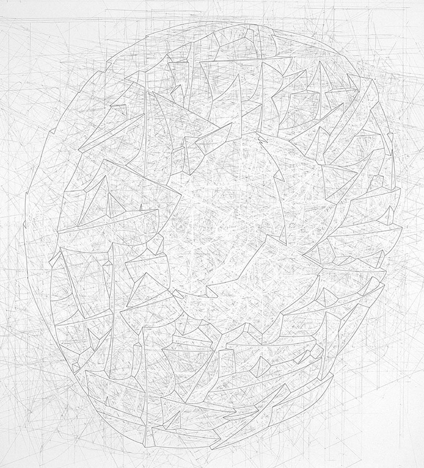
Figure 1: Richard Talbot, Random Moves, 1989, pencil and ink on paper, 120 x 120cm
The diagrammatic drawings of Richard Talbot present viewers with a palimpsest of their the own process of creation, or working-out. Each image sits embedded within a network of the construction lines and erasure marks from which it has arisen, and the artist himself suggests that this promotes the idea that the process of drawing itself can be considered the medium of his work, rather than the materials chosen to make the drawings (1).
I first discovered Richard's work in the book 'Writing on Drawing', a compilation of essays edited by Steve Garner, and published by Chicago University Press in 2013. (More information about the publication is available in a previous blog post: Diagrammatology: A reader.) Richard's contribution 'Drawing Connections', comprises chapter 3 of the book, and introduces his studio practice and academic research in to the theory, history and practice of perspective. As a second year PhD student in Kyoto I travelled to the UK at the end of the summer in 2013 as part of a research trip to interview artists and theoreticians working with diagrams. One of the highlights of the trip was the opportunity to talk with Richard in his beautiful studio and office in the distinctive, red-brick, double arches of Newcastle University's Gate Tower. 
The Arches viewed from the Quadrangle, Newcastle University.
MW: You originally had studied Astronomy and Physics ?
RT: I did, but realized early on that I had chosen the wrong subject. I noticed also that you had studied Biomedicine. MW: Yes, so I was immersed in diagrams, especially as I specialised in Biochemistry, which as a subject deals with diagrams on many levels. RT: Yes, when I was at school, all the chemistry diagrams and the glassware we used, I still find very exciting, it still gives me a buzz when I look at those diagrams. Also I suppose that Alchemical drawings which are in a sense diagrammatic, but which also refer to broader cultural aspects and spiritual things. But I think it is that combination of diagrammatic mixed with something else where things become very interesting. MW: Especially for the initiated few who can decode and read the Alchemical imagery and illustrations such as those in Michael Maier’s books. And you were also interested in optics and optical diagrams ?
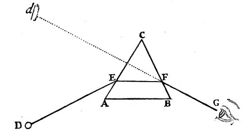
Figure 2: Ray diagram from 'OPTICKS: A treatise of the Reflections, Refractions, Inflections and Colours of light', Sir Isaac Newton (forth edition, 1730, Available online here)
RT: Again, I always was - by the geometric diagrams of optics: the eye, mirrors, the idea of ‘looking through’, I was interested by that whole system; the picture of the eye, the rays coming in to the eye, or out of the eye. I find all of those things exciting, and I think that it’s because you’re almost standing outside of the system, and you can see what this system is.
MW: That’s something I wanted to ask you about because you had mentioned that you were interested in landscapes, and the idea that maybe the drawings you make are detached, conceptual landscapes. I remember reading 'To the Lighthouse' by Virginia Woolf, and there’s a very short chapter in the middle of the book, which describes time passing in an empty room. But it does so from outside the book, from the detached perspective of an omnipotent narrator, an all seeing eye. I wondered if that was something you were interested in as an artist? RT: Yes, I think so. I suppose maybe it’s this kind of hyper-consciousness, just this thing, observing, and you just become very aware of time and space, and of yourself as a little entity within this. It’s almost as if time disappears. The other thing I remember reading a lot as a student was Nietzsche, and the image of time as a snake eating its tail. He called it ‘eternal recurrence’, where you’re trying to imagine that every moment could be relived exactly the same, so it kind of neutralizes time, because as animals we’re stuck with this as a problem and try to find strategies to overcome that sense of things in the future and things in the past. 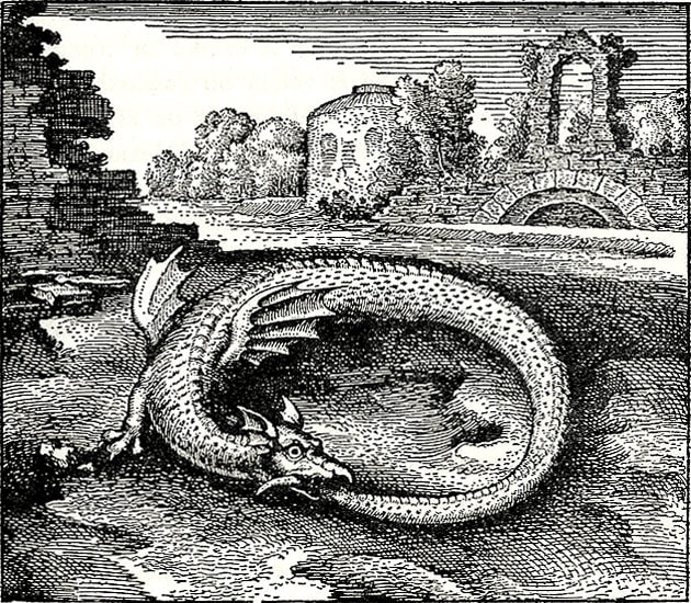
Figure 3: Michael Maier, Ouroboros, Emblem 14, Atlanta Fugens, 1617.
MW: I read that time was something that you would like to take out of your drawings, or perhaps avoid referencing in some way. Also, that you presented the objects in your drawings as Platonic forms, without any signs of wear and tear or reference to scale. RT: Yes, that’s right, I started off by making objects, but always found it really frustrating in terms of size, or what you make it with. But I suppose that a lot of the twentieth century was about that problem, about objects, and their separateness to us all. MW: Such as the use of Plinths to present work ? RT: Yes, for example Plinths. MW: So did you ever regard your sculptural works as models, as a way to perhaps overcome these issues ? RT: I suppose I did think of them as 3 dimensional diagrams, but then I suppose that made me unhappy about the materials they were made from. I always imagined whether perhaps it could be made out of perfect marble perhaps. MW: I started to consider making works from elemental materials, such as aluminium or carbon, just to try to deal with the problem of simplifying or neutralizing that issue of materiality. One of the 3 dimensional works that you made called ‘boat’ was made out of rubber wasn’t it ? Hanging as a collapsed frame on the wall, the skeletal form of a boat. 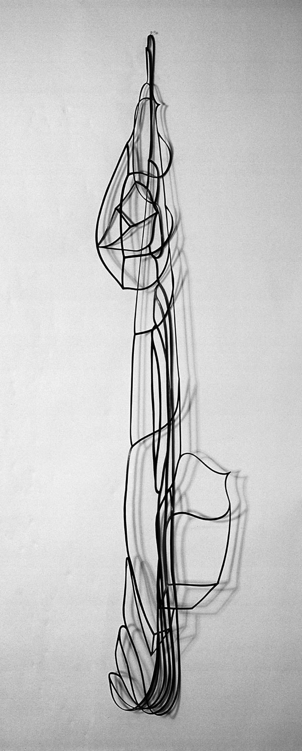
Figure 4: Richard Talbot, Boat, rubber, 180 x 30 x 10 cm
RT: Yes, it’s funny that that particular series of works didn’t end up going anywhere; I’m just trying to remember what the actual sequence was. I think sometime in the early eighties, I was put forward for a commission; it was one of those completely random invitations to do something. It was for the Savoy Hotel. It was one of those awkward things of, well, do you design sculpture, or do you use something you’ve already got? So I started playing around with drawings and making cutouts from drawings of things. I ended up with some large sheets of rubber and started cutting it out to see whether it was something I could use. I didn’t intend to end up with something which would hang on the wall, but I did that in the studio by putting it to one side, and it’s quite extraordinary how that works. So it was quite accidental, but was just the recognition of having taken it in to that different area that I didn’t have any control of, so it was quite accidental. It was all cut by hand, so it was a very crisp line cut with a scalpel. MW: About your working process, you wrote very beautifully about that initial process of orientation, the initial white sheet that you approach, and the infinite possibilities you’re faced with - setting up some kind of initial starting conditions. You used the analogy of the Gothic Cathedral with its ground plans, and then the more organic process of construction that follows that. There was also another article in the same book (Writing on Drawing: Essays on Drawing Practice and Research) by Terry Rosenberg about ideational drawing, a process of drawing which I though really suited your work very well. RT: Yes, I mean I must say that I haven’t read fully all of the articles in that book, but have skimmed through them. MW: There were a couple of essays that really stood out for me personally, yours and Terry Rosenberg’s. I enjoyed the way you talked about your use of perspective, not as a tool to create realistic drawings, but as a tool to allow you to use your intuition. RT: Well I think that also goes back to that idea of self-consciousness, sort of knowing that you’re this entity that looks at something from the outside. I used to play around with spatial perspectives, and then I thought that actually one way of neutralizing these issues was just to use it, just to actually use the system. So that to get over that whole issue of viewpoint, for example when you make a piece of sculpture, how do you look at it ? If there’s no best side as it were. So I thought, well if I just take it on full, this issue of perspective, and to absolutely use it as it was set up to use, then it falls by the way side, as an issue. MW: Turning the problem in to part of the solution? RT: I think it’s like sometimes in Mathematics, when a problem can’t be solved directly, they will call on a tool from other part of mathematics, and using that tool they can then move from one place to another. But in the end result, that tool disappears, it doesn’t ultimately play a part in the answer, but it has been a useful tool to get you from one place to another. MW: That reminds me of the role enzymes play in Biochemistry. They’re completely essential to facilitating the process, but don’t take part in a reaction in a way that they are altered themselves in the outcome. RT: Yes, that’s right, yes. So it is a kind of a vehicle, but then it’s using that perspective that makes me then question how it was originally used in the Renaissance, because when you’re actually working with it on the paper, there are so many interesting things actually going on that art historian looking in from the outside wouldn’t grasp. And it is to do with that idea of play, between the diagrammatic and the spatial element. Perspective isn’t all about creating a space, it is about the surface and how these things operate 2 dimensionally as well. 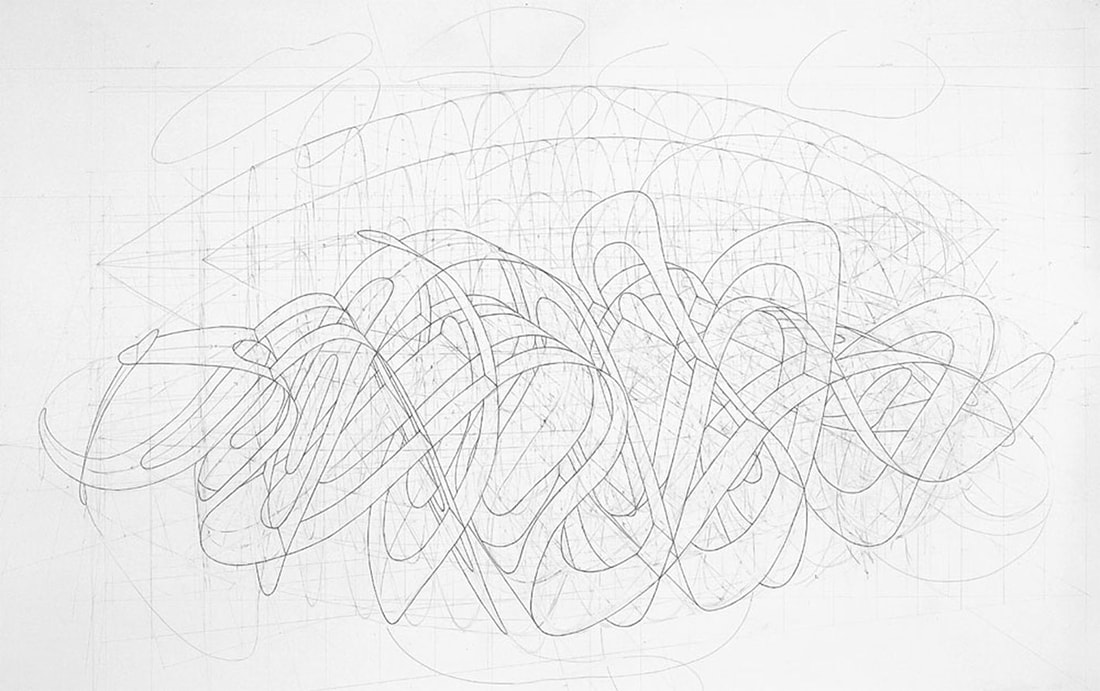
Figure 5, Richard Talbot, Missing the Target, 1989, pencil on paper, 140 x 80 cm
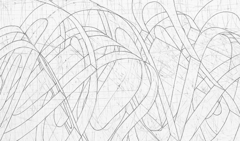
Figure 5, Missing the Target (Detail)
MW: I was very interested in the way you talked about the depth of space in your drawings, and not using deep space, but keeping things relatively shallow and immediate. RT: Yes, I think that this also relates to my sense of what these Renaissance artists were doing. The picture that is portrayed of perspective is all about getting everything in terms of the horizon. But I don’t actually think that’s it at all. You are really working in a really shallow space. All those Renaissance paintings are also working in a really shallow space, and I think when you’re actually constructing that on the paper, there’s a real, almost physical connection to the space. MW: I don’t normally use colour in my work, it’s actually something I avoid, and have for a long time. Then I came across a book by David Batchelor called Chromophobia. He was writing about colour and how it has been perceived as the additional, the exotic, the lipstick. Or at least that’s how it was regarded by artists and writers who saw it as extraneous. And so I’m interested to ask you how you deal with colour in your work. RT: Well I have to admit as to having always avoided it, as I’ve never understood it. It’s a complete mystery. If I was making a drawing, I can’t see any reason to use colour. But then equally I probably can’t see any reason not to use it. But then I would probably be thinking well, why do I ? But then I know with somebody like Michael Craig Martin, I suppose he’s somebody in the seventies who was producing very austere, paired down work, such as his linear drawings, which were initially all black and white. But then he probably just stopped worrying and started to use incredibly strong colours in his work. And now the colour is really significant to his work. But its interesting that Michael Craig Martin was taught by Joseph Albers. MW: That’s interesting, I didn’t know that. RT: Yes, at Yale. So he would have had a real grounding in colour, and it’s almost as if he, you know – 30 years later or whatever it was – just decided to start using these colours. It is odd how we set rules for ourselves and at the time we kind of need them, but occasionally we just think ‘drop them’, and stop worrying about them. 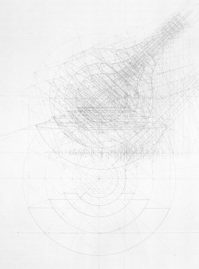
Figure 6, Richard, Glass, 1989, pencil on paper, 110 x 100 cm
MW: There were a number of times when looking at your works and reading what you wrote about them that reminded me of mathematics, and the idea of skeletonized forms. The idea of an equation, where the aim is to remove as much information as possible and leave only the knowledge - the process of essentializing something. Also the way that you talk about using intuition, and how intuition can be very immediate, or how it can require you to put the work away for many years. A slow boiler that you come back to much later. Is mathematics something you’re interested in? Or is it restricted to geometry, or patterns of thought? RT: Yes, I’m interested, not in the sense of reading books on mathematics, but when I’m near mathematicians and they talk about what they are doing, I do feel an affinity with what they are doing, and I suppose that with my drawings, they become very complex, but I do have that hankering after something really, really simple. I do have this idea that one day I’ll just be able to draw a line, and that that will be the finish! And in a way I suppose you do occasionally see it in some art works – and think that that is just an extraordinary piece of drawing, but then that in a way embodies everything they’ve ever done – 40 years later they’ve managed to make this extraordinary thing ! MW: Richard Dawkins wrote a while ago about the idea of a conceptual space containing all possible genetic variations, a kind of hyper-space of all possible genetic forms, and I was always fascinated by that idea. I think that also Douglas Hofsteader in Goedel Escher Bach, described the idea that Bach, in composing, had the ability to look over all the millions, well almost infinite combinations of musical notes, and was able to see patterns, islands or constellations of musical forms. And I wondered if that idea was perhaps something you were interested in. A vaguely discernible, fuzzy possibility of the form you’re searching for, and how this idea relates to diagrammatic forms. 
Figure 7: Richard Talbot: Step up, step down, pencil on paper, 120 x 120 cm
RT: Yes, I think that is definitely true, and I suppose that one of the things I am aware of is that in some ways, the drawings all start from the same point. That blank paper, that orientation. MW: The tabula-rasa ? RT: Absolutely, and you know that it could go in a completely infinite number of directions, and yet there is a sense that there is some solution there - that you setting things up. It becomes very obvious sometimes. I wouldn’t compare myself to Bach, but I can see that way of thinking - that there is an infinite number of possibilities, but you alight on a particular form that is true for you in one sense or another. It’s hard to really articulate that process.
MW: How would you describe the relationship between the forms in your drawings and the marks which make up the background from which the image appears ?
RT: I think when I first started using perspective I was still in that mindset of drawing objects as things in space, but then quite quickly I became aware of how potent the workings-out - you know, the plans, the elevations and so on - how potent they were and how they were working with the kind of forms which were being described. It was also in trying to pin things down, I became aware of the balance between leaving things open ended and tying something down and saying ‘this is that form’. It was that form, but not in such a positive or fixed way. I stopped using ink on the drawings. I was using ink to go around the forms I was building, but that stopped. And so I started getting a much more subtle interplay between the workings out, and those workings out would be the plans, and elevations, and a myriad of other kind of connections which were being built, a kind of scaffolding. MW: And you saw inking in as a kind of finishing process ? RT: I did. You know you suddenly think that it has in a way killed off the drawings. Not inking became a way to leave the drawing as an open-ended thing. Perhaps when a work is too ‘closed down’ it can end up being very uninteresting. For example Raphael. I’ve never enjoyed looking at Raphael’s paintings because they seem so overly fixed, whereas, Piero de la Francesca’s paintings seem almost as if they are propositions. 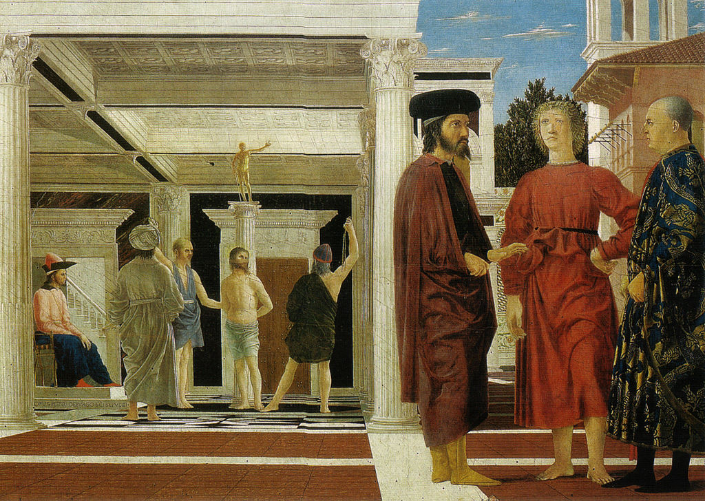
Figure 8: Piero della Francesca, Flagellation of Christ, c.1468-70,
Oil and tempera on panel, 58.4 x 81.5 cm
Figures 9a,b, Diagrammatic Study of Piero della Francesca:
The Flagellation of Christ (outline and outline proportions) Courtesy of Richard Talbot. MW: Very early on in coming up with the questions that I wanted to ask in my PhD, I pretty much hit the same problem you did in realizing that I had always studied sculpture, but always made drawings. And I thought of the drawings as sculptural drawings and, luckily for me, my teachers at the time thought the same. So I had to decide whether to investigate the relationship between 2D and 3D diagrams - and thus include sculpture, or the way in which artists use diagrammatic image making to a romantic end, a subjective end; the way in which Marcel Duchamp played subject against object and also struggled with the issues of dimensionality. Where do you stand in terms of subject and object ? RT: Yes, well I don’t think I would come down either way, because I don’t think that coming down on either side actually gets you anywhere. I suppose that in my student days, this dilemma about the objective and subjective was helped by there being, at Goldsmiths - which was something which was great about Goldsmiths at that time - was that there was a huge range of practice within the staff. So you did have conversations with people who were systems thinkers, right through to people who were watercolour, or landscape painters. People weren’t trying to ram the stuff down your throat; you were just having these interesting conversations, and then weighing it up about your own situation. Thinking about what you were doing, what you thought you were trying to do, what you were actually doing ! You know, all those worries you have about, you know, ‘is it art ?’ I found myself really being able to make work when I stopped worrying about what side of the fence I was on, and finding a way of working where I felt as if I wasn’t having to choose one way or the other. But both sides of me could be involved in that hankering after perfection. It’s a case of playing these things off against each other. I distinctly remember that when I did my MA at Chelsea, the external assessor we had was Paul Neagu, I think he’s dead now, but he was very well known. He was one of the artists who Richard Demarco brought to this country, alongside such artists as Joseph Beuys. Anyway I remember that the work I’d made at Chelsea had become really quite austere, and extremely minimal, and he said… ‘don’t forget the other side of yourself’, and I realized exactly what it was he meant. That we can easily kind of forget. But then I think that also we need those extremes sometimes, to realize something. We need to go beyond in order to know where the edge was. It’s only when you fall over the edge that your realize there was one ! MW: So there is actually nothing within your body of work that you see as a mathematical proof, some foundation to build upon ? RT: No, I would certainly never say that there is anything that I’m demonstrating that is mathematical, no. I could say that when I was at Goldsmiths, I was taught by people who were involved in systems, and there were several people I knew, for example Malcolm Hughes working at the Slade, who had students working with experimental systems, building computers to generate paintings and so on; and I always felt that there was a problem in that they knew the kind of thing they were aiming for, and that it just seemed as if, well, you could make that painting without that system. It was almost as if they were using that system as almost a ‘get out’. The paintings would always end up looking like lots of other abstract constructive paintings that weren’t made with a system, that were just made purely intuitively. And so I have a distrust of the idea of a system, and I think that that system is always, ultimately being driven by you.
MW: What are you working on at the moment ? RT: Well apart form being heavily tied up in administration, I’ve finished some drawings and I’ve also been playing with film and video, which I can show you if you want. It’s very long drawing, based on a system in a sense, and was a definite play on the standard idea of a single viewer’s perspective. They start with a really basic perspective grid, a ‘unit’, drawn in such a way that I can simply add these units together and extend the space in any direction. Strangely, it adds the possibility of time, in that your eye can travel along the drawing and the space continues always to make sense. The video is another simple grid that is constantly shifting from the 2 dimensional surface in to the 3 dimensional image. Originally I had intended it to be projected on to a screen, but then I had the chance to project it in one of the large spaces downstairs, and the results were quite extraordinary - because it did actually become part of the space, which wasn’t fully intentional, but those were the results. The question of the artist’s intention is also an interesting problem I think within the history of perspective; the well-known analyses of key renaissance paintings demonstrate that the spaces in the paintings are sometimes not quite what they seem to be. There is often some uncertainty, yet it is usually thought that perspective is fixed - that it's an unambiguous and rational thing. 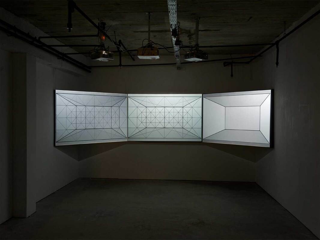
Figure 10: Richard Talbot, All depth, no substance, 2013, Installation view
MW: Watching the video feels like a trying to solve a puzzle in perspective, there are moments when the lines are like a 2 dimensional pattern of shifting compositions, and then suddenly something in the visual cortex takes over and there’s the impression of instant depth from those very same lines. It reminds me of watching animations of higher dimensional cubes rotating. You think you have understood what is happening and there’s a sudden unexpected shift, you have to grapple with different kinds of depths. RT: Well - I don’t know - It’s to do with my intention, I’m not settling down to produce something which has a specific result. I know they do result in that, but I’m not setting out to do that. I am showing this work – I’ve never tried it before. I hope it works… It’s actually going to be projected on to three screens, the same image, butted up against itself, but slightly out of synch. So the whole thing will be ‘shifting’, so that a more complex thing will be going on. I have no idea what it will look like – it might just look awful, but then I’m trying it – for this show. Grid from Richard Talbot on Vimeo.
Richard Talbot's diagrammatic drawings are further discussed in chapter 3.5 of my PhD thesis, which is available to down load here.
Richard's academic studies in to the origins of linear perspective can be downloaded by clicking on the following link:
Finally, below are a series of Piero della Francesca's own diagrammatic studies from his book 'De prospectiva pingendi: a treatise on perspective' c 1470 - 1492. The treatise, divided into three books, provides detailed, mathematical instructions, illustrated with numerous diagrams, for creating realistic perspective in illustrations. It was widely known among artists (such as Albrecht Dürer), but also in an academic milieu, where the copies of the Latin translation are thought to have circulated. The book is available to view online at the British Library here.
References:
1) Talbot,R. (2008) Drawings Connections, In: Writing on Drawing: Essays on drawing practice and research (2008) Intellect Books, UK: Bristol, p.55. 2) Hughes, R. 1980, The Shock of the New, London: Penguin Random House Company, p.17.
0 Comments
❉ Blog number 17 on diagrams in art and culture covers some of the ideas, images and research projects I discovered during a spring-time residency on the island of Jeju in South Korea. The two new drawings I developed following my stay there were on show in a group exhibition at the Chusa Memorial Museum from Oct 15th - Nov 17th, 2019. 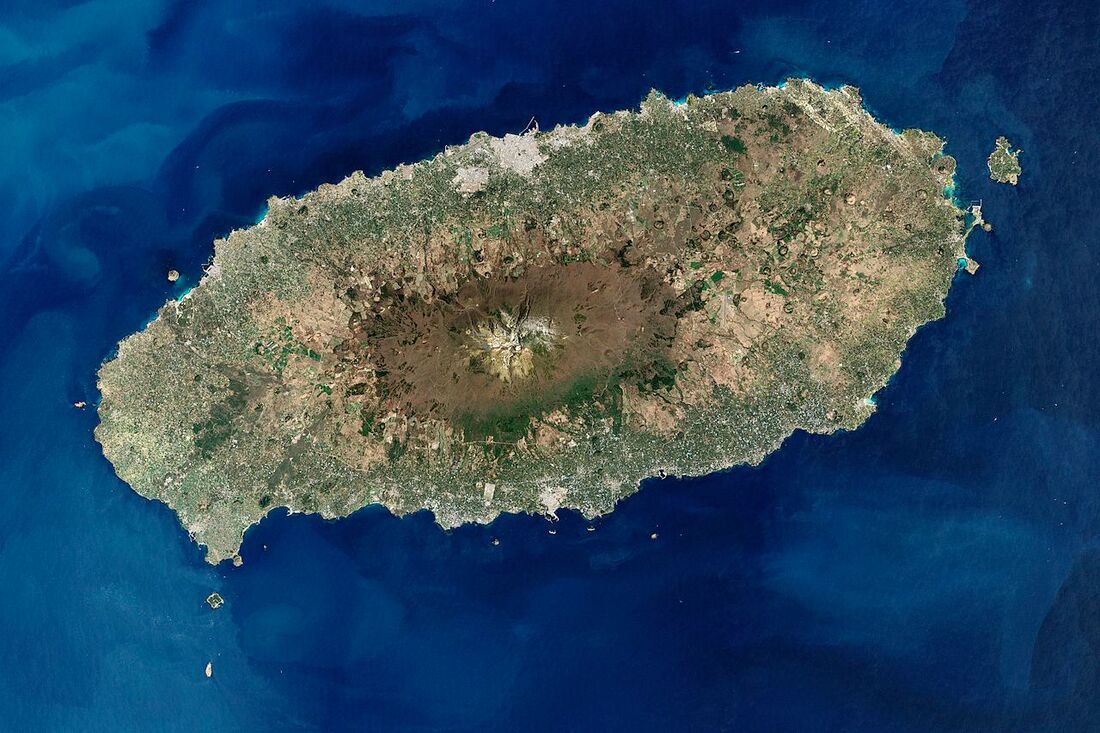
figure 1: NASA image of Jeju Island
( United States Geological Survey Landsat data, Robert Simmon, Google Earth, 2000 )
In the spring of 2019, I travelled to Jeju island, an eye-shaped volcanic landmass staring upwards off the southern coast of the Korean peninsula. I'd been invited by the Korean artist Mikyung Oh and her husband, the sculptor Do il, to take part in a group residency in connection with the Chusa Memorial Museum, during which time the selected artists were asked to respond to the works of the legendary Korean scholar and calligrapher after whom the museum is named (fig. 2).
Mikyung and Do il's main studios are in Yongin city just south of Seoul, but they travel regularly with their daughter Yule to Mikyung's hometown on Jeju to maintain the family tangerine orchard. The residency program is run from Mikyung's family home there, alongside a barn converted by Do il in to studio space. Once all the artists had arrived at the orchard we were welcomed by a Kayagum concert held beneath the heavy bows of one of Jeju's ancient Hackberry trees. Afterwards, we set about exploring the island and learning more about it's most famous historical resident Chusa Kim Jeong-hui, exiled scholar and man with two hundred names.
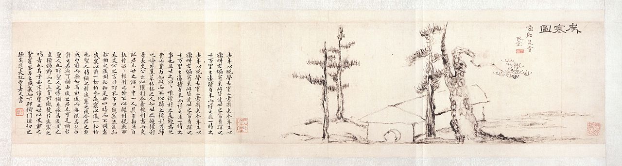
figure 3: Chusa Kim Jeong-hui’s masterpiece Sehando (A Winter scene),
1844, National Treasure #180 ( public domain )
Geology and the molten roots of an island
|
||||||||||||||||||||||||||||||||||||||||
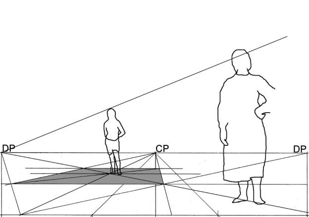
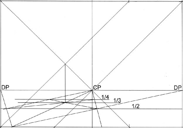
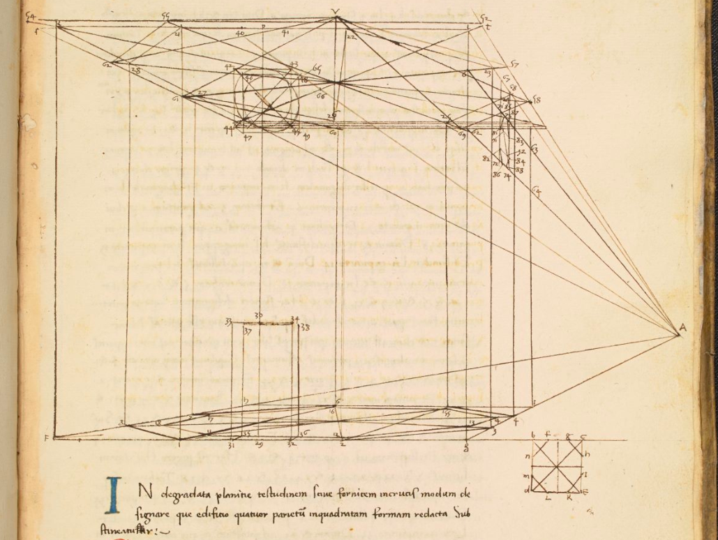
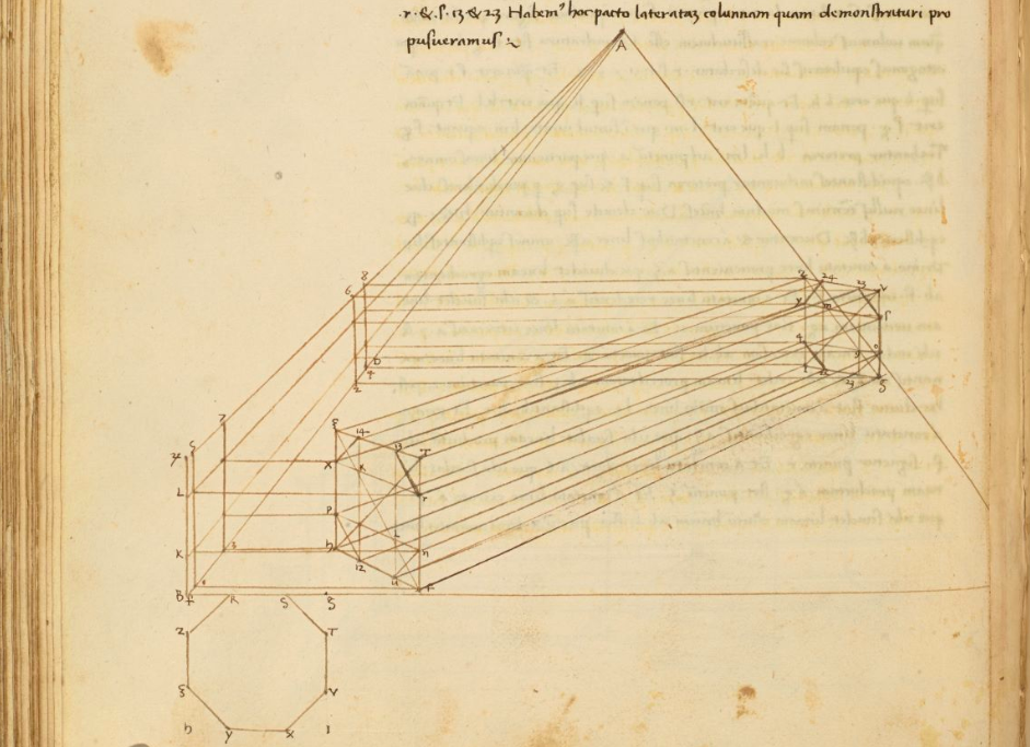


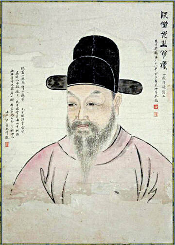
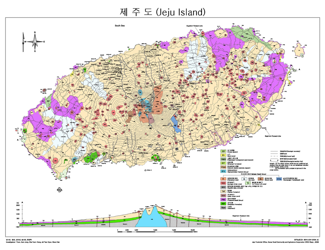
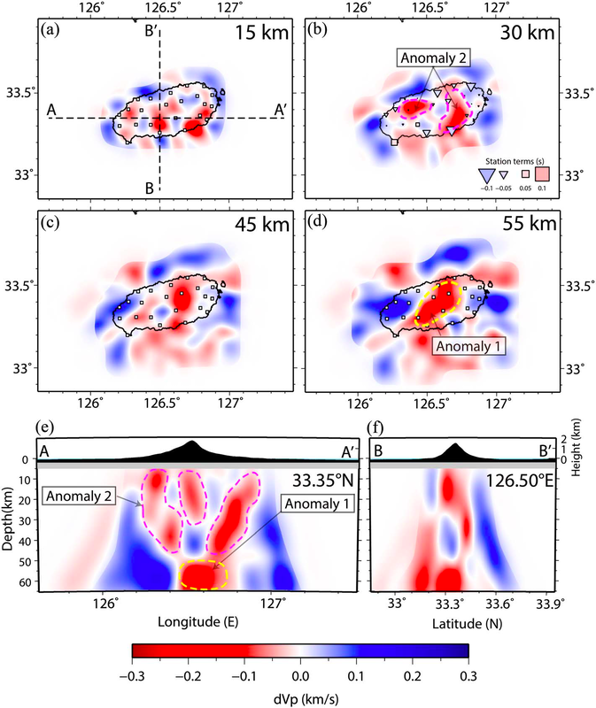
figure 6: Diagrams of Lithospheric Structures Beneath Jeju Island
Image courtesy of Jung-Hun Song (CC BY-NC-ND 4.0) |
Between 2013 and 2015, a team of Geologists from Seoul and Busan used 20 seismographic stations across the island to record waves passing through the earth from the 484 different earthquakes that had occurred in neighboring regions during that period.
Earthquake waves are known to travel at different speeds through different types of rock. By carefully comparing the arrival times of the waves at each station against which routes they had taken through the earth, (a process known as 'Teleseismic Traveltime Tomography'), the scientists were able to model the enormous bodies of magma beneath Jeju, giving us our first look at the vast molten roots of the island and a clearer understanding of how these systems develop (fig. 6). |
The geology and vegetation of Jeju are in fact so unusual, that large tracts of the island are now protected by law under Unesco World Heritage status. One of the island's major geological features was unwittingly discovered by a farmer installing electricity cables, who watched as one of his posts vanished in to the ground before him. The pole had broken through the roof of a cavernous Lava-tube full of rare rock formations, and large sections of these tunnels are now open to the public, with others being continually discovered thanks to less invasive techniques such as ground penetrating radar.
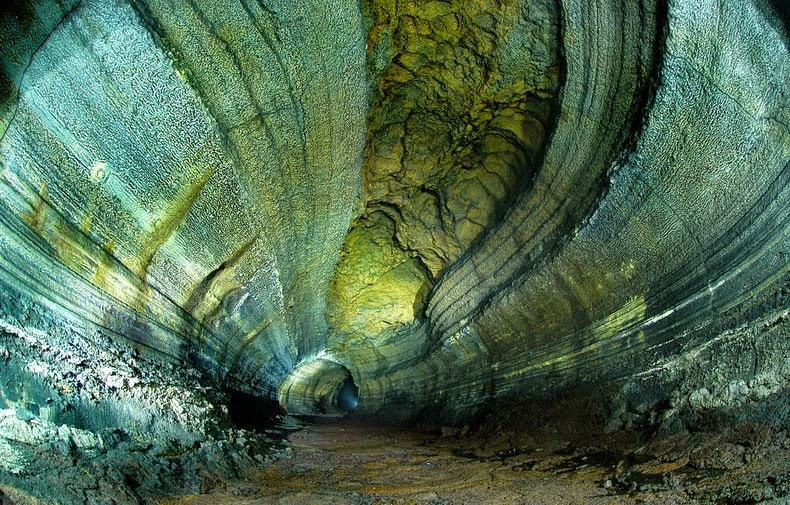
figure7: Section of a lava tube system in the North East of Jeju island
Biology and the genetic roots the orchid
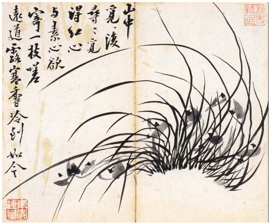
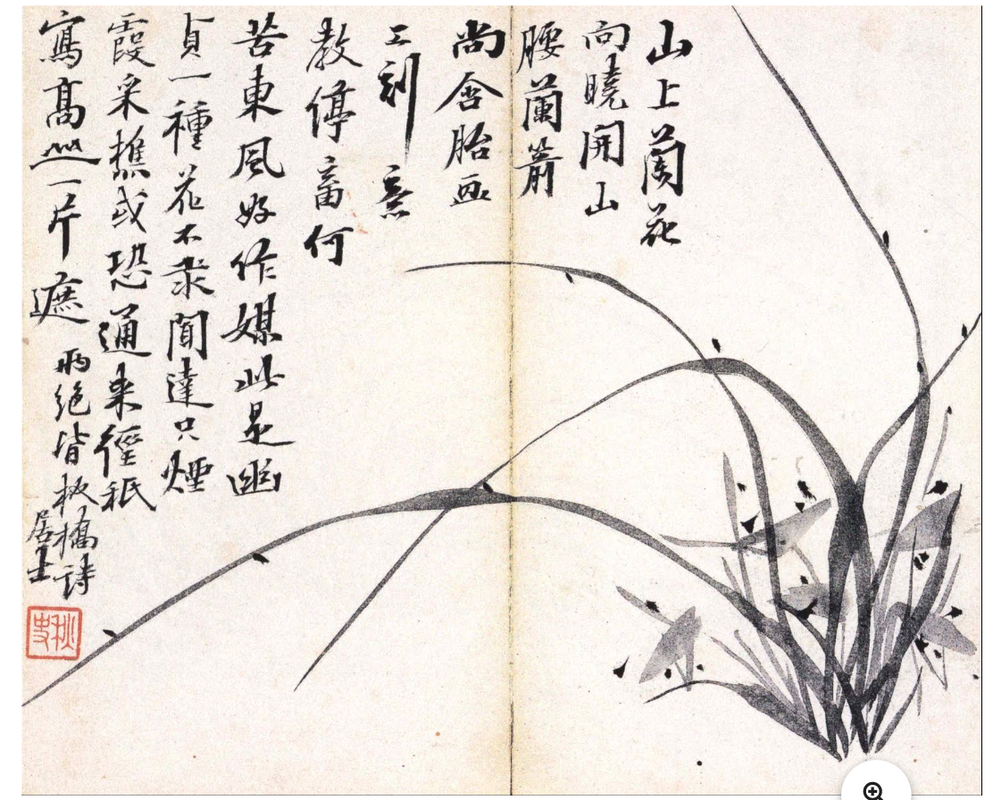
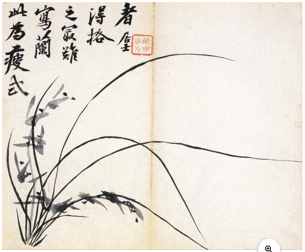
During his time on Jeju, Chusa wrote letters and poems to friends and students, taught classes at a local school and wandered the island to pick tea leaves and sketch the local orchids. One of the ‘four noble gentlemen’ of traditional Chinese painting, orchids are renowned for their ability to grow and blossoms in barren environments, and scholar-artists used them as a visual metaphor for resilience, nobility and humility, and as a symbol of friendship and loyalty.
Chusa's brush of choice was made of rat’s whiskers, a material which he found combined strength with sensitivity, and also allowed him to abruptly change the direction of his stroke whilst painting. With each new painting he would often coin a new 'Ho' or pen-name when signing the piece, to suggest a particular persona in association with the image.
Chusa's brush of choice was made of rat’s whiskers, a material which he found combined strength with sensitivity, and also allowed him to abruptly change the direction of his stroke whilst painting. With each new painting he would often coin a new 'Ho' or pen-name when signing the piece, to suggest a particular persona in association with the image.
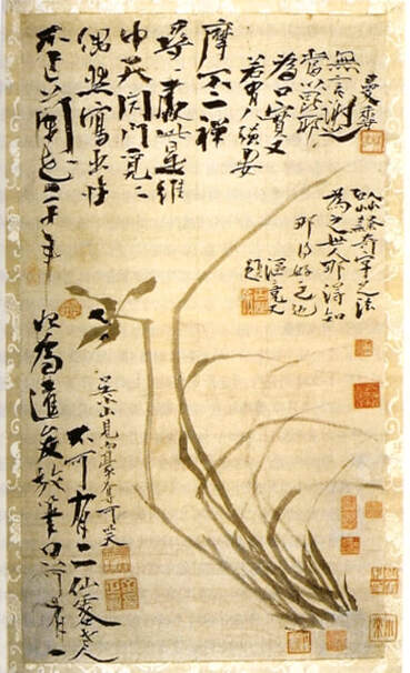
figure 8: Orchid painting, Chusa
(unknown date, public domain) |
Over his life time Chusa created over 200 different pen-names for his calligraphy, poems and paintings, and according to his own accounts, in his 70 years he wore down 10 ink stones and 1,000 brushes whilst developing the distinctive Chusa style or 'Chusache'.
His most famous orchid masterpiece is said to have been made after not having painted a single orchid for 20 years, created in an absent minded moment as a gift for his young servant (figure 8). It's unlikely that his servant appreciated what he'd been given, but a local artisan certainly knew it's worth and continued to beg and pester Chusa for the scroll until it suddenly one day disappeared. Later, Chusa wryly added this tale to the painting itself in his unique 'Chusache' script (fig. 8). |
Thanks to their ability to migrate and develop to suit different conditions, orchids have evolved in to an extraordinarily diverse family of plants. Their highly specialised roots have allowed them to colonize not only the inhospitable lava rocks and quick draining soils of Jeju, but almost every habitat on Earth, except Antarctica.
Around 10% of all flowering plants species are now known to be orchids, with somewhere between 20,000 and 30,000 species and over 70,000 hybrids and cultivars. Scientists are currently in the process of mapping out the extensive evolutionary lineage of orchids and in 2017, a study published in Nature Magazine announced that an international consortium of researchers had sequenced the genome of Apostasia shenzhenica, a primitive 'Grass Orchid' whose appearance is only barely recognisable as an orchid.
By comparing it's genome with known sequences in other species, they were able to estimate the time at which it diverged or 'split off' from other orchids. Their study also gives us a better idea of when the 'Most Recent Common Ancestor' (MRCA) of all orchids existed, now believed to be around 200 million years ago at the dawn of the age of the dinosaurs (figure 9).
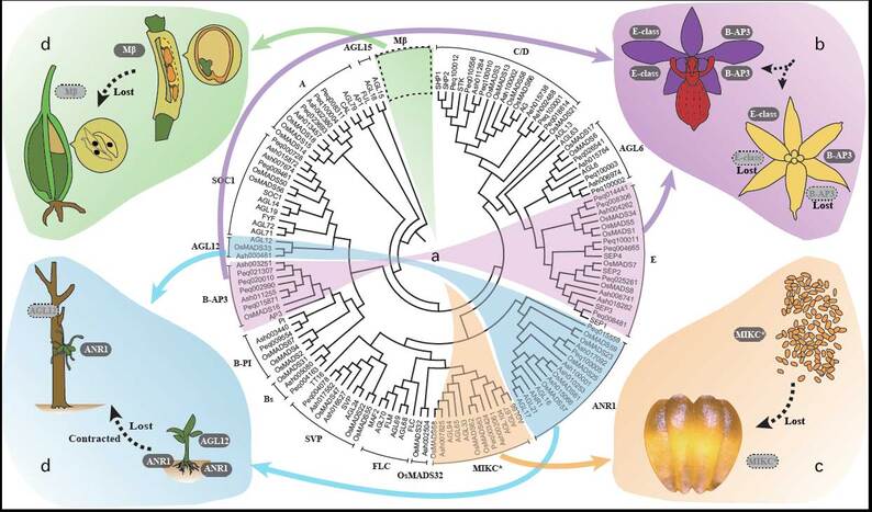
figure 9: Phylogenetic tree diagram of MADS-box genes involved in orchid morphological evolution.
Image courtesy of Jie-Yu Wang and Rolf Lohaus (CC BY 4.0)
Critical appreciation of traditional Korean painting often involves an awareness of the negative space or unpainted regions of an art work, and several of Chusa's orchid paintings use the white of the paper at the base of the leaves and stalks to suggest the terrain in which the flower grew (see below).
In developing the two new drawings for the residency on Jeju, I was interested in the notion of absence within an image - what an artist chooses to show and chooses not to, but also in terms of what can be said to lie hidden behind the surface appearance of the things which surround us.
Written within the fabric of nature is evidence of innumerable events that occurred in deep geological and evolutionary time in order for the volcanoes and orchids to exist, and it's only by means of years of collaborative investigation and ingenious new techniques, that we have come to be able to detect and decipher them.
As geologists diagram the molten roots beneath the rock on which Chusa wandered, and geneticists piece together the genetic roots which underlie each of Chusa's orchids, we have come to realise that these structures stretch backwards through space and time in ways that Chusa could never have imagined.
Below are high resolution images of each finished drawing, which can be viewed in detail using the control icons to the right of each image. Beneath these are a collection of Chusa's own orchid paintings, which now comprise a digitized collection available online here as part of Google's Arts and Culture Project.
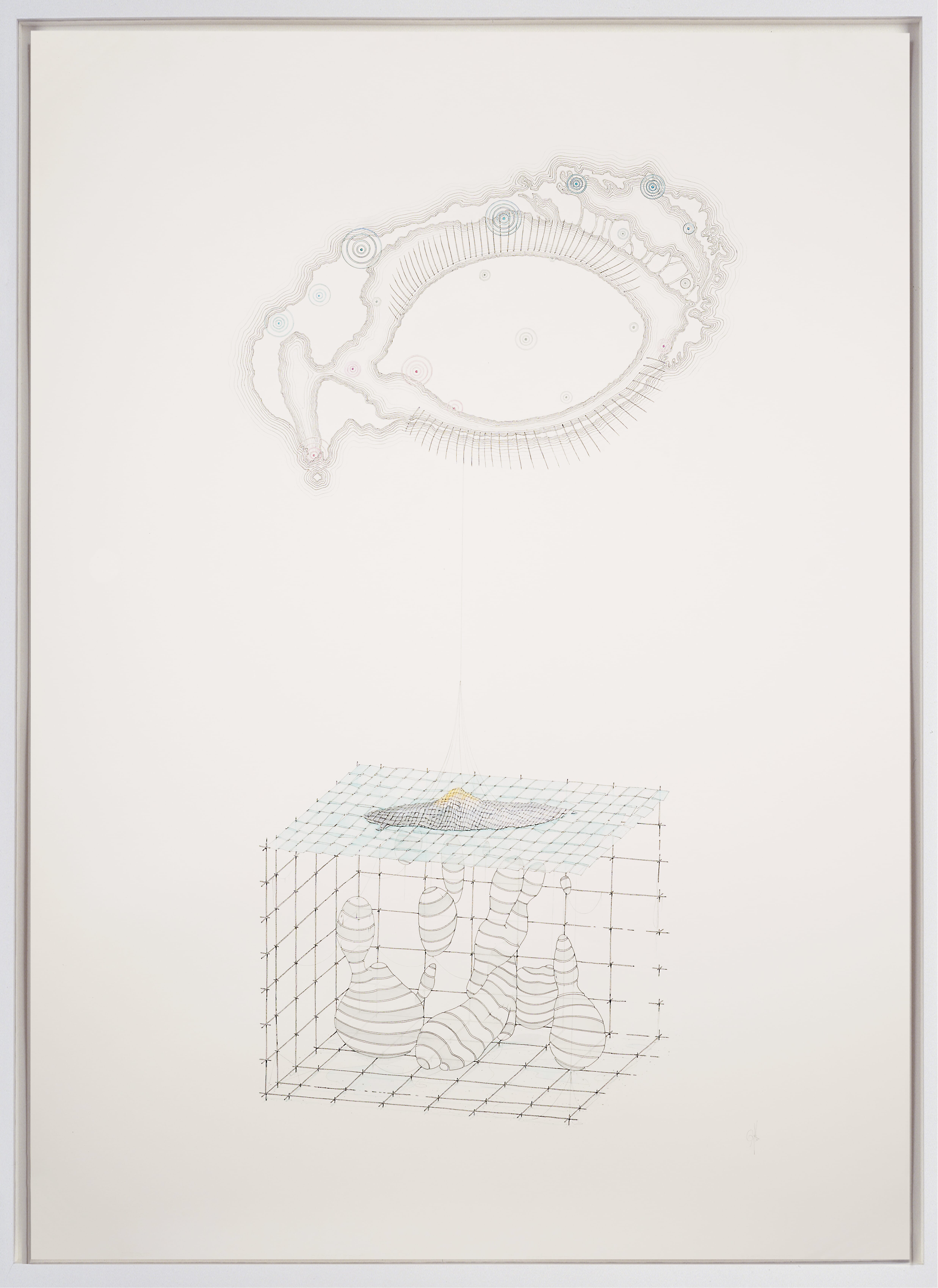
Tear glands, tear ducts, tear drops
(Lacrimal gland and ducts with Lithospheric anomalies)
Michael Whittle, 2019, Ink pencil and watercolour on paper, 111.2 x 78.9 cm
References:
Jung-Hun Song et.al., 2018, Imaging of Lithospheric Structure Beneath Jeju Volcanic Island by Teleseismic Traveltime Tomography, Journal of Geophysical Research: Solid Earth, 10.1029.
Online: https://doi.org/10.1029/2018JB015979
Jung-Hun Song et.al., 2018, Imaging of Lithospheric Structure Beneath Jeju Volcanic Island by Teleseismic Traveltime Tomography, Journal of Geophysical Research: Solid Earth, 10.1029.
Online: https://doi.org/10.1029/2018JB015979
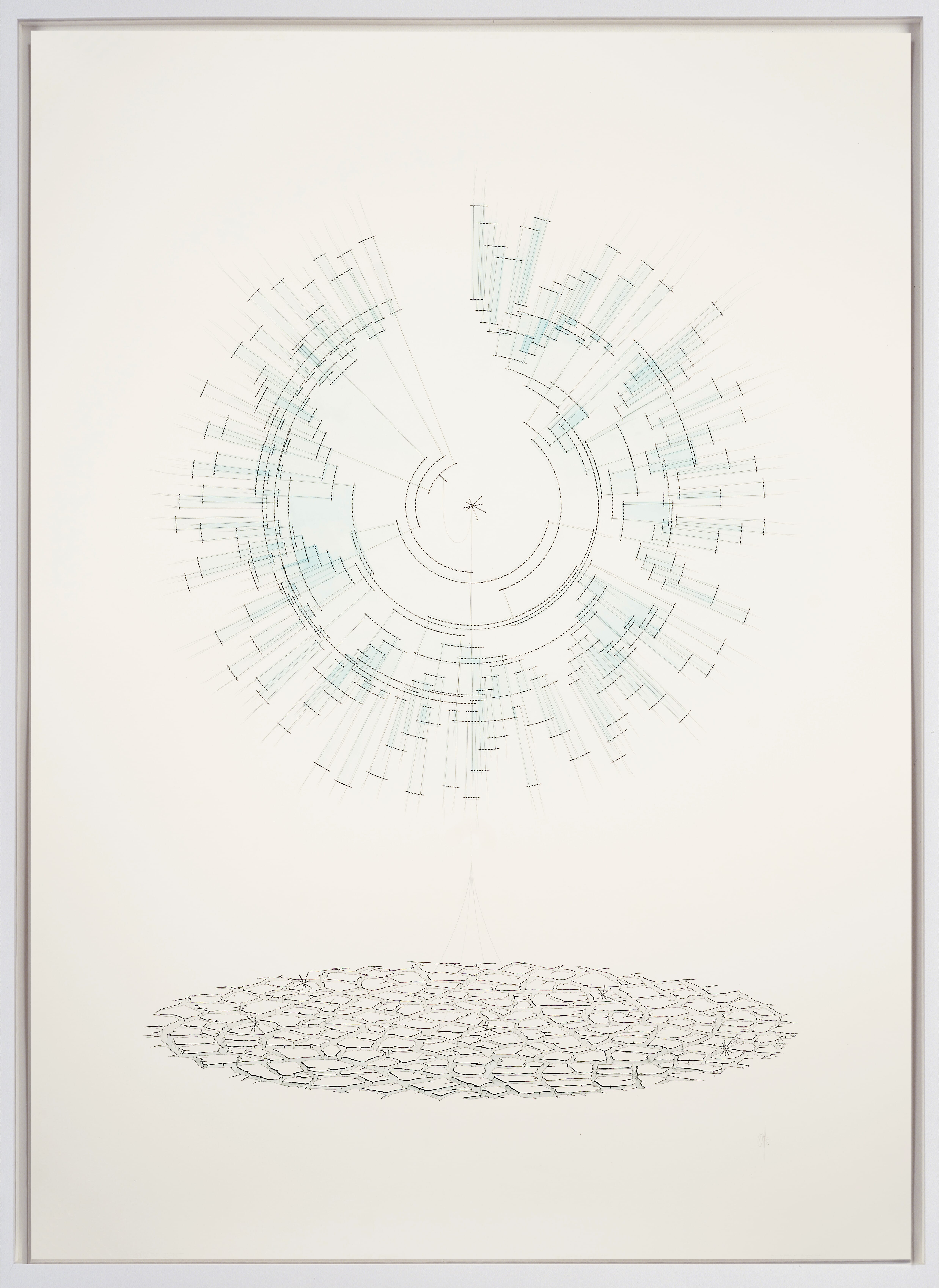
The roots of the Orchid
(Divergent phylogenetic tree with common ancestor and desiccation)
Michel Whittle, 2019, Ink pencil and watercolour on paper, 111.2 x 78.9 cm
References:
Guo-Qiang Zhang et.al., 2017, The Apostasia genome and the evolution of orchids. Nature 549: 379-383
Online: https://rdcu.be/bUj7h
Guo-Qiang Zhang et.al., 2017, The Apostasia genome and the evolution of orchids. Nature 549: 379-383
Online: https://rdcu.be/bUj7h
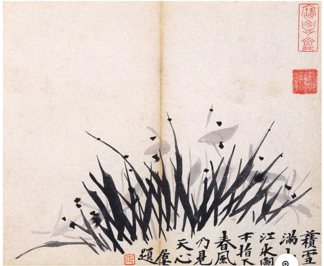
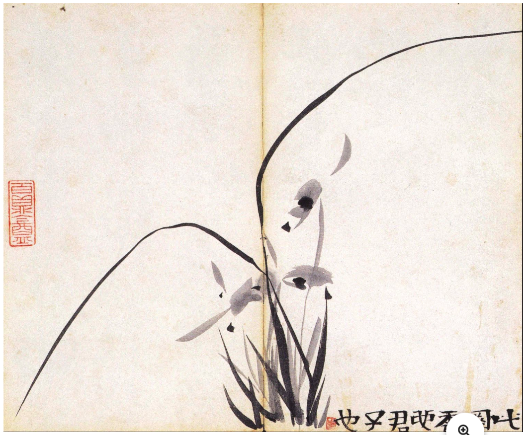
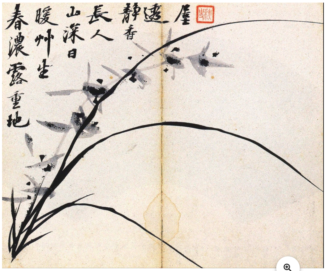
Chusa's Orchids:


❉ Blog post 14 on diagrams in the arts and sciences considers the role of diagrams in theoretical and particle physics, as powerful conceptual tools to gain unexpected insights in to the fundamental nature of reality.
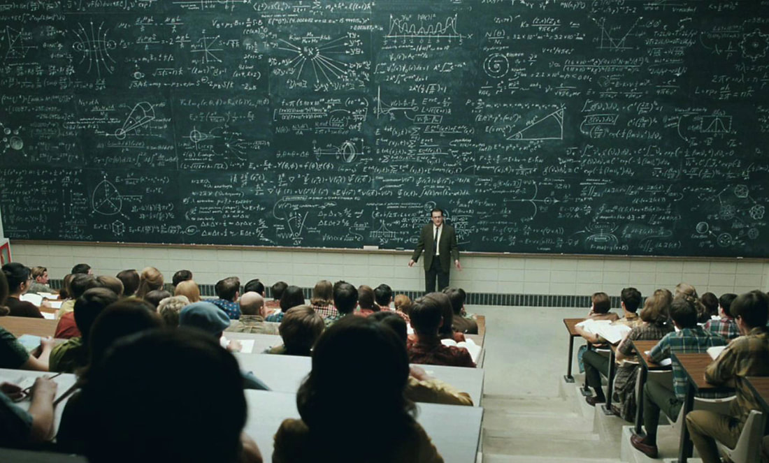
Figure 1: Lecture scene from the Coen Brother's Academy Award winning file 'A serious Man', 2009.
The previous blog looked at some of the difficulties involved in diagramming ideal geometric forms in mathematics, and how the natural limits to human vision affects the accuracy of their interpretation. Despite such shortcomings, diagrams still play an extraordinary variety of roles at the frontiers of mathematical knowledge production, where they help fathom some of the most complex patterns the human minds is capable of comprehending.
Mathematician, astronomer and physicist C.F. Gauss famously asserted that: "Mathematics is the Queen of the Sciences, and Arithmetic the Queen of Mathematics. She often condescends to render service to Astronomy and other natural sciences, but under all circumstances the first place is her due." (1)
Mathematician, astronomer and physicist C.F. Gauss famously asserted that: "Mathematics is the Queen of the Sciences, and Arithmetic the Queen of Mathematics. She often condescends to render service to Astronomy and other natural sciences, but under all circumstances the first place is her due." (1)
This notion of mathematics in service to science is most discernible in the intimate relationship between maths and physics. In the introduction to Eric Temple Bell's book 'Mathematics - Queen and Servant of Science', titled in reference to Gauss, we're reminded how important advances in pure mathematics have sometimes found application many years after the initial discoveries were made. Without the non-Euclidean Geometry that Riemann developed in 1854, for example, Einstein would have been unable to state his theory of General Relativity and Gravitation in 1916.
While mathematics may still retains a position of sovereignty within contemporary science, the relationship is no longer so one sided. Research in contemporary physics has developed such a rich and sophisticated mathematical language of its own that it's quite capable of inspiring insights within the field of mathematics itself.
The sheer complexity of the calculations involved in string theory for example, lead physics titan Edward Witten to describe them as a bit of 21st century physics that somehow dropped into the 20th century. Witten's own work in string theory was revolutionary and led Witten to mathematical results so profound that he become the first physicist to be awarded the Fields medal for mathematics in 1990.
With this in mind, this blog entry considers some of the most profound, mysterious and powerful diagram in physics, diagrams which seem to transcend their mathematical origins and function at meta-levels in terms of their efficiency and the value of their insights.
The first and most iconic example of such diagrams is the Feynman diagram, named after the American physicist Richard Feynman (1918-88). Feynman was the eccentric 'genius's genius' with a legendary reputation for creative problem solving and the ability to teach the complexities of quantum physics to students and non-physicists.
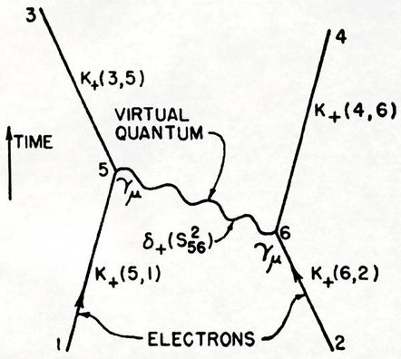 Figure 2: One of the earliest published Feynman diagrams (Sightings, Sept. 2003) depicting electron-electron scattering by means of a virtual photon (labelled here as virtual quantum and depicted as a wavy line). The diagram presents a quantum-mechanical view of how particles with like charge repel one another. | Feynman first created his diagrams as mnemonic doodles to keep track of the long and complex calculations of QED, or Quantum Electrodynamics, the study of electromagnetism at the quantum-mechanical level. However he quickly realised they could be developed into a method of organising calculations with such efficiency that they avoid having to write out sheets of dense mathematical notation. Feynman diagrams are powerful tools because they provide a transparent picture for particle interactions in spacetime. They usually represent sub-atomic events in two dimensions: space on the horizontal axis and time on the vertical axis (figure 2). Straight lines represent fermions, such as electrons, and wavy lines represent bosons, such as photons (except for the Higgs boson which uses a dashed line, and gluons which use loops). |
The points where one line connects to another is known as a vertex, and this is where the particles meet and interact: by emitting or absorbing new particles, deflecting one another, or changing type. The Feynman diagram in figure 2 sketches out a map of the mathematical expression: e 2 ∫∫d4 x5 d4 x6 K+(3,5)K+(4,6)γµδ+(s 56 2 )γµK+(5,1)K+(6,2). In it's simplest interpretation two electrons interact, trade a virtual photon and then scatter as a result of their interaction.
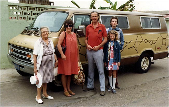
Figure 3: Richard Feynman with his family in front of his 1974 Dodge Tradesman van,
which he decorated with hand painted Feynman diagrams.
which he decorated with hand painted Feynman diagrams.
The visual clarity and precision of feynman diagrams belies the quantum uncertainty of the subatomic collisions and scatterings events they depict. Unlike a bubble chamber image, only the sum of all the Feynman diagrams represent any given particle interaction; particles do not opt for a one diagram or another each time they interact.
At the quantum level particles interact in every way available to them, and so an exact description of the scattering process involves summing up a large number of diagrams, each with their own mathematical formula for the likelihood they will occur.
At the quantum level particles interact in every way available to them, and so an exact description of the scattering process involves summing up a large number of diagrams, each with their own mathematical formula for the likelihood they will occur.
In this way a single Feynman diagram represents all possibilities of an interaction from its initial to final state, and so the connections of a Feynman diagram are more important than the configuration of it's lines, squiggles, loops and dashes.
Pioneer of data visualization and expert on information graphics Edward Tufte, had 120 Feynman diagrams constructed in stainless steel (see figure 4). His wall mounted constructs represent all 120 different ways that a 6-photon scattering event can be depicted.
Pioneer of data visualization and expert on information graphics Edward Tufte, had 120 Feynman diagrams constructed in stainless steel (see figure 4). His wall mounted constructs represent all 120 different ways that a 6-photon scattering event can be depicted.
Figure 4: All possible 6-photon scattering (120 space-time Feynman diagrams), 2012, Edward Tufte,
Wall mounted installation of stainless steel with shadows, 530 x 230 x 10 cm (Installation view at Fermilab)
Wall mounted installation of stainless steel with shadows, 530 x 230 x 10 cm (Installation view at Fermilab)
Feynman introduced his ingenious schematic in 1948, but by the 1980's their limitations were starting to become apparent, and Feynman himself went on to prove that the diagrams were only approximations that involved an enormous amount of redundancy that arose from their reliance on involving virtual particles (see figure 2).
Feynman diagrams were designed to describe all the possible results of subatomic particle collisions, but even a seemingly simple event like two gluons colliding to produce four less energetic gluons, involves some 220 diagrams. Such collisions occur billions of times a second during experiments carried out using modern day particle accelerators.
In the mid-2000s patterns began to emerge from events recorded in particle accelerators that repeatedly hinted at an unknown, underlying, coherent mathematical structure. A new set of formulas were proposed by the physicists Ruth Britto, Freddy Cachazo, Bo Feng and Edward Witten, known as the BCFW recursion relations after their discoverers. The formulas dispense with familiar variables of Feynman diagrams such as position and time, and involves an entirely new diagrammatic system first developed in the 1970's by Roger Penrose, named twistor diagrams.
 Figure 5: Twistor diagrams depicting an interaction between six gluons that can be used to derive a simple formula for the 6-gluon scattering amplitude. | According to Andrew Hodges: "Twistor diagrams for scattering amplitudes have been explored since the early 1970s, when Roger Penrose first wrote them down. But the ideas underlying them suddenly received quite new attention at the end of 2003, when Ed Witten's twistor string model brought together twistor geometry, string theory and scattering amplitudes for pure gauge fields." (2) |
The incredible simplicity and power of twistor diagrams gave them an air of mystery according to Arkani-Hamed: “The terms in these BCFW relations were coming from a different world, and we wanted to understand what that world was.” (3)
After over a decade of research with his collaborators, Arkani-Hamed showed how twistor diagrams could be pieced together to create a timeless, multidimensional object known as an 'Amplituhedron' (figure 6).
After over a decade of research with his collaborators, Arkani-Hamed showed how twistor diagrams could be pieced together to create a timeless, multidimensional object known as an 'Amplituhedron' (figure 6).
Figure 6: 'On-shell diagrams' are a new visual system for guiding and structuring the calculations of what happens when physical 'on-shell' particles interact, as opposed to the 'off-shell' virtual particles
of Feynman diagrams.
of Feynman diagrams.
The Amplituhedron has been described as an intricate, multi-faceted, higher dimensional jewel at the heart of quantum mechanics, a meta-level Feynman diagram completely new to mathematics.
 figure 7: Arkani-Hamed's hand drawn diagram of the amplituhedron representing an 8-gluon particle interaction. | This theoretical object enables simplified calculation of particle interactions with such astounding efficiency that according to Jacob Bourjaily, "you can easily do, on paper, computations that were infeasible even with a computer before." (4) The amplituhedron is a geometrical representation of real particle data. The scattering amplitude can be derived from its volume and details of a particular scattering process determine its dimensionality and facets. Figure 7 shows the amplituhedron representing an 8-gluon particle interaction, an event that would require almost 500 pages of algebra using Feynman diagrams. |
From Feynman diagrams to twistor diagrams and the discovery of the enigmatic amplituhedron, diagrams remain a powerful, albeit mysterious tool in theoretical physics. They permit information to be stored and shared with high fidelity, but they also mobilise and shape new knowledge by allowing intuition and rational thought to play a role in the creative process.
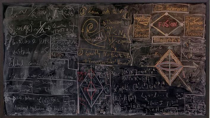
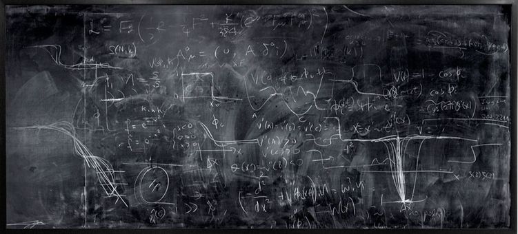
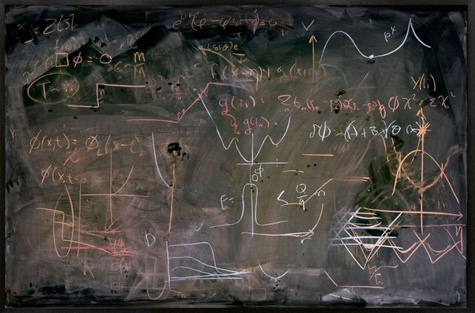
Diagrams in actions - the photography of Alejandro Guijarro
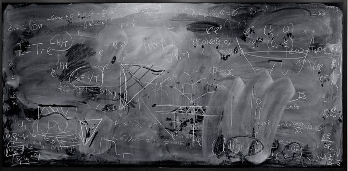
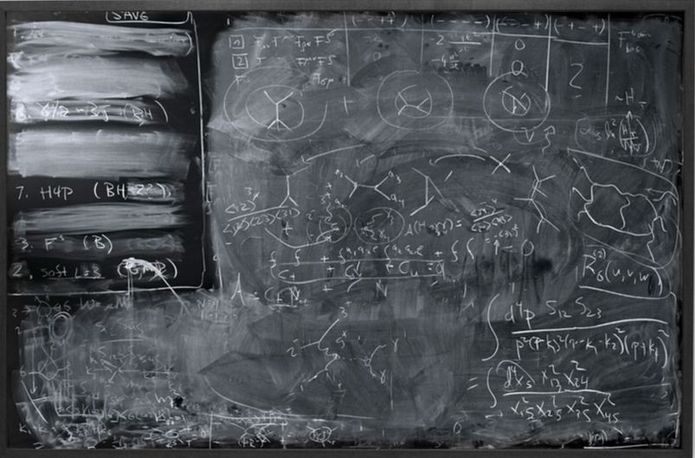
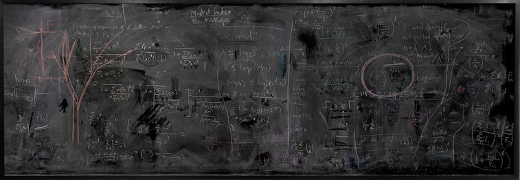
Alejandro Guijarro, STANFORD III, 2012, C-type print, 117 x 240 cm
For his 'Momentum' series (2010-2013), Spanish photographer Alejandro Guijarro traveled to several international academic institutions that specialize in quantum mechanics: CERN, Stanford, Berkeley and Oxford. In a form of documentation, Guijarro measured and photographed blackboards that he found in lecture theatres, meeting rooms and offices, then printed the images at a 1:1 scale.
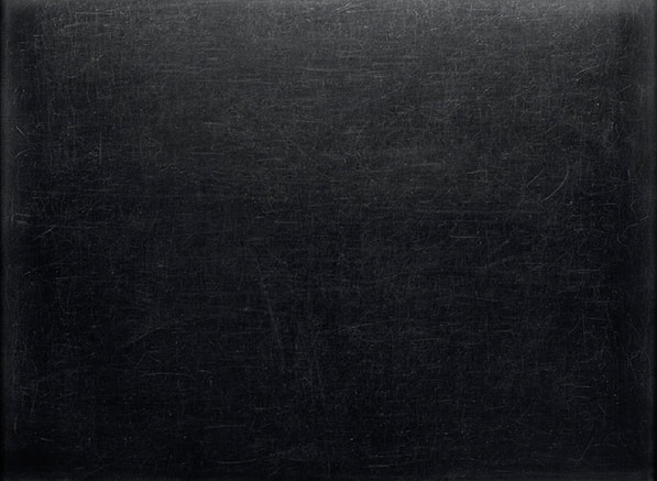
The series highlights the transitive nature of diagrams at work during the creation and transmission of knowledge. It presents the process as a physically involved gestural performance, as various trains of thought are followed and erased to leave a blurred palimpsest.
'Momentum' is reminiscent of Marcel Duchamp’s project 'Unhappy Readymade', discussed in this previous Blog: The Diagrams of Geometry part II- A soggy book of diagrams as a wedding present from Marcel Duchamp.
Both projects present us with a token of something lost - information and knowledge made manifest through the substrates ink, paper, chalk and board only to be subject to entropy.
In the case of 'Unhappy Readymade' it's the wind and rain which add entropy, in the case of Guijarro’s 'Momentum' it's the hand of the professor, janitor or the student armed with a blackboard eraser that return the arena of ideas to a tabula rasa.
Alejandro Guijarro, BERKLEY II, 2012, C-type print, 112 x 236 cm
Alejandro Guijarro, CAMBRIDGE VII, 2011, C-type print, 120 x 300 cm
Alejandro Guijarro, BERKELEY VIII, 2011, C-type print, 117 x 174 cm
Alejandro Guijarro, SLAC V, 2012, C-type print, 117 x 180 cm
Alejandro Guijarro, SLAC V, 2012, C-type print, 117 x 180 cm
Alejandro Guijarro, OXFORD I, 2011, C-type print, 110 x 150 cm
Notes:
1) C.F. Gauss quoted in Gauss zum Gedächtniss (1856) by Wolfgang Sartorius von Waltershausen
2) Andrew Hodges, Online at: http://www.twistordiagrams.org.uk/papers/
3) Arkani-Hamed, quoted in 'A Jewel at the Heart of Quantum Mechanics' by Natalie Wolchova, online
at: https://www.quantamagazine.org/physicists-discover-geometry-underlying-particle-physics-20130917/
4) Jacob Bourjaily, quoted in 'A Jewel at the Heart of Quantum Mechanics' by Natalie Wolchova, online
at: https://www.quantamagazine.org/physicists-discover-geometry-underlying-particle-physics-20130917/
❉ Blog post 12 on diagrams in the arts and sciences introduces the diagrammatic practice of Arakawa and Gins, the diagram obsessed proteges of Marcel Duchamp.
Figure 1: Blank Lines or Topological Bathing, 1980-81, acrylic on canvas, 254 x 691 cm
© 2017 Estate of Madeline Gins. Reproduced with permission of the Estate of Madeline Gins
© 2017 Estate of Madeline Gins. Reproduced with permission of the Estate of Madeline Gins
Whilst art students in Kyoto, my friends and I were invited by our teacher Usami Keiji to stay with him and his wife Sawako, at their cliff-top studios in Fukui, overlooking the sea of Japan. After a winding drive north through the mountains, we were met with an extravagant lunch of champagne, king crab, and one of Usami's arm-waving, hilarious, impromptu speeches on Foucault. Afterwards, a still-smiling Usami slid a book across the table between the bottles and empty red crab shells, saying only "This is a work of a genius".
The book was 'The Mechanism of Meaning', a series of essays and photographs documenting the creation of eighty, large panel paintings made by the Japanese artist Shusaku Arakawa and his wife, the American poet, Madeline Gins, following a decade of collaboration between 1963 to 1973.
Usami insisted I borrowed the book, but over the years whenever I tried to return it he would complain that it was too heavy for him to carry, and would ask me, smiling, to look after it well until the next time we met. Sadly, Usami passed away in 2012 and I still have his copy of the book, full of his own notes and comments in the margins about the work of two master diagram makers - Arakawa and Gins.
As the legend goes, Arakawa arrived in New York with nothing but a few dollar bills and the telephone number of Marcel Duchamp. More importantly however, he carried with him a letter of recommendation from his mentor, the poet Shuzo Takeguchi, one of Japan's leading art critics and a champion of Surrealism in Japan. As a parting gift Takeguchi had given the young artist a book of his poetry, amongst the pages of which he had hidden a considerable sum of money for the young artist to later discover.
Arakawa arrived to heavy snow at JFK airport in December 1961 and, using the little English he knew, made the fated phone call to Duchamp that would gain him not only immediate access to the very heart of New York's artistic community, but would see him become a protégé of Duchamp himself.
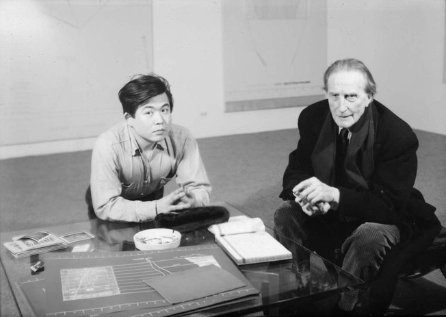
Figure 2: Arakawa and Marcel Duchamp at Dwan Gallery, New York, 1966
© 2017 Estate of Madeline Gins. Reproduced with permission of the Estate of Madeline Gins
© 2017 Estate of Madeline Gins. Reproduced with permission of the Estate of Madeline Gins
Duchamp arranged for Arakawa to stay in the loft apartment of Yoko Ono as she was away in Japan, and it was there that he met John Cage who had arranged to use the loft as a practice space for his group of musicians. It was also through Duchamp that Arakawa was introduced to Andy Warhol, whose attendance at Arakawa's early exhibitions brought a great deal of attention to the young, as yet unknown artist.
The year after Arakawa arrival in New York he met Madeline Gins, and a year later they started work together on 'The Mechanism of Meaning', an ambitious collaboration that would take another ten years to complete.*
(* Note: The series actually exists in two different versions, one at the Sezon Museum of Modern Art in Japan and the other in the holdings of the recently established 'Reversible destiny foundation' in New York, based in Arakawa and Gins former studio.)
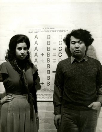 Figure 1: Madeline Gins and Arakawa in New York, 1972 Copyright credit: © 2017 Estate of Madeline Gins. Reproduced with permission of the Estate of Madeline Gins and Reversible Destiny Foundation. | 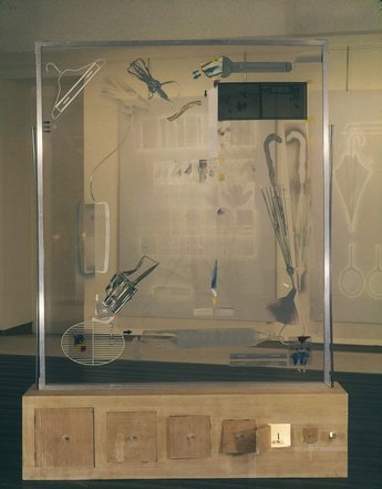 Figure 3: Arakawa, Diagram with Duchamp’s Glass as a Minor Detail (Installation View of 'Arakawa: Diagrams', Dwan Gallery, Los Angeles 1964) Copyright credit: © 2017 Estate of Madeline Gins. Reproduced with permission of the Estate of Madeline Gins and Reversible Destiny Foundation. |
As described in an earlier blog post: " Coffee, diagrams, chocolate, masturbation ", diagrams were at the very heart of Marcel Duchamp's artistic practice and philosophy, having been educated at a time in France when sweeping reforms replaced traditional landscape and portrait studies with a fastidious training in diagrammatic draftsmanship.
Duchamp's fascination with the reductive, refined aesthetics of diagrammatic images was clearly something he passed on to Arakawa, who developed his own obsession with diagrams and diagram making. His first solo exhibition in New York at the Dwan Gallery in 1966 was titled simply 'Arakawa: Diagrams', and the Gallerist Virginia Dwan later recalled how she had to dissuade the artist from wanting to sign his paintings 'Diagram', a move she felt was too abstract even for the New York art world.
Early works such as 'Diagram with Duchamp’s Glass as a Minor Detail' (Figure 3) are evidence that Arakawa was all to aware of the profound influence his mentor was having upon his practice, and his desire to both pay homage and at the same time break orbit and seek out his own distinctive style. However Duchamp's diagrammatic art 'in service of the mind' would remain a major influence on both Arakawa and Gins as they developed their own master work - 'The Mechanism of Meaning'.
Of the 80 panels that make up the series, one acts as an index by dividing the body of works into 16 different groups of paintings like chapters in a text book:
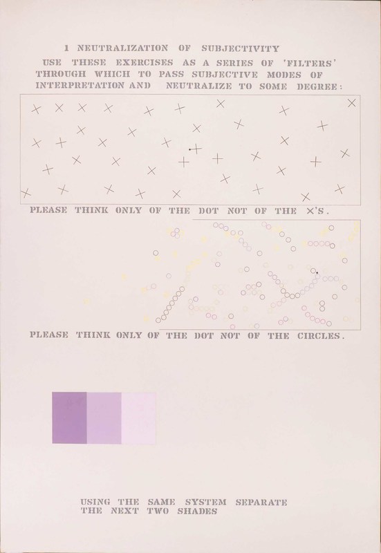
1) Neutralization of Subjectivity
2) Localization and Transference
3) Presentation of Ambiguous zones
4) The Energy of Meaning (Biochemical, Physical, and Psychophysical aspects)
5) Degrees of meaning
6) Expansion and Reduction - Meaning of Scale
7) Splitting of Meaning
8) Reassembling
9) Reversibility
10) Texture of Meaning
11) Mapping of Meaning
12) Feeling of Meaning
13) Logic of Meaning
14) Construction of the Memory of Meaning
15) Review and Self-Criticism
'The Mechanism of Meaning' consists a number of self-contradictory puzzles, instructions and statements presented in a variety of diagrammatic formats. Gins' wide-ranging studies are evident in the works, which reference Oriental philosophy, Japanese and Chinese poetry, English and Physics. Gins also took art classes at the Brooklyn Museum, and it was here that she first met her fellow student Arakawa (who later claimed that he enrolled only in order to extend his American visa).
When engaging with 'The Mechanism of Meaning', the panels act in a way like mirrors to the thought processes being used to analyse them, a kind of self referential, recursive process reminiscent of Douglas Hofstadter idea of 'a strange loops'.
Many of the texts in the paintings resemble 'Koans' from Zen Buddhism, short puzzles designed to be meditated upon by monks during their training. Viewers of 'The Mechanism of Meaning' are instructed to 'Turn left as you turn right', or to picture a 'Mnemonic device for forgetting' and then 'Imagine a thought which bypasses everything'.
Zen Koans are intended to jolt the thinker in to a state of enlightenment through paradox, and the project won Arakawa and Gins a host of intellectual admirers including Italo Calvino, who wrote how "An Arakawa painting seems precisely cut out to contain the mind, or to be contained in it… After studying one of Arakawa’s paintings it is I who begin to feel that my mind is ‘like’ the picture" (1).
The French Philosopher Jean-Francois Lyotard described how the work of Arakawa and Gins “makes us think through the eyes.” (2) Such an poignant image is reminiscent of the American Philosopher C.S. Peirce's description of diagrams as 'moving pictures of thought'.
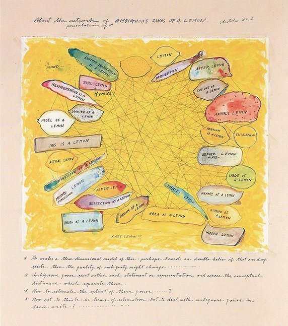
Figure 4: 'About the network of ( perception of ) AMBIGUOUS ZONES OF A LEMON (Sketch No.2)',
Ink on paper, from “The Mechanism of Meaning” c. 1963 – 88, Ink on paper (size unknown)
Copyright credit: © 2017 Estate of Madeline Gins. Reproduced with permission of the Estate of Madeline Gins and Reversible Destiny Foundation.
Ink on paper, from “The Mechanism of Meaning” c. 1963 – 88, Ink on paper (size unknown)
Copyright credit: © 2017 Estate of Madeline Gins. Reproduced with permission of the Estate of Madeline Gins and Reversible Destiny Foundation.
Figure 4 is a sketch for the panel 'Ambiguous zones of a Lemon', and consists of an entangled network that diagrams the various ways we can consider a lemon. What at first appears to be a humorous take on a lemon's multiple, nuanced qualities, in fact turns out to reveal a great deal about the complex relationship between our objective and subjectively descriptions of reality.
To paraphrase the British philosopher Bertrand Russell: an observer, when he feels himself to himself to be observing a stone (or, in Arakawa's case, a lemon), is really, if physics is to be believed, observing the effects of the stone upon himself (3).
The distinction between subjective and objective qualities is of fundamental importance to the philosophy of science, where qualities are divided in to primary (those that exist independent of an observer, such as quantity and mass), and secondary (those given by the human senses to an object, such as colour, taste and smell). The categories of Arakawa and Gins play with these distinctions, allowing them to resonate in a way that I term 'Romantic - Objective'.
Categories of ambiguous zones:
| lemon dream of a lemon area of a lemon hidden lemon subject: lemon illusion of a lemon memory of a lemon image of a lemon before or pre- lemon painting of a lemon | another translation of a lemon still lemon (if possible) misapprehension of a lemon drawing of a lemon model of a lemon this is a lemon actual lemon impression of a lemon moving / transitional lemon almost lemon | animal's lemon cut-out of a lemon after lemon past lemon sliced lemon reflection of a lemon photo of a lemon reflection of a lemon photo of a lemon last lemon ?? |
'The Mechanism of Meaning' series is akin to Duchamp's idea of a 'playful physics', in which objectivity and systems of scientific measure and analysis are taken to their limits, in order to reveal their tenuous philosophical underpinnings.
The aim of such an approach isn't simply to undermine the scientific process, for, in the words of Arakawa himself, "If you want to become an artist, you have to become a scientist first." (4) Rather the aim is to creatively test the limits of thought and logic in a way similar to the Philosophy of Ludwig Wittgenstein, the work of whom Arakawa and Gins had read and would discuss at length in their studio. (The style of Wittgenstein's 'Tractatus Logico-Philosophicus' becomes immediately apparent when viewing 'The mechanism of Meaning'.)
Gins and Arakawa created a rich new vocabulary to map out the poetic-conceptual terrain their work explored, and their terminology is suggestive of entirely new fields of study. Rather than refer to himself an artist, Arakawa pronounced himself a 'coordinologist', and Gins described herself as a 'biotopologist', and both continued to engage in frequent discussions with philosophers and scientists.
'The Mechanism of Meaning gained world-wide success in the 1970's, and was shown in it's entirety at the Venice Biennale in 1970, and again in Germany in 1972, where it was praised by the renowned German theoretical physicist Werner Heisenberg, winner of the 1932 Nobel prize in physics, who invited Arakawa and Gins as artists in residence at the prestigious Max-Planck-Institute.
Heisenberg has the so called 'uncertainty principle' named after him, and it's easy to imagine the appeal that 'The Mechanism of Meaning' had to a mind used to struggling with the indeterminate nature of reality at it's most fundamental level.
Below are a series of selected panels from the 'The Mechanism of Meaning' series.
I would like to thank the Estate of Madeline Gins and the Reversible Destiny Foundation for permission to use these images, and more information can be found at the Reversible Destiny Foundation homepage, or by following their facebook page here.
The foundation recently announced that they will be working together with Gagosian gallery to fully document and represent 'The Mechanism of Meaning' series, in order to bring this important and still highly relevant work Arakawa and Gins to a contemporary audience.
 The Mechanism of Meaning, 1.1 Neutralization of Subjectivity, 1963-73/96, Acrylic and silk screened paper on canvas, 244 x 173 cm © 1997 Estate of Madeline Gins. Reproduced with permission of the Estate of Madeline Gins 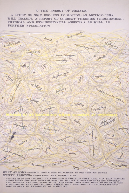 The Mechanism of Meaning, 4.1 The Energy of Meaning, 1963-73/96, Acrylic and coloured pencil on canvas, 244 x 173 cm © 1997 Estate of Madeline Gins. Reproduced with permission of the Estate of Madeline Gins 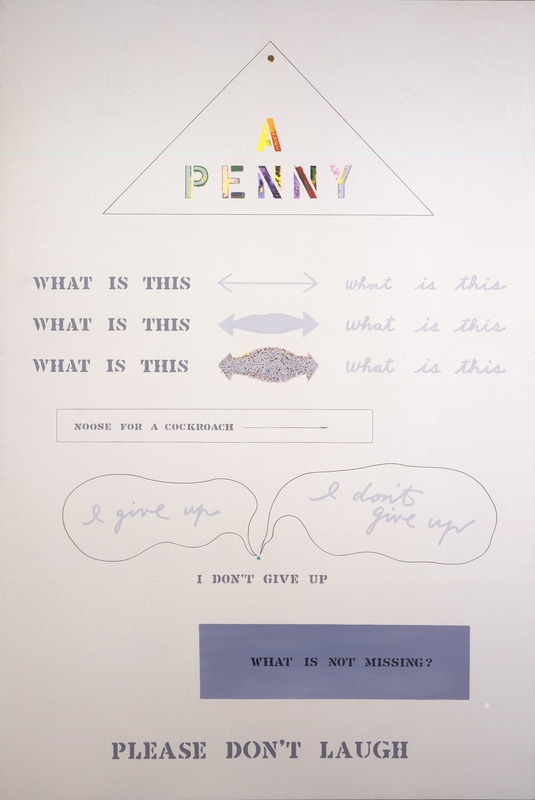 The Mechanism of Meaning, 5.4 Degrees of Meaning, 1963-73/96, Acrylic, cork, magnetic clip, nails, painted assemblage (Mylar, paper, string, wire, and wood), paper, rubber strip, wire, wood and measuring stick on canvas, 244 x 173 cm © 1997 Estate of Madeline Gins. Reproduced with permission of the Estate of Madeline Gins 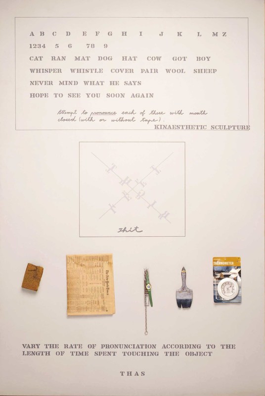 The Mechanism of Meaning, 5.6 Degrees of Meaning, 1963-73/96, Acrylic, level, metal chain, newspaper, packaged outdoor thermometer, paintbrush, sponge, and wristwatch on canvas, 244 x 173 cm © 1997 Estate of Madeline Gins. Reproduced with permission of the Estate of Madeline Gins 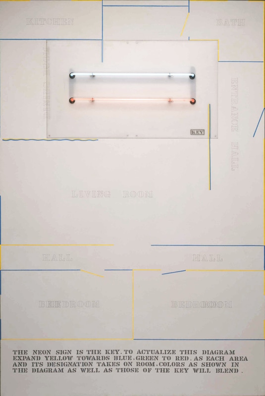 The Mechanism of Meaning, 6.2 Expansion and Reduction - Meaning of Scale, 1963-73/96, Acrylic, neon tubes with plastic electrical unit and oil on canvas, 244 x 173 cm © 1997 Estate of Madeline Gins. Reproduced with permission of the Estate of Madeline Gins 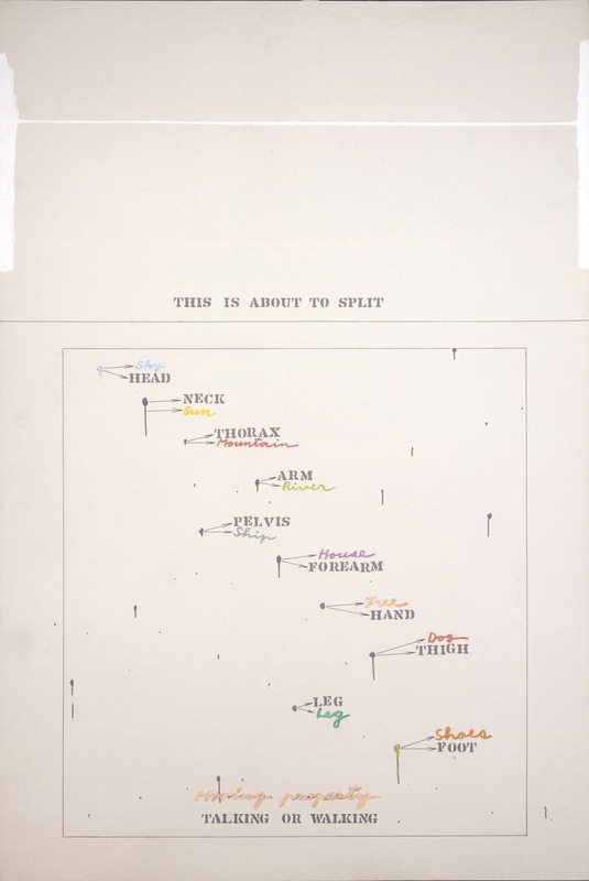 The Mechanism of Meaning, 7.2 Splitting of Meaning, 1963-73/96, Acrylic, neon tubes with plastic electrical unit and oil on canvas, 244 x 173 cm © 1997 Estate of Madeline Gins. Reproduced with permission of the Estate of Madeline Gins 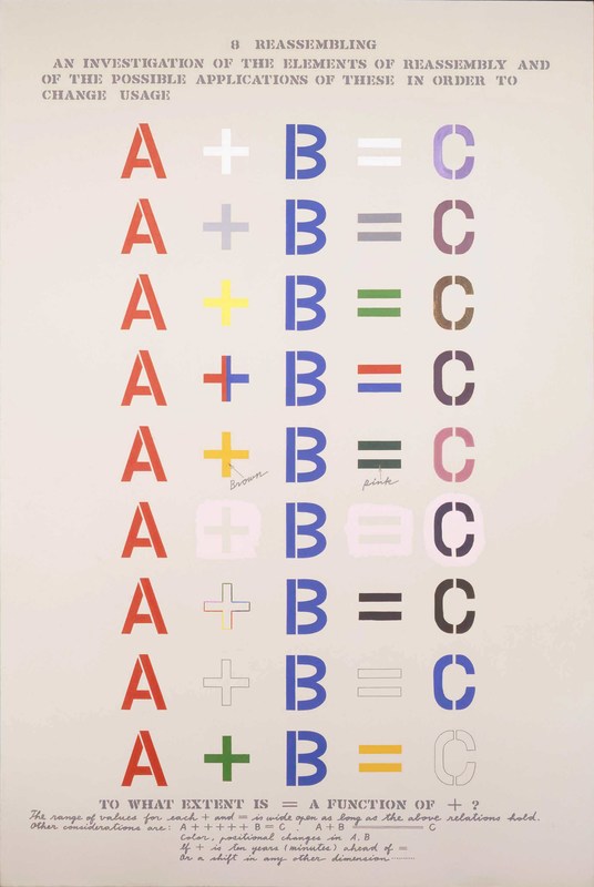 The Mechanism of Meaning, 8.1 Reassembling, 1963-73/96, Acrylic on canvas, 244 x 173 cm © 1997 Estate of Madeline Gins. Reproduced with permission of the Estate of Madeline Gins 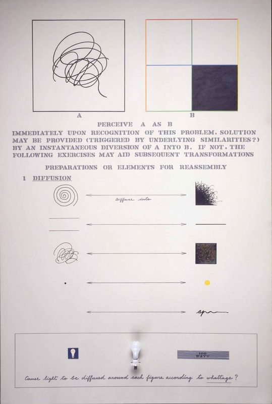 The Mechanism of Meaning, 8.2 Reassembling, 1963-73/96, Acrylic, cardboard, lightbulb, lightbulb socket, and painted duct tape on canvas, 244 x 173 cm © 1997 Estate of Madeline Gins. Reproduced with permission of the Estate of Madeline Gins 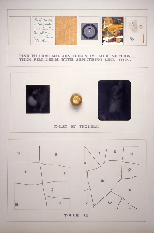 The Mechanism of Meaning, 10.3 Textures of Meaning 963-73/96, Acrylic, ball of transparent tape, newspaper, painted photograph, paper record, pencil, plastic cup, razor blade, ring and X-rays on canvas, 244 x 173 cm © 1997 Estate of Madeline Gins. Reproduced with permission of the Estate of Madeline Gins 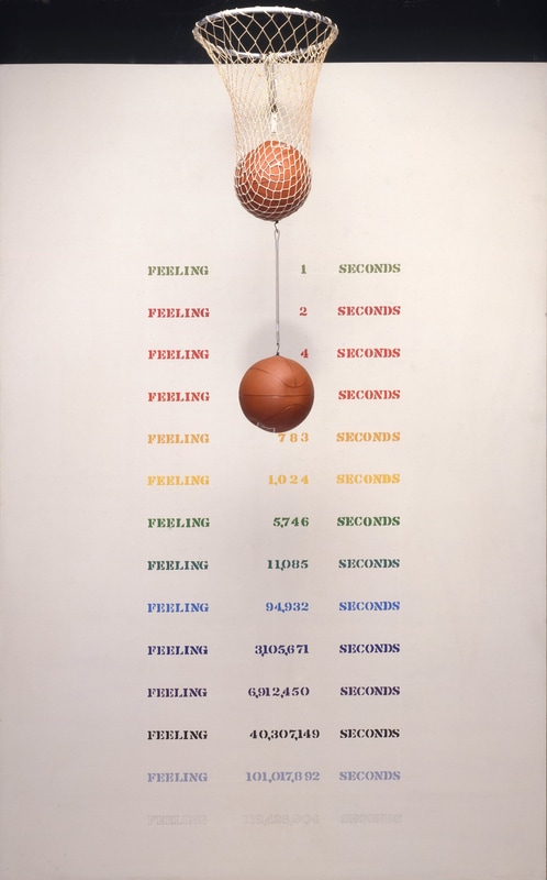 The Mechanism of Meaning, 12.4 The Feeling of Meaning, 1963-73/96, Acrylic , baseballs, hoop, metal spring and net on canvas, 244 x 173 cm © 1997 Estate of Madeline Gins. Reproduced with permission of the Estate of Madeline Gins 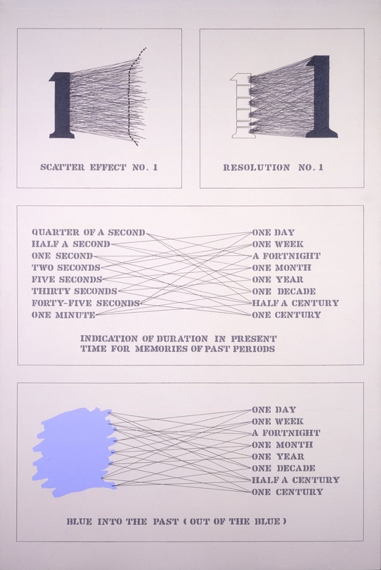 The Mechanism of Meaning, 14.2 Construction of the Memory of Meaning, 1963-73/96, Acrylic and pencil on canvas, 244 x 173 cm © 1997 Estate of Madeline Gins. Reproduced with permission of the Estate of Madeline Gins |
References:
1) Italo Calvino, The arrow in the mind: A review of the Mechanism of Meaning. In: Image, Eye and Art in Calvino: Writing Visibility. 2007, Chpr 20.
2) Lyotard, J.F, In: Reversible Destiny, Arakawa / Gins, Guggenheim Museum Publication, 1997.
3) Bertrand Russell, An inquiry into meaning and truth: The William James lectures for 1940 delivered at Harvard University, London Routledge, 1992, p.72.
4) Arakawa speaking in the film Children Who Won’t Die (2010) Directed by Nobu Yamaoka.
5) Peirce, C.S, quoted in: Brent, J. Charles Sanders Peirce: A life, 1998, Indiana Uni. Press, p.129
❉ Blog post 11 on diagrams in the arts and sciences examines a three-part drawing I made in 2007 titled 'Clouds, Glands, Tributaries'. This minimal, diagrammatic, meditation on water turned out to be a turning point in my artistic practice, bringing together my interest in encyclopaedias, diagrams, the sciences and romanticism for the first time.
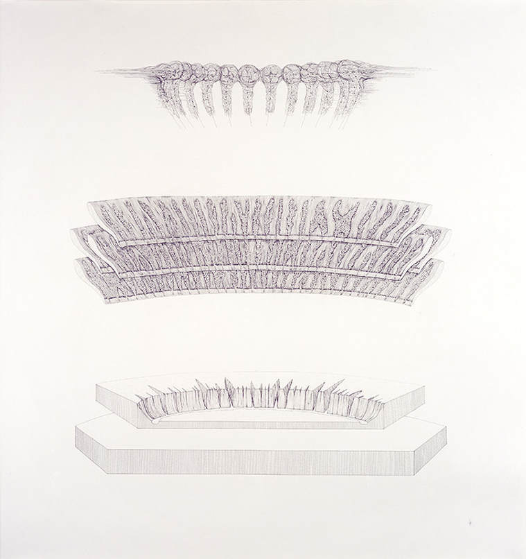
Image 1: Michael Whittle, Clouds, glands, tributaries, 2007, Ink on Paper, 133 x 125.5 cm
'Clouds, glands, tributaries' was drawn as part of a series of new works for the exhibition 'The Louder the Sun Blooms' held in New York, 2007. The title for the show was taken from the Dylan thomas Poem 'Poem on his Birthday', as the synesthetic image conjured by the words associate sound, heat, light and the unfurling of life with romantic notions of temporary beauty.
The limitations of the human senses and of human thought are interests that connect not only the works in that particular exhibition, but the majority art that I've produced over the last 10 years. Other common themes include our attempts to classify and comprehend the world around us, taking into account our biological limitations, and, most importantly, the dissonance that arises from our division of existence in to the subjective inner world of experience and an objective outer world of physical reality.
As an undergraduate student of Biochemistry, I was summoned by the head of the department to his office after our end of year examinations, where he cautioned me against my use of adjectives such as 'subtle', 'intricate' and 'profound' in an essay on molecular biology. Science, I was told, was like a game of cricket, which relies upon everyone playing by the same rules. Subjectivity, it turns out, was to be avoided at all costs in the context of a Biochemistry examination.
Five years later at the Royal College of Art, the vice chancellor, himself a former Biochemist, described my entry for the 2003, RCA Christmas card competition as too 'cold', 'clinical' and 'objective', but decided to award it second prize anyway out of curiosity.
It took a while to realise the deeper connection between these two seemingly unrelated events, but they were my earliest first hand experiences of the great divide between scientific objectivity and artistic subjectivity, and it wasn't until I created 'Clouds, glands, tributaries' in 2007, that I felt I had struck a balance between these two philosophical ideals, and possibly found a way to combine them.
Over time I came to realise that the approach to creating drawing is almost identical to that writing of Japanese Haiku poetry. Unlike classical Chinese poetry, the Haiku poet must remain entirely objective whilst composing the three short lines of the poem. In a classic 'show, don't tell' fashion, if a poet makes the mistake of revealing their subjective feelings too directly then the poem fails as a haiku.
To my mind the true power of a haiku lies in the 'subjective void' left by the poet for readers to fill themselves. As a result, the effect of a successful haiku is fleeting but powerfully subjective, and much more than the sum of its objective observations. The best haiku, even in translation, are capable of subjectively connecting reader and writer across vast distances in time, space, culture and language, despite the suppression of subjective expression in favour of objective depiction.
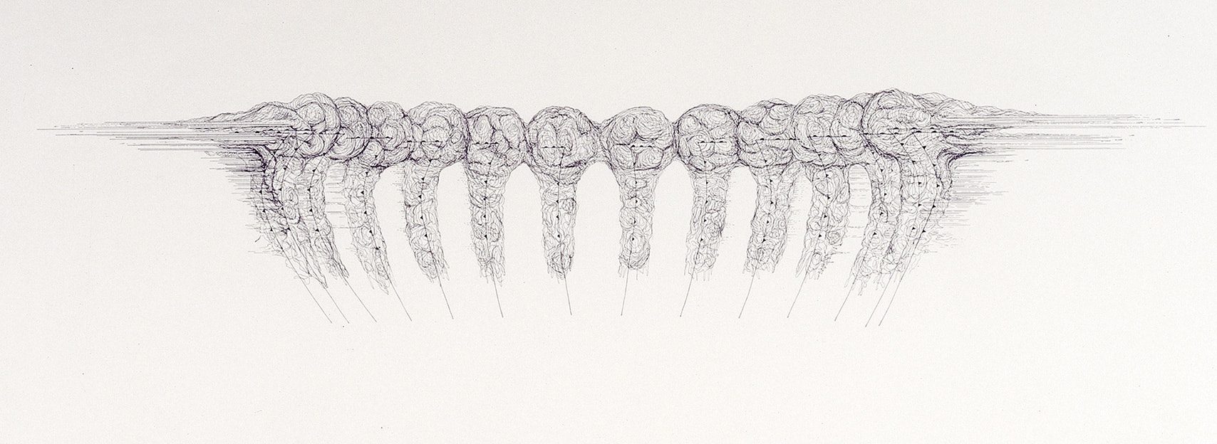
Image 2: Clouds, glands, tributaries (detail 1)
14 cyclones rotating towards the viewer, drawn as weather diagrams
14 cyclones rotating towards the viewer, drawn as weather diagrams
Considered as a visual haiku, 'Clouds, glands, tributaries' consists of three tiers of objective, scientific diagrams that are connected abstractly through notions of water. The top level depicts several storm clouds in the ‘Comma cloud pattern’, otherwise known as ‘Mid-latitude cyclones’ in American meteorological terms. These particular clouds also reference a season, as haiku should, in that the majority of Mid-Latitude cyclones occur in the winter.
| The cloud images are based on weather diagrams and employ the symbols for ‘cold front’ (colder air moving in the direction the triangles are pointing) and ‘warm front’ (warmer air moving in the direction the semicircles are pointing). Whereas weather diagrams depict such formations as maps viewed from above (i.e. by satellite imagery), in the drawing the clouds are positioned upright so that the cyclones rotate inwards toward the viewer. | 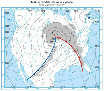 Image 3: Mature mid-latiude wave cyclone Source: Lutgens and Tarbuck, 2009 |
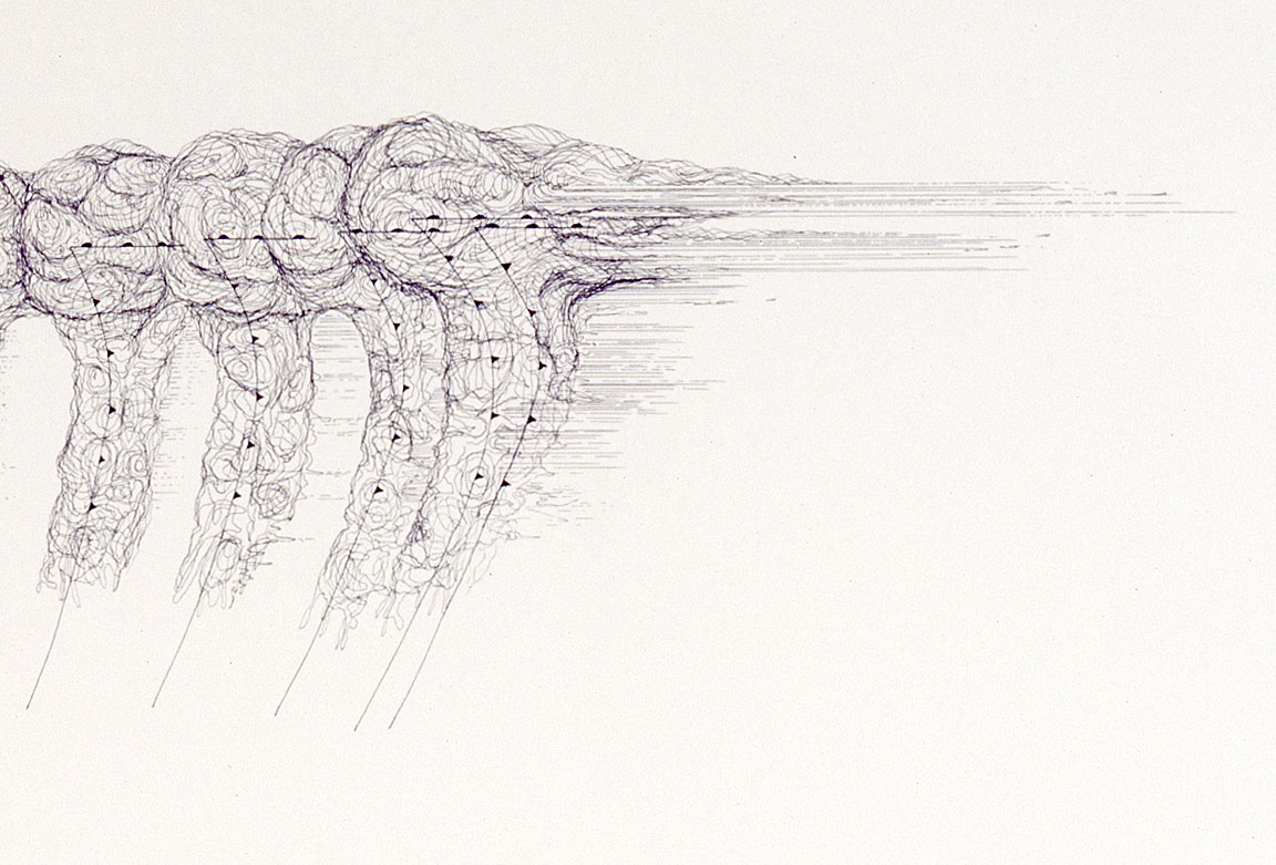
Image 4: Clouds, glands, tributaries (detail 2)
Collision of cold front and warm front as part of the formation of a cyclone
Collision of cold front and warm front as part of the formation of a cyclone
Beneath this layer, and on a very different scale, are drawn the Meibomian / Tarsal glands of the human inner eyelids. These specialised sebaceous glands secrete meibum along the rim of the eyelids inside the ‘tarsal plates’ (eyelids).
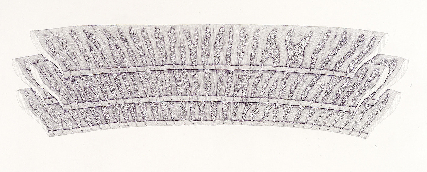
Image 5: Clouds, glands, tributaries (detail 3)
four inner eyelids complete with Meibomian (tarsal) glands
four inner eyelids complete with Meibomian (tarsal) glands
Meibum is complex mixture of lipids that forms an oily layer trapping an aqueous layer of tears that coats the surface of the human eye. Composing the outer most layer of the 'precorneal film', meibum prevents the evaporation of tears as well as their spillage onto the cheeks, and create a delicate airtight seal when the lids are closed.
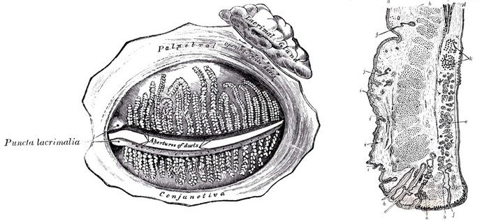
Image 6: Medical diagram of the inner eyelids showing Meibomium (tarsal) glands and their ducts,
and also the Lacrimal gland which creates tears. (frontal view and cross section)
and also the Lacrimal gland which creates tears. (frontal view and cross section)
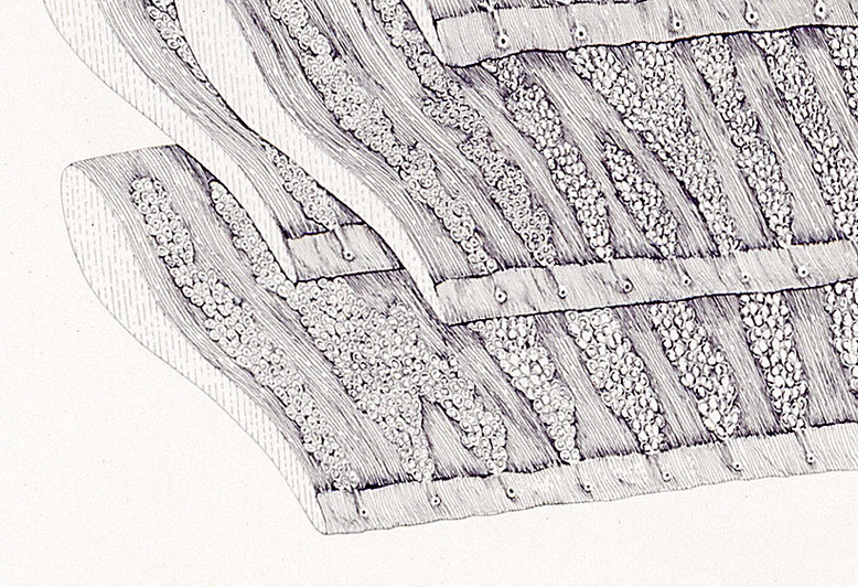
Image 6: Clouds, glands, tributaries (detail 4)
Inner upper eyelids complete with meibomian (tarsal) glands and ducts
Inner upper eyelids complete with meibomian (tarsal) glands and ducts
In 'Clouds, glands, tributaries', four distinct superior tarsal plates (upper eyelids) are depicted overlapping one another, with the ducts of the glands pointing downwards towards a semi-circular river valley and floodplain beneath.
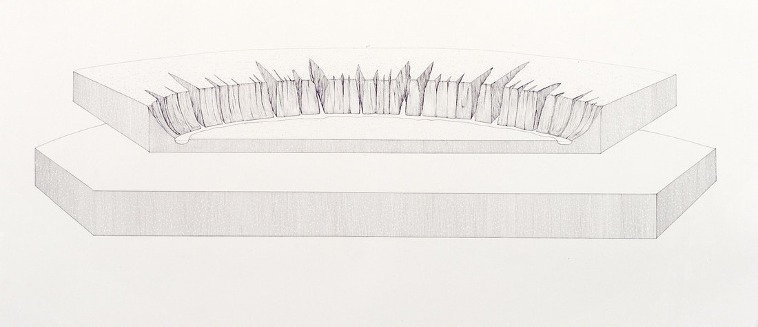
Image 7: Clouds, glands, tributaries (detail 5)
diagram depicting the theory of river tributary formation and flood plain
diagram depicting the theory of river tributary formation and flood plain
This base layer shifts upwards in scale to depict two sheets of bedrock at the surface of the earth's crust. These geological cross sections show before (lower plate) and after (upper plate) images of erosion caused by both a river and the elements, to create various V-shaped valleys on the opposite bank to the floodplain.
The drawings are based on the geological theory for the formation of river tributaries which suggests that over a period of geological time, small irregularities in the valley wall are eroded by running water to create fissures that gradually extend back into the surface of rock face into vast and complex river networks.
The drawings are based on the geological theory for the formation of river tributaries which suggests that over a period of geological time, small irregularities in the valley wall are eroded by running water to create fissures that gradually extend back into the surface of rock face into vast and complex river networks.
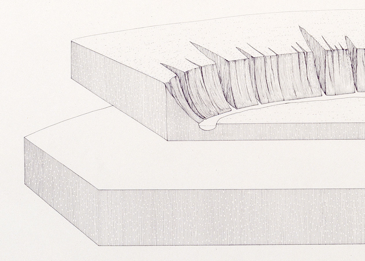
Image 8: Clouds, glands, tributaries (detail 6)
diagram depicting the theory of river tributary formation
diagram depicting the theory of river tributary formation
The three levels of the drawing 'Clouds, glands, tributaries' all indirectly reference water through a number of processes acting at different scales. The cyclonic clouds of water vapour are an emergent property of countless water droplets marshalled into an organised process by the collision of cold, dry air with warm, moist air, creating structures between 1500-5000 km in diameter, far larger than a hurricane or tropical storm.
The Meibomian / Tarsal glands secrete an oil that traps the 'tear film' against the surface of the eye. This creates a miniscule layer of salt water 0.003 mm thick, through which we view the world. The geological layer beneath this depicts an erosion pattern arising as a result of water draining from the land into a river system.
Two other aspects of water are present only by suggestion, the raindrops from the storm clouds and tears from the eyes, and both of these play off the idea of erosion over time on the landscape beneath. The spherical ball of an eye is also suggested by the spherical, negative space created by each of the three layers, in particular the four, overlapping, upper eyelids.
To use Umberto Eco's terms, 'Clouds, glands, tributaries' is an open work in with no definitive reading. Like Marcel Duchamp's 'Large Glass' ('The Bride Stripped Bare by Her Bachelors, Even'), the title provides important clues but specific details remain hidden unless the viewer has some knowledge in meteorology, biology or geology.
Duchamp proposed thought of a painting's title as "another colour on the artist’s palette", and his use of obscure references in 'The Large Glass' was accompanied by volumes of notes published both during his lifetime and afterwards as an encyclopaedic reference system to 'The Large Glass'. The disconnected and vague nature of the notes however only acts to add yet another layer of abstract meaning to be deciphered, as part of a cryptic game that has occupied a whole generation of Duchamp scholars.
'Clouds, glands, tributaries' relies upon specialised knowledge to recognise the specific nature of the diagrams being used as the title gives no suggestion as to what type of cloud, gland or tributary the viewer is looking at, so that the references risk being lost in ambiguity.
In order to avoid this problem the titles of later works employ more specific scientific terminology, to act as a set of keys to access the concepts being referred to. Instead of having to refer to volumes of notes to read each drawing however, an inquisitive viewer can check the terms used in a title using their smartphone, and in this way each person can develop their own reading of a work and draw their own conclusions, thanks to the ever increasing intelligence of search engines, and the vast, interconnected hypertext of the internet.
To see just how subtle, intricate and profound biochemical pathways really are, it's worth following the link below to two of my favourite diagrams of all times. Compiled by Gerhard Michal of the Boehringer Mannheim company, they were originally published as huge wall posters, but are now available for free in an online, interactive form.
The two charts 'Biochemical Pathways' and 'Cellular and Molecular Processes', are both daunting in their scale and beauty, but it's worth remembering that if every known molecule within the human cell were to be included on a chart at this scale, it would need to be far larger than a football pitch in size (and probably 3-D).
Click on the images below to access the online versions of the charts:
❉ This is the tenth in a series of blogs that discuss diagrams and the diagrammatic format, especially in relation to fine art and the sciences. I recently completed my PhD on this subject at Kyoto city University of the Arts, Japan's oldest Art School.
Feel free to leave comments or to contact me directly if you'd like any more information on life as an artist in Japan, what a PhD in Fine Art involves, applying for the Japanese Government Monbusho Scholarship program (MEXT), or to talk about diagrams and diagrammatic art in general.
Feel free to leave comments or to contact me directly if you'd like any more information on life as an artist in Japan, what a PhD in Fine Art involves, applying for the Japanese Government Monbusho Scholarship program (MEXT), or to talk about diagrams and diagrammatic art in general.
 |  |
Figures 1, 2: Yves Netzhammer, digital drawings, 2010
The working process of Swiss artist Yves Netzhammer begins with what he calls his 'stockpile of conjectures'. This is a growing body of diagrammatic sketches that compose his process of visual thinking, and act as source material for further development into finished drawings, animations, sculptures and installations.
Netzhammer's use of computer illustration and 3D modeling programs is a means of distancing the hand of the artist from his artworks, and imbues his work with a concise and highly distinctive aesthetic of economised line, form, colour and movement. In this way, the diagrams, models and video works of Netzhammer embody the characteristics of what Duchamp called "paintings of precision", imagery purified of irregularities and presented in an airless, ideal realm.
Figure 3: Yves Netzhammer, Untitled, Seilzeichnung, 2011,
Rope, metal, wood, glass and colour, variable dimensions
Rope, metal, wood, glass and colour, variable dimensions
'Seilzeichnung' (rope-drawing), was the first art work I saw by Netzhammer in Gwangju, South Korea, in 2011. Part wall-drawing, part sculpture, the focal point of the work is the diagrammatic depiction of a dog biting a human wrist, with the dotted bone of the forearm visible between the dog's teeth. The fingers of hand hold a swab with which an anonymous person appears to be taking a clinical sample from the back of the dog's tongue.
| In the sculptural version the black vinyl outline of the dog leaves the wall and becomes a black rope. This then passes through two supports to create a barrier so that the physical form of the work also acts to keep the viewer at a distance. Netzhammer's work explores the philosophical and psychological aspects of the complex interrelationship between humans, animals, objects and tools in the natural environment. Emotionally engaging elements within the work encourage mixed feelings of repulsion and empathy in a way that immediately engages viewers subjectively. This is further accentuated by the objective, clinical, almost antiseptic aesthetic that the diagram affords. | 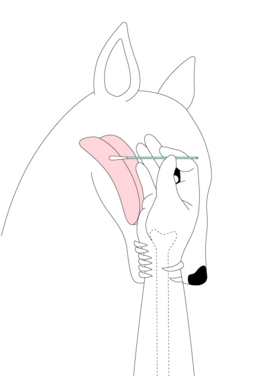 Figure 4: Digital drawing for Seilzeichnung, 2011 |
Certain elements of Netzhammer's work are common to other diagrammatic artists such as Mark Mander’s use of cross section, artificial architectural constructs, interconnected forms and lines which divide, connect, and often bind objects and ideas together.
You can read more about Mander's work in a previous blog here: Portrait of the artist as a building.
Netzhammer first studied architecture and received training in architectural draughting. This is an important point, because of the strong theoretical and practical presence of the diagram within the field since the 1980's. Netzhammer later enrolled at Zurich’s Hochschule für Gestaltung und Kunst, where he attended the figurative arts course.
The human form in Netzhammer's work is depicted in a way that highlights its own artificiality. His figures resemble the featureless models used in art school life drawing class, crash test dummies and shop display mannequins. These are presented in spaces constructed in the idealised, neutral style of the computer-aided design programs of architectural modeling. A stark, single light source also helps direct the viewer's attention to the objective, artificiality of this system of visualisation.
Below is a series of video extracts that help give a clearer example of how Netzhammer uses the diagrammatic format to create a distinctive, objective visual language which he then applies to emotive, subjective themes in a way that I describe as Romantic Objective.
The clips were compiled by the artist himself from an exhibition at Bremen Art Museum in 2006: 'Die Anordungsweise zweier Gegenteil, bei der Erzeugung ihres beruhrungsmaximums' (The arrangement of two opposites while their maximum point of contact is under generation).
Figure 6: Yves Netzhammer, The Arrangement of Two Opposites While
Their Maximum Contact Is Under Generation
2005, Kunsthalle Bremen, Germany
Their Maximum Contact Is Under Generation
2005, Kunsthalle Bremen, Germany
I contacted Netzhammer in 2013 as part of my PhD research into the importance of the diagram in contemporary art. I wanted to ask about the role the diagram plays in his own drawings, installations and video works, and why he opted to work with diagrammatic imagery. He explained that:
" It started, in my case, in looking for another way to show a new form of subjectivity. I positioned the computer between me and my thoughts/wishes. I guess, I prefer the diagrammatic “style”, because I’m really trying to find “something” (connected to philosophical questions). Not in the common scientific sense of discovery, but something which appears close to our questions about identity. I hope that an artistic approach to forms of empathy can generate such results, especially, when it comes in a paradoxical format like drawings, which stands in the tradition of explanation. "
A full transcript of Netzhammer's answers and other interviews with diagrammatic artists can be found on the research page of this website.
Below are a series of video clips of Netzhammer's various projects.
More information can be found at the artist's own website: http://netzhammer.com/
and also the online journal: http://www.journalfuerkunstsexundmathematik.ch/
❉ This is the third in a series of blogs that discuss diagrams in the arts and sciences. I recently completed my PhD on this subject at Kyoto city University of the Arts, Japan's oldest Art School.
Feel free to leave comments or to contact me directly if you'd like any more information on life as an artist in Japan, what a PhD in Fine Art involves, applying for the Japanese Government Monbusho Scholarship program (MEXT), or to talk about diagrams and diagrammatic art in general.
Feel free to leave comments or to contact me directly if you'd like any more information on life as an artist in Japan, what a PhD in Fine Art involves, applying for the Japanese Government Monbusho Scholarship program (MEXT), or to talk about diagrams and diagrammatic art in general.
Figure 1: Mark Manders, view of artist's studio with works in progress
The Dutch Artist Mark Manders describes himself as “a human being who unfolds into a horrifying amount of language and materials by means of very precise conceptual constructions”. (1) Manders entered the world of fine art as a writer and text still plays an important role in giving key insights in to his practice. However unlike the artistic self portraits of James Joyce in prose, or Dylan Thomas in poetry, Manders' self portrait is architectural.
Since 1986, Manders has been constructing what he calls his 'self-portrait as a building', and uses this conceptual framework to represent the fictional artist 'Mark Manders', a distinct alter-ego that he describes as a “neurotic, sensitive individual who can only exist in an artificial world.” (2)
The Diagrammatic format is immediately apparent in Manders' projects as the means by which he marshals the "horrifying amounts of language and materials" that his mind is capable of producing. Diagrams provide method to his madness and imbue his art works with an air of precision, authority and logical rigor, even if we can only guess at their exact function.
Figure 2: Mark Manders, Finished Sentence, 1998-2006,
iron, ceramic, teabags, offset print on paper, 336 x 185 x 85 cm
iron, ceramic, teabags, offset print on paper, 336 x 185 x 85 cm
Manders' self portraits incorporate the diagrammatic format on three distinct levels: as an aesthetic, as a creative tool and as a means of organising and predicting the ways in which viewers will experience his art works as they pass through his installations.
Aesthetically, many of the sculptures are formal constructs presented on table tops and in vitrines, resembling scientific models or experiments left unattended. Stephen Berg described these machines and factory-like constructions as “laboratory constellations for uncertainty and unknowable discoveries, production plants for dissident thoughts, transmitters for contacting the fictional.” (3)
The floor plans and delicate pencil drawings show Manders' use of the diagram as a powerful visual and conceptual tool for creation and organisation, whilst the architectural nature of his exhibition installations guide viewers through carefully prearranged objects in a series of constructed environments, which the artist refers to as “memory spaces”. (4)
Figure 3: Mark Manders, Drawing with Shoe Movement / Floor Plans from Self-Portrait as a Building,
2002, Pencil on paper
2002, Pencil on paper
Manders artistic practice is what I refer to as "Romantic-Objective", combining his own highly subjective and existential self-expression with an objective and analytical approach to phenomena mirroring that of science. Writing about his sculpture "Shadow Study (2)", Manders describes the thought processes that underly his choice of objects for the sculpture, and in doing so reveals it to be part exercise in 'material culture' (a kind of ethnography of objects) and part day dream. The visual language however is distinctively diagrammatic, and reminiscent of a highly reduced scientific demonstration or model.
" If you think about the evolution of cups, it’s just a beautiful evolution. The first cups were human hands: folded together, they took the water out of the river. The next cups were made from things like hollowed pieces of wood or folded leaves, and so on. The last beautiful moment in the history of the cup was when it got a handle. After that, nothing really interesting happened with cups, just small variations, mainly ornamental. Many generations worked on it, and now you can say that the cup is finished in terms of evolution.
A few times a day there is a cup very close to my upper leg bone, and I slowly discovered that if you turn an empty cup upside down there is a shadow falling out of the cup, falling upon my leg. I wanted to keep this shadow, have it and own it, so I turned it into an image. " (5)
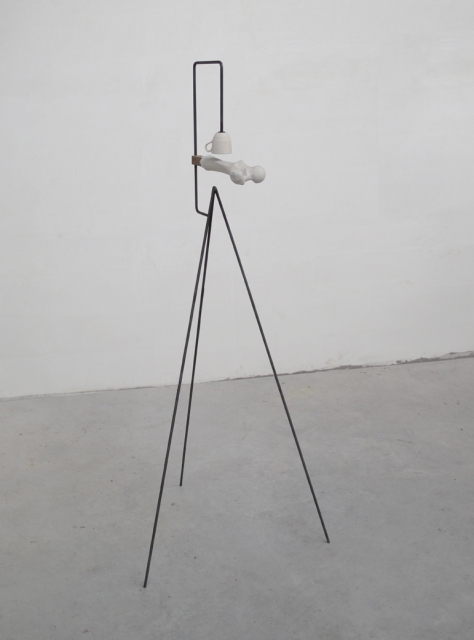
Figure 4: Mark Manders, Shadow Study (2) 2010, Metal, porcelain, painted epoxy, and wood / 151 x 65 x 65 cm
"Shadow study (2)" subtly references the transparency of bone china, sunlight and shade, and creates a three part visual haiku of upturned cup and the 'pouring of shadow' upon the thigh bone, amplified by the pyramidal structure of the support suggestive of the conical rays of the sun.
Mander's heightened awareness of the details of everyday life and the inherent paradox of both their importance and insignificance brings to mind a seemingly timeless quote, often mistakenly attributed to such greats as W.B. Yeats and Bertrand Russell:
" The Universe is full of magic things, patiently waiting for our senses to grow sharper. " (6)
In the case of Romantically Objective Art, that heightened awareness and sharpness of focus is due in a large part to the use of the diagrammatic format, in all its guises.
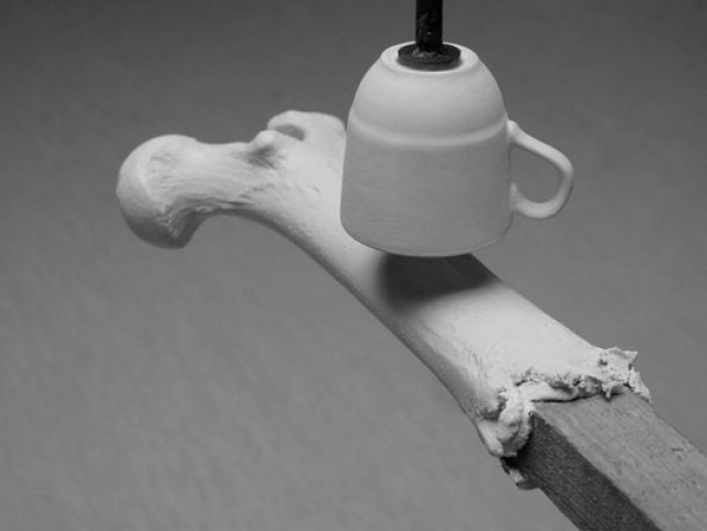
Figure 5: Mark Manders, Shadow Study (2) 2010, Metal, porcelain, painted epoxy, and wood / 151 x 65 x 65 cm
References:
1) Manders, M. (2010) Parallel Occurrences / Documented Assignments. Aspen Museum of Art, Aspen Art Museum and The Hammer Museum. p.11
2) van Adrichem, J., Bouwhuis J., Dölle M. (2002) Sculpture in Rotterdam, 010 Publishers, p. 60.
3) Berg, S. (2007) Like the night creeping into a shoe. In: In the Absence of Mark Manders. Berg. S. (Ed.) Hatje Cantz. p. 14.
4) Manders, M. (2003) Quoted in: Koplos J. Mark Manders at Greene Naftali - New York, Art in America, April 2003.
5) Manders, M. http://www.markmanders.org/works-a/shadow-study-2/2/
6) Eden Phillpotts, 1991, A shadow Passes. [OXEP] 2004, Oxford Dictionary of National Biography [Online], Entry: Eden Phillpotts (1862–1960) by Thomas Moult, rev. James Y. Dayananda, Oxford University Press.
More information can be found at: http://www.markmanders.org/
Dr. Michael Whittle
British artist and
researcher based
in Macau
Posts:
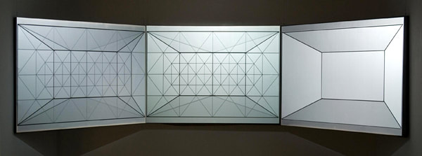
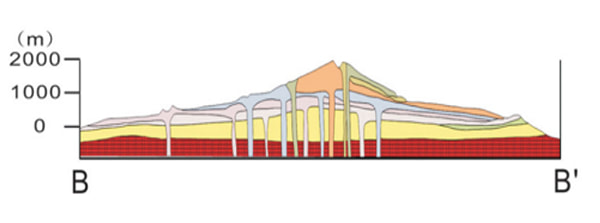
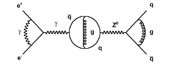
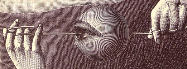
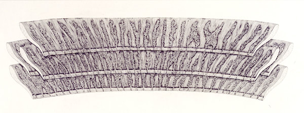

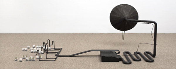
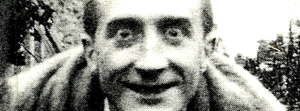
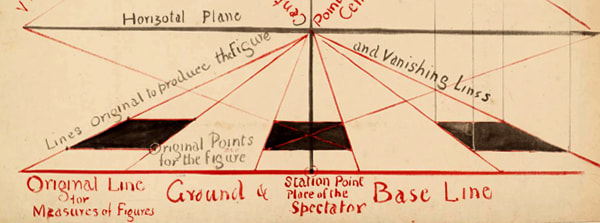
Categories
All
Alchemical Art
Anatomy
Arakawa And Gins
Architecture
Bauhaus
Contemporary-art
Contemporary-art
Duchamp
Genetics
Geology
Geometry
JMW Turner
Leonardo Da Vinci
Literature
Mathematics
Medieval Art
Musicology
Oskar Schlemmer
Perspective
Physics
Romanticism
Sol LeWitt
Surrealism
Theatre
Archives
April 2024
December 2023
November 2023
September 2023
June 2022
June 2021
August 2020
October 2019
August 2018
January 2018
November 2017
October 2017
April 2017
November 2016
October 2016
September 2016
June 2016
May 2016
April 2016
March 2016