Diagrams in Literature: labyrinthine plots, obscure connections and the intricate inner working of a sentence.
- jmfwhittle
- Jun 21, 2016
- 8 min read
Updated: Nov 5, 2025
❉ This is the seventh in a series of blogs that discuss diagrams in the arts and sciences. I recently completed my PhD on this subject at Kyoto city University of the Arts, Japan's oldest Art School.
Feel free to leave comments or to contact me directly if you'd like any more information on life as an artist in Japan, what a PhD in Fine Art involves, applying for the Japanese Government Monbusho Scholarship program (MEXT), or to talk about diagrams and diagrammatic art in general.
Literature and diagrams seem like unlikely partners. Reading is an inherently linear process, a journey from one word to the next, while a diagram is a spatial field of non-linear relationships. Yet for the most complex and ambitious literary works, the diagram is not just a useful tool for analysis; it becomes a fundamental part of the creative act itself, a necessary map for navigating labyrinthine narratives.
Mapping the Narrative Universe
Long before the advent of modernism, some authors were already deconstructing the very form of the novel. The most audacious of these was Laurence Sterne, whose 18th-century masterpiece, The Life and Opinions of Tristram Shandy, Gentleman, is a brilliant satire of the traditional autobiography.
The novel's central joke is that its narrator, Tristram, is utterly incapable of telling his own life story in a straight line. He intends to start with his birth but is so overwhelmed by digressions—family anecdotes, philosophical musings, and comical mishaps—that he doesn't manage to get born until the third volume.
To make this chaotic structure a visible, undeniable part of the book, Sterne famously included a series of diagrams in Volume VI that map the novel's narrative progress. He presents the reader with several charts. One shows a simple straight line, which he ironically offers as the ideal path a story should take. He then contrasts this with the actual paths of his own volumes: a chaotic scribble of loops, knots, and wild deviations that perfectly visualizes the reader's journey through his digressive text.

Figure 2) Sterne's Plot Graphs from the Novel Tristram Shandy, pg 278
These are not mere illustrations; they are a profound meta-fictional act. Sterne wasn't just telling a story; he was diagramming the very act of storytelling itself. The diagrams are a visual argument, asserting that life and memory do not function in straight lines but are messy, associative, and gloriously non-linear.
By breaking the so called 'fourth wall' and showing the reader the blueprint of his chaotic narrative, Sterne makes the novel's structure a central character and invites us to question the very nature of how stories are told.
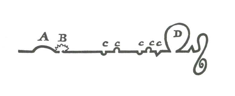
Figure 3) Sterne's final plot graph, with labels for explanations, pg 287
Two centuries after Sterne, another author-turned-critic, Vladimir Nabokov, championed the diagram as an essential tool for literary analysis. Nabokov held a famously divided opinion of James Joyce's work: he detested what he called the "cancerous growth" of Finnegans Wake but considered Ulysses a work of brilliant, lucid machinery. (1) As part of his literature lectures, he argued that to truly understand the genius of Ulysses, one first needed a map.

Figure 4: Vladimir Nabokov, Map of Leopold Bloom’s and Stephen Dedalus’s travels through Dublin, ca. 1948–58, Graphite and colored pencil
The Henry W. and Albert A. Berg Collection of English and American Literature, The New York Public Library, Astor, Lenox and Tilden Foundations
© Vladimir Nabokov, used by permission of The Wylie Agency LLC
He famously diagrammed the intertwining routes taken by his protagonists, Stephen Dedalus and Leopold Bloom, through the streets of Dublin on a single day, June 16, 1904. This was not a mere visual aid but a core part of his pedagogical philosophy. He urged other instructors to do the same, suggesting they “prepare maps of Dublin with Bloom’s and Stephen’s intertwining itineraries clearly traced” rather than perpetuating what he saw as the “pretentious nonsense of Homeric, chromatic, and visceral chapter headings”. (2)
For Nabokov, the novel was a 'Great Machine,' and this diagram was its essential blueprint. He believed the book's power lay not in its allegorical allusions but in its concrete, meticulously constructed reality. The map was a tool to ground the reader in the physical world of the novel, allowing them to appreciate the novel's intricate spatial architecture and the precise choreography of its characters' movements through the city.
The Shape of Stories
If a diagram can map the world of a novel, can it also map its emotional core? The American novelist Kurt Vonnegut believed so. He proposed that the world's stories are built upon a small number of fundamental plot shapes, which could be graphed on a simple axis of "Good Fortune" vs. "Ill Fortune" over time. His master's thesis on the topic was rejected for being too simple, but the idea endured as a powerful tool for literary analysis.

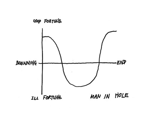

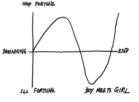
Figures 5, 6: Kurt Vonnegut's plot shapes for the narratives 'Man in a hole' and 'boy meets girl'
He showed how the story of Cinderella follows a clear archetypal shape: a protagonist starts with middling fortune, receives incremental gifts from a spirit or deity (the fairy godmother), suffers a dramatic fall from grace (midnight), and then rises to an "off the chart" level of bliss. In a brilliant stroke of analysis, Vonnegut recognized this same deep structural pattern in the New Testament. He identified other common patterns as well, such as "Man in a Hole" (a simple fall then rise) and "Boy Meets Girl" (fall-rise-fall).


Figures 7, 8: Kurt Vonnegut's plot shapes for Cinderella and Kafka
However, Vonnegut also acknowledged the limits of his system when faced with profound moral complexity. He noted that Shakespeare's Hamlet has the same basic character situation as Cinderella (a person of high station is brought low), but the play's deep ambiguity makes it impossible to chart.
As Vonnegut proposed, the masterpiece leaves us utterly uncertain as to what constitutes good news and what is bad news. Is Hamlet's death a tragedy or a blessed release? Is his revenge a triumph or a disaster? Faced with this ungraphable complexity, Vonnegut opted to leave the diagram for Hamlet tellingly empty.

Figure 9: Kurt Vonnegut's empty plot shapes for Hamlet
Vonnegut's Vindication
As it turns out, Kurt Vonnegut was decades ahead of his time. His Master's thesis on the shapes of stories was famously rejected by the University of Chicago's anthropology department because, in his own words, "it was so simple, and looked like too much fun". (3) However, in a 2016 paper, a team of scientists at the University of Vermont's Computational Story Lab did exactly what Vonnegut had predicted back in 1995: they fed the simple shapes of stories into computers (3).
Using data-mining techniques and sentiment analysis, the researchers mapped the emotional arcs of over 1,700 works of fiction from the Project Gutenberg collection. They essentially tracked the emotional valence—the positivity or negativity of the words used—as the story progressed, creating a data-driven version of Vonnegut's graphs. By applying three different analytical methods, they found that the vast number of stories in their dataset were dominated by six core emotional arcs .
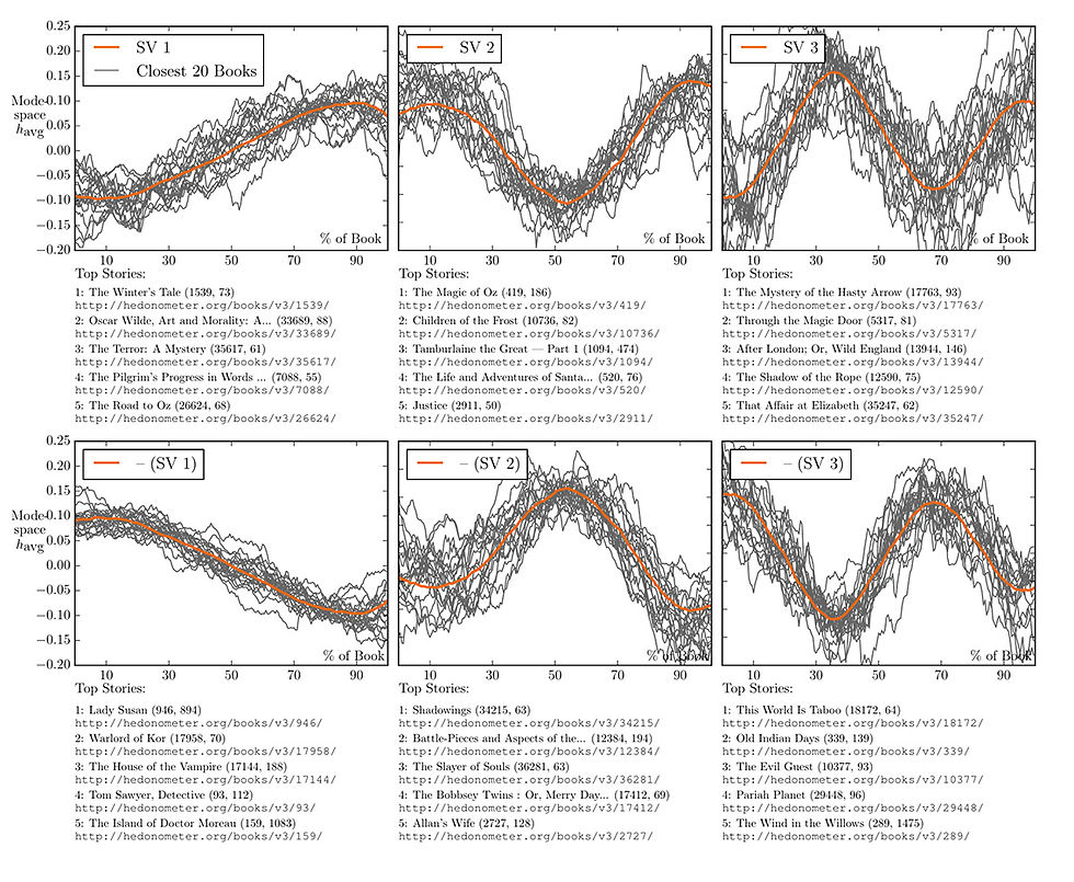
Figure 10: This figure from the 2016 study visualizes the six core emotional arcs
discovered through data-mining thousands of books.
The top row shows the three primary shapes and lists the stories that best fit them:
Rags to Riches: A steady, ongoing rise in fortune (e.g., Alice's Adventures Underground).
Man in a Hole: A fall, then a rise.
Cinderella: A rise, then a fall, then a rise again.
The bottom row shows their inverse shapes:
Tragedy (or Riches to Rags): A steady, ongoing fall (e.g., Romeo and Juliet).
Icarus: A rise, then a fall.
Man in a Hole: A fall, then a rise.
In each of the six charts, the bold orange line represents the ideal mathematical shape for that arc, while the thinner grey lines show the actual emotional journeys of the 20 real books that most closely match that pattern.
The results are a stunning, empirical confirmation of Vonnegut’s core theory. The archetypes he drew on a blackboard—like "Man in a Hole" and "Cinderella"—emerged from the data as two of the six most fundamental emotional arcs in English-language fiction. Vonnegut, who passed away in 2007, would surely be amused but unsurprised by this validation.
The Labyrinthine Text
While Ulysses can be mapped onto the physical world, James Joyce's final work, Finnegans Wake, resists such charting because it is a map of an inner world: the landscape of a dream. Its dense, famously difficult plot is not a linear sequence but a convoluted and circular web of events that seem to happen simultaneously. The book famously begins mid-sentence—"riverrun, past Eve and Adam's, from swerve of shore to bend of bay..."—and ends with the first half of that same sentence, creating a loop that suggests the text has no true beginning or end.
This structure, combined with Joyce's use of multilingual puns and portmanteau words, means that a single word can contain multiple, branching meanings. As the Irish poet Billy Mills noted, it is "the book the web was invented for," a text that functions less like a conventional novel and more like a hypertext encyclopedia, requiring the reader to hold multiple domains of knowledge in mind at once to appreciate its depth.

Figure 11: László Moholy-Nagy's diagram of Finnegan's Wake, 1946,
from 'Vision in Motion', Chicago.
Given this complexity, diagrams become essential tools for both creating and decoding the work's labyrinth of references. The most famous of these is a chart created in 1946 by the artist László Moholy-Nagy, which visualizes the novel's intricate thematic structure. In this diagram, Joyce himself (JJ) is positioned at the pivotal center of a wheel. The four concentric circles represent the book's foundational framework: Giambattista Vico's theory of cyclical history.
Radiating columns are headed by the main characters, while horizontal rows denote the book's many layers of meaning—familial, historical, mythological, and so on. Finally, the spokes of the wheel represent other symbolic systems (the zodiac, the four evangelists, locations in Dublin) that cut across the various narrative layers, suggesting a near-infinite web of interconnections. It is a map not of a journey, but of a dense, interconnected system of thought.
The Sentence as a System
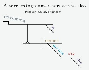
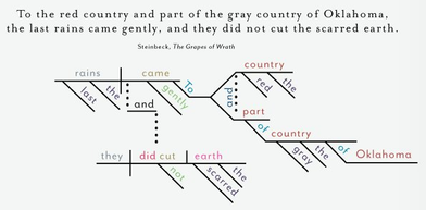
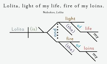
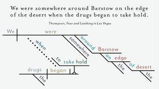
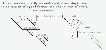
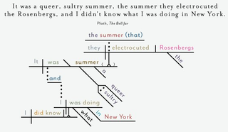
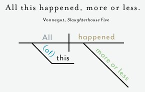
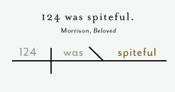
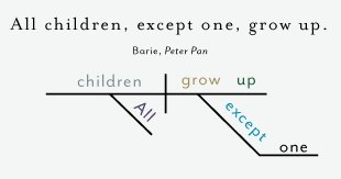
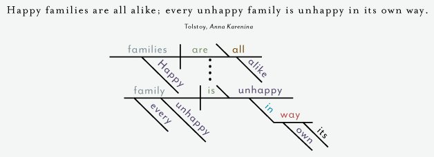
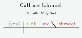
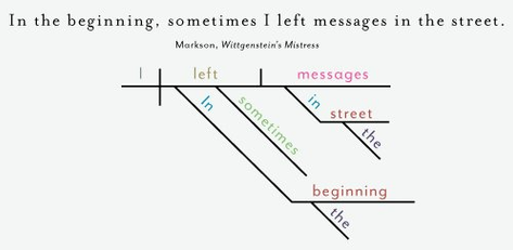
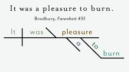
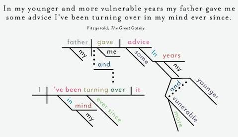
From the grand architecture of a novel's plot, the diagram can also zoom into its smallest functional unit: the sentence. While modern linguistics often uses tree diagrams to analyze sentence structure, the most iconic and visually distinct method comes from the late 19th century.
In the 1870s, American educators Alonzo Reed and Brainerd Kellogg developed a novel system for diagramming sentences as a pedagogical tool to teach grammar. Their method, which became a staple in classrooms for decades, was designed to move beyond rote memorization and allow students to see the logical relationships between the parts of a sentence.

The Reed-Kellogg system captures the grammatical skeleton of a sentence in a clear visual layout that highlights its core components. It works by placing words on a framework of lines, each with a specific function. The subject, verb, and object are placed on a horizontal baseline, separated by vertical lines. Modifiers like adjectives and adverbs branch off on slanted lines below the words they describe, while prepositional phrases are set on a combination of slanted and horizontal lines known as "stilts."
The result is a compact and aesthetically pleasing chart that reveals the intricate, logical machine working inside even the most complex prose. The method provides a powerful visual metaphor, transforming the sentence from a simple string of words into an architectural structure, with a foundation, supports, and ornamentation. Its enduring appeal is a testament to its elegance, as seen in modern infographics and posters that use the Reed-Kellogg style to dissect the famous opening lines of literature.
Summary:
From the grand architecture of a novel's plot down to the grammatical bones of a single sentence, the diagram reveals itself as a surprising and essential literary tool. Authors like Laurence Sterne used it for witty meta-commentary in Tristram Shandy, while scholars like Vladimir Nabokov employed cartography to decode the spatial architecture of Joyce's Ulysses.
The "shape" of stories themselves was explored through Kurt Vonnegut's archetypal plot graphs—a theory recently validated by modern data science—and the hypertextual nature of Joyce's Finnegans Wake showed how a text can become a diagram. Finally, the Reed-Kellogg method revealed the intricate grammatical machinery inside a single sentence. In each case, these examples demonstrate how diagrams serve as indispensable tools for both creating and decoding the hidden architecture of literary works.
Gallery:


References:
1) Nabokov, V. (1980). Lectures on Literature (F. Bowers, Ed.). Harcourt Brace Jovanovich.
2) Vonnegut, K. (1981). Palm Sunday: An Autobiographical Collage. RosettaBooks LLC.
3) Reagan, A. J., Mitchell, L., Kiley, D., Danforth, C. M., & Dodds, P. S. (2016). The emotional arcs of stories are dominated by six basic shapes. http://arxiv.org/abs/1606.07772http://arxiv.org/abs/1606.07772


Comments